A text input in HTML is one tag: <input type="text">. Give it a <label> so people and screen readers know what it is for, and a name so its value is sent with the form.
<label for="city">City</label>
<input type="text" id="city" name="city">
The rest of this page is about reading the value and making the box look right.
Try the box below. Type a few letters, then click outside it, and watch which events fire.
<!doctype html>
<html lang="en">
<head>
<meta charset="utf-8">
<meta name="viewport" content="width=device-width, initial-scale=1">
<title>input vs change events</title>
<style>
  body { margin: 0; padding: 16px; font-family: system-ui, sans-serif; background: #f4f5f7; color: #1d2330; }
  label { display: block; font-size: 14px; font-weight: 600; margin-bottom: 6px; }
  input {
    box-sizing: border-box; width: 100%; max-width: 360px;
    padding: 10px 12px; font-size: 16px;
    border: 1px solid #b8bfca; border-radius: 8px; background: #fff;
  }
  input:focus { outline: 2px solid #2563eb; outline-offset: 1px; border-color: #2563eb; }
  .buttons { margin: 10px 0; display: flex; gap: 8px; flex-wrap: wrap; }
  button { font: inherit; font-size: 13px; padding: 6px 10px; border: 1px solid #b8bfca; border-radius: 6px; background: #fff; cursor: pointer; }
  table { font-size: 13px; border-collapse: collapse; margin-bottom: 10px; }
  td { padding: 2px 10px 2px 0; }
  td code { background: #e8ebf0; padding: 1px 5px; border-radius: 4px; }
  #log {
    height: 130px; overflow-y: auto; margin: 0; padding: 8px 10px;
    background: #fff; border: 1px solid #dfe3e8; border-radius: 8px;
    font: 12px/1.5 ui-monospace, Consolas, monospace; list-style: none;
  }
  .input { color: #1d4ed8; }
  .change { color: #0f5132; font-weight: 700; }
  .none { color: #9a3412; }
</style>
</head>
<body>
<form id="form">
  <label for="name">Your name</label>
  <input type="text" id="name" name="name" value="Hello">
  <div class="buttons">
    <button type="button" id="set">Set value from JS</button>
    <button type="reset">Reset form</button>
  </div>
</form>

<table>
  <tr><td>input.value</td><td><code id="v"></code></td></tr>
  <tr><td>input.defaultValue</td><td><code id="dv"></code></td></tr>
</table>
<ol id="log"><li>Type in the box, then click outside it.</li></ol>

<script>
  const input = document.getElementById('name');
  const log = document.getElementById('log');

  function show() {
    document.getElementById('v').textContent = JSON.stringify(input.value);
    document.getElementById('dv').textContent = JSON.stringify(input.defaultValue);
  }
  function add(cls, text) {
    const li = document.createElement('li');
    li.className = cls; li.textContent = text;
    log.prepend(li);  // newest on top
  }

  // fires on every edit: each key, paste, cut, autofill
  input.addEventListener('input', () => { add('input', 'input   value = ' + JSON.stringify(input.value)); show(); });

  // fires once, when the edited field loses focus
  input.addEventListener('change', () => add('change', 'change  value = ' + JSON.stringify(input.value)));

  // setting .value in code fires no event at all
  document.getElementById('set').addEventListener('click', () => {
    input.value = 'Set by code';
    add('none', 'value set by JS (no event fired)');
    show();
  });

  // reset puts value back to defaultValue (the value="" attribute)
  document.getElementById('form').addEventListener('reset', () => {
    setTimeout(() => { add('none', 'form reset'); show(); });
  });

  show();
</script>
</body>
</html>
Label the box: for/id or wrapping
A label does two jobs. It gives the field an accessible name that screen readers announce, and clicking the label text puts the cursor in the box, which gives touch users a bigger target.
There are two ways to connect them. Both are valid HTML:
<!-- 1. for points at the input's id -->
<label for="email">Email</label>
<input type="text" id="email" name="email">

<!-- 2. the input sits inside the label -->
<label>Email <input type="text" name="email"></label>
The for/id form is easier to lay out with CSS, because the label and the box are separate elements. The id must be unique on the page, or the label will point at the first match.
A placeholder is not a label
The placeholder attribute shows grey text inside an empty box. It is tempting to use it as the field name and save space. The trouble starts when the user types: the hint vanishes, and with it the only text saying what the field is.
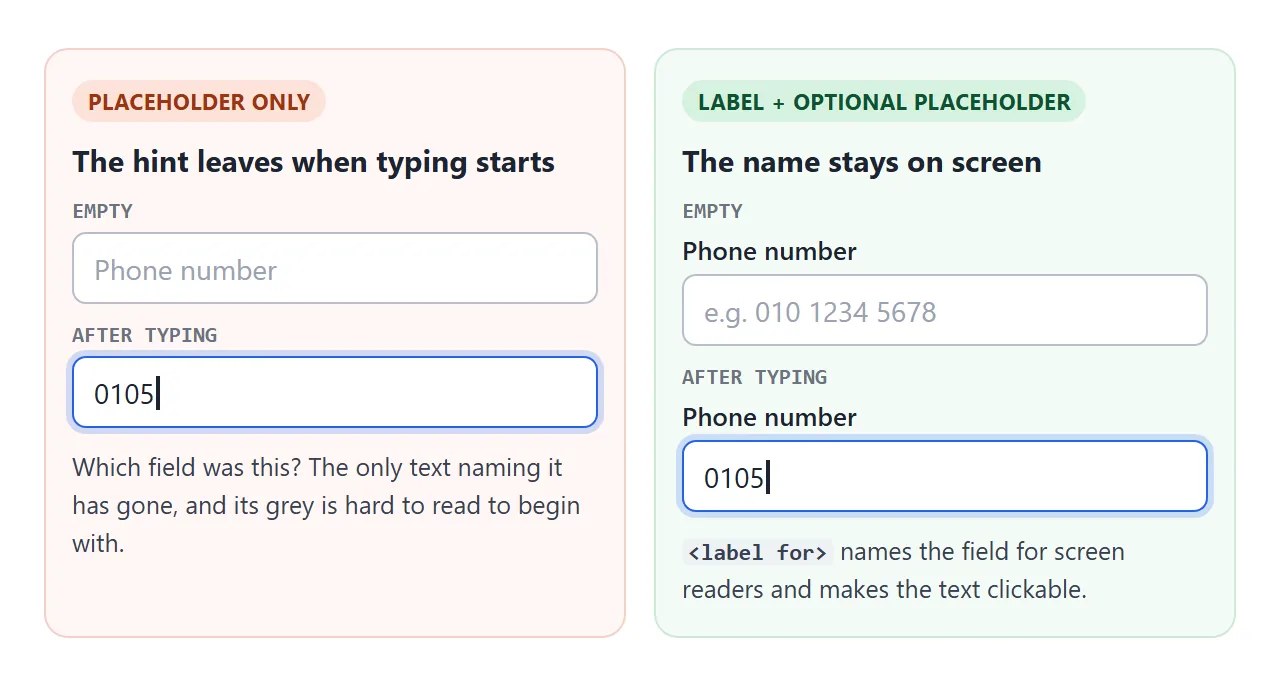
Use the placeholder for an example of the format, such as e.g. 010 1234 5678, and keep the name in a label. If space is tight, the floating label further down keeps both in one box.
value, defaultValue and the attribute
The value attribute in the HTML is only the starting text. In JavaScript it appears as input.defaultValue, and input.getAttribute('value') returns the same thing. Neither changes when the user types.
The live text is the property input.value. Always read that. When a form is reset, the browser copies defaultValue back into value, which is what the Reset form button in the first example shows.
Setting input.value = '...' from a script changes the box but fires neither input nor change. If other code listens for those events, dispatch one yourself: input.dispatchEvent(new Event('input')).
The input event and the change event
Both events tell you the text changed. They differ in when.
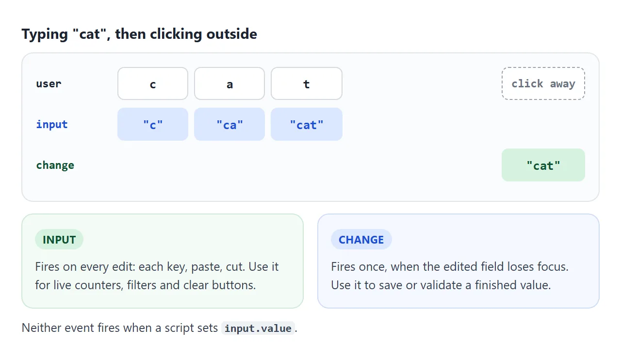
| Event | Fires when | Good for |
|---|---|---|
input |
Every edit: a key, a paste, a cut, autofill | Character counters, live search, clear buttons |
change |
The edited field loses focus | Saving the value, showing an error once the user is done |
keydown |
A key is pressed, before the text changes | Shortcuts such as Enter or Escape |
Do not use keydown or keyup to read what was typed. Pasting with the mouse and autofill change the text without any key event, and input catches both.
Limits: maxlength, minlength, required, pattern
Four attributes cover most rules without a script:
maxlength="40"stops the user from typing more than 40 characters.minlength="3"marks the field invalid when the user has typed fewer than 3. It does not stop typing.requiredblocks submission while the box is empty.pattern="[A-Z]{2}-\d{4}"must match the whole value. An empty field passes unless it is alsorequired.
When the form is submitted, the browser checks these and shows its own message on the first failing field. HTML form validation covers the messages, the :invalid styles and how to replace them with your own.
If the browser keeps offering old entries under the box, see turning off autocomplete on an input.
Styling the text box with CSS
The default box is small and looks different in each browser. A few properties give a consistent field:
input[type=text] {
  box-sizing: border-box;   /* width includes padding and border */
  width: 100%;
  padding: 10px 12px;
  font: inherit;
  font-size: 16px;
  border: 1px solid #b8bfca;
  border-radius: 8px;
}
input[type=text]:focus {
  outline: none;            /* replaced by the ring below */
  border-color: #2563eb;
  box-shadow: 0 0 0 3px rgba(37, 99, 235, .3);
}
Inputs do not inherit the page font by default, so font: inherit matters. Keep a visible focus style. Removing outline without drawing something else leaves keyboard users unable to see which box they are in.
Some mobile browsers zoom the page in when a text box with a font size below 16px gets focus. Setting 16px on the input avoids it without touching the zoom settings of the page.
<!doctype html>
<html lang="en">
<head>
<meta charset="utf-8">
<meta name="viewport" content="width=device-width, initial-scale=1">
<title>Styled text inputs</title>
<style>
  body { margin: 0; padding: 16px; font-family: system-ui, sans-serif; background: #f4f5f7; color: #1d2330; }
  .grid { display: grid; grid-template-columns: repeat(auto-fit, minmax(240px, 1fr)); gap: 18px 20px; }
  .field label { display: block; font-size: 13px; font-weight: 600; margin-bottom: 5px; }
  .hint { font-size: 12px; margin-top: 4px; color: #5b6270; }

  /* the shared look */
  .box {
    box-sizing: border-box;       /* width includes padding and border */
    width: 100%;
    padding: 10px 12px;
    font: inherit; font-size: 16px;
    color: inherit; background: #fff;
    border: 1px solid #b8bfca; border-radius: 8px;
  }
  .box:focus {
    outline: none;                /* only because we draw our own ring below */
    border-color: #2563eb;
    box-shadow: 0 0 0 3px rgba(37, 99, 235, .3);
  }

  /* error state */
  .box.error { border-color: #c2410c; background: #fff7f5; }
  .box.error:focus { box-shadow: 0 0 0 3px rgba(194, 65, 12, .25); }
  .field .msg { color: #9a3412; }

  /* with icon: padding makes room for the svg */
  .icon-wrap { position: relative; }
  .icon-wrap svg { position: absolute; left: 11px; top: 50%; transform: translateY(-50%); pointer-events: none; }
  .icon-wrap .box { padding-left: 38px; }

  /* floating label: placeholder=" " lets :placeholder-shown tell empty from filled */
  .float { position: relative; }
  .float .box { padding: 20px 12px 6px; }
  .float label {
    position: absolute; left: 13px; top: 14px; margin: 0;
    font-size: 16px; font-weight: 400; color: #6b7280;
    pointer-events: none; transition: all .15s;
  }
  .float .box:focus + label,
  .float .box:not(:placeholder-shown) + label { top: 5px; font-size: 11px; color: #2563eb; }

  .wide { grid-column: 1 / -1; }
</style>
</head>
<body>
<div class="grid">
  <div class="field">
    <label for="a">Browser default</label>
    <input type="text" id="a">
    <div class="hint">No CSS at all.</div>
  </div>

  <div class="field">
    <label for="b">Padding, border, focus ring</label>
    <input class="box" type="text" id="b" placeholder="Click to see the ring">
  </div>

  <div class="field">
    <label for="c">Error state</label>
    <input class="box error" type="text" id="c" value="ab" aria-invalid="true" aria-describedby="c-msg">
    <div class="hint msg" id="c-msg">Use at least 3 characters.</div>
  </div>

  <div class="field">
    <label for="d">With an icon</label>
    <div class="icon-wrap">
      <svg width="18" height="18" viewBox="0 0 24 24" fill="none" stroke="#6b7280" stroke-width="2" aria-hidden="true"><circle cx="11" cy="11" r="7"/><path d="m20 20-4-4"/></svg>
      <input class="box" type="text" id="d" placeholder="Search">
    </div>
  </div>

  <div class="field float">
    <input class="box" type="text" id="e" placeholder=" ">
    <label for="e">Floating label</label>
  </div>

  <div class="field wide">
    <label for="f">Full width</label>
    <input class="box" type="text" id="f" placeholder="width: 100% with box-sizing: border-box">
  </div>
</div>
</body>
</html>
The floating label uses one trick. The input gets placeholder=" " (a single space) so the :placeholder-shown selector can tell an empty box from a filled one.
The label sits after the input in the HTML, so input:not(:placeholder-shown) + label can move it up.
readonly and disabled
Both stop the user from editing. They differ in what happens to the value.
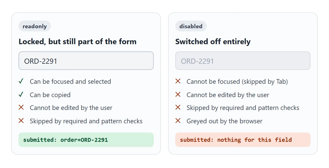
Use readonly for a value the user should see and send but not change, such as an order number. Use disabled for a field that does not apply right now. If you need the value submitted anyway, copy it into an <input type="hidden">.
A finished search box
This example puts it together: a label, a clear button that appears once there is text, a character counter tied to maxlength, and a message that waits until the user leaves the box before it complains.
<!doctype html>
<html lang="en">
<head>
<meta charset="utf-8">
<meta name="viewport" content="width=device-width, initial-scale=1">
<title>Search box with clear button and counter</title>
<style>
body { margin: 0; padding: 18px; font-family: system-ui, sans-serif; background: #f4f5f7; color: #1d2330; }
form { max-width: 440px; }
label { display: block; font-size: 14px; font-weight: 600; margin-bottom: 6px; }
.wrap { position: relative; }
input {
box-sizing: border-box; width: 100%;
padding: 11px 42px 11px 12px; /* right padding leaves room for the clear button */
font: inherit; font-size: 16px;
border: 1px solid #b8bfca; border-radius: 8px; background: #fff;
}
input:focus { outline: none; border-color: #2563eb; box-shadow: 0 0 0 3px rgba(37, 99, 235, .3); }
input.bad { border-color: #c2410c; }
.clear {
position: absolute; right: 6px; top: 50%; transform: translateY(-50%);
width: 30px; height: 30px; border: 0; border-radius: 50%;
background: #e8ebf0; color: #374151; font-size: 18px; line-height: 1; cursor: pointer;
}
.clear[hidden] { display: none; }
.row { display: flex; justify-content: space-between; gap: 10px; margin-top: 5px; font-size: 12px; min-height: 18px; }
#msg { color: #9a3412; }
#count { color: #5b6270; white-space: nowrap; }
#count.full { color: #9a3412; font-weight: 700; }
button[type=submit] { margin-top: 10px; font: inherit; padding: 9px 16px; border: 0; border-radius: 8px; background: #1d4ed8; color: #fff; cursor: pointer; }
#out { margin-top: 12px; font: 13px ui-monospace, Consolas, monospace; color: #0f5132; }
</style>
</head>
<body>
<form id="form" novalidate>
<label for="q">Search the docs</label>
<div class="wrap">
<input type="text" id="q" name="q" maxlength="40" minlength="3" required
autocomplete="off" enterkeyhint="search" aria-describedby="msg count">
<button type="button" class="clear" id="clear" aria-label="Clear search" hidden>×</button>
</div>
<div class="row">
<span id="msg" aria-live="polite"></span>
<span id="count">0 / 40</span>
</div>
<button type="submit">Search</button>
<div id="out"></div>
</form>
<script>
const q = document.getElementById('q');
const clear = document.getElementById('clear');
const msg = document.getElementById('msg');
const count = document.getElementById('count');
let touched = false; // show errors only after the first blur or submit
function check() {
let text = '';
if (q.value.trim() === '') text = 'Type something to search.';
else if (q.value.trim().length < 3) text = 'Use at least 3 characters.';
msg.textContent = touched ? text : '';
q.classList.toggle('bad', touched && text !== '');
q.setAttribute('aria-invalid', touched && text !== '');
return text === '';
}
q.addEventListener('input', () => {
count.textContent = q.value.length + ' / ' + q.maxLength;
count.classList.toggle('full', q.value.length === q.maxLength);
clear.hidden = q.value === '';
check();
});
q.addEventListener('change', () => { touched = true; check(); });
clear.addEventListener('click', () => {
q.value = '';
q.dispatchEvent(new Event('input')); // setting .value fires no event, so fire one
q.focus();
});
document.getElementById('form').addEventListener('submit', (e) => {
e.preventDefault(); // demo only: show what would be sent
touched = true;
if (!check()) { q.focus(); return; }
const data = new FormData(e.target);
document.getElementById('out').textContent = 'Would send: q=' + JSON.stringify(data.get('q'));
});
</script>
</body>
</html>
- Clear button: a
<button type="button">placed over the right edge of the box, withpadding-righton the input so text does not run under it. It setsvalueto empty and dispatchesinputso the counter updates. - Counter: on every
inputevent, writevalue.lengthnext tomaxLength. - Inline message: check the length on
input, but only show the message after the firstchangeor submit. Errors that appear on the first keystroke are noise.
<input type="search"> is also available for search fields. Some browsers draw their own clear button inside it, so a custom one like this can end up doubled there.
When it does not work
| What you see | Cause | Fix |
|---|---|---|
| JavaScript reads the old text | Reading defaultValue or getAttribute('value') |
Read the input.value property |
| The field name disappears while typing | The placeholder is doing the label's job | Add a <label>, keep the placeholder as an example |
| Clicking the label does nothing | for does not match the input's id |
Make them identical, or wrap the input in the label |
| The box is too narrow | The size attribute defaults to about 20 characters |
Set width in CSS; it overrides size |
width: 100% pokes out of its container |
Padding and border are added on top of the width | box-sizing: border-box |
change fires late, or not at all |
It waits for the edited field to lose focus | Use input for live updates |
No event after setting value in code |
Script changes fire no events | dispatchEvent(new Event('input')) |
| A field is missing from the submitted data | It is disabled, or has no name |
Use readonly, and give it a name |
| The page zooms in on a phone when the box is tapped | The input's font size is below 16px | font-size: 16px on the input |
Share it as a link
A form is easier to judge by typing into it than by looking at a screenshot. To let someone try your text boxes, paste the page into a NOS document and choose Create share link. HTML to link walks through it.
The page renders as written and its scripts run, so counters, clear buttons and messages all work for the person who opens it. If you change the code later, the same link shows the new version.