A <fieldset> groups form controls that belong together, and the <legend> inside it names the group. Use it for a set of radio buttons or checkboxes that answer one question, or for a block like an address.
Screen readers can then tell the user which question a button belongs to.
The minimum is two tags:
<fieldset>
  <legend>Shipping speed</legend>
  <label><input type="radio" name="speed" value="standard"> Standard</label>
  <label><input type="radio" name="speed" value="express"> Express</label>
</fieldset>
Try the difference. Click or tab to a radio button on each side.
<!doctype html>
<html lang="en">
<head>
<meta charset="utf-8">
<meta name="viewport" content="width=device-width, initial-scale=1">
<title>Radio group with and without fieldset</title>
<style>
  body { margin: 0; padding: 14px; font-family: system-ui, sans-serif; background: #f4f5f7; color: #1d2330; }
  .row { display: grid; grid-template-columns: repeat(auto-fit, minmax(160px, 1fr)); gap: 12px; }
  .panel { background: #fff; border-radius: 12px; padding: 12px; }
  .tag { margin: 0 0 10px; font-size: 12px; font-weight: 700; color: #5b6270; }
  label { display: block; margin: 6px 0; font-size: 14px; }
  .q { margin: 0 0 4px; font-weight: 600; font-size: 14px; }
  fieldset { margin: 0; }
  .out { margin: 12px 0 0; padding: 8px 10px; border-radius: 8px; background: #eef1f5; font-size: 13px; min-height: 36px; }
</style>
</head>
<body>
<div class="row">
  <!-- Without: the question is only a paragraph next to the radios -->
  <div class="panel">
    <p class="tag">div + p</p>
    <div>
      <p class="q">Shipping speed</p>
      <label><input type="radio" name="speed1" value="standard"> Standard</label>
      <label><input type="radio" name="speed1" value="express"> Express</label>
      <label><input type="radio" name="speed1" value="pickup"> Pick up</label>
    </div>
    <p class="out" aria-live="polite">Click or tab to a radio button.</p>
  </div>

  <!-- With: the legend is the caption of the whole group -->
  <div class="panel">
    <p class="tag">fieldset + legend</p>
    <fieldset>
      <legend>Shipping speed</legend>
      <label><input type="radio" name="speed2" value="standard"> Standard</label>
      <label><input type="radio" name="speed2" value="express"> Express</label>
      <label><input type="radio" name="speed2" value="pickup"> Pick up</label>
    </fieldset>
    <p class="out" aria-live="polite">Click or tab to a radio button.</p>
  </div>
</div>

<script>
  // Show the group name the browser exposes for the focused radio button
  document.querySelectorAll('.panel').forEach((panel) => {
    const out = panel.querySelector('.out');
    panel.addEventListener('focusin', (e) => {
      const legend = e.target.closest('fieldset')?.querySelector('legend');
      out.textContent = legend
        ? 'Group name: "' + legend.textContent + '". Screen readers can say it as you enter the group.'
        : 'Group name: none. "Shipping speed" is just a nearby paragraph.';
    });
  });
</script>
</body>
</html>
Why radio groups belong in a fieldset
Each radio button already has its own label: "Standard", "Express", "Pick up". What the labels do not say is the question. On the left, "Shipping speed" is a paragraph that happens to sit above them. Nothing in the markup connects the two.
On the right, the browser exposes the fieldset as a group whose name is the legend text.
When a screen reader user moves into the group, the screen reader can announce that name along with the button. The exact wording and timing depend on the screen reader, but the question is no longer lost.
The same applies to a set of checkboxes ("Which days suit you?") and to any cluster of fields under one heading. A single text input with its own label does not need a fieldset.
How the default fieldset looks
Without CSS, the browser draws a thin groove border around the group and places the legend on the top border line, cutting a gap into it. The fieldset also gets a small margin and padding.
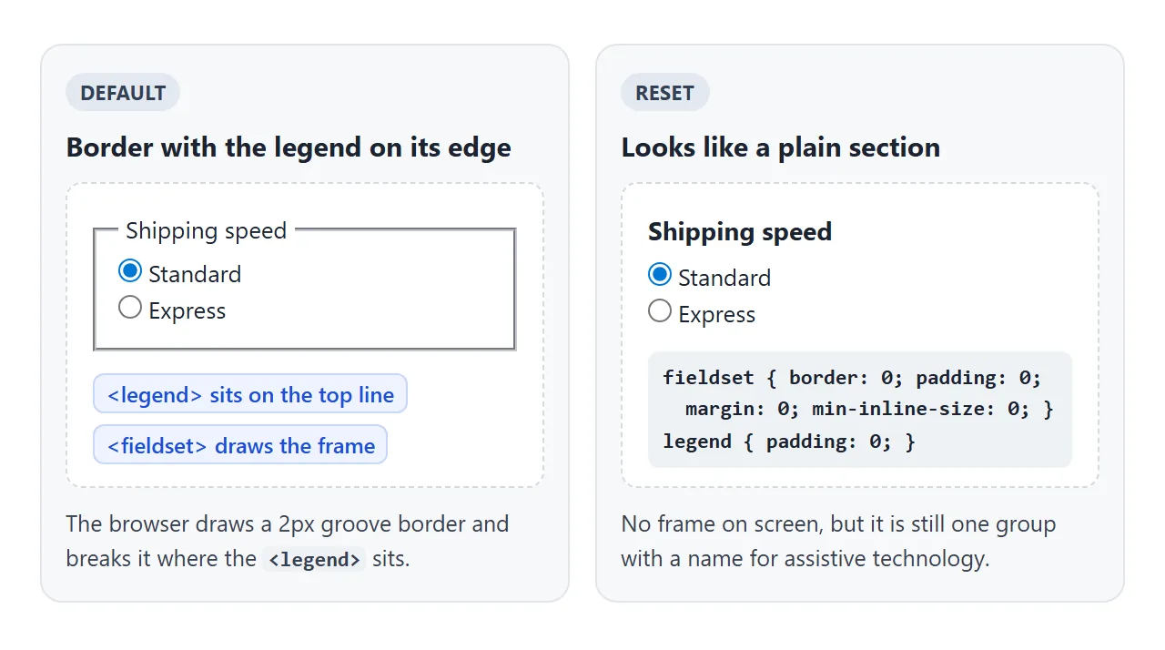
The legend sitting on the line is the one thing a normal element cannot copy easily. You can keep it and style it, or reset everything so the fieldset looks like a plain <div> with a heading.
Styling the border and legend with CSS
The border is an ordinary CSS border, so border, border-radius and background work as on any box. The legend takes font, colour and padding. Padding on the legend widens the gap in the line.
fieldset {
  border: 1.5px solid #d9dde4;
  border-radius: 14px;
  padding: 8px 16px 16px;
  min-inline-size: 0;   /* see "Fieldsets on phones" below */
}
legend { padding: 0 8px; font-size: 16px; font-weight: 700; }
To make it look like a plain section, reset it:
fieldset { border: 0; padding: 0; margin: 0; min-inline-size: 0; }
legend { padding: 0; }
The group and its name for assistive technology stay. Only the frame disappears, so give the section some other visual cue, such as a bold legend or spacing, so sighted users still see where it starts.
Disable a whole section with one attribute
Add disabled to a fieldset and every form control inside it is disabled: inputs, selects, textareas and buttons. They go grey, cannot be focused, and match the :disabled selector. Removing the attribute brings them all back.
<!doctype html>
<html lang="en">
<head>
<meta charset="utf-8">
<meta name="viewport" content="width=device-width, initial-scale=1">
<title>Disable a whole fieldset</title>
<style>
  body { margin: 0; padding: 14px; font-family: system-ui, sans-serif; background: #f4f5f7; color: #1d2330; }
  form { background: #fff; border-radius: 12px; padding: 14px; max-width: 420px; }
  fieldset { margin: 12px 0; border: 1px solid #cfd4dc; border-radius: 10px; min-inline-size: 0; }
  fieldset:disabled { opacity: .55; }
  legend { font-weight: 600; padding: 0 6px; }
  label { display: block; margin: 8px 0; font-size: 14px; }
  input[type=text] { display: block; width: 100%; box-sizing: border-box; margin-top: 3px; padding: 7px 8px; font: inherit; }
  button { padding: 8px 12px; font: inherit; border-radius: 8px; border: 1px solid #1d4ed8; background: #2563eb; color: #fff; }
  pre { margin: 12px 0 0; padding: 10px; background: #1d2330; color: #d6f2df; border-radius: 8px; font-size: 12.5px; white-space: pre-wrap; }
</style>
</head>
<body>
<form id="order">
  <label><input type="checkbox" id="same" name="same_as_billing" value="yes" checked>
    Ship to my billing address</label>

  <!-- One attribute switches off every control inside -->
  <fieldset id="ship" disabled>
    <legend>Shipping address</legend>
    <label>Street <input type="text" name="street" value="12 Harbour Road"></label>
    <label>City <input type="text" name="city" value="Leeds"></label>
  </fieldset>

  <button type="button" id="show">Show what would be sent</button>
  <pre id="out"></pre>
</form>

<script>
  const form = document.getElementById('order');
  const same = document.getElementById('same');
  const ship = document.getElementById('ship');
  const out = document.getElementById('out');

  function show() {
    // Disabled controls are left out of FormData, just as on a real submit
    const lines = [...new FormData(form)].map(([k, v]) => k + ' = ' + v);
    out.textContent = lines.join('\n') || '(nothing)';
  }

  same.addEventListener('change', () => {
    ship.disabled = same.checked;  // checked = use billing, so no shipping fields
    show();
  });
  document.getElementById('show').addEventListener('click', show);
  show();
</script>
</body>
</html>
The script is one line: ship.disabled = same.checked. Two details matter:
- Disabled fields are not sent. Their values stay on screen, but they are left out of the form data. In the example, the street and city appear in the list only while the fieldset is enabled.
- The first legend is the exception. Controls inside the fieldset's first
<legend>are not disabled. That is where a "use this section" checkbox can live, so it keeps working while the rest is off.
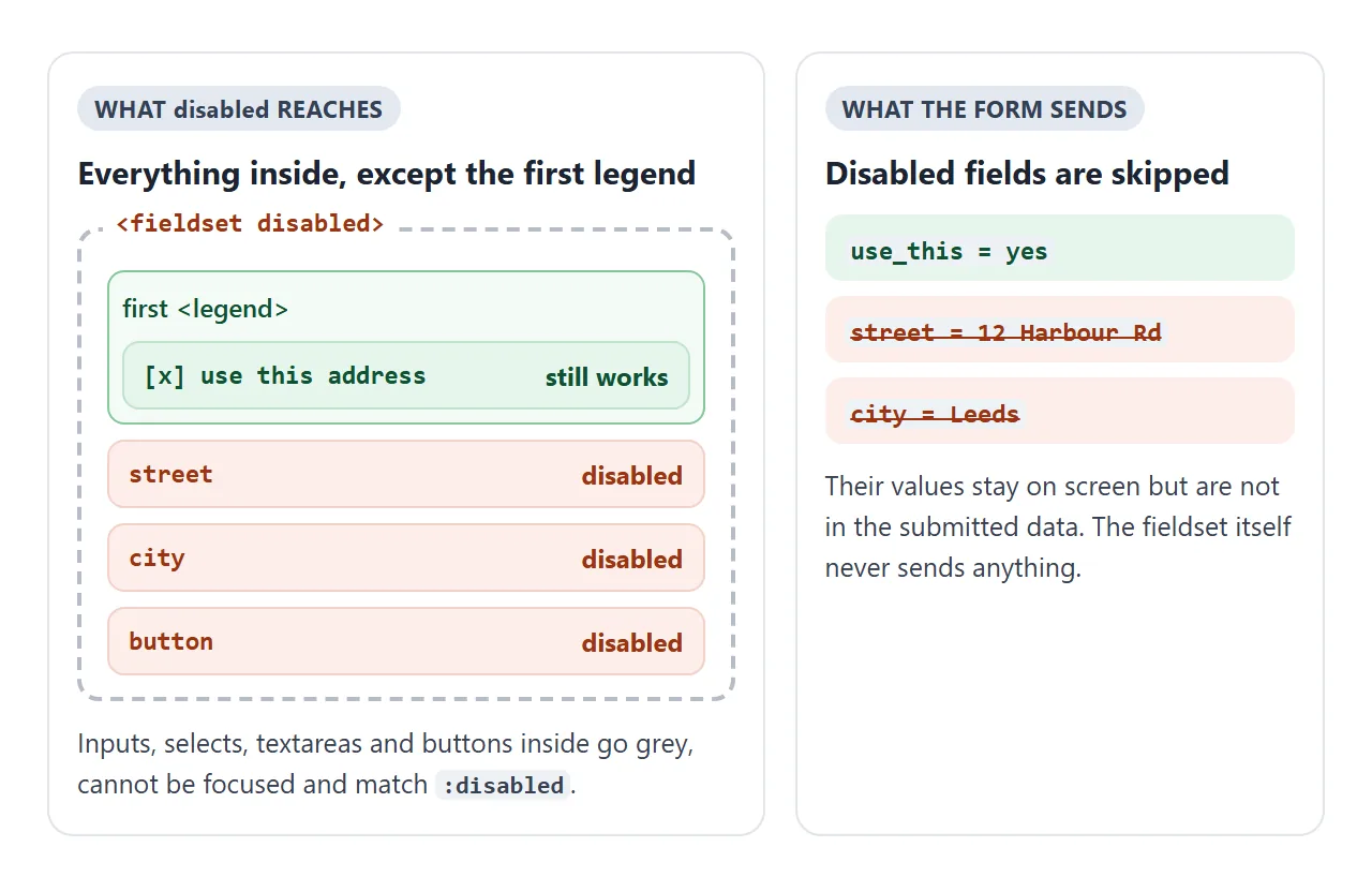
If you want fields that cannot be edited but are still sent, use readonly on each input instead. readonly works on text-like inputs and textareas. There is no readonly attribute for a fieldset.
fieldset vs div
<div> |
<fieldset> |
|
|---|---|---|
| Groups things on screen | Yes | Yes |
| Exposed as a named group | No | Yes, named by its legend |
| Default border and padding | None | Groove border, small padding |
| Disable all controls inside | Needs a script that loops over them | One disabled attribute |
| Default minimum width | None | min-inline-size: min-content |
Use a div for layout. Use a fieldset when the controls share a question or a topic.
The name and form attributes
A fieldset can have a name, but it is not a field. Nothing is sent under that name. The name is useful from script: form.elements.shipping returns the fieldset, and fieldset.elements lists the controls inside it.
The form attribute ties the fieldset itself to a form elsewhere on the page by its id.
It does not pull the inputs inside with it. Each input still belongs to the <form> that contains it, or to the one named in its own form attribute.
A finished checkout form
Three sections, each a fieldset with a numbered legend on the border. The radio groups inside are fieldsets too, reset to look like plain content.
The fields sit in a CSS grid that goes to fewer columns as the screen narrows. Leave a required field empty and press the button to see the browser's check.
<!doctype html>
<html lang="en">
<head>
<meta charset="utf-8">
<meta name="viewport" content="width=device-width, initial-scale=1">
<title>Checkout form with styled fieldsets</title>
<style>
  * { box-sizing: border-box; }
  body { margin: 0; padding: 16px; font-family: system-ui, sans-serif; background: #f4f5f7; color: #1d2330; }
  form { max-width: 560px; margin: 0 auto; }

  /* Each section: a soft card with the legend on its top edge */
  fieldset {
    margin: 0 0 18px; padding: 8px 16px 16px;
    border: 1.5px solid #d9dde4; border-radius: 14px; background: #fff;
    min-inline-size: 0;  /* default is min-content, which can push past a phone screen */
  }
  legend { padding: 0 8px; font-size: 16px; font-weight: 700; }
  legend .n {
    display: inline-grid; place-items: center; width: 22px; height: 22px; margin-right: 6px;
    border-radius: 50%; background: #2563eb; color: #fff; font-size: 12px;
  }

  .grid { display: grid; grid-template-columns: repeat(auto-fit, minmax(150px, 1fr)); gap: 10px 12px; }
  label { display: block; font-size: 13px; color: #4b5260; }
  input[type=text], input[type=email], input[type=tel] {
    display: block; width: 100%; margin-top: 4px; padding: 9px 10px;
    font: inherit; font-size: 15px; color: #1d2330; border: 1px solid #c9ced6; border-radius: 8px;
  }

  /* A fieldset inside a fieldset: the radio group, reset to look like plain content */
  fieldset.choices { margin: 14px 0 0; padding: 0; border: 0; background: none; }
  fieldset.choices legend { padding: 0; margin-bottom: 6px; font-size: 13px; font-weight: 600; color: #4b5260; }
  .opt {
    display: flex; align-items: center; gap: 8px; margin-top: 6px; padding: 10px 12px;
    border: 1px solid #d9dde4; border-radius: 10px; font-size: 14px; color: #1d2330; cursor: pointer;
  }
  .opt:has(input:checked) { border-color: #2563eb; background: #eff4ff; }
  .opt span { margin-left: auto; color: #5b6270; }

  button { width: 100%; padding: 12px; font: inherit; font-weight: 700; border: 0; border-radius: 10px; background: #2563eb; color: #fff; }
  #out { margin: 14px 0 0; padding: 12px; background: #1d2330; color: #d6f2df; border-radius: 10px; font-size: 13px; white-space: pre-wrap; overflow-wrap: anywhere; }
  #out:empty { display: none; }
</style>
</head>
<body>
<form id="checkout">
  <fieldset>
    <legend><span class="n">1</span>Contact</legend>
    <div class="grid">
      <label>Email <input type="email" name="email" required autocomplete="email"></label>
      <label>Phone <input type="tel" name="phone" autocomplete="tel"></label>
    </div>
  </fieldset>

  <fieldset>
    <legend><span class="n">2</span>Delivery</legend>
    <div class="grid">
      <label>Full name <input type="text" name="name" required autocomplete="name"></label>
      <label>Street <input type="text" name="street" required autocomplete="street-address"></label>
      <label>City <input type="text" name="city" required autocomplete="address-level2"></label>
      <label>Postcode <input type="text" name="postcode" required autocomplete="postal-code"></label>
    </div>
    <fieldset class="choices">
      <legend>Delivery speed</legend>
      <label class="opt"><input type="radio" name="speed" value="standard" checked> Standard <span>Free</span></label>
      <label class="opt"><input type="radio" name="speed" value="express"> Express <span>$6</span></label>
    </fieldset>
  </fieldset>

  <fieldset>
    <legend><span class="n">3</span>Payment</legend>
    <fieldset class="choices">
      <legend>Pay with</legend>
      <label class="opt"><input type="radio" name="pay" value="card" checked> Card</label>
      <label class="opt"><input type="radio" name="pay" value="invoice"> Invoice</label>
    </fieldset>
  </fieldset>

  <button type="button" id="review">Review order</button>
  <pre id="out"></pre>
</form>

<script>
  const form = document.getElementById('checkout');
  const out = document.getElementById('out');

  document.getElementById('review').addEventListener('click', () => {
    if (!form.reportValidity()) return;  // shows the browser's message on the first empty field
    const lines = [...new FormData(form)].map(([k, v]) => k + ': ' + v);
    out.textContent = 'Ready to send:\n' + lines.join('\n');
  });
</script>
</body>
</html>
The checks come from required and type="email". HTML form validation covers those attributes and how to reword the messages. To send the form to a real server, give it an action and a submit button:
<form action="/order" method="post">
  <fieldset> ... </fieldset>
  <button type="submit">Place order</button>
</form>
Fieldsets on phones
By default a fieldset has min-inline-size: min-content, which a div does not have.
It will not shrink below the width of its widest content. A long code, a wide table or a fixed-width input inside it pushes the fieldset past the edge of a narrow screen.
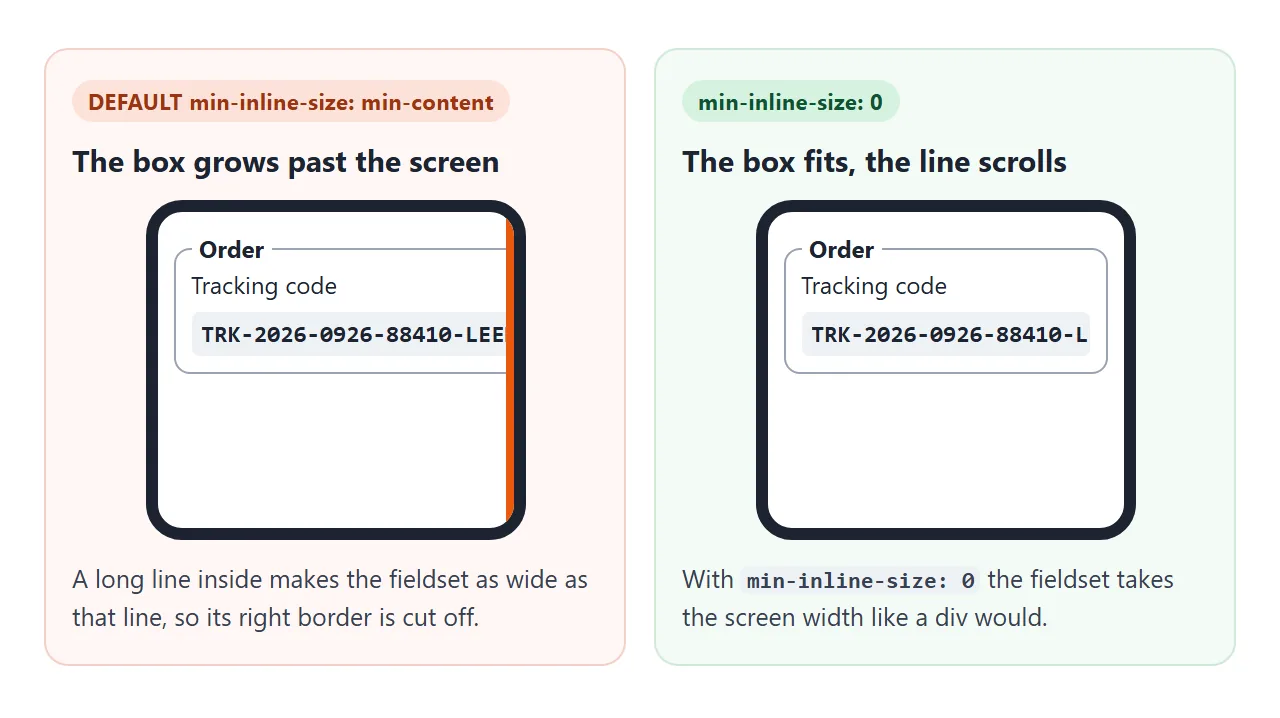
Add min-inline-size: 0 (or min-width: 0) to the fieldset.
It then takes the width of its container, and the wide content inside can wrap or scroll on its own. The page also needs the viewport meta tag to be sized for a phone at all.
When it does not work
| What you see | Cause | Fix |
|---|---|---|
| The legend text sits inside the box, not on the border, and the group has no name | The legend is wrapped in a div or label, so it is not a direct child of the fieldset |
Make <legend> the first child of <fieldset> |
| The legend works but a validator flags it | Something comes before the legend inside the fieldset | Move the legend to the top. The standard only allows it first |
display: flex or grid on the fieldset lays out differently than on a div |
A fieldset keeps its legend out of the normal flow and has its own rendering rules | Put a div inside the fieldset and make that the flex or grid container. Test the layout either way |
| Some answers never reach the server | Those fields sit in a disabled fieldset | Enable the fieldset before sending, or use readonly on the inputs |
| The border is gone and the section blends into the page | The reset removed the only visual grouping | Style the legend as a heading, or add spacing or a background |
| The form is wider than the phone screen | Default min-inline-size: min-content |
min-inline-size: 0 on the fieldset |
Share it as a link
A form is easier to judge by filling it in than by looking at a screenshot. Try the tab order, the grouping and the phone layout on the real thing.
To send the working version, paste the page into a NOS document and choose Create share link. HTML to link walks through it.
The page renders as written and its scripts run, so the people you send it to can click through the form themselves. If you change the code later, the same link shows the new version.