Add flex-shrink: 0 to any flex item that must keep its size. Every flex item has flex-shrink: 1 by default. When the row is narrower than its contents, all items give up width, including icons, avatars and buttons that you gave a fixed width.
Try it. The row starts too narrow. Look at the icon, the round avatar and the button, then tick the box.
<!doctype html>
<html lang="en">
<head>
<meta charset="utf-8">
<meta name="viewport" content="width=device-width, initial-scale=1">
<title>Why flex items squash</title>
<style>
  body { margin: 0; padding: 14px; font-family: system-ui, sans-serif; background: #f4f5f7; color: #1d2330; }
  .controls { font-size: 13px; margin-bottom: 12px; }
  .controls input[type=range] { width: 100%; }
  .controls label { display: inline-flex; gap: 6px; align-items: center; margin-top: 6px; font-weight: 600; }

  .row { display: flex; align-items: center; gap: 10px; padding: 10px; background: #fff; border-radius: 10px; box-shadow: 0 2px 8px rgba(0, 0, 0, .08); }
  .icon { width: 24px; height: 24px; color: #2563eb; }
  .avatar { width: 40px; height: 40px; border-radius: 50%; background: #0f766e; color: #fff; display: grid; place-items: center; font-size: 13px; font-weight: 700; }
  .text { font-size: 14px; line-height: 1.35; }
  .btn { padding: 7px 10px; border: 0; border-radius: 6px; background: #2563eb; color: #fff; font: 600 13px system-ui, sans-serif; }

  /* the fix: these three keep their size, only the text gives way */
  .row.fixed .icon,
  .row.fixed .avatar,
  .row.fixed .btn { flex-shrink: 0; }

  #out { margin-top: 10px; font: 13px/1.5 ui-monospace, Consolas, monospace; color: #374151; }
</style>
</head>
<body>
<div class="controls">
  Row width: <b id="w"></b>
  <input type="range" id="slider" min="220" step="10">
  <label><input type="checkbox" id="fix"> flex-shrink: 0 on icon, avatar and button</label>
</div>

<div class="row" id="row">
  <svg class="icon" viewBox="0 0 24 24" aria-hidden="true"><circle cx="12" cy="12" r="10" fill="currentColor"/></svg>
  <div class="avatar">AB</div>
  <div class="text">Ada Byron replied to your comment about the launch checklist</div>
  <button class="btn">Mark as read</button>
</div>

<div id="out"></div>

<script>
  const row = document.getElementById('row');
  const slider = document.getElementById('slider');
  const out = document.getElementById('out');
  const px = (sel) => Math.round(row.querySelector(sel).getBoundingClientRect().width) + 'px';

  slider.max = Math.min(560, Math.floor(document.body.clientWidth - 28));
  slider.value = 260;

  function update() {
    row.style.width = slider.value + 'px';
    document.getElementById('w').textContent = slider.value + 'px';
    out.textContent = 'icon ' + px('.icon') + ' (set 24px) · avatar ' + px('.avatar') +
      ' (set 40px) · button ' + px('.btn');
  }
  slider.addEventListener('input', update);
  document.getElementById('fix').addEventListener('change', (e) => {
    row.classList.toggle('fixed', e.target.checked);
    update();
  });
  update();
</script>
</body>
</html>
Without the fix, the 24px icon ends up a thin oval and the button wraps onto three lines. With it, only the text gives way.
Why flex items squash
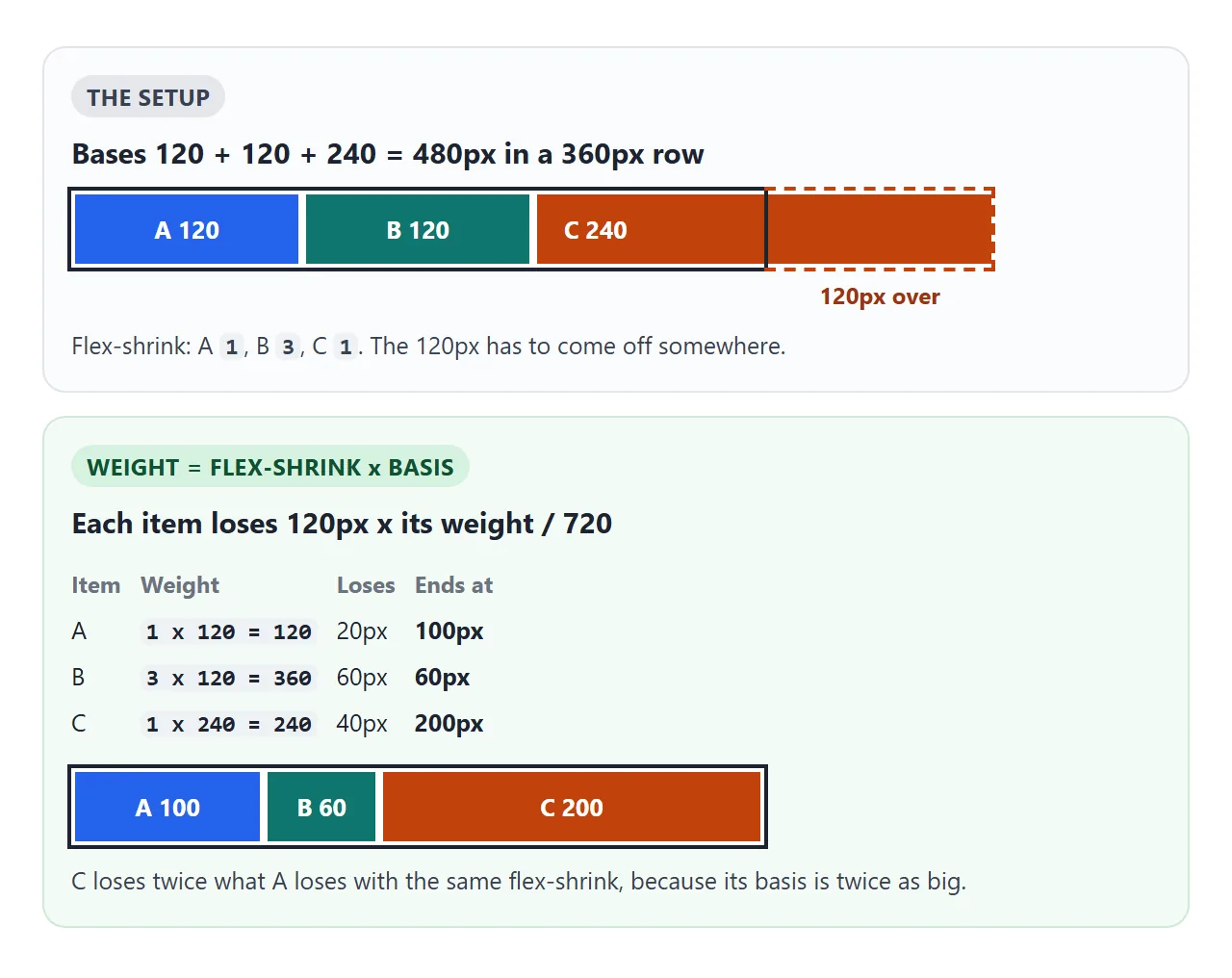
In a flex row, width is not a fixed size. It is the item's flex-basis, the size it starts from before the browser fits the row.
If all the bases add up to more than the container, the browser takes the difference out of the items that are allowed to shrink.
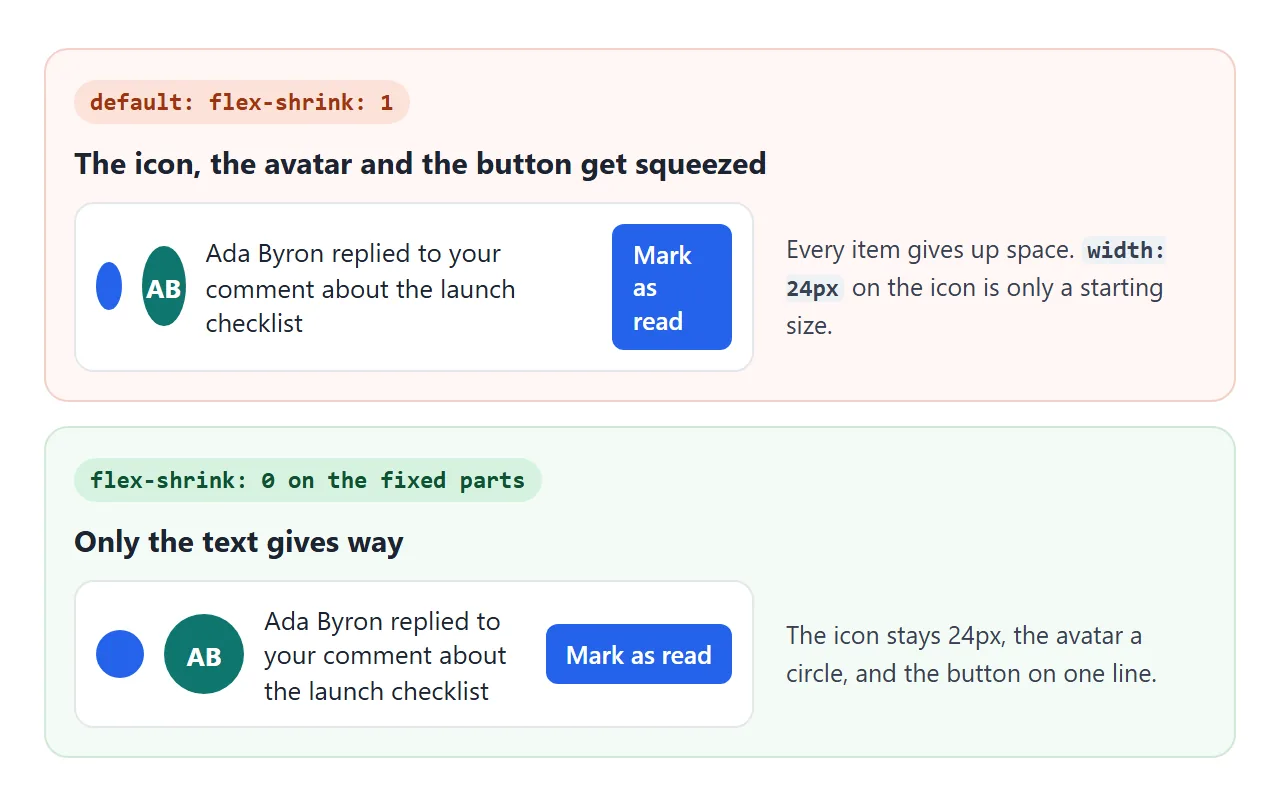
Each item can only shrink down to its minimum size. For a flex item that is min-width: auto: the smaller of its width and its narrowest possible content. That is why the parts squash differently:
- An empty div or an inline SVG icon has no text inside, so it can shrink to a sliver.
- An avatar with initials stops at the width of the letters, and the circle turns into an oval.
- A button wraps its label onto several lines, one word per line.
- An image usually keeps its width, but it can be stretched tall instead. That is
align-items: stretch, covered in the table below.
The fix: flex-shrink: 0 on the fixed parts
.row    { display: flex; align-items: center; gap: 10px; }
.icon   { width: 24px; height: 24px; flex-shrink: 0; }
.avatar { width: 40px; height: 40px; flex-shrink: 0; }
.button { flex-shrink: 0; }
.text   { min-width: 0; }   /* the one part that gives way */
Put it on the items, not the container. flex-shrink on the element with display: flex does nothing to its children.
Leave at least one item free to shrink. If every item has flex-shrink: 0 and they do not fit, the row simply overflows its container and pokes out the side.
How flex-shrink values are weighted
When several items can shrink, they do not lose equal amounts. Each item's share of the cut is its flex-shrink multiplied by its flex-basis. A larger number shrinks faster, and so does a wider item.
Pick different values and compare the math with what the browser draws:
<!doctype html>
<html lang="en">
<head>
<meta charset="utf-8">
<meta name="viewport" content="width=device-width, initial-scale=1">
<title>How flex-shrink is weighted</title>
<style>
  body { margin: 0; padding: 12px; font-family: system-ui, sans-serif; background: #f4f5f7; color: #1d2330; }
  p { margin: 0 0 8px; font-size: 13px; }
  .picks { display: flex; gap: 8px; margin-bottom: 10px; font-size: 13px; }
  .picks label { flex: 1; }
  .picks select { width: 100%; font: inherit; padding: 4px; }

  /* a 360px row, and the bases add up to 480px: 120px too wide */
  .box { display: flex; width: 360px; height: 48px; outline: 2px solid #1d2330; }
  .item { min-width: 0; overflow: hidden; color: #fff; font: 700 13px/48px system-ui, sans-serif; text-align: center; white-space: nowrap; }
  #a { flex: 0 1 120px; background: #2563eb; }
  #b { flex: 0 1 120px; background: #0f766e; }
  #c { flex: 0 1 240px; background: #c2410c; }

  #math { margin-top: 12px; font: 12px/1.6 ui-monospace, Consolas, monospace; white-space: pre-wrap; }
</style>
</head>
<body>
<p>Bases: A 120px, B 120px, C 240px in a 360px row. Pick a flex-shrink for each.</p>
<div class="picks">
  <label>A <select data-for="a"><option>0</option><option selected>1</option><option>2</option><option>3</option></select></label>
  <label>B <select data-for="b"><option>0</option><option selected>1</option><option>2</option><option>3</option></select></label>
  <label>C <select data-for="c"><option>0</option><option selected>1</option><option>2</option><option>3</option></select></label>
</div>

<div class="box">
  <div class="item" id="a">A</div><div class="item" id="b">B</div><div class="item" id="c">C</div>
</div>

<div id="math"></div>

<script>
  const basis = { a: 120, b: 120, c: 240 };
  const overflow = 120 + 120 + 240 - 360;
  const el = (k) => document.getElementById(k);

  function update() {
    const shrink = {};
    document.querySelectorAll('select').forEach((s) => {
      shrink[s.dataset.for] = +s.value;
      el(s.dataset.for).style.flexShrink = s.value;
    });
    // each item's weight is its flex-shrink times its basis
    const total = Object.keys(basis).reduce((sum, k) => sum + shrink[k] * basis[k], 0);
    let text = 'Too wide by ' + overflow + 'px. Total weight ' + total + '\n';
    for (const k of Object.keys(basis)) {
      const w = shrink[k] * basis[k];
      const loss = total ? overflow * w / total : 0;
      const real = el(k).getBoundingClientRect().width;
      el(k).textContent = k.toUpperCase() + ' ' + Math.round(real);
      text += k.toUpperCase() + ': ' + shrink[k] + ' x ' + basis[k] + ' = ' + w +
        ', loses ' + loss.toFixed(1) + ' -> ' + (basis[k] - loss).toFixed(1) +
        'px (drawn ' + real.toFixed(1) + ')\n';
    }
    if (!total) text += 'Nothing can shrink, so the row overflows.';
    document.getElementById('math').textContent = text;
  }
  document.querySelectorAll('select').forEach((s) => s.addEventListener('change', update));
  update();
</script>
</body>
</html>
With every value at 1, all three items keep the same 75% of their basis. Set B to 3 and it loses three times as much per pixel of basis as A.
The full walk-through of basis, grow and shrink together is in CSS flex-grow, flex-shrink and flex-basis.
Two details from the specification, both measured here:
- The weight uses the basis without padding and border. An item with a 100px basis and 50px of padding on each side is weighted as 100, not 200.
- If the
flex-shrinkvalues add up to less than 1, only that fraction of the overflow is removed. One 400px item withflex-shrink: 0.5in a 300px row ends at 350px.
flex shorthand values and what they do to shrinking
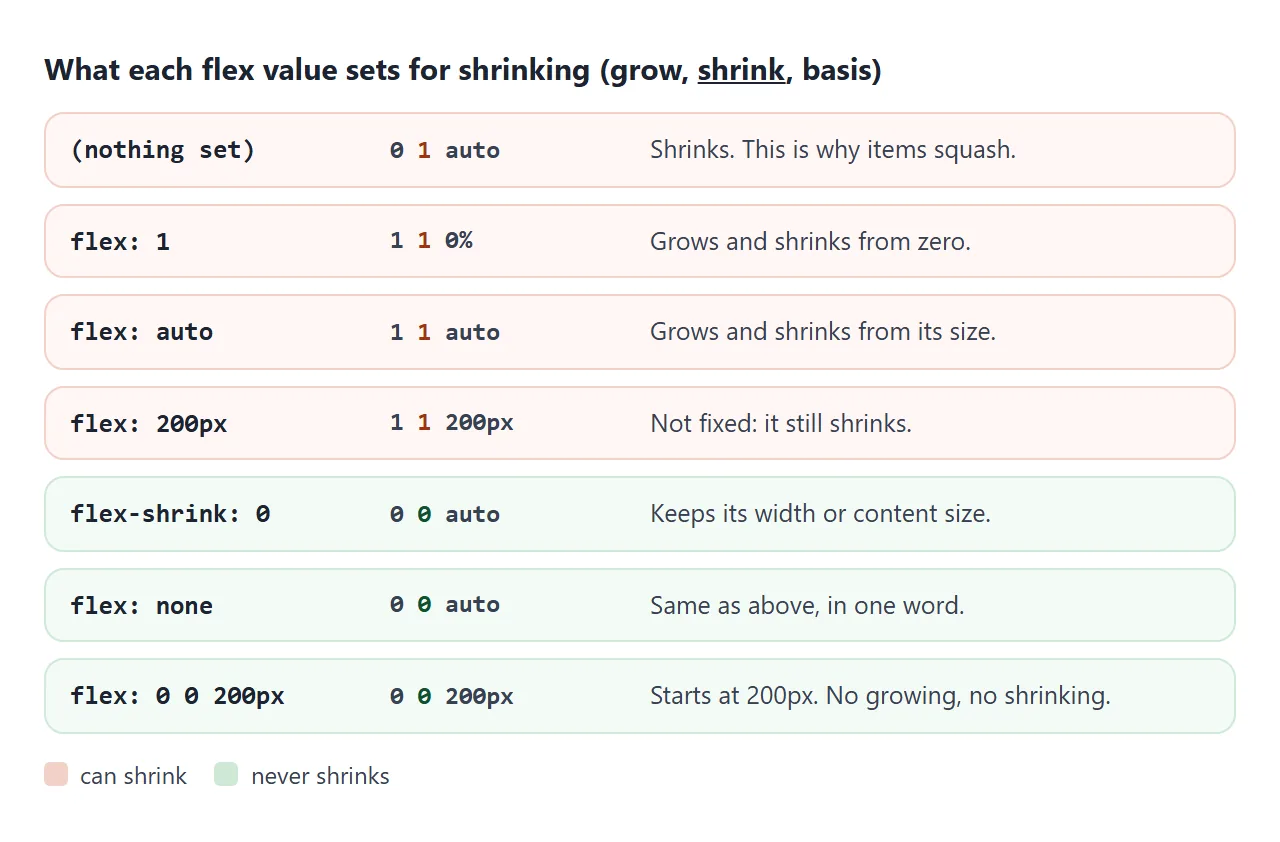
The flex shorthand sets grow, shrink and basis in one line. Several common values leave shrinking switched on, which surprises people.
| You write | Grow Shrink Basis | Shrinks? |
|---|---|---|
| nothing | 0 1 auto |
Yes |
flex: 1 |
1 1 0% |
Yes |
flex: auto |
1 1 auto |
Yes |
flex: 200px |
1 1 200px |
Yes |
flex: 2 3 |
2 3 0% |
Yes, with 3 times the weight |
flex-shrink: 0 |
0 0 auto |
No |
flex: none |
0 0 auto |
No |
flex: 0 0 200px |
0 0 200px |
No |
Watch out for flex: 200px. It reads like a fixed size, but it expands to 1 1 200px, so the item grows and shrinks.
For a column that stays at 200px, write flex: 0 0 200px. It can still grow past 200px if its content has a longer unbreakable word or a wider image.
flex: none and flex-shrink: 0 give the same result on an item with nothing else set. Use flex-shrink: 0 when you have already set a grow or basis you want to keep.
A finished example: a file list
A list row is the classic place for this. The icon, the file size and the button must never change. The file name takes what is left and ends in an ellipsis.
<!doctype html>
<html lang="en">
<head>
<meta charset="utf-8">
<meta name="viewport" content="width=device-width, initial-scale=1">
<title>A file list that never squashes its icons</title>
<style>
  body { margin: 0; padding: 14px; font-family: system-ui, sans-serif; background: #f4f5f7; color: #1d2330; }
  .size { font-size: 13px; margin-bottom: 10px; }
  .size input { width: 100%; }

  .list { margin: 0; padding: 0; list-style: none; background: #fff; border-radius: 10px; box-shadow: 0 2px 8px rgba(0, 0, 0, .08); }
  .file { display: flex; align-items: center; gap: 10px; padding: 10px 12px; }
  .file + .file { border-top: 1px solid #eceef1; }

  .file svg { flex-shrink: 0; width: 28px; height: 28px; }  /* icon: never shrinks */
  .name {                                                    /* name: gives way */
    flex: 1; min-width: 0;
    white-space: nowrap; overflow: hidden; text-overflow: ellipsis; font-size: 14px;
  }
  .kb { flex: none; font-size: 12px; color: #5b6270; }      /* size: never shrinks */
  .get { flex: none; padding: 6px 10px; border: 0; border-radius: 6px; background: #2563eb; color: #fff; font: 600 12px system-ui, sans-serif; }
  .get.done { background: #16a34a; }
</style>
</head>
<body>
<div class="size">List width: <b id="w"></b>
  <input type="range" id="slider" min="260" step="10">
</div>

<ul class="list" id="list">
  <li class="file">
    <svg viewBox="0 0 28 28"><rect x="4" y="2" width="20" height="24" rx="3" fill="#2563eb"/></svg>
    <span class="name">quarterly-report-final-version-2.pdf</span>
    <span class="kb">2.4 MB</span><button class="get">Download</button>
  </li>
  <li class="file">
    <svg viewBox="0 0 28 28"><rect x="4" y="2" width="20" height="24" rx="3" fill="#0f766e"/></svg>
    <span class="name">team-photo.png</span>
    <span class="kb">860 KB</span><button class="get">Download</button>
  </li>
  <li class="file">
    <svg viewBox="0 0 28 28"><rect x="4" y="2" width="20" height="24" rx="3" fill="#c2410c"/></svg>
    <span class="name">budget-2026-with-notes-from-the-finance-meeting.xlsx</span>
    <span class="kb">118 KB</span><button class="get">Download</button>
  </li>
</ul>

<script>
  const slider = document.getElementById('slider');
  const list = document.getElementById('list');

  slider.max = Math.min(560, Math.floor(document.body.clientWidth - 28));
  slider.value = slider.max;

  function resize() {
    list.style.width = slider.value + 'px';
    document.getElementById('w').textContent = slider.value + 'px';
  }
  slider.addEventListener('input', resize);
  resize();

  // demo only: mark the button instead of downloading a file
  list.addEventListener('click', (e) => {
    if (!e.target.matches('.get')) return;
    e.target.textContent = 'Saved';
    e.target.classList.add('done');
  });
</script>
</body>
</html>
.file   { display: flex; align-items: center; gap: 10px; }
.file svg { flex-shrink: 0; width: 28px; height: 28px; }
.name   { flex: 1; min-width: 0; white-space: nowrap;
          overflow: hidden; text-overflow: ellipsis; }
.kb, .get { flex: none; }
The name needs min-width: 0 as well as flex: 1. Without it, white-space: nowrap makes the full name its minimum width, and it pushes everything else out of the row. text-overflow: ellipsis explains the three lines that make the dots appear.
flex-shrink vs flex-wrap
flex-shrink only works on one line. With flex-wrap: wrap, items that do not fit move to a new line at their full size instead of shrinking. Shrinking then only happens to an item that is wider than the whole line on its own.
Use shrinking for toolbars and list rows that must stay on one line, and wrapping for cards and tags. CSS flex-wrap covers the wrapping side, and CSS Flexbox covers rows, gaps and alignment from the start.
When it does not work
| What you see | Cause | Fix |
|---|---|---|
| An icon or avatar is squashed | Default flex-shrink: 1 |
flex-shrink: 0 on it |
| A button label wraps onto many lines | The button is shrinking | flex-shrink: 0 or flex: none on the button |
flex-shrink: 0 has no effect |
It is on the container | Put it on the child items |
| The row sticks out of its container | Every item has flex-shrink: 0 |
Let one item shrink, with min-width: 0 |
| A text item will not shrink | min-width: auto keeps it at its content |
min-width: 0 or overflow: hidden |
flex: 200px still shrinks |
It means 1 1 200px |
flex: 0 0 200px |
| An image is stretched tall, not narrow | align-items: stretch sets its height |
align-items: center on the row |
| Items drop to a new line instead | flex-wrap: wrap is on |
Remove it, or accept the wrap |
Share it as a link
Squashing only shows up at certain widths, so a screenshot rarely shows the problem you are describing. An .html file sent as an attachment may open as plain code on a phone.
To send the working version, paste the page into a NOS document and choose Create share link. HTML to link walks through it.
The page renders as written and its scripts run, so the people you send it to can drag the width and tick the boxes themselves. If you change the code later, the same link shows the new version.