The <body> element holds everything visible on the page, and most body CSS is two lines: margin: 0 and a background. The rest of this page covers where body behaves differently from a normal box: the 8px margin, backgrounds, height, theme classes and scroll lock.
Start with the margin. Press the button and watch the grey strip around the blue header disappear.
<!doctype html>
<html lang="en">
<head>
<meta charset="utf-8">
<meta name="viewport" content="width=device-width, initial-scale=1">
<title>The default body margin</title>
<style>
  body { font-family: system-ui, sans-serif; background: #e8ecf2; }
  /* the only change: remove the browser's 8px */
  body.flush { margin: 0; }
  .bar {
    display: flex; align-items: center; justify-content: space-between; gap: 10px;
    padding: 12px 14px; background: #1f6feb; color: #fff;
  }
  .bar b { font-size: 15px; }
  button { font: inherit; font-size: 13px; padding: 7px 10px; border: 0; border-radius: 6px; cursor: pointer; }
  p { padding: 0 14px; line-height: 1.5; }
  code { background: #fff; padding: 1px 5px; border-radius: 4px; }
</style>
</head>
<body>
<header class="bar"><b>Site header</b><button id="toggle">Set margin: 0</button></header>
<p>Look at the grey strip around the blue bar. That is the body margin.</p>
<p>Computed body margin: <code id="out"></code></p>

<script>
  const btn = document.getElementById('toggle');
  const out = document.getElementById('out');

  function show() {
    out.textContent = getComputedStyle(document.body).margin;
  }

  btn.addEventListener('click', () => {
    const flush = document.body.classList.toggle('flush');
    btn.textContent = flush ? 'Back to default' : 'Set margin: 0';
    show();
  });

  show();
</script>
</body>
</html>
The default 8px margin
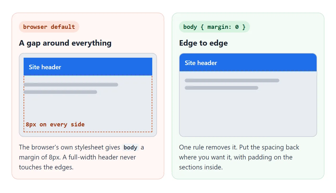
The browser ships its own stylesheet, and in it body gets display: block and margin: 8px. That is why a full-width header never quite reaches the edge of the window, even when your CSS says nothing about spacing.
body {
  margin: 0;
}
After removing it, put spacing back on purpose: padding on main, or on each section. Then a header or a hero image can run edge to edge while the text still has room.
A gap can survive margin: 0. If the first child is an h1 or p with a top margin, that margin collapses through body and pushes the whole page down.
In our test, an h1 sat 21px from the top with body margin 0. Set the first child's top margin to 0, or give body some padding.
body background vs html background
Here body works differently from other boxes. If html has no background, the browser takes the body background and paints it across the whole canvas, not just the body box. So a short page with a coloured body still fills the window.
<!doctype html>
<html lang="en">
<head>
<meta charset="utf-8">
<meta name="viewport" content="width=device-width, initial-scale=1">
<title>body background vs html background</title>
<style>
  body {
    margin: 0; padding: 14px;
    font-family: system-ui, sans-serif; line-height: 1.45;
    background: #ffe9b8;              /* the body colour */
    outline: 2px dashed #b45309;      /* shows where the body box ends */
    outline-offset: -2px;
  }
  /* toggled by the checkbox */
  html.own-bg { background: #fff; }
  label { display: flex; gap: 8px; align-items: center; font-weight: 600; cursor: pointer; }
  input { width: 18px; height: 18px; }
  p { margin: 10px 0 0; font-size: 14px; }
</style>
</head>
<body>
<label><input type="checkbox" id="own"> Give html its own background</label>
<p id="out"></p>
<p>The dashed line is the edge of the body box. The page below it is not body.</p>

<script>
  const own = document.getElementById('own');
  const out = document.getElementById('out');

  function show() {
    out.textContent = own.checked
      ? 'html has a background: the body colour stays inside the dashed box.'
      : 'html has no background: the body colour fills the whole frame.';
  }

  own.addEventListener('change', () => {
    document.documentElement.classList.toggle('own-bg', own.checked);
    show();
  });

  show();
</script>
</body>
</html>
Once html has a background of its own, the canvas uses that, and body paints only its own height. On a short page, the colour then stops partway down the window.
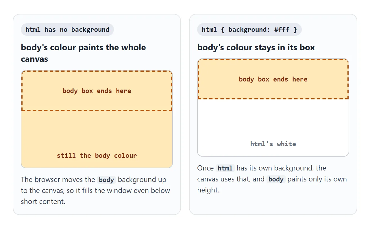
The simple rule: set the page background on one of the two, not both. If you need both, give body a minimum height (next section) so its box covers the window. CSS background-color covers the colour values themselves.
height: 100% vs min-height: 100dvh
body is only as tall as its content. height: 100% looks like the fix, but a percentage height needs a parent with a set height. The parent of body is html, which is height: auto.
In our test, body with one line of text stayed 21px tall until html also got height: 100%.
Even then, a fixed height is a cap. Content taller than the window spills out of body, and backgrounds and borders on body stop at the first screen. min-height has neither problem:
body {
  min-height: 100vh;   /* fallback for older browsers */
  min-height: 100dvh;  /* follows the phone toolbar */
}
| Rule on body | Needs html height? | Grows with content? |
|---|---|---|
height: 100% |
Yes | No, content overflows |
min-height: 100% |
Yes | Yes |
min-height: 100vh |
No | Yes |
min-height: 100dvh |
No | Yes, and tracks the visible area on phones |
dvh is the dynamic viewport height. On phones it changes as the browser toolbar shows and hides, where vh stays at one value. CSS min-height goes deeper into the difference, and the sticky footer guide builds a full page layout on this rule.
Body classes for themes
Body is a convenient place for page-wide state, because every visible element sits inside it. Put the theme colours in custom properties on body, and let a class swap them:
body { --bg: #fff; --fg: #1d2330; background: var(--bg); color: var(--fg); }
body.theme-dark { --bg: #14171d; --fg: #e6e9ef; }
document.body.classList.remove('theme-light', 'theme-dark');
document.body.classList.add('theme-dark');
Use classList rather than setting className. Body can carry other state classes at the same time, and className would wipe them out. Because html has no background here, the theme background still fills the whole window. For following the system setting, see dark mode CSS.
Scroll lock: overflow: hidden on body
When a modal is open, the page behind it should not scroll. Add a class to body when the modal opens and remove it when it closes:
html { scrollbar-gutter: stable; }
body.modal-open { overflow: hidden; }
This works because of another body rule. The window scrolls, not body, and if html has overflow: visible, the browser applies the body overflow to the window. If html has its own overflow value, the lock on body stops working.
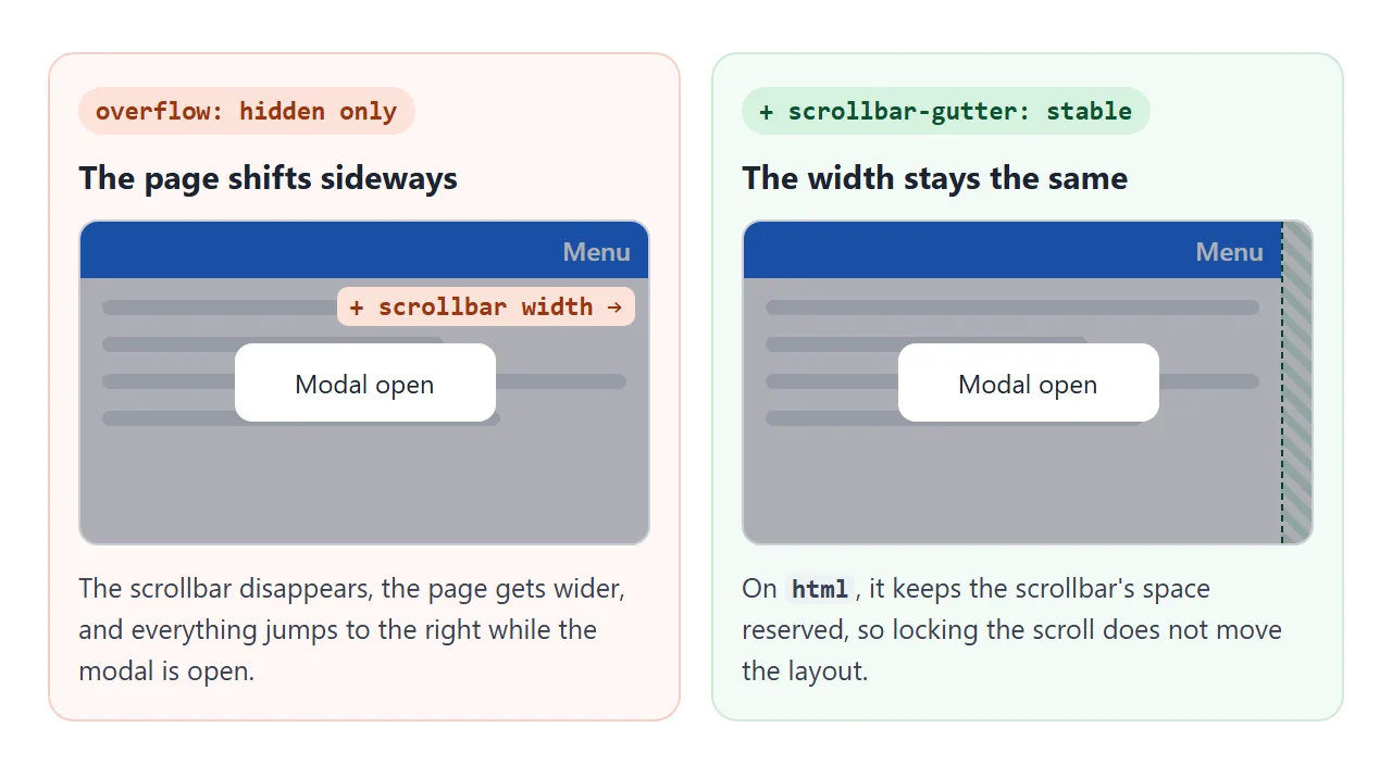
The scrollbar-gutter line matters on desktop. In our test with a visible scrollbar, locking the scroll widened the page from 785px to 800px and the layout jumped. With the gutter reserved, the width stayed at 785px.
A <dialog> opened with showModal() does not lock scrolling by itself. In our Chromium test, the page behind it still scrolled with the mouse wheel and Page Down.
Listen for the dialog's close event to remove the class, so Escape unlocks it too. HTML CSS modal compares the dialog element with a hand-built overlay.
A finished example: theme and scroll lock together
This page puts it together: margin 0, min-height: 100dvh with a footer at the bottom, three theme classes, and a modal that locks scrolling. Scroll the page, open the modal, then try to scroll again.
<!doctype html>
<html lang="en">
<head>
<meta charset="utf-8">
<meta name="viewport" content="width=device-width, initial-scale=1">
<title>Body classes for theme and scroll lock</title>
<style>
  html { scrollbar-gutter: stable; }   /* no layout jump when the scrollbar goes away */

  body {
    margin: 0;
    min-height: 100dvh;                 /* at least one screen tall, grows with content */
    display: flex; flex-direction: column;
    font-family: system-ui, sans-serif; line-height: 1.5;
    background: var(--bg); color: var(--fg);
    /* theme colours, swapped by a class on body */
    --bg: #ffffff; --fg: #1d2330; --card: #f1f3f6; --accent: #1f6feb;
  }
  body.theme-dark  { --bg: #14171d; --fg: #e6e9ef; --card: #222731; --accent: #6ea8ff; }
  body.theme-paper { --bg: #f7f1e3; --fg: #3b3226; --card: #ece3cf; --accent: #9a5b13; }

  /* scroll lock while the dialog is open */
  body.modal-open { overflow: hidden; }

  header, footer { padding: 10px 14px; background: var(--card); }
  header { position: sticky; top: 0; display: flex; flex-wrap: wrap; gap: 6px; align-items: center; }
  main { flex: 1; padding: 4px 14px; }
  button {
    font: inherit; font-size: 13px; padding: 6px 10px; cursor: pointer;
    border: 1px solid var(--accent); border-radius: 6px; background: transparent; color: var(--fg);
  }
  button.primary { background: var(--accent); color: var(--bg); }
  dialog { border: 0; border-radius: 12px; padding: 18px; max-width: 280px; background: var(--bg); color: var(--fg); }
  dialog::backdrop { background: rgba(0, 0, 0, .45); }
</style>
</head>
<body class="theme-light">
<header>
  <button data-theme="theme-light">Light</button>
  <button data-theme="theme-dark">Dark</button>
  <button data-theme="theme-paper">Paper</button>
  <button class="primary" id="open">Open modal</button>
</header>
<main id="main"></main>
<footer>Footer: body is at least one screen tall, so this stays at the bottom.</footer>

<dialog id="dlg">
  <p style="margin-top: 0">Try to scroll the page now. It stays put.</p>
  <button class="primary" id="close">Close</button>
</dialog>

<script>
  const body = document.body;
  const dlg = document.getElementById('dlg');

  // filler paragraphs so the page scrolls
  const main = document.getElementById('main');
  for (let i = 1; i <= 12; i++) {
    const p = document.createElement('p');
    p.textContent = 'Paragraph ' + i + '. Scroll the page, then open the modal.';
    main.append(p);
  }

  // theme: swap one class on body, keep the others (such as modal-open)
  document.querySelectorAll('[data-theme]').forEach((btn) => {
    btn.addEventListener('click', () => {
      body.classList.remove('theme-light', 'theme-dark', 'theme-paper');
      body.classList.add(btn.dataset.theme);
    });
  });

  // modal: lock on open, unlock on every kind of close (button, Escape)
  document.getElementById('open').addEventListener('click', () => {
    dlg.showModal();
    body.classList.add('modal-open');
  });
  document.getElementById('close').addEventListener('click', () => dlg.close());
  dlg.addEventListener('close', () => body.classList.remove('modal-open'));
</script>
</body>
</html>
A body setup to start from:
- Set
margin: 0on body and add spacing with padding inside. - Give body
min-height: 100dvh, with100vhon the line before as a fallback. - Keep theme colours in variables on body and override them in classes.
- Add a
modal-openclass withoverflow: hidden, andscrollbar-gutter: stableon html.
When it does not work
| What you see | Cause | Fix |
|---|---|---|
| A thin gap around the whole page | The default 8px body margin | body { margin: 0 } |
| A gap at the top after margin 0 | The first child's top margin collapses through body | Top margin 0 on the first child, or padding on body |
| The background stops partway down | Both html and body have a background | Background on one only, or min-height on body |
height: 100% on body does nothing |
html has no set height | min-height: 100dvh on body |
| The page still scrolls behind the modal | overflow is set on html too |
Remove it from html, or lock on html instead |
| The layout jumps when the modal opens | The scrollbar disappears | scrollbar-gutter: stable on html |
document.body.scrollTop is always 0 |
The window scrolls, not body | Read window.scrollY |
document.body is null |
The script runs in head, before body exists | Move the script to the end of body, or use defer |
Share it as a link
Page-level behaviour such as a theme switch or a locked modal is hard to show in a screenshot. Someone has to click it. An .html attachment may open as plain code on a phone, so the effect never shows.
To send the working version, paste the page into a NOS document and choose Create share link. HTML to link walks through it.
The page renders as written and its scripts run, so the people you send it to can switch themes and open the modal themselves. If you change the code later, the same link shows the new version.