CSS overflow controls what a box does with content that is bigger than the box. visible (the default) lets it spill out, hidden and clip cut it off, and scroll and auto make the box scroll.
None of them does anything until the box has a size its content can exceed.
Try the five values on one box. Then tick height: auto and watch every value stop mattering for the vertical direction.
<!doctype html>
<html lang="en">
<head>
<meta charset="utf-8">
<meta name="viewport" content="width=device-width, initial-scale=1">
<title>CSS overflow playground</title>
<style>
  body { margin: 0; padding: 16px; font-family: system-ui, sans-serif; color: #1d2330; background: #f4f5f7; }
  .controls { display: flex; flex-wrap: wrap; gap: 6px; margin-bottom: 10px; }
  .controls label { font: 13px ui-monospace, Consolas, monospace; background: #fff; border: 1px solid #d5d9e0; border-radius: 8px; padding: 6px 9px; cursor: pointer; }
  .controls input:checked + span { font-weight: 700; color: #0f5132; }
  .sliders { display: grid; grid-template-columns: auto 1fr auto; gap: 6px 10px; align-items: center; font-size: 13px; margin-bottom: 14px; max-width: 420px; }
  .stage { min-height: 250px; }

  /* the box under test */
  #box {
    overflow: visible;         /* changed by the buttons */
    width: 220px;
    height: 110px;
    padding: 10px;
    background: #fff;
    border: 2px solid #2563eb;
    border-radius: 8px;
    font-size: 14px; line-height: 1.45;
  }
  .url { font-family: ui-monospace, Consolas, monospace; color: #9a3412; }
  #out { white-space: pre-wrap; font: 13px ui-monospace, Consolas, monospace; background: #1d2330; color: #e5e7eb; border-radius: 8px; padding: 8px 10px; }
</style>
</head>
<body>
<div class="controls" id="values">
  <label><input type="radio" name="v" value="visible" checked> <span>visible</span></label>
  <label><input type="radio" name="v" value="hidden"> <span>hidden</span></label>
  <label><input type="radio" name="v" value="clip"> <span>clip</span></label>
  <label><input type="radio" name="v" value="scroll"> <span>scroll</span></label>
  <label><input type="radio" name="v" value="auto"> <span>auto</span></label>
</div>
<div class="sliders">
  <span>width</span><input type="range" id="w" min="120" max="340" value="220"><span id="wv">220px</span>
  <span>height</span><input type="range" id="h" min="60" max="300" value="110"><span id="hv">110px</span>
  <span></span><label><input type="checkbox" id="auto"> height: auto</label><span></span>
</div>
<div class="stage">
  <div id="box">
    This box has more text than it can hold. Pick a value above and watch what happens to the lines that do not fit.
    The address below has no spaces, so it cannot wrap:
    <span class="url">example.com/a/very/long/path/without/any/spaces</span>
  </div>
</div>
<div id="out"></div>

<script>
  const box = document.getElementById('box');
  const out = document.getElementById('out');
  const w = document.getElementById('w'), h = document.getElementById('h'), auto = document.getElementById('auto');

  function update() {
    box.style.overflow = document.querySelector('input[name=v]:checked').value;
    box.style.width = w.value + 'px';
    box.style.height = auto.checked ? 'auto' : h.value + 'px';
    h.disabled = auto.checked;
    document.getElementById('wv').textContent = w.value + 'px';
    document.getElementById('hv').textContent = auto.checked ? 'auto' : h.value + 'px';
    // scrollHeight = height of the content, clientHeight = height of the visible area
    const tooTall = box.scrollHeight > box.clientHeight;
    const tooWide = box.scrollWidth > box.clientWidth;
    out.textContent = 'overflow: ' + box.style.overflow +
      '\ncontent overflows: ' + (tooTall ? 'down ' : '') + (tooWide ? 'sideways' : '') + (!tooTall && !tooWide ? 'no' : '');
  }
  document.getElementById('values').addEventListener('change', update);
  [w, h, auto].forEach(el => el.addEventListener('input', update));
  update();
</script>
</body>
</html>
The five values
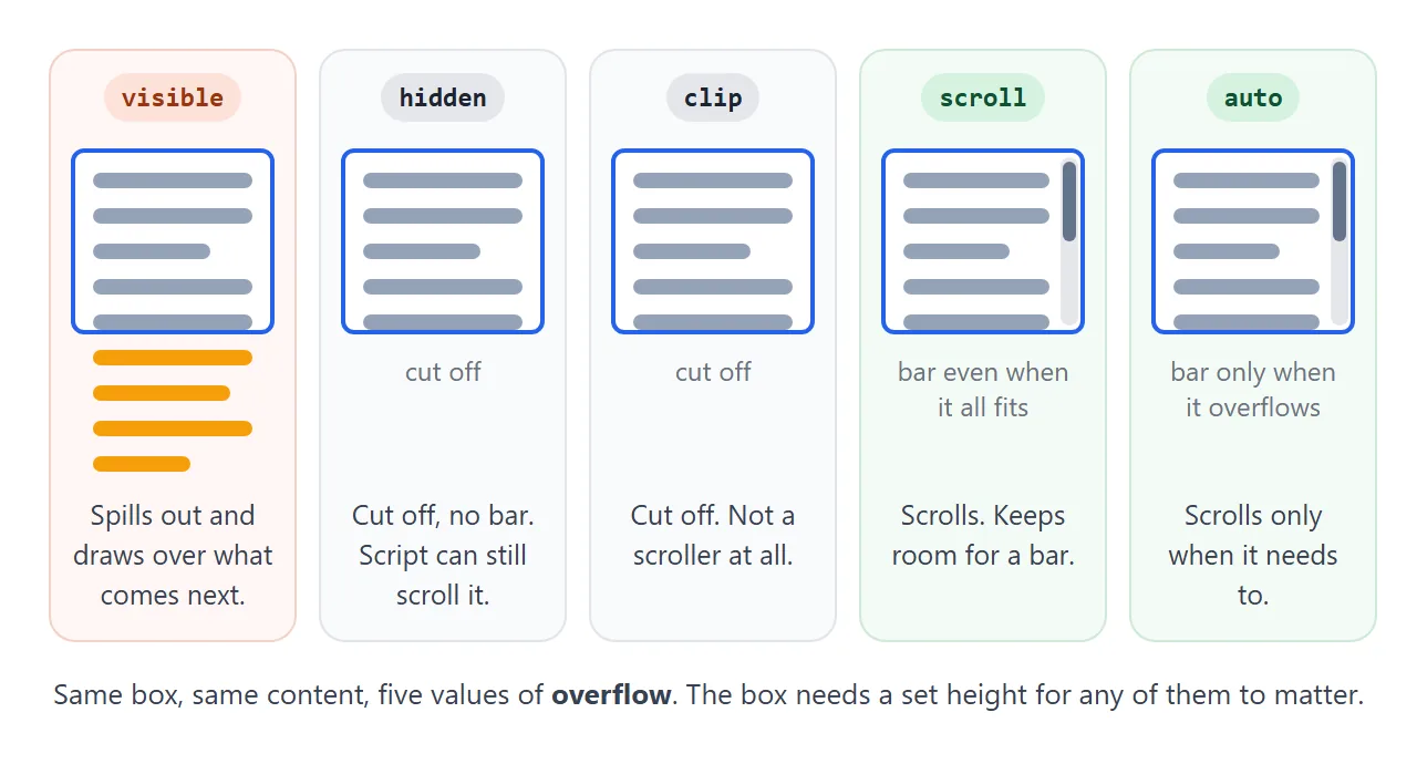
| Value | Content that does not fit | Scrollable | Typical use |
|---|---|---|---|
visible |
Drawn outside the box | No | The default. Most boxes |
hidden |
Cut off at the padding edge | By script only, no bar | Rounded cards, image crops |
clip |
Cut off at the padding edge | No, not even by script | Cutting without side effects |
scroll |
Reached by scrolling | Yes, bars reserved | Panels whose width must not shift |
auto |
Reached by scrolling | Yes, bars when needed | Chat logs, code blocks, side panels |
auto is the right choice for almost every scrolling box. scroll only differs on systems that draw classic scrollbars, where it keeps room for a bar even when nothing overflows.
On phones, and on systems with overlay scrollbars, the bars appear only while scrolling, so the two look the same.
To change how the bar itself looks, see styling the scrollbar.
overflow needs a size to do anything
A block box with no height grows to fit its content. Content that always fits never overflows, so overflow: auto on such a box shows no scrollbar and overflow: hidden cuts nothing.
This is the most common reason overflow "does nothing". The fix is a limit:
.panel {
  max-height: 300px;   /* grows up to 300px, then scrolls */
  overflow-y: auto;
}
max-height is usually better than height: a short list stays short, and a long one scrolls. In a flex or grid layout the size can also come from the layout itself, as long as the box is not allowed to grow past it.
Sideways is different. A block's width is already limited by its parent, so horizontal overflow happens when something inside cannot shrink or wrap: a long word or address, a wide image, or white-space: nowrap.
Make a box scroll
- Give the box a size. Set a
heightormax-height, and a width if it should scroll sideways. - Set overflow.
overflow: autofor both directions, oroverflow-y: autofor just one. - Stop scroll chaining. Add
overscroll-behavior: containso the page does not take over when the box reaches its end. More on that below.
Wide tables are a special case, because a table ignores overflow on itself. Making an HTML table scroll shows the wrapper that fixes it.
overflow-x and overflow-y do not mix freely
overflow is shorthand for overflow-x and overflow-y, and you can set them apart. There is one catch. If one axis is hidden, scroll or auto, the other axis cannot stay visible. The browser changes it to auto.
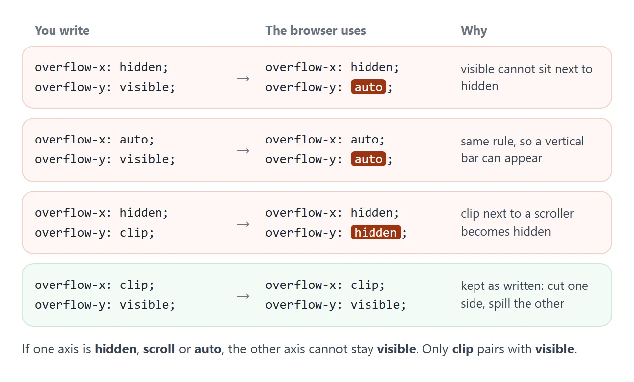
So overflow-x: hidden on its own often gives the box a vertical scrollbar you did not ask for. The content that should spill down is now trapped inside the box.
clip follows a similar rule: next to hidden, scroll or auto it becomes hidden. But clip next to visible is allowed and kept. That makes overflow-x: clip the way to cut the sides while letting content spill downward.
<!doctype html>
<html lang="en">
<head>
<meta charset="utf-8">
<meta name="viewport" content="width=device-width, initial-scale=1">
<title>overflow-x, overflow-y and clip</title>
<style>
  body { margin: 0; padding: 16px; font-family: system-ui, sans-serif; color: #1d2330; background: #f4f5f7; }
  h2 { font-size: 15px; margin: 0 0 8px; }
  section { background: #fff; border: 1px solid #e1e4ea; border-radius: 12px; padding: 12px 14px; margin-bottom: 14px; }
  .row { display: flex; flex-wrap: wrap; gap: 8px 14px; font: 13px ui-monospace, Consolas, monospace; margin-bottom: 8px; }
  select, button { font: inherit; }
  .result { font: 13px ui-monospace, Consolas, monospace; background: #1d2330; color: #e5e7eb; border-radius: 8px; padding: 8px 10px; white-space: pre-wrap; }
  .result b { color: #fbbf24; }

  /* part 1: a box whose tall content should spill down */
  #pair { width: 200px; height: 60px; border: 2px solid #2563eb; border-radius: 6px; padding: 6px; font-size: 13px; margin: 8px 0 50px; }

  /* part 2: the page-like scroller, and a card with a sticky header inside */
  .scroller { height: 190px; overflow-y: auto; border: 2px solid #475569; border-radius: 8px; background: #f8fafc; }
  .card { margin: 10px; border-radius: 8px; background: #fff; border: 1px solid #d5d9e0; }
  .card.hidden { overflow: hidden; }
  .card.clip { overflow: clip; }
  .card h3 { position: sticky; top: 0; margin: 0; padding: 8px 10px; font-size: 14px; background: #0f5132; color: #fff; }
  .card li { padding: 6px 0; font-size: 13px; }
</style>
</head>
<body>
<section>
  <h2>1. Set one axis, the other one changes</h2>
  <div class="row">
    <label>overflow-x: <select id="ox"><option>visible</option><option selected>hidden</option><option>clip</option><option>scroll</option><option>auto</option></select></label>
    <label>overflow-y: <select id="oy"><option selected>visible</option><option>hidden</option><option>clip</option><option>scroll</option><option>auto</option></select></label>
  </div>
  <div id="pair">Line 1 of the tall content<br>Line 2<br>Line 3<br>Line 4<br>Line 5</div>
  <div class="result" id="pairOut"></div>
</section>

<section>
  <h2>2. A sticky header inside a card with overflow</h2>
  <div class="row">
    <label><input type="radio" name="c" value="hidden" checked> card: overflow: hidden</label>
    <label><input type="radio" name="c" value="clip"> card: overflow: clip</label>
  </div>
  <div class="scroller" id="scroller">
    <div class="card hidden" id="card">
      <h3>Sticky header (top: 0)</h3>
      <ol><li>Scroll this grey box.</li><li>Row 2</li><li>Row 3</li><li>Row 4</li><li>Row 5</li><li>Row 6</li><li>Row 7</li><li>Row 8</li><li>Row 9</li><li>Row 10</li><li>Row 11</li><li>Row 12</li></ol>
    </div>
  </div>
  <div class="result" id="stickyOut"></div>
</section>

<script>
  const pair = document.getElementById('pair');
  const ox = document.getElementById('ox'), oy = document.getElementById('oy');
  function showPair() {
    pair.style.overflowX = ox.value;
    pair.style.overflowY = oy.value;
    const s = getComputedStyle(pair);  // what the browser actually uses
    const note = s.overflowY !== oy.value || s.overflowX !== ox.value ? '  <b>changed by the browser</b>' : '';
    document.getElementById('pairOut').innerHTML =
      'you wrote:       x ' + ox.value + ', y ' + oy.value +
      '\nbrowser uses:    x ' + s.overflowX + ', y ' + s.overflowY + note;
  }
  ox.addEventListener('change', showPair);
  oy.addEventListener('change', showPair);
  showPair();

  const card = document.getElementById('card'), scroller = document.getElementById('scroller');
  const header = card.querySelector('h3'), stickyOut = document.getElementById('stickyOut');
  function showSticky() {
    // is the header still at the top edge of the grey box?
    const gap = Math.round(header.getBoundingClientRect().top - scroller.getBoundingClientRect().top);
    stickyOut.textContent = 'scrolled ' + Math.round(scroller.scrollTop) + 'px, header is ' +
      (gap >= 0 && gap <= 3 ? 'stuck at the top' : gap < 0 ? 'scrolled out of view' : gap + 'px from the top');
  }
  document.querySelectorAll('input[name=c]').forEach(r => r.addEventListener('change', () => {
    card.className = 'card ' + r.value;
    showSticky();
  }));
  scroller.addEventListener('scroll', showSticky);
  showSticky();
</script>
</body>
</html>
hidden vs clip
Both values cut off what does not fit, and they look the same. The difference is that hidden still makes the box a scroll container. It has no scrollbar, but script can scroll it with scrollTop or scrollIntoView(), and it changes how its children behave.
The child most affected is position: sticky. A sticky element sticks inside its nearest ancestor that is a scroll container.
Put overflow: hidden on a card and the card becomes that ancestor. The card never scrolls, so the header has nothing to stick to and scrolls away with the page.
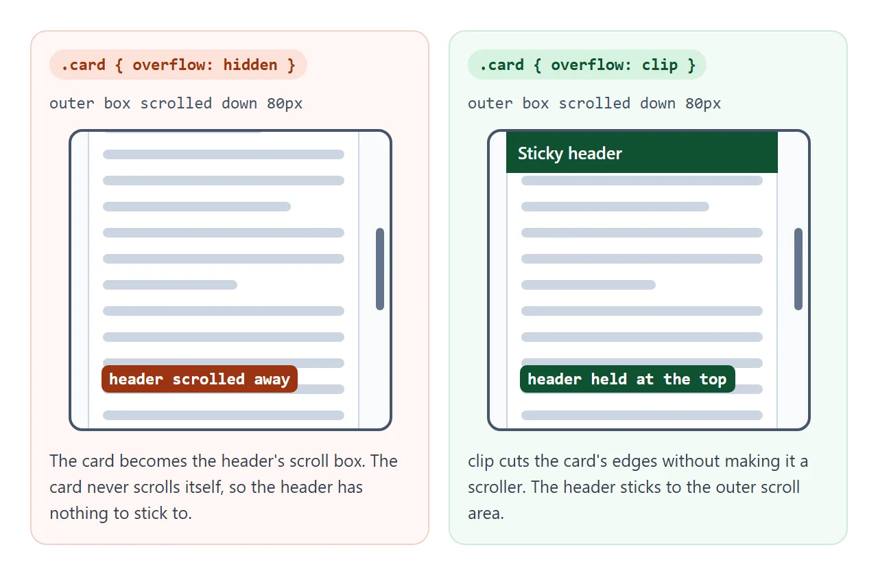
overflow: clip cuts the same edges without creating a scroll container, so the header keeps sticking to the real scroller. CSS position covers sticky's other requirements.
overflow contains floats
Any overflow value other than visible and clip starts a new block formatting context. In plain terms, the box becomes a self-contained layout island. Two things follow:
- Floats are contained. A parent with only floated children normally collapses to zero height. With
overflow: hiddenorauto, it grows to wrap them. - Margins stop leaking. A child's top margin no longer collapses through the parent's top edge.
That is why overflow: hidden became a classic float fix. It also clips, which is a side effect you may not want. display: flow-root creates the same layout island without cutting anything. CSS float shows both.
overflow: clip does not start a block formatting context, so it will not contain floats.
Finding what scrolls a phone page sideways
When a page scrolls sideways on a phone, one element is wider than the screen. Hiding the overflow on body covers it up, but the element is still too wide and its right side is cut off. Find it and fix it instead.
Open the page in your desktop browser's developer tools, switch to a phone-sized view, and paste this into the Console:
const vw = document.documentElement.clientWidth;
document.querySelectorAll('body *').forEach(el => {
  const r = el.getBoundingClientRect();
  if (r.right > vw + 1 || r.left < -1) {
    console.log(el, Math.round(r.right));
    el.style.outline = '2px solid red';
  }
});
Every element sticking out gets a red outline. The outermost one is usually the cause, and its children are just along for the ride.
Elements inside a box that scrolls on purpose, such as a wide table in a scroll wrapper, are listed too and can be ignored.
<!doctype html>
<html lang="en">
<head>
<meta charset="utf-8">
<meta name="viewport" content="width=device-width, initial-scale=1">
<title>Find what overflows</title>
<style>
  * { box-sizing: border-box; }
  body { margin: 0; font-family: system-ui, sans-serif; color: #1d2330; background: #f4f5f7; }
  .tools { padding: 12px 14px; background: #1d2330; color: #e5e7eb; }
  .tools button { font: 600 13px system-ui, sans-serif; padding: 7px 11px; border-radius: 8px; border: 0; margin: 0 6px 6px 0; cursor: pointer; }
  #find { background: #fbbf24; color: #1d2330; }
  #fix { background: #d6f2df; color: #0f5132; }
  #report { font: 12.5px/1.5 ui-monospace, Consolas, monospace; white-space: pre-wrap; margin: 4px 0 0; }

  /* a small sample page */
  header { padding: 14px 16px; background: #fff; border-bottom: 1px solid #e1e4ea; font-weight: 700; }
  main { padding: 14px 16px; }
  .card { background: #fff; border: 1px solid #e1e4ea; border-radius: 10px; padding: 12px; margin-bottom: 12px; font-size: 14px; line-height: 1.5; }

  /* three sneaky causes of sideways scrolling */
  .promo { width: 100vw; margin-left: 16px; padding: 12px; border-radius: 10px; background: #2563eb; color: #fff; }
  .link { font-family: ui-monospace, Consolas, monospace; color: #9a3412; }
  .chart { display: block; }

  /* the fixes */
  .fixed .promo { width: auto; margin-left: 0; }
  .fixed .link { overflow-wrap: anywhere; }
  .fixed .chart { max-width: 100%; height: auto; }

  .flag { outline: 3px solid #dc2626; outline-offset: -3px; }
</style>
</head>
<body>
<div class="tools">
  <button id="find">Find wide elements</button><button id="fix">Apply fixes</button>
  <div id="report">This page scrolls sideways. Press the yellow button.</div>
</div>
<header>Sample page</header>
<main>
  <div class="promo">Promo banner, width: 100vw</div>
  <p class="card">Your tracking code: <span class="link">TRK8F14E45FCEEA167A5A36DEDD4BEA2543C9F0AE1B2D7E4F8A0C3B9E1D5F7A2C4E6B8D0F1A3C5E7B9D2F4A6C8E0B</span></p>
  <div class="card">
    <svg class="chart" width="520" height="90" viewBox="0 0 520 90"><rect width="520" height="90" rx="8" fill="#e0e7ff"/><path d="M10 80 L120 50 L220 60 L330 25 L510 15" stroke="#4f46e5" stroke-width="4" fill="none"/></svg>
  </div>
</main>

<script>
  // List every element that sticks out past the right or left edge of the viewport.
  function findWide() {
    const vw = document.documentElement.clientWidth;
    const wide = [];
    document.querySelectorAll('body *').forEach(el => {
      el.classList.remove('flag');
      const r = el.getBoundingClientRect();
      if (r.right > vw + 1 || r.left < -1) wide.push(el);
    });
    // keep only the outermost ones: the element that causes it, not its children
    const causes = wide.filter(el => !wide.includes(el.parentElement));
    causes.forEach(el => el.classList.add('flag'));
    const pageWidth = document.documentElement.scrollWidth;
    document.getElementById('report').textContent =
      'viewport ' + vw + 'px, page ' + pageWidth + 'px\n' +
      (causes.length
        ? causes.map(el => el.tagName.toLowerCase() + '.' + el.classList[0] +
            '  right edge ' + Math.round(el.getBoundingClientRect().right) + 'px').join('\n')
        : 'nothing sticks out');
  }
  document.getElementById('find').addEventListener('click', findWide);
  document.getElementById('fix').addEventListener('click', () => {
    document.body.classList.toggle('fixed');
    document.getElementById('fix').textContent = document.body.classList.contains('fixed') ? 'Undo fixes' : 'Apply fixes';
    findWide();
  });
</script>
</body>
</html>
The usual suspects and their fixes:
width: 100vwplus a margin or padding.100vwis the full viewport, and on systems with classic scrollbars it includes the scrollbar too. Usewidth: autoor100%.- Images, videos and embeds with a fixed width. Add
max-width: 100%; height: auto;. See CSS max-width. - Long words, links and codes. Add
overflow-wrap: anywhere, covered in HTML word break. For one line with dots at the end, use text-overflow: ellipsis.
A missing viewport meta tag also makes a page look wrong on phones, but that shrinks the whole page rather than scrolling it sideways.
Nested scrolling: overscroll-behavior
Scroll to the end of a scrolling panel and keep going. The browser passes the leftover scroll to the next scroller up, usually the page.
This is called scroll chaining, and in a chat box or a side menu it feels like the page ran away.
.chat {
  max-height: 60vh;
  overflow-y: auto;
  overscroll-behavior: contain;  /* stop at the end, do not scroll the page */
}
contain stops the chaining and keeps the box's own bounce or glow effect. none stops both. The property only matters on a box that actually scrolls.
When it does not work
| What you see | Cause | Fix |
|---|---|---|
overflow: auto shows no scrollbar |
The box has no height and grows with its content | Add height or max-height |
| An unwanted vertical scrollbar appears | overflow-x: hidden turned overflow-y into auto |
Use overflow-x: clip |
| A dropdown or tooltip is cut off | An ancestor with overflow: hidden clips it |
Move the overflow to an inner box, or see below |
| Shadows or focus rings are cut at the edge | The overflow box clips everything past its padding edge | Add padding to the overflow box |
position: sticky stopped sticking |
An ancestor has overflow: hidden or auto |
Use overflow: clip on that ancestor |
| The page scrolls sideways on phones | One element is wider than the screen | Find it with the snippet above |
| A scroll box inside a flex or grid item widens the page | The item's minimum width defaults to its content width | min-width: 0 on the flex or grid item |
| Scrolling a panel also scrolls the page | Scroll chaining | overscroll-behavior: contain |
An absolutely positioned dropdown is clipped when its positioned ancestor (the position: relative one) is the overflow box or sits inside it.
To fix it, put position: relative on an element outside the clipped box, or show the menu with the popover attribute, which draws it above the page.
Share it as a link
Overflow problems depend on screen width, so a screenshot from your desktop rarely shows what a phone user sees. A link that opens the real page lets the other person resize, scroll and see the bug, or the fix, for themselves.
Paste the page into a NOS document and choose Create share link. HTML to link walks through it.
The page renders as written and its scripts run, so the overflow finder above works for the people you send it to. If you change the code later, the same link shows the new version.