The HTML popover attribute turns any element into a panel that opens on top of the page. Give it an id, give a button popovertarget with that id, and the button opens and closes it. There is no JavaScript and no z-index to manage.
<button popovertarget="info">Info</button>
<div id="info" popover>Opens on top. Esc or a click outside closes it.</div>
Try both kinds below. Open each one, then click somewhere else on the page.
<!doctype html>
<html lang="en">
<head>
<meta charset="utf-8">
<meta name="viewport" content="width=device-width, initial-scale=1">
<title>Popover without JavaScript</title>
<style>
  body {
    margin: 0; padding: 16px; font-family: system-ui, sans-serif;
    background: #f4f5f7; color: #1d2330;
  }
  .cols { display: grid; grid-template-columns: 1fr 1fr; gap: 12px; }
  .col { background: #fff; border-radius: 12px; padding: 12px; }
  h2 { font-size: 15px; margin: 0 0 4px; }
  p { font-size: 13px; color: #555; margin: 0 0 10px; }
  button {
    font: inherit; font-size: 14px; padding: 7px 12px; margin: 0 4px 6px 0;
    border: 1px solid #c9ced8; border-radius: 8px; background: #fff; cursor: pointer;
  }
  /* A popover is position: fixed and centred by default. Place these two by hand. */
  [popover] {
    inset: auto; top: 190px; margin: 0; width: calc(50% - 50px);
    border: 0; border-radius: 10px; padding: 12px;
    box-shadow: 0 10px 30px rgba(0, 0, 0, .18); font-size: 14px;
  }
  #auto-pop { left: 24px; background: #e8f1ff; }
  #manual-pop { right: 24px; background: #fff4e0; }
</style>
</head>
<body>
<div class="cols">
  <div class="col">
    <h2>popover (auto)</h2>
    <p>Closes on a click outside or Esc.</p>
    <button popovertarget="auto-pop">Toggle</button>
  </div>
  <div class="col">
    <h2>popover="manual"</h2>
    <p>Stays open until a button closes it.</p>
    <button popovertarget="manual-pop" popovertargetaction="show">Show</button>
    <button popovertarget="manual-pop" popovertargetaction="hide">Hide</button>
  </div>
</div>

<div id="auto-pop" popover>
  <b>Auto popover</b><br>Click anywhere else, or press Esc.
</div>

<div id="manual-pop" popover="manual">
  <b>Manual popover</b><br>Clicks outside do nothing. Use Hide.
</div>
</body>
</html>
popover (auto) and popover="manual"
The attribute has two common values, and they differ only in what closes the panel. popover with no value is the same as popover="auto".
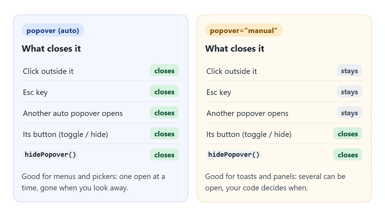
An auto popover has light dismiss: a click outside it or the Esc key closes it.
Opening a second auto popover closes the first, unless the second one sits inside the first, as a sub-menu would. That is the behaviour you want from menus, pickers and small info panels.
A manual popover ignores clicks outside and Esc. Several can be open together, and they stay until a button or hidePopover() closes them. That fits toasts, a pinned help panel or anything that must not vanish while the user works elsewhere.
Opening and closing it: buttons first, JavaScript when needed
Three attributes on a <button> cover most cases without a script:
| Attribute on the button | What it does |
|---|---|
popovertarget="menu" |
Toggles the popover with id="menu" |
popovertargetaction="show" |
Only opens it (does nothing if it is open) |
popovertargetaction="hide" |
Only closes it, such as a Close button inside the panel |
The button also tells screen readers whether its popover is open, because the browser sets the expanded state for you. The target must be a <button> (or an <input type="button">); the attribute does nothing on a link or a div.
From JavaScript, three methods do the same job:
const menu = document.getElementById('menu');
menu.showPopover();           // open
menu.hidePopover();           // close
const isOpen = menu.togglePopover();  // flip, returns true if now open

menu.addEventListener('toggle', (e) => {
  console.log(e.oldState, '->', e.newState);  // "closed" -> "open"
});
The toggle event fires after the popover opens or closes, whatever caused it: a button, Esc, a click outside or your own code. beforetoggle fires just before, which is the moment to set its position.
The top layer: why z-index stops mattering
An open popover is drawn in the browser's top layer, a layer above the whole page. Parents with overflow: hidden cannot clip it, and no z-index elsewhere can cover it.
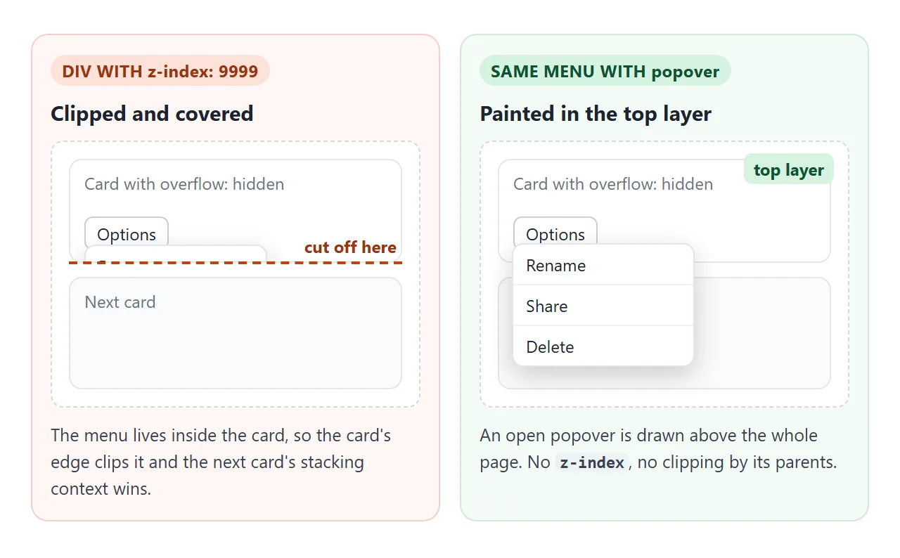
That removes the most common reason a menu or a tooltip disappears behind the next section. CSS z-index explains the stacking contexts that cause it, and why raising the number to 9999 often does nothing.
The top layer only applies while the popover is open. A closed popover is display: none.
Styling: :popover-open, ::backdrop and an entry animation
Style the element itself for its look, :popover-open for anything that differs when it is open, and ::backdrop for the layer between it and the page. The backdrop is invisible until you give it a background.
<!doctype html>
<html lang="en">
<head>
<meta charset="utf-8">
<meta name="viewport" content="width=device-width, initial-scale=1">
<title>Styling a popover</title>
<style>
  body {
    margin: 0; padding: 16px; font-family: system-ui, sans-serif;
    background: #f4f5f7; color: #1d2330;
  }
  button {
    font: inherit; font-size: 14px; padding: 8px 14px; border-radius: 8px;
    border: 1px solid #c9ced8; background: #fff; cursor: pointer;
  }
  .open-btn { background: #2563eb; border-color: #2563eb; color: #fff; }
  #note, #log { font-size: 13px; color: #555; margin: 12px 0 0; }
  #log { font-family: ui-monospace, Consolas, monospace; }

  /* Closed state: also the state it animates from and back to */
  #tip {
    width: min(300px, 80vw); border: 0; border-radius: 14px; padding: 18px;
    box-shadow: 0 18px 40px rgba(0, 0, 0, .25);
    opacity: 0; translate: 0 16px;
    transition: opacity .25s, translate .25s,
                display .25s allow-discrete, overlay .25s allow-discrete;
  }
  /* Open state */
  #tip:popover-open { opacity: 1; translate: 0 0; }
  /* Where the entry animation starts (browsers without @starting-style skip it) */
  @starting-style {
    #tip:popover-open { opacity: 0; translate: 0 16px; }
  }
  /* The layer between the popover and the page */
  #tip::backdrop { background: rgba(15, 23, 42, .45); }
  #tip h3 { margin: 0 0 6px; font-size: 17px; }
  #tip p { margin: 0 0 14px; font-size: 14px; line-height: 1.45; }
</style>
</head>
<body>
<button class="open-btn" popovertarget="tip">What's new</button>
<p id="note"></p>
<p id="log">toggle events will show here</p>

<div id="tip" popover>
  <h3>Popovers can be styled</h3>
  <p>This one fades in, dims the page with ::backdrop and still closes on Esc or a click outside.</p>
  <button popovertarget="tip" popovertargetaction="hide">Got it</button>
</div>

<script>
  // Feature check: does this browser know @starting-style?
  const hasStart = 'CSSStartingStyleRule' in window;
  document.getElementById('note').textContent = hasStart
    ? '@starting-style is supported here: the popover fades in and out.'
    : 'No @starting-style here: the popover appears without the fade-in.';

  // toggle fires after the popover opens or closes
  const log = document.getElementById('log');
  document.getElementById('tip').addEventListener('toggle', (e) => {
    log.textContent = 'toggle: ' + e.oldState + ' -> ' + e.newState;
  });
</script>
</body>
</html>
#tip {                                /* closed, and where it animates from */
  opacity: 0; translate: 0 16px;
  transition: opacity .25s, translate .25s,
              display .25s allow-discrete, overlay .25s allow-discrete;
}
#tip:popover-open { opacity: 1; translate: 0 0; }
@starting-style {                     /* first frame after opening */
  #tip:popover-open { opacity: 0; translate: 0 16px; }
}
#tip::backdrop { background: rgb(15 23 42 / .45); }
@starting-style gives the first frame of the animation, since the element had no box a moment earlier. allow-discrete on display and overlay keeps it painted in the top layer until the fade-out ends.
A browser without @starting-style simply shows the popover without the fade. The demo checks for it and says which case you are in.
Positioning it under its button
By default a popover opens in the middle of the viewport, not next to the button. The browser gives it position: fixed, inset: 0 and margin: auto, plus a thin border, a little padding and a plain background.
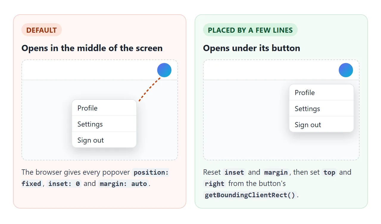
A few lines put it under the button. Reset the defaults in CSS, then read the button's box just before the popover opens:
#menu { inset: auto; margin: 0; }
menu.addEventListener('beforetoggle', (e) => {
  if (e.newState !== 'open') return;
  const r = avatar.getBoundingClientRect();
  menu.style.top = (r.bottom + 8) + 'px';
  menu.style.right = (innerWidth - r.right) + 'px';  // right edges lined up
});
Because the popover is fixed, these are viewport coordinates, which is exactly what getBoundingClientRect() returns.
CSS anchor positioning is a newer way to do this without a script: anchor-name on the button, position-anchor and anchor() on the popover. Check support in the browsers your readers use before relying on it, and keep the script as a fallback.
A finished example: account menu and toast stack
The two kinds work well together. The account menu is an auto popover, so it closes when you click away. Each toast is a manual popover, so a click elsewhere or Esc leaves it alone until it times out or you close it.
<!doctype html>
<html lang="en">
<head>
<meta charset="utf-8">
<meta name="viewport" content="width=device-width, initial-scale=1">
<title>Account menu and toasts with popover</title>
<style>
  body { margin: 0; font-family: system-ui, sans-serif; background: #f4f5f7; color: #1d2330; }
  header {
    display: flex; align-items: center; justify-content: space-between;
    padding: 10px 16px; background: #fff; box-shadow: 0 1px 0 #e1e4ea;
  }
  .logo { font-weight: 700; }
  .avatar {
    width: 38px; height: 38px; border-radius: 50%; border: 0; cursor: pointer;
    background: linear-gradient(135deg, #6366f1, #06b6d4); color: #fff; font-weight: 700;
  }
  main { padding: 16px; }
  main p { font-size: 14px; color: #555; margin: 0 0 10px; }
  .act {
    font: inherit; font-size: 14px; padding: 8px 12px; margin: 0 6px 6px 0;
    border: 1px solid #c9ced8; border-radius: 8px; background: #fff; cursor: pointer;
  }

  /* Account menu: an auto popover placed by the script under the avatar */
  #menu {
    inset: auto; margin: 0; padding: 6px; min-width: 190px;
    border: 1px solid #e1e4ea; border-radius: 12px;
    box-shadow: 0 12px 30px rgba(0, 0, 0, .16);
  }
  #menu .who { padding: 8px 10px; font-size: 13px; color: #555; border-bottom: 1px solid #eef0f3; }
  #menu button {
    display: block; width: 100%; text-align: left; font: inherit; font-size: 14px;
    padding: 9px 10px; border: 0; border-radius: 8px; background: none; cursor: pointer;
  }
  #menu button:hover, #menu button:focus-visible { background: #f1f4f9; }

  /* Toasts: manual popovers stacked in the bottom-right corner */
  .toast {
    inset: auto; right: 12px; margin: 0; width: min(260px, calc(100vw - 24px));
    box-sizing: border-box; padding: 12px 36px 12px 14px; border: 0; border-radius: 10px;
    background: #1d2330; color: #fff; font-size: 14px;
    box-shadow: 0 8px 24px rgba(0, 0, 0, .25); transition: bottom .2s;
  }
  .toast button {
    position: absolute; top: 6px; right: 6px; border: 0; background: none;
    color: #cbd5e1; font-size: 18px; line-height: 1; cursor: pointer;
  }
</style>
</head>
<body>
<header>
  <span class="logo">Acme</span>
  <button class="avatar" id="avatar" popovertarget="menu" aria-label="Account">JL</button>
</header>

<main>
  <p>Open the account menu, then click outside it. Buttons below add toasts, which stay until closed or timed out.</p>
  <button class="act" data-msg="Draft saved">Save</button>
  <button class="act" data-msg="Link copied">Copy link</button>
</main>

<div id="menu" popover>
  <div class="who">Signed in as <b>jl@example.com</b></div>
  <button data-msg="Profile opened">Profile</button>
  <button data-msg="Settings opened">Settings</button>
  <button data-msg="Signed out (demo)">Sign out</button>
</div>

<script>
  const avatar = document.getElementById('avatar');
  const menu = document.getElementById('menu');

  // Place the menu under the avatar, right edges lined up, just before it opens
  menu.addEventListener('beforetoggle', (e) => {
    if (e.newState !== 'open') return;
    const r = avatar.getBoundingClientRect();
    menu.style.top = (r.bottom + 8) + 'px';
    menu.style.right = Math.max(8, innerWidth - r.right) + 'px';
  });

  // Menu items: close the menu, then report with a toast
  menu.querySelectorAll('button').forEach((b) => b.addEventListener('click', () => {
    menu.hidePopover();
    toast(b.dataset.msg);
  }));
  document.querySelectorAll('.act').forEach((b) =>
    b.addEventListener('click', () => toast(b.dataset.msg)));

  // Each toast is its own manual popover, so light dismiss never closes it
  const toasts = [];
  function toast(text) {
    const t = document.createElement('div');
    t.className = 'toast';
    t.popover = 'manual';
    t.textContent = text;
    const x = document.createElement('button');
    x.textContent = '×';  // the multiplication sign as a close icon
    x.setAttribute('aria-label', 'Close');
    x.addEventListener('click', () => remove(t));
    t.append(x);
    document.body.append(t);
    t.showPopover();
    toasts.push(t);
    stack();
    setTimeout(() => remove(t), 4000);
  }
  function remove(t) {
    if (!t.isConnected) return;
    t.hidePopover();
    t.remove();
    toasts.splice(toasts.indexOf(t), 1);
    stack();
  }
  // Newest toast at the bottom, older ones pushed up
  function stack() {
    let bottom = 12;
    for (let i = toasts.length - 1; i >= 0; i--) {
      toasts[i].style.bottom = bottom + 'px';
      bottom += toasts[i].offsetHeight + 8;
    }
  }
</script>
</body>
</html>
- Menu: one
beforetogglelistener places it under the avatar. Clicking an item callshidePopover()and adds a toast. - Toasts: each is created with
t.popover = 'manual', thenshowPopover(). A small function sets every toast'sbottom, newest lowest, whenever one is added or removed. - No z-index anywhere: both live in the top layer, so they sit above the header and the page without any stacking rules.
For menus in site navigation, with keyboard handling for each item, see the HTML dropdown menu guide.
Popover, dialog or tooltip?
popover |
<dialog> with showModal() |
Hover tooltip | |
|---|---|---|---|
| Opens on | Button click or script | Script | Hover or focus |
| Rest of the page | Stays usable | Inert until closed | Stays usable |
| Esc closes it | Auto: yes. Manual: no | Yes | Only if you code it |
| Top layer | Yes | Yes | No, unless it is also a popover |
| Good for | Menus, pickers, toasts, tips | Confirmations, forms that must be answered | Short labels on icons |
A modal needs the user's answer before anything else, and HTML CSS modal covers the <dialog> route. For a label that shows on hover rather than a click, pure HTML tooltip compares the options.
When it does not work
| What you see | Cause | Fix |
|---|---|---|
| The popover opens in the middle of the screen | Default position: fixed with inset: 0 and margin: auto |
Set inset: auto; margin: 0 and place it yourself |
| The button reloads the page instead | A button inside a <form> is a submit button, and submitting wins |
Add type="button" |
| A manual popover never closes on a click outside | That is what manual means |
Add a Close button, or use popover (auto) |
| Clicking the button does nothing | popovertarget does not match the id exactly, or it is on a link or div |
Copy the id, use a <button> |
| The panel shows even when closed | Your CSS sets display on it, which beats the browser's hiding rule |
Put display: flex (or grid) under :popover-open |
| It is always visible in an older browser | The browser does not know the attribute | Check HTMLElement.prototype.hasOwnProperty('popover') and add a fallback |
Share it as a link
A menu or a toast is easier to show than to describe. A screenshot cannot be clicked, and a sent .html file may open as plain code on a phone.
To send the working version, paste the page into a NOS document and choose Create share link. HTML to link walks through it.
The page renders as written and its scripts run, so the people you send it to can open the menu and fire the toasts themselves. If you change the code later, the same link shows the new version.