CSS anchor positioning puts one element next to another without a script. Give the reference element an anchor-name, point a positioned element at it with position-anchor, then choose a side with position-area or exact edges with anchor().
Try it. Press the buttons under the example to move the tooltip around the anchor.
<!doctype html>
<html lang="en">
<head>
<meta charset="utf-8">
<meta name="viewport" content="width=device-width, initial-scale=1">
<title>CSS anchor positioning basics</title>
<style>
  body {
    margin: 0; padding: 14px;
    font-family: system-ui, sans-serif; background: #f4f5f7; color: #1d2330;
  }
  .stage {
    height: 200px; display: grid; place-items: center;
    background: #fff; border-radius: 12px;
  }
  .anchor {
    anchor-name: --target;   /* 1. name the reference element */
    padding: 10px 18px; border: 0; border-radius: 8px;
    background: #2563eb; color: #fff; font: 600 15px system-ui, sans-serif;
  }
  .tip {
    position: absolute;       /* 2. must be absolute or fixed */
    position-anchor: --target;/* 3. attach it to the named anchor */
    position-area: top;       /* 4. pick a cell around the anchor */
    margin: 6px;
    padding: 6px 10px; border-radius: 6px;
    background: #1d2330; color: #fff; font-size: 13px; white-space: nowrap;
  }
  .areas { display: flex; flex-wrap: wrap; gap: 6px; margin-top: 12px; }
  .areas button {
    padding: 6px 10px; border: 1px solid #cfd4dc; border-radius: 6px;
    background: #fff; font: 13px system-ui, sans-serif; cursor: pointer;
  }
  .areas button.on { background: #1d2330; color: #fff; border-color: #1d2330; }
  code { display: block; margin-top: 10px; font: 13px ui-monospace, Consolas, monospace; }
</style>
</head>
<body>
<div class="stage">
  <button class="anchor">Anchor</button>
</div>
<div class="tip" id="tip">I'm the tooltip</div>

<div class="areas" id="areas">
  <button class="on">top</button>
  <button>bottom</button>
  <button>left</button>
  <button>right</button>
  <button>top left</button>
  <button>top right</button>
  <button>bottom left</button>
  <button>bottom right</button>
</div>
<code id="css">position-area: top;</code>

<script>
  const tip = document.getElementById('tip');
  const css = document.getElementById('css');
  const buttons = document.querySelectorAll('#areas button');

  buttons.forEach((b) => b.addEventListener('click', () => {
    tip.style.positionArea = b.textContent;  // the only line that changes
    css.textContent = 'position-area: ' + b.textContent + ';';
    buttons.forEach((x) => x.classList.toggle('on', x === b));
  }));
</script>
</body>
</html>
The full CSS for that tooltip is four lines. It is a newer feature, so check current browser support for the browsers your readers use. The last example shows a fallback for the rest.
The three pieces
Every anchored element needs the same three steps.
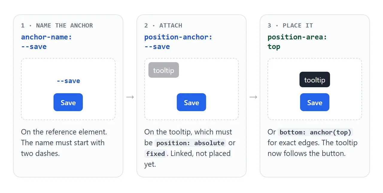
- Name the anchor. On the button, set
anchor-name: --save. Like a custom property, the name must start with two dashes. A plain name such assaveis invalid and the whole declaration is ignored. - Link the tooltip. It needs
position: absoluteorposition: fixed, plusposition-anchor: --save. Without a position value the anchor properties do nothing. - Place it. Use
position-areafor a side or corner, oranchor()for exact edges.
.save-button {
  anchor-name: --save;
}
.tooltip {
  position: absolute;
  position-anchor: --save;
  position-area: top;
  margin: 6px;
}
The margin makes the gap between the two. If you are new to absolute and fixed, CSS position explains how each one picks its reference box.
position-area: pick a cell
position-area treats the space around the anchor as a 3 by 3 grid. The anchor is the middle cell, and you name the cell the element goes into.
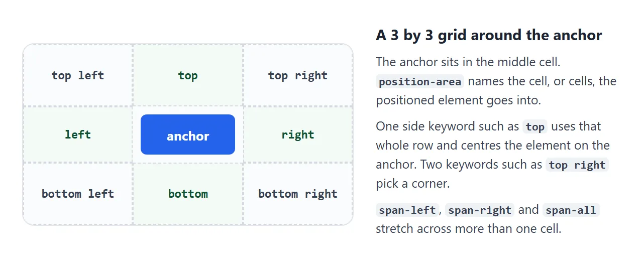
A single keyword such as top or right places the element on that side, centred on the anchor. Two keywords such as bottom right pick a corner.
Values with span-, such as bottom span-right, let the element start at the anchor and extend in one direction, which suits a menu that lines up with its button.
anchor(): line up exact edges
When a cell is not precise enough, use the anchor() function inside an inset property: top, right, bottom, left or their logical forms. It returns the position of one edge of the anchor.
.menu {
  position: absolute;
  position-anchor: --save;
  top: anchor(bottom);    /* menu's top = anchor's bottom edge */
  left: anchor(left);     /* left edges lined up */
  margin-top: 6px;
}
Read top: anchor(bottom) as "put my top edge at the anchor's bottom edge". The function is only valid in inset properties. It does nothing inside margin or transform.
anchor-size(): match the anchor's size
anchor-size() returns the anchor's width or height, for use in sizing properties such as width, min-width and max-height. The common case is a menu that is never narrower than its button:
.menu { min-width: anchor-size(width); }
When there is no room: position-try-fallbacks
A tooltip above a button is fine until the button scrolls near the top edge. Then the tooltip goes past the edge and part of it disappears. position-try-fallbacks gives the browser other positions to try.
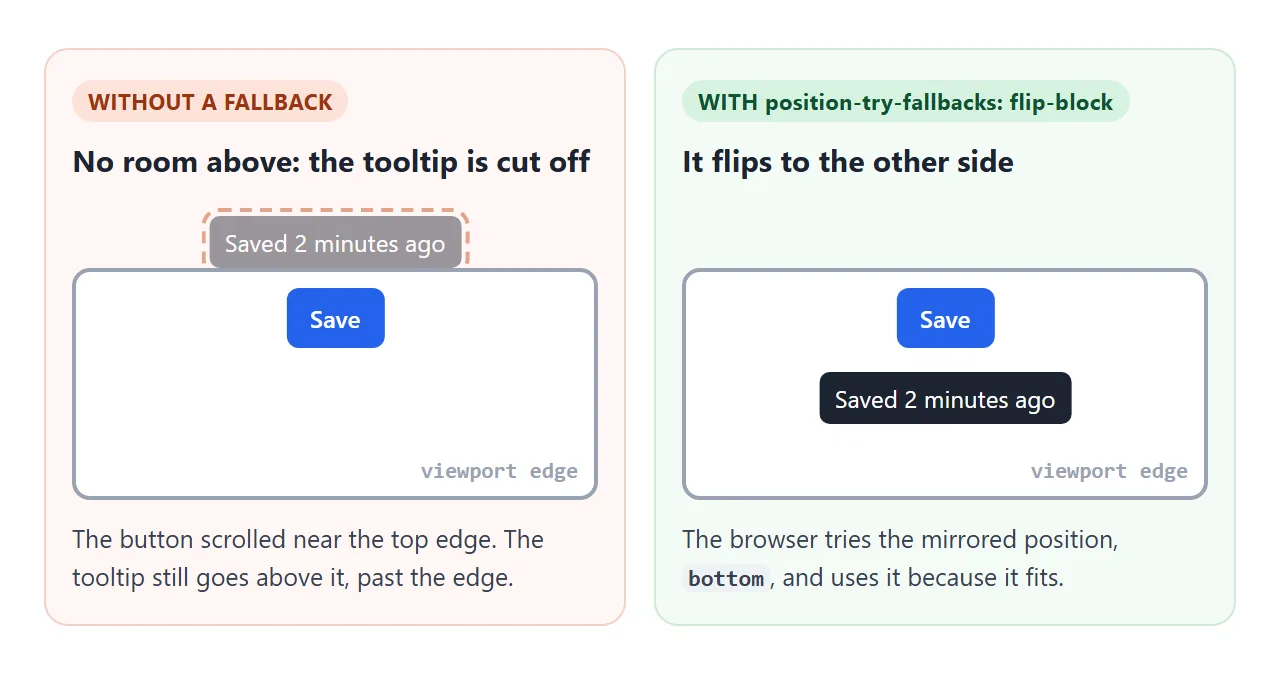
flip-block mirrors the position top to bottom, flip-inline mirrors it left to right, and you can list several, separated by commas. The browser uses the first one that fits inside the containing block.
Scroll the box below. The tooltip is position: fixed, so its containing block is the visible area.
<!doctype html>
<html lang="en">
<head>
<meta charset="utf-8">
<meta name="viewport" content="width=device-width, initial-scale=1">
<title>position-try-fallbacks</title>
<style>
  body {
    margin: 0;
    font-family: system-ui, sans-serif; background: #f4f5f7; color: #1d2330;
  }
  .scroller { height: 100vh; overflow-y: auto; }
  .filler { height: 100vh; padding: 16px 40px; box-sizing: border-box; color: #6b7280; font-size: 14px; }
  .filler.end { display: flex; align-items: flex-end; }
  .anchor {
    anchor-name: --save;
    margin-left: 40px;
    padding: 10px 18px; border: 0; border-radius: 8px;
    background: #2563eb; color: #fff; font: 600 15px system-ui, sans-serif;
  }
  .tip {
    position: fixed;                      /* the viewport is its containing block */
    position-anchor: --save;
    position-area: top;                   /* first choice: above */
    position-try-fallbacks: flip-block;   /* no room above? mirror it below */
    position-visibility: anchors-visible; /* hide it when the button scrolls away */
    margin: 8px 0;
    padding: 6px 10px; border-radius: 6px;
    background: #1d2330; color: #fff; font-size: 13px; white-space: nowrap;
  }
  .note {
    position: fixed; top: 10px; right: 10px; margin: 0;
    padding: 6px 10px; border-radius: 8px; background: #fff;
    font-size: 13px; box-shadow: 0 2px 8px rgba(0, 0, 0, .1);
  }
  .note b { color: #0f5132; }
  .note b.flipped { color: #9a3412; }
</style>
</head>
<body>
<div class="scroller" id="scroller">
  <div class="filler end">Scroll the button up to the top edge, then back down.</div>
  <button class="anchor">Save</button>
  <div class="filler" style="padding-top: 90px">Scroll back up.</div>
</div>
<div class="tip" id="tip">Saved 2 minutes ago</div>
<p class="note">Tooltip: <b id="side">above</b></p>

<script>
  // CSS picks the side. This script only reports it.
  const tip = document.getElementById('tip');
  const btn = document.querySelector('.anchor');
  const side = document.getElementById('side');
  const box = document.getElementById('scroller');

  function report() {
    const b = btn.getBoundingClientRect();
    if (b.bottom <= 0 || b.top >= innerHeight) {
      side.textContent = 'hidden (button out of view)';
      return;
    }
    const above = tip.getBoundingClientRect().top < b.top;
    side.textContent = above ? 'above' : 'below (flipped)';
    side.classList.toggle('flipped', !above);
  }
  box.addEventListener('scroll', () => requestAnimationFrame(report));
  // start with the button in the lower half of the box
  box.scrollTop = innerHeight * 0.4;
  requestAnimationFrame(report);
</script>
</body>
</html>
Two details show up when you scroll back down. The tooltip stays below the button even when there is room above again.
The browser keeps the last position that fitted, so the tooltip does not jump back and forth, and switches only when the current one stops fitting.
The second detail is position-visibility: anchors-visible, which hides the tooltip when the button scrolls completely out of view.
Named fallbacks with @position-try
For a fallback that changes more than the side, write an @position-try rule with a name that starts with two dashes:
@position-try --right-side {
  position-area: right;
  margin: 0 0 0 8px;
}
.tooltip {
  position-try-fallbacks: flip-block, --right-side;
}
Inside @position-try you can set the inset, margin, sizing, alignment and position-area properties. The browser tries the fallbacks in the order you list them.
A finished example: a popover menu
The popover attribute opens and closes a menu, closes it on Esc or an outside click, and puts it above everything else. It does not put the menu next to its button. Anchor positioning does that part.
<!doctype html>
<html lang="en">
<head>
<meta charset="utf-8">
<meta name="viewport" content="width=device-width, initial-scale=1">
<title>Popover menu with anchor positioning</title>
<style>
body {
margin: 0; padding: 14px;
font-family: system-ui, sans-serif; background: #f4f5f7; color: #1d2330;
}
.bar {
display: flex; justify-content: space-between; align-items: center;
padding: 10px 12px; background: #fff; border-radius: 12px;
}
#menu-btn {
anchor-name: --menu-btn;
padding: 8px 14px; border: 1px solid #cfd4dc; border-radius: 8px;
background: #fff; font: 600 14px system-ui, sans-serif; cursor: pointer;
}
#menu {
/* popovers start centred: clear that first */
inset: auto; margin: 0;
padding: 6px; border: 1px solid #e1e4ea; border-radius: 10px;
background: #fff; box-shadow: 0 10px 30px rgba(0, 0, 0, .15);
}
#menu button {
display: block; width: 100%; padding: 8px 12px; border: 0; border-radius: 6px;
background: none; text-align: left; font: 14px system-ui, sans-serif; cursor: pointer;
}
#menu button:hover, #menu button:focus-visible { background: #eef2ff; }
/* Browsers with anchor positioning: CSS does all the placing */
@supports (anchor-name: --a) {
#menu {
position-anchor: --menu-btn;
top: anchor(bottom);
right: anchor(right); /* right edges lined up */
min-width: anchor-size(width); /* never narrower than the button */
margin-top: 6px;
position-try-fallbacks: flip-block;
}
}
.out { margin-top: 14px; font-size: 14px; }
.how { color: #6b7280; font-size: 13px; }
</style>
</head>
<body>
<div class="bar">
<b>Report.html</b>
<button id="menu-btn" popovertarget="menu">Actions ▾</button>
</div>
<div id="menu" popover>
<button>Rename</button>
<button>Duplicate</button>
<button>Move to folder</button>
<button>Delete</button>
</div>
<p class="out" id="out">Open the menu and pick an action.</p>
<p class="how" id="how"></p>
<script>
const btn = document.getElementById('menu-btn');
const menu = document.getElementById('menu');
const out = document.getElementById('out');
const supported = CSS.supports('anchor-name: --a');
document.getElementById('how').textContent = supported
? 'Placed by CSS anchor positioning.'
: 'Placed by the JavaScript fallback.';
// Fallback: measure the button just before the menu opens
if (!supported) {
menu.addEventListener('beforetoggle', (e) => {
if (e.newState !== 'open') return;
const r = btn.getBoundingClientRect();
menu.style.top = (r.bottom + 6) + 'px';
menu.style.right = (innerWidth - r.right) + 'px';
menu.style.minWidth = r.width + 'px';
});
}
menu.querySelectorAll('button').forEach((item) => item.addEventListener('click', () => {
out.textContent = 'You chose: ' + item.textContent;
menu.hidePopover();
}));
</script>
</body>
</html>
- Reset the popover defaults. A popover starts centred in the viewport, so set
inset: autoandmargin: 0first. - Anchor rules inside @supports.
top: anchor(bottom),right: anchor(right)andmin-width: anchor-size(width)only apply where the browser understands them. - Script fallback. When
CSS.supports('anchor-name: --a')is false, abeforetogglelistener reads the button'sgetBoundingClientRect()and sets the same three values.
if (!CSS.supports('anchor-name: --a')) {
  menu.addEventListener('beforetoggle', (e) => {
    if (e.newState !== 'open') return;
    const r = btn.getBoundingClientRect();
    menu.style.top = (r.bottom + 6) + 'px';
    menu.style.right = (innerWidth - r.right) + 'px';
    menu.style.minWidth = r.width + 'px';
  });
}
The popover is position: fixed, and getBoundingClientRect() returns viewport coordinates, so the numbers line up without adding the scroll offset.
The script version measures once, when the menu opens. It does not follow the button if the page scrolls while the menu is open, which is one thing the CSS version does better.
For a small hover hint on text, a CSS-only tooltip may be all you need. For the difference between a select box and a navigation menu, see HTML dropdown menu.
Which tool to use
| You want | Use |
|---|---|
| A tooltip on one side of a button | position-area: top |
| A menu whose edge lines up with the button | top: anchor(bottom) and right: anchor(right) |
| A menu at least as wide as its button | min-width: anchor-size(width) |
| A tooltip that flips near the edge | position-try-fallbacks: flip-block |
| A fallback with its own margin or size | An @position-try rule |
| The same result in browsers without support | @supports plus getBoundingClientRect() |
When it does not work
| What you see | Cause | Fix |
|---|---|---|
| The element stays where it would be without anchoring | Names do not match, or lack the two dashes | Use the same --name in anchor-name and position-anchor |
| Nothing moves at all | The element is position: static or relative |
Set position: absolute or fixed |
| It ignores the anchor inside a wrapper | The wrapper is its containing block and does not contain the anchor | Move the anchor inside, or use position: fixed |
| Two absolute elements, anchor comes second | The anchor must be laid out before the element | Put the anchor earlier in the HTML |
| It never flips | Absolute inside a scrolling box: the check uses its containing block, not the visible part | Use position: fixed for the element |
| It flips but does not flip back | The browser keeps the last position that fitted | Expected. It switches when that stops fitting |
| Rules copied from an old tutorial do nothing | inset-area and position-try-options were renamed |
Use position-area and position-try-fallbacks |
| Works in one browser, not another | Anchor positioning is not supported there | Wrap it in @supports, add the script fallback |
If two elements share one anchor-name, the positioned element uses only one of them: the last one in the HTML that it is allowed to anchor to. Give each anchor its own name, or set the name inline on each button.
Share it as a link
Anchored menus and flipping tooltips are easier to show than to describe. A screenshot cannot be scrolled or clicked, so the person you send it to cannot see the flip happen.
To send the working version, paste the page into a NOS document and choose Create share link. HTML to link walks through it.
The page renders as written and its scripts run, so the people you send it to can open the menu and scroll the tooltip themselves. If you change the code later, the same link shows the new version.