The toggle event fires on a <details> element or a popover after it opens or closes. The event has two properties, oldState and newState, each the string "open" or "closed". Popovers also fire beforetoggle just before the change, and that one can cancel an opening.
panel.addEventListener('toggle', (e) => {
  if (e.newState === 'open') console.log('opened');
});
Try both below. Open and close the details element and the popover, then tick Block opening and try the popover again.
<!doctype html>
<html lang="en">
<head>
<meta charset="utf-8">
<meta name="viewport" content="width=device-width, initial-scale=1">
<title>toggle and beforetoggle log</title>
<style>
  body { margin: 0; padding: 16px; font-family: system-ui, sans-serif; background: #f4f5f7; color: #1d2330; }
  .row { display: flex; flex-wrap: wrap; gap: 12px; align-items: flex-start; }
  details, .box { background: #fff; border: 1px solid #dde1e7; border-radius: 10px; padding: 10px 14px; }
  details { flex: 1 1 170px; }
  summary { cursor: pointer; font-weight: 600; }
  .box { flex: 1 1 170px; }
  button { font: inherit; padding: 6px 12px; border-radius: 8px; border: 1px solid #1d4ed8; background: #2563eb; color: #fff; cursor: pointer; }
  label { display: block; margin-top: 8px; font-size: 14px; }
  #tip { border: 1px solid #dde1e7; border-radius: 10px; padding: 14px 16px; max-width: 240px; }
  #log { margin: 14px 0 0; padding: 10px 12px; list-style: none; background: #111827; color: #e5e7eb;
         border-radius: 10px; font: 13px/1.6 ui-monospace, Consolas, monospace; height: 170px; overflow: auto; }
  #log .before { color: #fbbf24; }
  #log .after { color: #86efac; }
</style>
</head>
<body>
<div class="row">
  <details id="more">
    <summary>A details element</summary>
    <p>Click the summary again to close it.</p>
  </details>
  <div class="box">
    <button popovertarget="tip">Open popover</button>
    <label><input type="checkbox" id="block"> Block opening</label>
  </div>
</div>
<div id="tip" popover>A popover. Press Esc or click outside to close it.</div>
<ul id="log"><li>Open and close both. Events appear here.</li></ul>

<script>
  const log = document.getElementById('log');
  const block = document.getElementById('block');

  function write(e) {
    const li = document.createElement('li');
    li.className = e.type === 'beforetoggle' ? 'before' : 'after';
    li.textContent = e.type + '  #' + e.target.id + '  ' + e.oldState + ' -> ' + e.newState;
    log.prepend(li);
  }

  for (const el of [document.getElementById('more'), document.getElementById('tip')]) {
    el.addEventListener('beforetoggle', write);
    el.addEventListener('toggle', write);
  }

  // beforetoggle can cancel opening a popover
  document.getElementById('tip').addEventListener('beforetoggle', (e) => {
    if (block.checked && e.newState === 'open') {
      e.preventDefault();
      log.firstChild.textContent += '  (cancelled)';
    }
  });
</script>
</body>
</html>
toggle and beforetoggle: which fires when
For a popover, one click produces two events. beforetoggle fires first, while the state has not changed yet. The popover opens or closes. Then toggle fires a moment later, once the change is done.
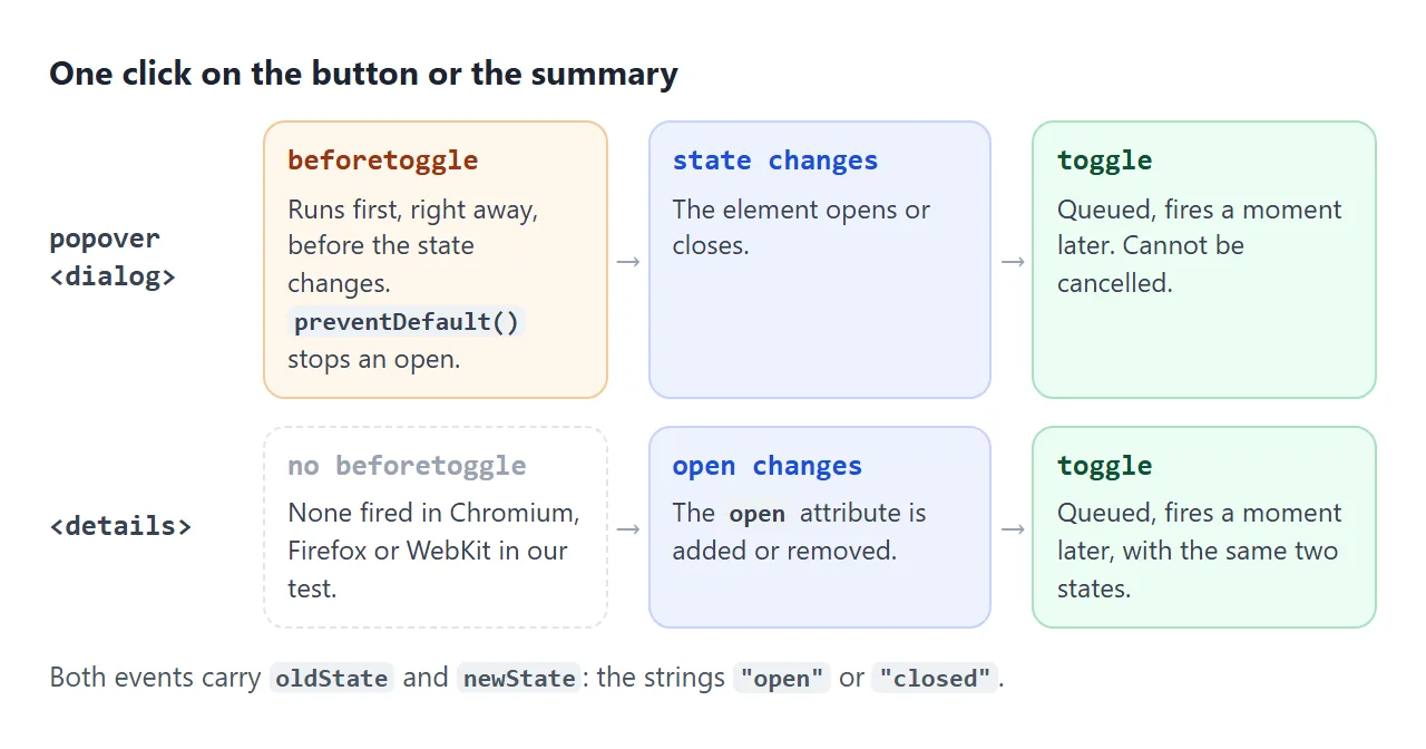
A <details> element is different. In Chromium, Firefox and WebKit, clicking its summary or setting its open property fired only toggle, with no beforetoggle. A <dialog> behaved like a popover: showModal() and close() fired both events in all three.
beforetoggle |
toggle |
|
|---|---|---|
| When | Before the state changes | After, as a queued task |
| Can cancel | Yes, when opening | No |
| Fired by popover | Yes | Yes |
Fired by <dialog> |
Yes | Yes |
Fired by <details> |
Not in our tests | Yes |
| Good for | Placing the panel, filling it, saying no | Saving state, analytics, updating other parts of the page |
Both events are ToggleEvent objects. Neither bubbles: a toggle listener on document heard nothing in our test. That matters for the accordion below.
Reading newState and oldState
newState tells you where the element ended up. Use it rather than flipping your own flag each time the event arrives, because the two can drift apart.
The browser merges changes made in one run of a script. If your code closes and reopens a details element in the same function, only one toggle event arrives, carrying the first oldState and the last newState.
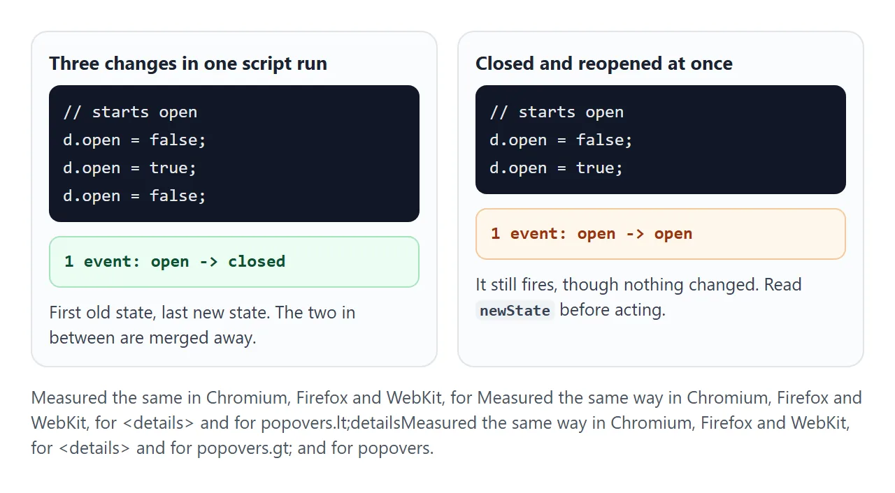
The second case surprised us: closing and immediately reopening fired a single event reading open to open. It happened for details and popovers in all three engines.
A handler that does work "on toggle" without checking newState would run for a change that never showed on screen.
details.addEventListener('toggle', (e) => {
  if (e.oldState === e.newState) return;  // nothing actually changed
  save(details.id, e.newState);
});
One more event to expect: a details element written with open in the HTML fires toggle once, closed to open, right after the page loads.
Stopping a popover from opening with beforetoggle
beforetoggle is cancelable when the popover is opening. Call preventDefault() and it stays closed. No error is thrown and no toggle event follows. This is the demo's Block opening checkbox:
tip.addEventListener('beforetoggle', (e) => {
  if (e.newState === 'open' && !formIsReady()) e.preventDefault();
});
Closing cannot be cancelled. When newState is "closed", e.cancelable is false and preventDefault() does nothing, so Esc and a click outside always close an auto popover.
beforetoggle is also the right moment to place a popover next to its button or to fill it with fresh content, because it has not been painted yet. The HTML popover guide covers placement.
An accordion that keeps one section open
Give every <details> in a group the same name attribute and the browser keeps at most one of them open. No script is needed for that part. The HTML accordion without JavaScript guide covers the markup and styling.
The events are what JavaScript adds. When you open one section, the browser closes the other, and both fire toggle.
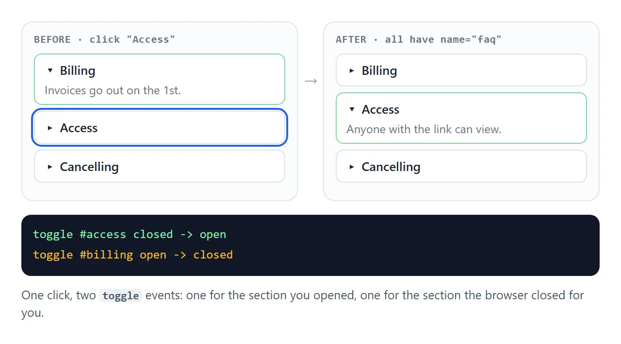
Because toggle does not bubble, one listener on the wrapper only works in the capture phase. Pass true as the third argument:
faq.addEventListener('toggle', (e) => {
  console.log(e.target.id, e.newState);
}, true);  // capture: toggle does not bubble
Open the sections below in any order and watch two lines arrive per switch.
<!doctype html>
<html lang="en">
<head>
<meta charset="utf-8">
<meta name="viewport" content="width=device-width, initial-scale=1">
<title>Exclusive accordion with toggle events</title>
<style>
  body { margin: 0; padding: 16px; font-family: system-ui, sans-serif; background: #f4f5f7; color: #1d2330; }
  details { background: #fff; border: 1px solid #dde1e7; border-radius: 10px; margin-bottom: 8px; }
  summary { cursor: pointer; font-weight: 600; padding: 10px 14px; }
  details p { margin: 0; padding: 0 14px 12px; }
  #now { font-size: 14px; margin: 10px 0 6px; }
  #log { margin: 0; padding: 10px 12px; list-style: none; background: #111827; color: #86efac;
         border-radius: 10px; font: 13px/1.6 ui-monospace, Consolas, monospace; height: 120px; overflow: auto; }
</style>
</head>
<body>
<div id="faq">
  <details name="faq" id="billing" open>
    <summary>Billing</summary>
    <p>Invoices go out on the first of each month.</p>
  </details>
  <details name="faq" id="access">
    <summary>Access</summary>
    <p>Anyone with the link can view the page.</p>
  </details>
  <details name="faq" id="cancel">
    <summary>Cancelling</summary>
    <p>Cancel any time from the account page.</p>
  </details>
</div>
<div id="now">Open now: Billing</div>
<ul id="log"></ul>

<script>
  const log = document.getElementById('log');
  const now = document.getElementById('now');

  // toggle does not bubble, so listen in the capture phase on the parent
  document.getElementById('faq').addEventListener('toggle', (e) => {
    const li = document.createElement('li');
    li.textContent = '#' + e.target.id + '  ' + e.oldState + ' -> ' + e.newState;
    log.prepend(li);

    const open = document.querySelector('#faq details[open] summary');
    now.textContent = 'Open now: ' + (open ? open.textContent : 'nothing');
  }, true);
</script>
</body>
</html>
Before name existed, accordions did this job in a toggle handler: when one opened, close the rest. Chromium, Firefox and WebKit all handled name in our test, so that handler is only needed as a fallback. Check for the feature with this line:
const hasName = 'name' in HTMLDetailsElement.prototype;
Animating the open and close
toggle fires after the change, so it cannot start an opening animation in time. CSS does this job now. The ::details-content pseudo-element is the part of a details element that hides and shows, and you can transition it.
:root { interpolate-size: allow-keywords; }
details::details-content {
  block-size: 0; opacity: 0; overflow: clip;
  transition: block-size .3s, opacity .3s,
              content-visibility .3s allow-discrete;
}
details[open]::details-content { block-size: auto; opacity: 1; }
interpolate-size lets the height animate to auto. allow-discrete on content-visibility keeps the content visible until the closing transition ends.
Support is uneven, so test it in the browsers your readers use. In our tests, the installed Chromium slid open and closed. Firefox and WebKit accepted ::details-content but not interpolate-size, so the section opened and closed at once. Nothing broke; they simply skip the slide.
For popovers and dialogs, the tool is @starting-style, which the popover guide shows with a fade-in. For other ways to animate to an unknown height, see CSS transition to height auto.
A finished example: animated FAQ with a counter
This FAQ puts the pieces together: name keeps one answer open, ::details-content animates it where the browser can, and one capture-phase toggle listener counts opens and ignores closes.
<!doctype html>
<html lang="en">
<head>
<meta charset="utf-8">
<meta name="viewport" content="width=device-width, initial-scale=1">
<title>Animated FAQ with toggle events</title>
<style>
  :root { interpolate-size: allow-keywords; }  /* lets height animate to auto */
  body { margin: 0; padding: 16px; font-family: system-ui, sans-serif; background: #f4f5f7; color: #1d2330; }
  details { background: #fff; border: 1px solid #dde1e7; border-radius: 12px; margin-bottom: 8px; }
  summary { cursor: pointer; font-weight: 600; padding: 12px 16px; list-style: none; display: flex; justify-content: space-between; }
  summary::-webkit-details-marker { display: none; }
  summary::after { content: '+'; font-size: 20px; line-height: 1; transition: rotate .25s; }
  details[open] summary::after { rotate: 45deg; }
  details::details-content {
    block-size: 0; opacity: 0; overflow: clip;
    transition: block-size .3s, opacity .3s, content-visibility .3s allow-discrete;
  }
  details[open]::details-content { block-size: auto; opacity: 1; }
  .answer { padding: 0 16px 14px; }
  #note { font-size: 13px; color: #9a3412; margin-top: 4px; }
  #status { font-size: 14px; color: #374151; margin-top: 10px; }
</style>
</head>
<body>
<div id="faq">
  <details name="faq">
    <summary>When are you open?</summary>
    <div class="answer">Tuesday to Sunday, 9:00 to 18:00.</div>
  </details>
  <details name="faq">
    <summary>Do I need to book?</summary>
    <div class="answer">Only for groups of six or more.</div>
  </details>
  <details name="faq">
    <summary>Can I bring a dog?</summary>
    <div class="answer">Yes, on a lead. Water bowls are by the door.</div>
  </details>
</div>
<div id="status">Pick a question.</div>
<div id="note"></div>

<script>
  const counts = new Map();
  const status = document.getElementById('status');

  document.getElementById('faq').addEventListener('toggle', (e) => {
    const d = e.target;
    if (e.newState !== 'open') return;   // ignore closes, including the auto-closed one

    counts.set(d, (counts.get(d) || 0) + 1);
    status.textContent = 'Opened "' + d.querySelector('summary').textContent + '" ' + counts.get(d) + ' time(s).';
  }, true);

  // without interpolate-size the panel still opens, just without the slide
  if (!CSS.supports('interpolate-size', 'allow-keywords')) {
    document.getElementById('note').textContent = 'This browser skips the height animation.';
  }
</script>
</body>
</html>
- Ignore closes: the handler returns early unless
newStateis"open". The automatic close of the other section would otherwise count too. - One listener: capture on the wrapper covers every section, including ones added later.
- Feature check:
CSS.supports()tells the page whether the height slide is available, and a note says so when it is not.
When it does not work
| What you see | Cause | Fix |
|---|---|---|
| A listener on a parent never runs | toggle does not bubble |
Pass true as the third argument to capture it |
| The handler runs twice per click in an accordion | The auto-closed section fires its own toggle |
Check e.newState and e.target |
| The handler runs once on page load | A details element had open in the HTML |
Expect the first event, or check a flag |
| A beforetoggle listener on details never runs | Details fired no beforetoggle in our tests |
Listen for click on the summary |
preventDefault() does not keep it open |
Closing cannot be cancelled | Only cancel when newState is "open" |
| The value read in the handler is already the new one | toggle fires after the change |
Use e.oldState, or beforetoggle on a popover |
| The section snaps open with no slide | The browser lacks interpolate-size |
Accept the snap, or animate with a grid row trick |
Share it as a link
An accordion or a menu is easier to show than to describe. A screenshot cannot be opened and closed, and a sent .html file may open as plain code on a phone.
To send the working version, paste the page into a NOS document and choose Create share link. HTML to link walks through it.
The page renders as written and its scripts run, so the people you send it to can open each section and watch the events themselves. If you change the code later, the same link shows the new version.