Pricing page HTML is a grid of plan sections followed by a comparison table, both written as content rather than as layout scaffolding.
That distinction decides how the page behaves on a phone, how it reads aloud, and how quickly you can change a number the day before launch.
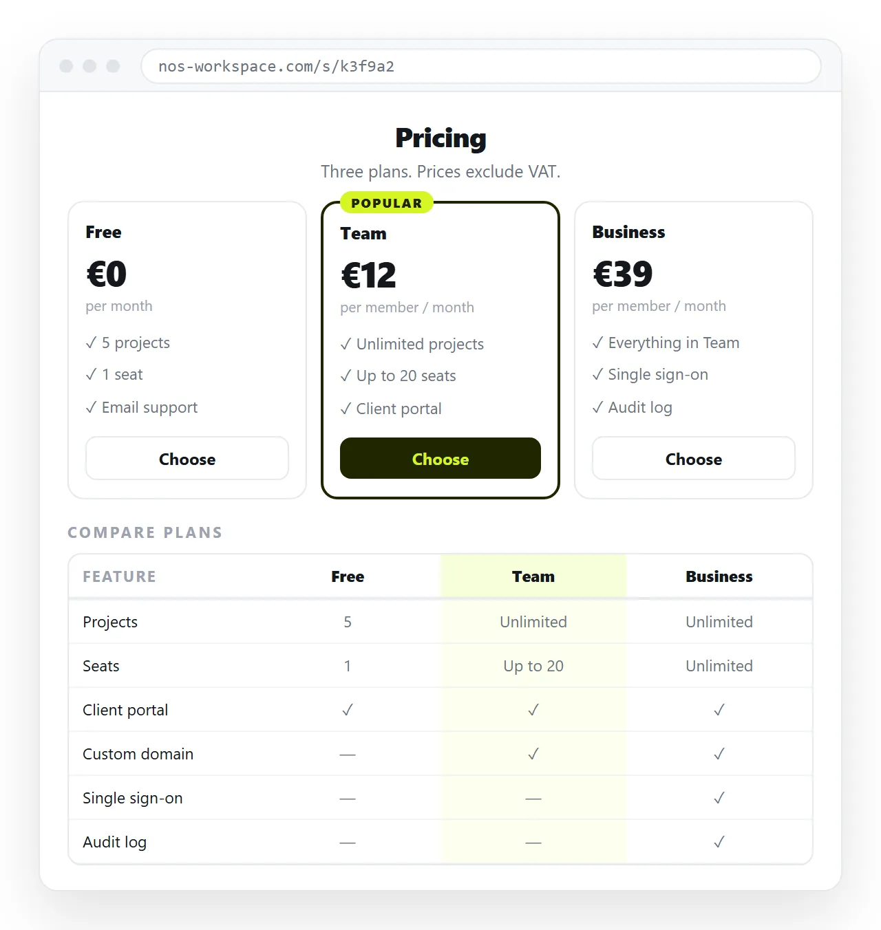
Pricing page HTML: the plan cards
Use CSS grid on the container and let the cards be sections. No floats, no layout tables.
<div class="plans">
  <section class="plan">
    <h2>Starter</h2>
    <p class="price">Free</p>
    <p class="who">For one person trying it out.</p>
    <ul>
      <li>3 documents</li>
      <li>Share links</li>
    </ul>
    <a class="cta" href="/signup">Start free</a>
  </section>
  <!-- further plans -->
</div>
.plans{display:grid;gap:20px;
       grid-template-columns:repeat(auto-fit,minmax(240px,1fr));}
.plan{border:1px solid #e0e0e0;border-radius:10px;padding:20px;}
.price{font-size:32px;margin:8px 0 4px;}
.who{color:#555;margin:0 0 16px;}
auto-fit with minmax handles the whole responsive story for the cards. Three columns on a laptop, one on a phone, nothing to write twice.
Write the price as a sentence
A common pattern splits the price into separately styled spans for the symbol, the number and the period. It looks correct and reads badly.
Screen readers announce the fragments in sequence, and if the stylesheet fails the page shows three disconnected pieces. Write it as one string and style it as one thing.
<p class="price">$12 <span class="per">per user, per month</span></p>
State the billing period in words next to every number. A page showing only $12 starts a support conversation about whether that is monthly or yearly.
The comparison table
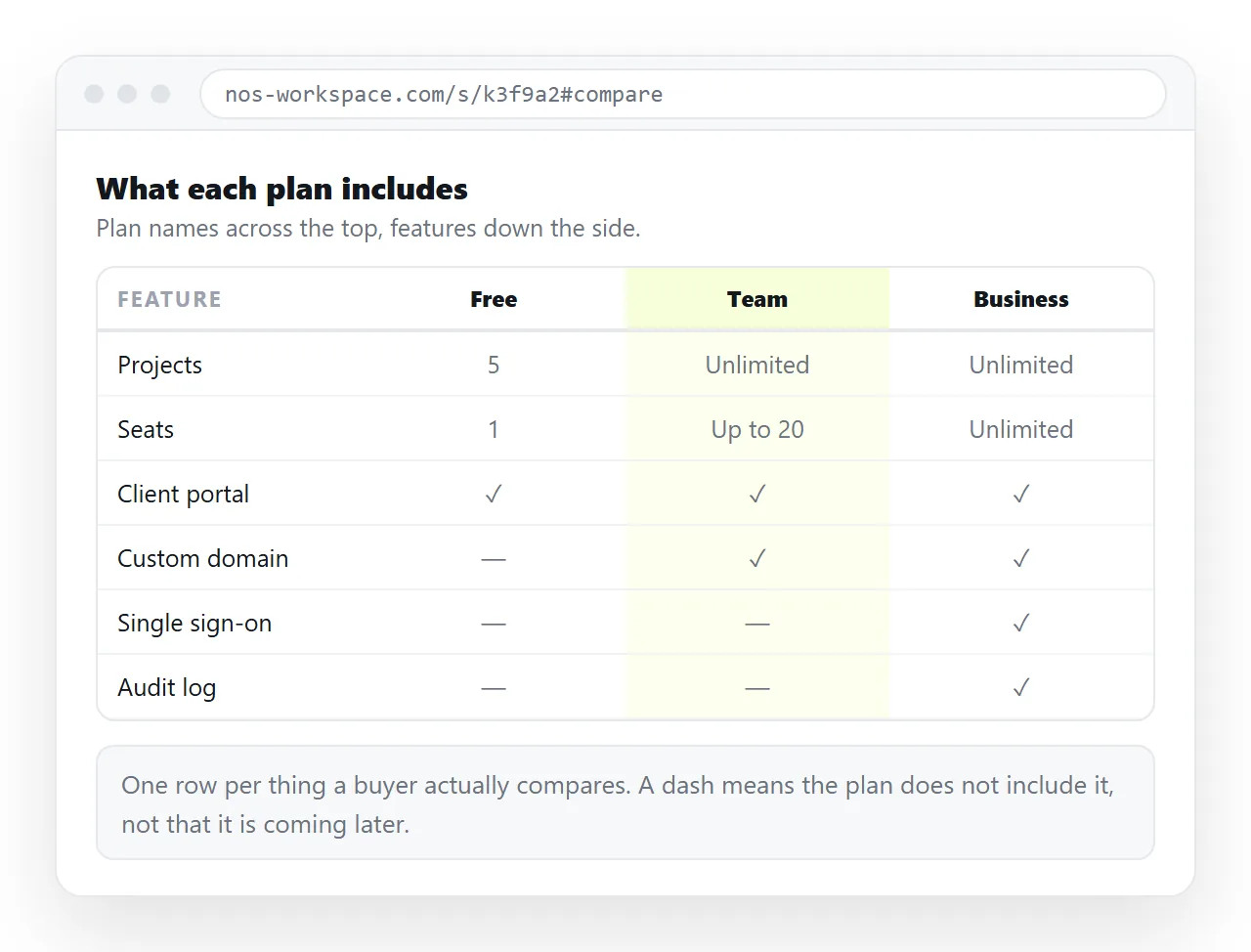
Cards answer "which plan", a table answers "what is the difference". Use a real <table>.
| Feature | Starter | Team | Business |
|---|---|---|---|
| Documents | 3 | Unlimited | Unlimited |
| Share links | Yes | Yes | Yes |
| Members | 1 | Up to 20 | Unlimited |
| Support | Community | Email and phone |
In your markup, the plan names go in <th scope="col"> and the feature names in <th scope="row">. That pairing is what lets assistive technology say "Team, members, up to twenty" rather than reading a loose grid of cells.
Write yes and no as words. A tick glyph with no text alternative is announced as nothing at all.
The table on a phone
This is the part that usually breaks. A four column comparison does not fit on a narrow screen.
Two workable approaches:
- Scroll container. Wrap the table in a div with
overflow-x:auto, give ittabindex="0"so keyboard users can scroll it, and label it so people know to swipe. - Restack per plan. Below a breakpoint, repeat the plan name and list its features vertically. More markup, better reading.
Shrinking the font until it fits is not a third option. It fails for exactly the readers who need the detail.
Buttons that say what happens
One action per card, and the wording should describe the outcome.
- Start free for a plan with no payment.
- Start trial when a trial begins.
- Contact sales when a conversation follows.
Avoid three identical buttons reading Choose. The label is the last thing a visitor reads before committing. Where the button leads is covered in HTML signup page.
Marking the recommended plan
Most pricing pages highlight one option, and the highlight is usually done with colour and a border alone.
That fails for anyone who cannot distinguish the tint, and it disappears in a printout. Add a short text badge inside the card, such as Most teams choose this, so the signal exists in words.
Keep the highlighted card the same height and width as its neighbours. Scaling it up looks deliberate on a laptop and breaks the grid on a phone, where the cards are stacked and the size difference reads as a mistake.
Details that get skipped
- Currency. Name it.
$12is ambiguous across several currencies. - Tax. Say whether the number includes it.
- Annual toggle. If prices switch between monthly and yearly, make sure the state is announced, not only coloured.
- Contrast. The highlighted plan often ends up as pale text on a tinted card. Check it.
- Print. Finance teams print pricing pages. A print stylesheet that drops navigation is a small kindness.
Reviewing the draft
Pricing pages go through more approval rounds than almost any other page, usually with someone in finance and someone in legal.
Emailing the .html file makes that worse. It hits the usual attachment problems, and every reviewer ends up with a different frozen copy while the numbers are still moving.
Paste the HTML into a NOS document instead. It renders as written, and the share link opens for every reviewer on whatever device they have.
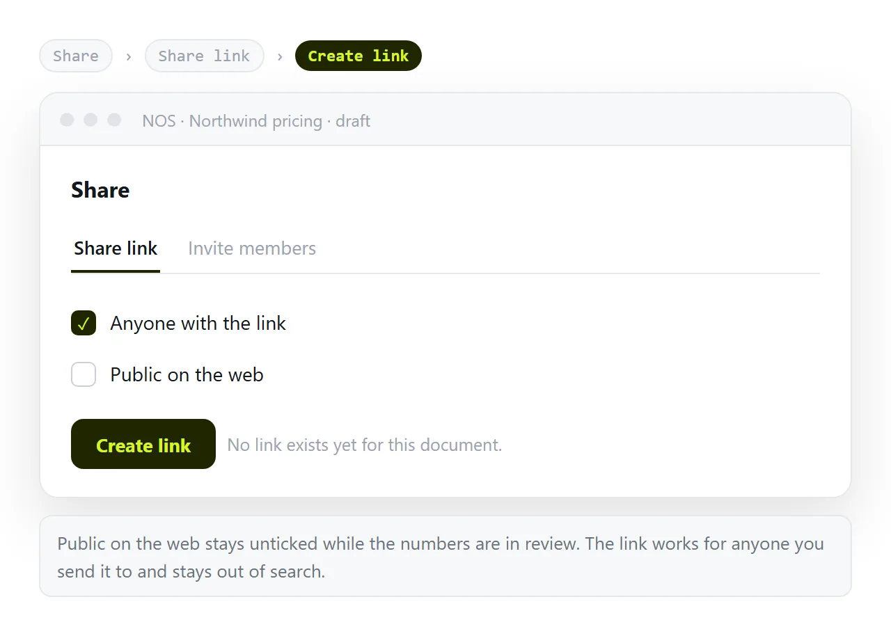
Keep it unlisted during review. A draft pricing page turning up in search results is a real and awkward failure.
Changing a number without touching markup
During review, most edits are a price, a limit or a line of wording. In the document you click the text and change it.
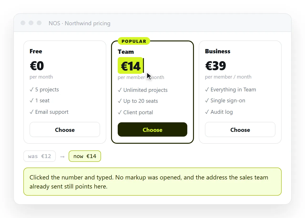
The address stays the same, so the link finance opened on Monday shows Tuesday's corrected figure. No second email, no version suffix on a file name, no doubt about which copy is current.
When the numbers are settled, the same HTML goes into your site build, or the document itself becomes the public page with Public on the web ticked.
For an internal price list rather than a public page, see HTML for pricing sheets. If the figures need to be changed by people who do not write markup, editable HTML table is the more direct route.