An HTML landing page is one file with one action in it, and the part that takes the longest is usually publishing rather than building.
The markup is straightforward. The stall happens when a single file gets routed through a deploy pipeline that was designed for an application.

What the page actually needs
| Part | Required | Why |
|---|---|---|
| Headline stating the offer | Yes | The visitor decides in seconds |
| Supporting detail | Yes | Three to five points, not a brochure |
| One call to action | Yes | Two actions split the response |
| Proof of some kind | Usually | A number, a logo, a quote you can stand behind |
| Navigation menu | No | Every link is an exit |
| Cookie heavy analytics stack | No | One lightweight measure is enough to start |
| A framework and build step | No | Nothing here is dynamic |
The list is short because a landing page is an argument, not a site. Anything that is not part of the argument is drag.
The head tags that decide how it is received
Four lines in the <head> do more for a landing page than most of the visual design.
<title>. It is the browser tab and the first line of every preview card. An untitled page reads as spam.- The viewport line.
<meta name="viewport" content="width=device-width,initial-scale=1">. Without it the page is unreadable on a phone, where most traffic lands. See the viewport meta tag. - A meta description. Used in search results and some previews. Writing a meta description covers the length.
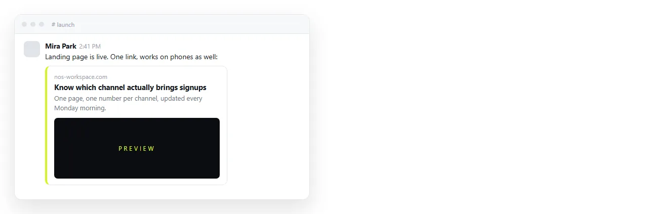
- Open Graph tags. These control the image, title and text when the link is posted in chat or social. Open Graph tags has the exact set.
Skipping the fourth one is the common miss. A link with no card gets far fewer clicks than the same link with one.
Keep it a single file
Styles in a <style> block, images embedded or on full addresses, scripts inline if you need any.
This matters because a landing page gets moved. Into an email test, onto a host, into a document, into a colleague's browser to check the copy.
Every one of those moves breaks relative paths. A page that reaches for a folder next to it loses its images the first time it travels.
Self contained HTML explains how to fold the pieces in. Once it is one file, the page works everywhere you put it.
The form, which is the only non static part
A landing page with a form is still a static page, as long as the form posts somewhere else.
Point the form action at a submission service or your own endpoint. The page is served as a file, the submission goes over the network to something that stores it.
That keeps the hosting requirement at "serve one file", which is the cheapest requirement there is. Static HTML vs dynamic sets out why this distinction saves so much work.
If you have no endpoint yet, a mailto link or a link to a scheduling page is a legitimate first version. Ship the page, then upgrade the action.
Getting it to an address
Two routes, and they differ in what happens after launch rather than at launch.
A static host serves the file. The address is stable, and every copy change is a re export and a re upload. For a page you will edit twice a week, that friction adds up.
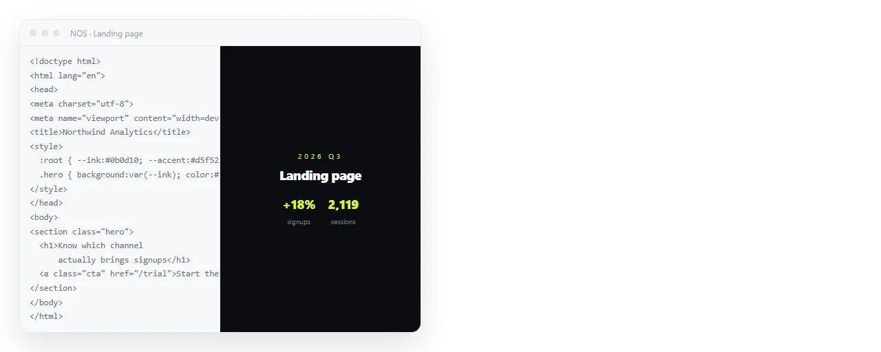
A document that renders HTML takes the paste directly. In NOS the page renders exactly as written, dark theme, charts and scripts included.
Take the address from Share, then Share link, then Create link. Tick Public on the web so search engines can reach it, since a landing page usually wants that.
Editing copy after it is live
This is where a landing page differs from most pages. The copy changes constantly in the first fortnight.
If a headline change means re exporting and re uploading, you will test fewer headlines. If it means clicking the words and typing, you will test more.
In a document the text stays clickable and the address does not move, so links already in circulation keep pointing at the current version. Editing generated HTML without code covers the same habit for pages you did not write yourself.
Measuring without building an analytics project
You need two numbers to judge a landing page: how many people arrived, and how many took the action.
A single lightweight analytics snippet gives you the first. The second comes from whatever receives the form, or from a distinct link on the button.
Resist adding more until those two numbers exist and disagree with your expectations. Scroll depth and heat maps are interesting after you have a conversion rate, not before.
If you run several versions, give each one its own address rather than trying to split traffic inside one page. Separate addresses are easier to reason about and easier to stop.
The mistakes that cost the most
- Two calls to action. The second one is usually there to satisfy an internal stakeholder, and it halves the first.
- A headline about you. The visitor is deciding whether this is for them, not who you are.
- No phone test. Most traffic is on a phone, and desktop previews hide the problem completely.
- Copy that cannot be edited quickly. The page ossifies at version one.
- A missing preview card. Links shared without one look like spam in a channel.
Before you send traffic
- Open it in the HTML file opener to confirm it stands alone.
- Load it on an actual phone, not a narrowed desktop window.
- Click the call to action and complete it yourself, end to end.
- Paste the link into a chat to check the preview card.
- Read the headline out loud. If it takes two breaths, cut it.
For the stripped down version of this build, see a simple HTML landing page. To publish what you already have, paste it into the HTML to link tool.