A simple HTML landing page is one file containing one headline, one supporting block and one action. Anything else is optional, and most of it reduces the response rate.
The reason to keep it one file is not minimalism. It is that a single file travels intact, and landing pages get moved constantly before they settle.
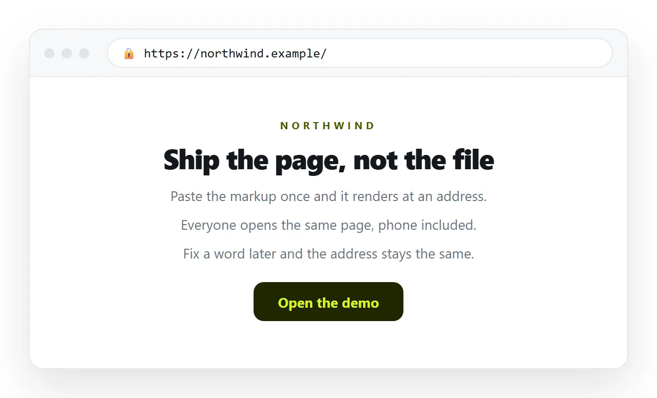
The skeleton
Six lines in the head, three blocks in the body. That is the whole page.
<!doctype html>
<html lang="en">
<head>
<meta charset="utf-8">
<title>Offer in six words</title>
<meta name="description" content="One sentence a search result can use.">
<meta name="viewport" content="width=device-width,initial-scale=1">
<meta property="og:title" content="Offer in six words">
<meta property="og:description" content="One sentence a chat card can use.">
<style>
  body { max-width: 40rem; margin: 0 auto; padding: 2rem; font: 16px/1.6 system-ui, sans-serif; }
  h1 { font-size: 2rem; line-height: 1.2; }
  a.cta { display: inline-block; padding: .8rem 1.4rem; background: #111; color: #fff; text-decoration: none; }
</style>
</head>
<body>
  <h1>What this is, in one line</h1>
  <p>Two sentences that make the headline credible.</p>
  <ul><li>Point one</li><li>Point two</li><li>Point three</li></ul>
  <a class="cta" href="#">The one action</a>
</body>
</html>
That renders correctly on a phone and a desktop, needs no network beyond itself, and can be read in full before anyone loses interest.
What each head line is doing
| Line | What it affects | Cost of skipping it |
|---|---|---|
charset |
Character encoding | Mangled punctuation and accents |
<title> |
Browser tab and every preview | The link looks untrustworthy |
description |
Search result text | Search shows a random sentence |
viewport |
Phone layout | Unreadable on most of your traffic |
og:title |
Chat and social card | A bare link nobody clicks |
og:description |
Chat and social card | Same |
None of these are visible on the page itself, which is why they get skipped. They decide how the page is received before anyone sees it.
The viewport meta tag and Open Graph tags cover the two that matter most.
What to cut
The instinct on a landing page is to add. Cut instead, and check each item against the one action.
- The navigation menu. Every entry is an exit route.
- The hero image that carries no information. It pushes the action below the fold on a phone.
- A second call to action. Two actions halve the first one.
- External fonts and frameworks. A network dependency that can fail while your own markup would have rendered. See web fonts.
- Long paragraphs. Three lines maximum on a phone, or the reader scrolls past.
- Anything that needs a build step. This page has no dynamic parts.
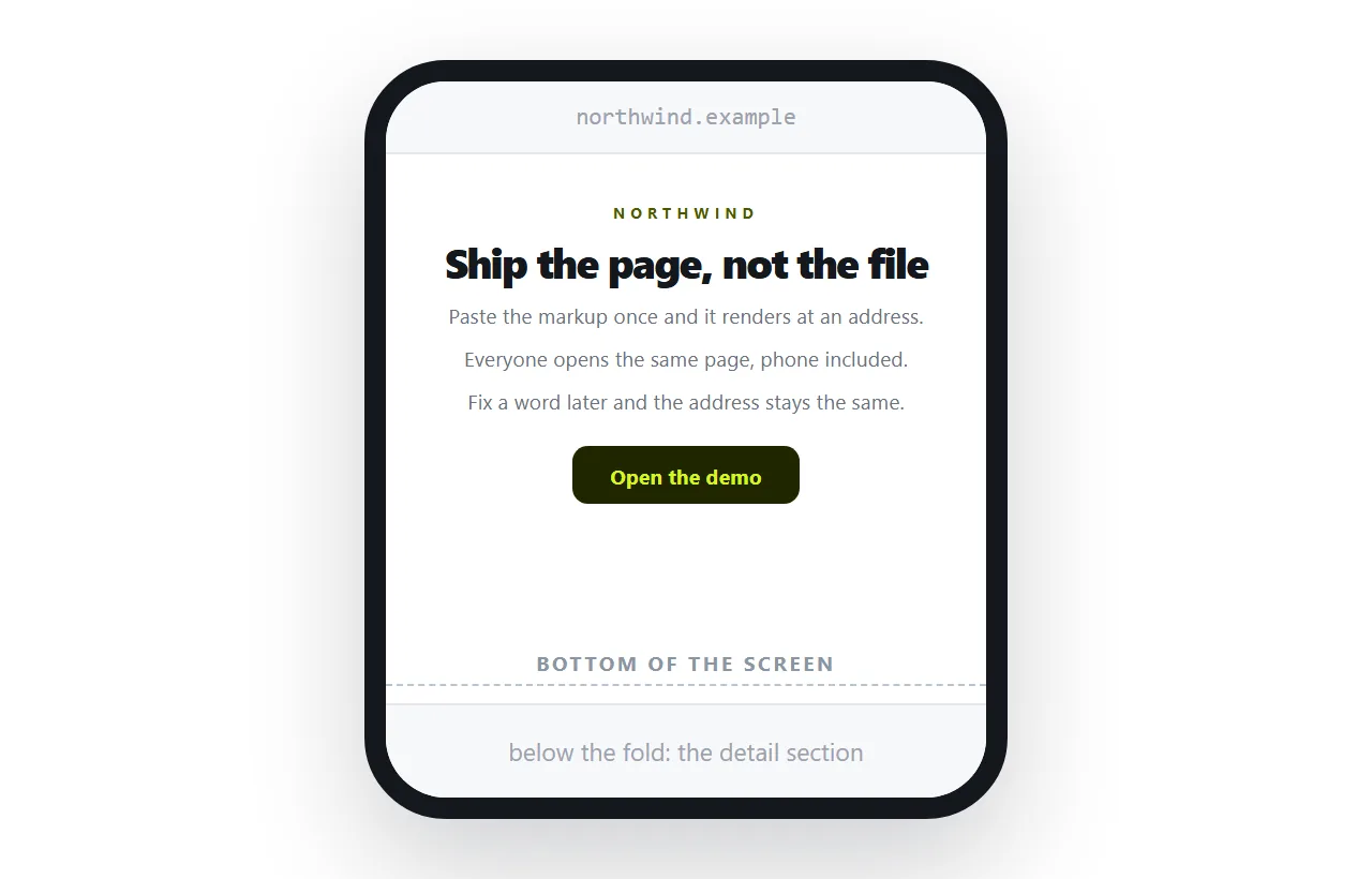
Three decisions that do most of the work
Width. One column, around 40 rem. Long lines are the most common reason a page reads as hard work on a laptop.
Contrast. Dark text on a light background, or the reverse, with nothing in between. Grey on grey is the second most common readability failure.
Fold. On a phone, the headline and the action should both be visible before any scrolling. Check this on a real device.
Those three settle most of the design argument. Everything after them is taste, and taste is cheaper to adjust once the page is live.
What proof to include, if any
A simple landing page does not need testimonials and logos, but it usually needs one concrete fact.
A number you can defend, a named customer who agreed to be named, or a specific limit of what the offer covers. Specificity reads as honesty.
Avoid the generic reassurance block. Three vague claims occupy the same space as one verifiable one and do less.
Keep it self contained
Styles in a <style> block. Images embedded as data or on full addresses. No folder paths.
The moment a page references a file sitting next to it, moving the page breaks it. That happens on the first email test, not months later.
Self contained HTML explains the substitutions, and images not showing is the symptom when you miss one.
Check it by opening the file in the HTML file opener, which has never seen your project folder. What survives there survives for a visitor.
Publishing it
The page is finished and now it needs an address. The fast route is a paste.
Paste the HTML into a NOS document and it renders exactly as written, including the style block, dark theme and any script you added.
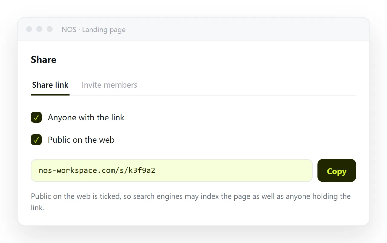
Create the address with Share, then Share link, then Create link. Tick Public on the web so search engines can index it, since a landing page usually wants to be found.
Why editing in place matters more here than anywhere
Landing page copy changes more than any other page you own. The headline in week one is rarely the headline in week three.
If each change means re exporting and re uploading a file, you will test fewer headlines and the page will settle on the first guess.
In a document you click the headline and retype it. The address does not move, so ads, emails and posts already pointing at the page keep working.
That single property is the difference between a page you iterate on and a page you shipped once.
A ten minute check before launch
- Load it on a real phone and confirm the action is visible without scrolling.
- Paste the link into a chat and look at the card.
- Click the action and complete it yourself.
- Read the headline aloud. If it needs two breaths, cut words.
- Search the source for any
srcorhrefstarting with a folder name and fix it.
For the fuller build with forms, proof and measurement, see the HTML landing page guide. To publish the file you already have, paste it into the HTML to link tool.