An HTML pie chart is most easily drawn with a CSS conic-gradient on a round element, which needs no JavaScript, no SVG and no library.
The trick is that the gradient stops are cumulative. A 30 percent slice followed by a 20 percent slice ends at 50 percent, not 20.
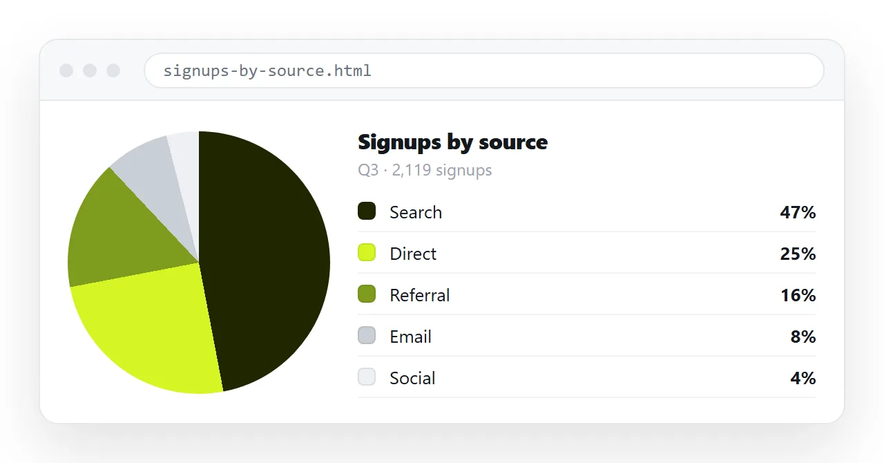
The CSS gradient version
Four slices, written as running totals.
.pie {
  width: 240px; aspect-ratio: 1; border-radius: 50%;
  background: conic-gradient(
    #4f7cff 0 42%,
    #34b27b 42% 68%,
    #e0a33e 68% 88%,
    #8a8f98 88% 100%
  );
}
That is the entire chart. It scales, it prints, it works offline, and there is nothing to load.
For a donut, lay a circle of the page background colour over the middle with a pseudo-element, or use a radial mask. Keep the hole under about 60 percent of the diameter or the slices get hard to compare.
Three approaches compared
| CSS conic gradient | Inline SVG | Chart library | |
|---|---|---|---|
| Extra files to load | None | None | The library |
| Hover tooltips | No | With script | Built in |
| Animated entry | Limited | Yes | Built in |
| Labels placed on slices | No | Yes, with maths | Built in |
| Works with scripts blocked | Yes | Yes | No |
| Size on the page | A few lines | Moderate | Large |
For a chart inside a report that people read once, the gradient wins on every practical axis. For a dashboard where readers hover to inspect values, a library earns its weight.
Inline SVG sits in the middle. You control the geometry exactly, and the markup stays part of the page rather than being drawn after load.
The SVG version, briefly
One circle, one stroke per slice, offset around the circumference.
<svg viewBox="0 0 42 42">
  <circle cx="21" cy="21" r="15.9" fill="none"
    stroke="#4f7cff" stroke-width="10"
    stroke-dasharray="42 58" stroke-dashoffset="25" />
</svg>
The radius 15.9 makes the circumference almost exactly 100, so dash values read as percentages directly. Each further slice repeats the circle with its own dash array and a dash offset equal to the cumulative total before it.
Label outside the circle
Labels inside slices look tidy in a mockup and collide in real data. A five percent slice has nowhere to put a word.
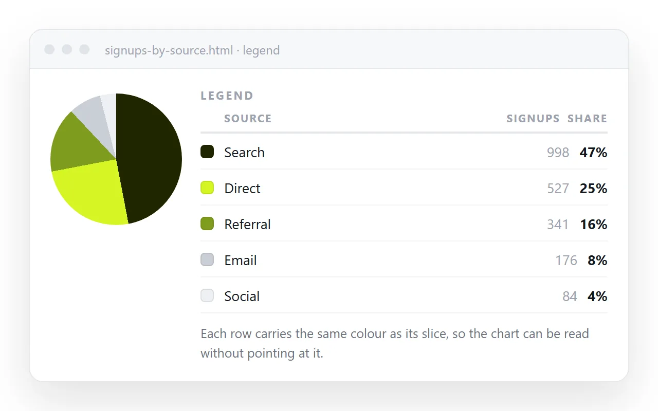
Put the legend next to the chart as a list.
- A square or circle swatch filled with the slice colour.
- The category name in plain text.
- The percentage, and the raw count in brackets if the reader will want it.
Order the legend the same way the slices run, clockwise from twelve. A legend in a different order than the chart is worse than no legend.
Make the values readable without the picture
A pie chart carries its data in angles, which is nothing to a screen reader and nothing in a text-only email client.
Give the chart container role="img" and an aria-label that states the headline split. Then include the same numbers as a small table beneath, or visually hidden if the design does not want it visible.
This is the same reason alt text matters for images. The picture is one representation of the data, not the data.
When a pie chart is the wrong chart
Pie charts answer one question: what share of the whole is each part. They are poor at almost everything else.
Switch to a bar chart when there are more than about six categories, when the categories do not sum to a meaningful whole, or when the reader needs to compare two similar values precisely.
Two pie charts side by side to show change over time is the worst common case. A pair of bars, or a single bar split into segments, reads immediately.
Share the HTML pie chart as a link
A chart in a report gets revised. That makes it a page, not an image.
- Open the file in the HTML file opener to confirm the gradient and fonts survive outside your folder.
- Paste the HTML into a NOS document. It renders as a page of its own.
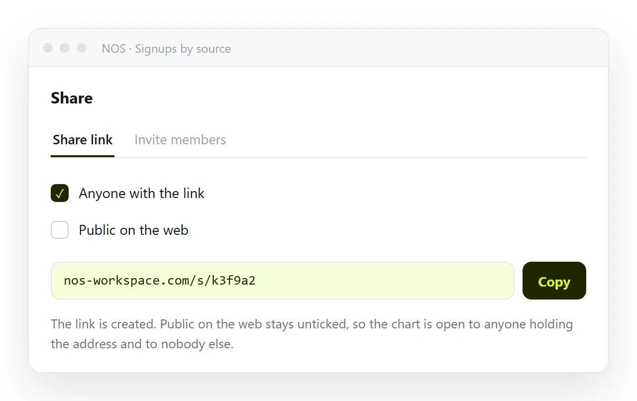
- Share, then Share link, then Create link. Leave it unlisted unless the chart is meant to be found in search.
- Send the link. Revise the page rather than sending a second version.
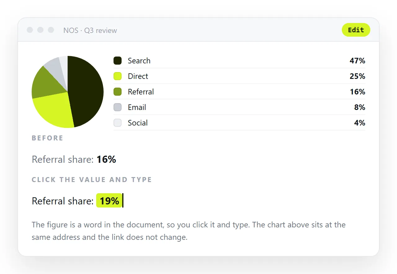
When the quarter closes, click the numbers in the document and update the gradient stops. The address holds, so the link in last month's update is still the current chart.
Turning a chart into a link covers the same route for charts that came out of a spreadsheet or a chat.
If the chart came from an AI chat
Assistants write conic gradient and SVG pie charts readily, and the output is usually close to correct.
Two things to check before you share it. Do the slice percentages sum to 100, and are the colours distinguishable when printed in grey.
If the chart looks right but the page around it does not, missing styles in AI HTML is the usual cause. Prompting for an HTML chart covers how to ask for one that already has the legend and the accessible table.
Checklist before sending
- Do the cumulative stops end at exactly 100 percent?
- Is the legend in the same order as the slices?
- Are the numbers available as text, not only as angles?
- Does it still read in greyscale, for whoever prints it?
- Is there a
<title>so the tab and preview card are not blank?