An HTML bar chart is a set of elements whose width or height is a percentage of the largest value, and CSS alone is enough to draw it.
Start from a table rather than a stack of empty divs. The numbers then survive with styles disabled, in a text email client, and for a screen reader.
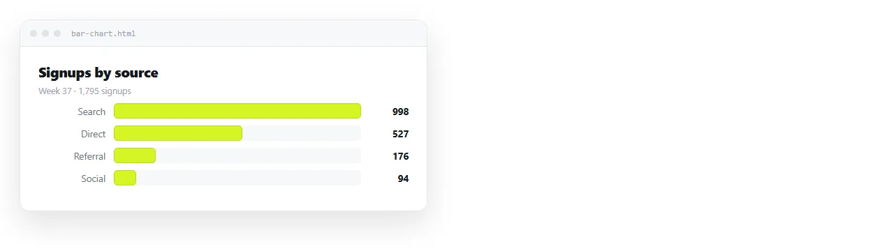
The markup
Keep the value in the text, and put the proportion in a custom property.
<table class="bars">
  <tr>
    <th>Organic search</th>
    <td><span class="bar" style="--w:100%"></span> 4,120</td>
  </tr>
  <tr>
    <th>Direct</th>
    <td><span class="bar" style="--w:58%"></span> 2,390</td>
  </tr>
</table>
The percentage is the value divided by the largest value, not by the total. Dividing by the total is the most common mistake here and it makes every bar look small.
.bar {
  display: inline-block; width: var(--w);
  height: 0.9rem; background: #4f7cff;
  border-radius: 2px; vertical-align: middle;
}
Horizontal or vertical
| Situation | Use |
|---|---|
| Category names are words or phrases | Horizontal |
| The axis is months, weeks, or quarters | Vertical |
| More than about ten categories | Horizontal, sorted by value |
| Comparing two series per category | Grouped, either direction |
| Showing composition within each category | Stacked |
| Values differ by more than 100x | Reconsider the chart, or split it |
Horizontal bars are underused. The label reads left to right on the same line as its bar, so nothing has to be rotated or truncated.
Vertical bars need a flex container with align-items: flex-end and a height on each bar. Rotated labels are the usual failure, and they are unreadable on a phone.
Sorting and the zero line
Sort by value unless the categories have an inherent order such as time or size band. An unsorted category chart makes the reader do the ranking.
Always start bars at zero. A truncated baseline exaggerates differences, and a reader who notices stops trusting the rest of the page.
If one value dwarfs the others, do not truncate the axis. Split it out and note it, or switch to a log scale and say so in the label.
Stacked and grouped bars
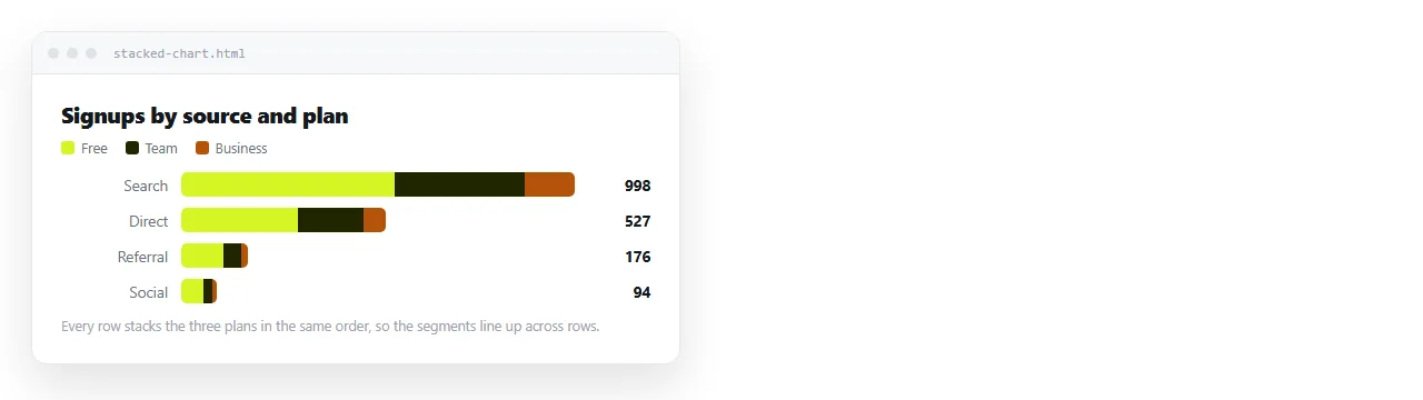
Stacked bars show composition inside each category. Each bar becomes a flex row and each segment gets a flex-basis of its share.
.stack { display: flex; width: var(--w); }
.stack > span { display: block; }
Keep the segment order the same in every bar. If the second segment is a different series in row three, the chart is unreadable even though it looks fine.
Grouped bars put two or three thin bars side by side per category. Past three series, the eye gives up and a small multiple set of separate charts reads better.
Labels, legends, and grey printing
Put the value at the end of the bar, not inside it. Inside works until a bar is short and the number overflows.
Use one colour for a single series. Multiple colours on a single-series chart suggests a meaning that is not there.
For multiple series, check the chart still reads printed in grey. Pair each colour with a different fill pattern or keep the lightness clearly separated, since hue alone fails for a meaningful share of readers.
Making it work on a phone
Horizontal bars handle narrow screens almost for free. The label column shrinks and the track shrinks with it.
Below about 500px, move the label above its bar instead of beside it. That buys the bar the full width of the screen.
Vertical bars usually need to become horizontal below the breakpoint. Confirm the viewport meta tag is in the head first, otherwise no media query fires as you expect.
Axis, gridlines, and how much to draw
A bar chart often needs no axis at all. If the value is printed at the end of every bar, an axis is repeating information.
Add gridlines when readers compare bars that are far apart on the page. Keep them faint, behind the bars, and space them at round numbers rather than at whatever divides evenly.
Skip the chart border and the background fill. Both are inherited habits from spreadsheet defaults and neither helps anyone read the data.
Label the unit once, in the heading above the chart. "Sessions, Q3 2026" is better than repeating the word on every row.
Share the HTML bar chart as a page, not a picture
Charts get revised. A picture of a chart does not.
- Open the file in the HTML file opener and check the bars and fonts survive outside your folder.
- Paste the HTML into a NOS document. It renders as its own page, styles included.
- Share, then Share link, then Create link. Leave it unlisted for internal figures.
- Send the link and update the page when the figures change.

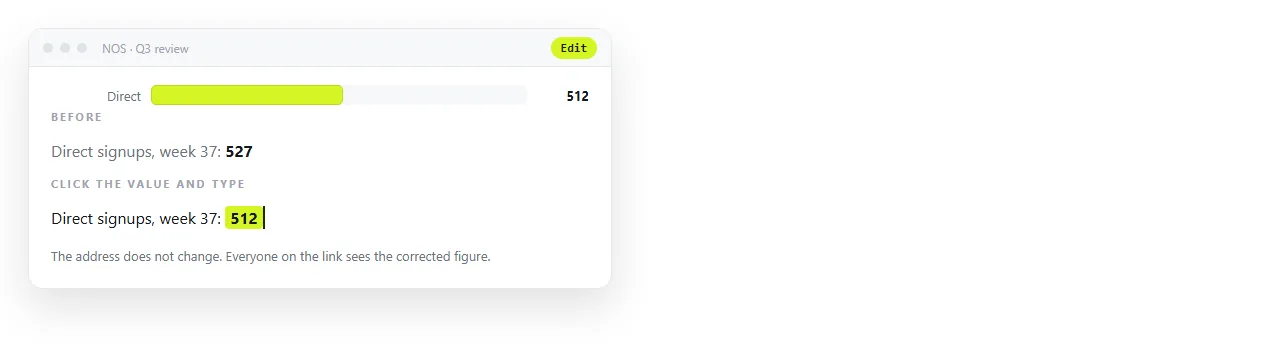
Because the address does not move, the link inside March's update still opens the current chart in June. That is the whole argument against a screenshot of a live page.
If the chart is one panel of a larger report, the same route applies to the whole thing. Client dashboards in HTML covers that case.
If an assistant wrote the chart
AI-generated bar charts are usually structurally fine and often scaled wrongly. Check two things.
First, divide by the maximum, not the total. Second, confirm the values in the markup match the values in your source, because a regenerated chart sometimes carries placeholder numbers.
Prompting for an HTML chart covers how to ask for a table-backed chart rather than a canvas one, which is what makes the output editable afterwards.
Before you send it
- Are bars scaled against the largest value rather than the sum?
- Does every bar start at zero?
- Is the numeric value present as text, not only as length?
- Does the chart read in greyscale?
- Is there a
<title>, and does the link need to stay unlisted?