To make a line chart in HTML without a library, draw it as inline SVG.
Each value becomes a point, one <path> connects the points, and <line> and <text> elements draw the gridlines and labels. A short script builds those elements from an array, so changing the data redraws the chart.
Here is the whole thing in one page. Change a number in data and the line moves.
<!doctype html>
<html lang="en">
<head>
<meta charset="utf-8">
<meta name="viewport" content="width=device-width, initial-scale=1">
<title>Line chart in plain SVG</title>
<style>
  body { margin: 0; padding: 14px; font-family: system-ui, sans-serif; background: #fff; color: #1d2330; }
  h3 { margin: 0 0 8px; font-size: 15px; }
  svg { display: block; width: 100%; max-width: 600px; height: auto; }  /* viewBox keeps the shape */
  .grid { stroke: #e5e7eb; }
  .axis text { font-size: 15px; fill: #5b6270; }
  .line { fill: none; stroke: #2a78d6; stroke-width: 2.5; stroke-linejoin: round; }
</style>
</head>
<body>
<h3>Visitors per month</h3>
<svg id="chart" viewBox="0 0 520 300" role="img" aria-label="Line chart of visitors per month, January to December"></svg>

<script>
  const data = [
    ['Jan', 120], ['Feb', 135], ['Mar', 128], ['Apr', 162], ['May', 190], ['Jun', 176],
    ['Jul', 210], ['Aug', 238], ['Sep', 221], ['Oct', 254], ['Nov', 281], ['Dec', 305],
  ];
  const W = 520, H = 300;
  const m = { top: 14, right: 16, bottom: 34, left: 46 };  // room for the axes
  const svg = document.getElementById('chart');

  // helper: make an SVG element with attributes
  function el(tag, attrs, parent) {
    const n = document.createElementNS('http://www.w3.org/2000/svg', tag);
    for (const k in attrs) n.setAttribute(k, attrs[k]);
    parent.appendChild(n);
    return n;
  }

  // scales: data value -> position inside the viewBox
  const yMax = 350;  // a round number above the largest value
  const x = (i) => m.left + i * (W - m.left - m.right) / (data.length - 1);
  const y = (v) => H - m.bottom - v / yMax * (H - m.top - m.bottom);  // SVG y grows downward

  // horizontal gridlines and y-axis labels
  const axis = el('g', { class: 'axis' }, svg);
  for (let v = 0; v <= yMax; v += 50) {
    el('line', { class: 'grid', x1: m.left, x2: W - m.right, y1: y(v), y2: y(v) }, axis);
    el('text', { x: m.left - 8, y: y(v) + 5, 'text-anchor': 'end' }, axis).textContent = v;
  }
  // x-axis labels, every other month so they do not collide
  data.forEach(([label], i) => {
    if (i % 2) return;
    el('text', { x: x(i), y: H - 10, 'text-anchor': 'middle' }, axis).textContent = label;
  });

  // the line: one path, "M" to the first point then "L" to each next point
  const d = data.map(([, v], i) => (i ? 'L' : 'M') + x(i) + ' ' + y(v)).join(' ');
  el('path', { class: 'line', d }, svg);
</script>
</body>
</html>
If your data is categories rather than a trend, a bar chart in HTML is the better form, and shares of a whole belong in a pie chart. A line says "this changed over time", so the x axis is almost always time.
From numbers to positions: the two scales
A scale is a function that turns a data value into a position in the SVG. A line chart needs two.
x(i)spreads the points evenly. Point 0 sits at the left margin, the last point at the right margin, and the rest share the space between.y(v)turns a value into a height. It divides the value by the top of the axis and multiplies by the plot height.
The catch is direction. In SVG, y = 0 is the top edge and y grows downward. If you place a value at y = value, rising numbers draw a falling line.
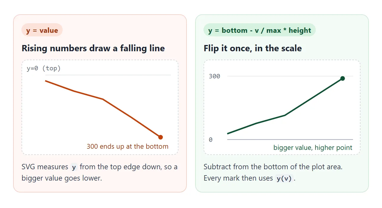
So the y scale subtracts from the bottom of the plot area:
const x = (i) => m.left + i * (W - m.left - m.right) / (data.length - 1);
const y = (v) => H - m.bottom - v / yMax * (H - m.top - m.bottom);
m holds the margins, the space the axis labels need. Every mark in the chart, including gridlines, dots and the tooltip, goes through these two functions, so the flip is written once.
Axes and gridlines
Gridlines are horizontal <line> elements at round values: 0, 50, 100 and so on. Each one gets a <text> label just left of the plot. Loop from 0 to the axis maximum in steps and call y(v) for both.
The axis maximum should be a round number above your largest value, not the largest value itself, or the top point touches the edge.
The finished example below picks it automatically: it divides the largest value by five, rounds that step up to 1, 2 or 5 times a power of ten, and rounds the maximum up to a whole number of steps.
Labels along the bottom are <text> elements at x(i) with text-anchor: middle. With twelve months on a narrow chart they collide, so the first example labels every other month.
| SVG element | Job in the chart | Key attributes |
|---|---|---|
<path> |
The line itself | d, fill: none, stroke |
<line> |
Gridlines and the hover guide | x1, y1, x2, y2 |
<text> |
Axis labels and series names | x, y, text-anchor |
<circle> |
The dot on the hovered point | cx, cy, r |
<g> |
A group to show or hide together | class, visibility |
Drawing the line: one path
The path's d attribute is a list of drawing commands. M x y moves the pen to the first point without drawing, and L x y draws a straight segment to the next one:
const d = data.map(([, v], i) => (i ? 'L' : 'M') + x(i) + ' ' + y(v)).join(' ');
Two style lines matter. fill: none stops the browser from filling the shape under the path, which is black by default. stroke-linejoin: round softens the corners where segments meet.
If a value is missing, do not draw a zero for it. End the segment and start the next one with a new M, so the reader sees a gap instead of a false dip.
Elements are created with document.createElementNS and the SVG namespace. A plain createElement('path') makes an HTML element that the browser does not draw. The short el() helper in the examples handles this. SVG in HTML covers inline SVG in more depth.
Responsive with viewBox
A chart written as width="600" height="300" keeps those pixels on a phone, so the page scrolls sideways or the right side is cut off.
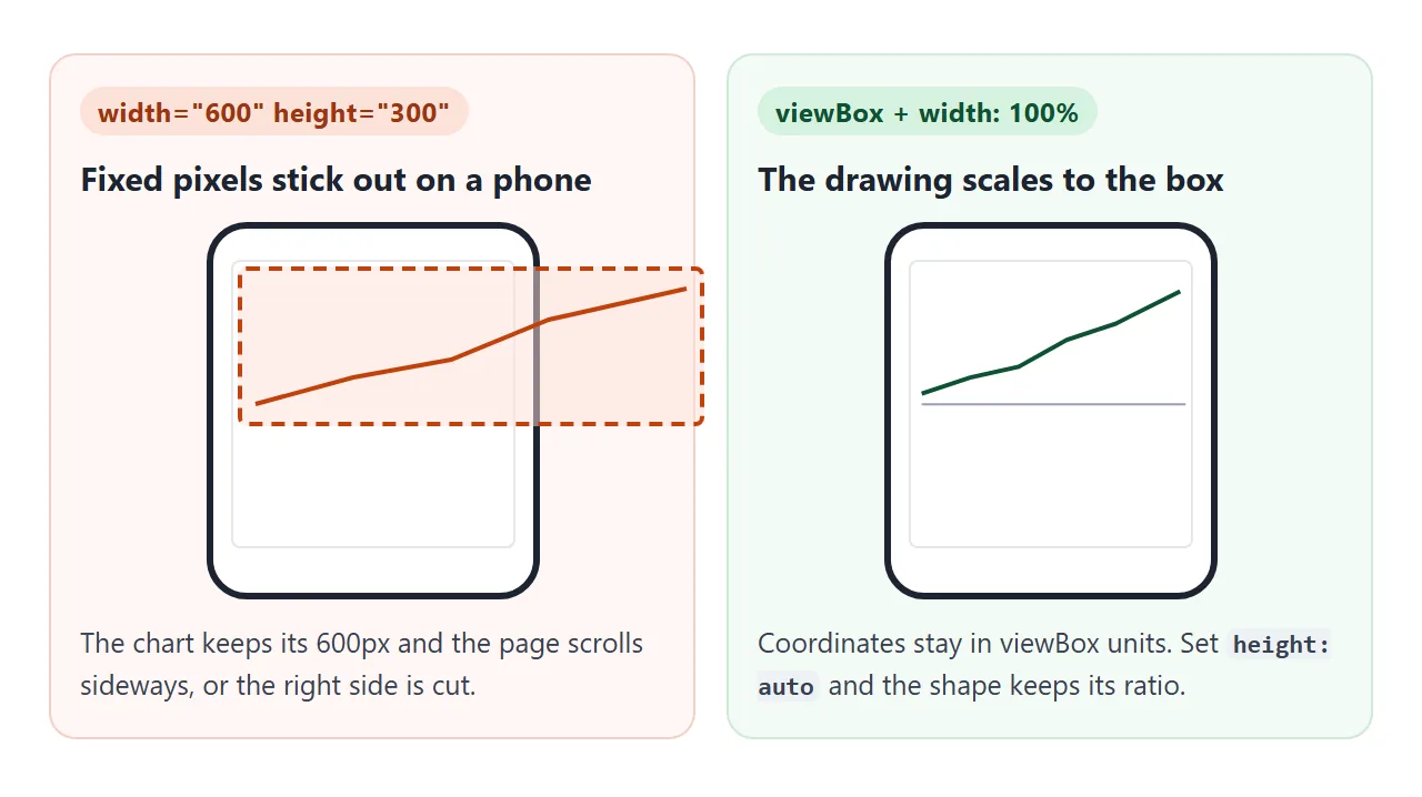
The fix is a viewBox. All coordinates are written in viewBox units, and the browser scales the drawing to whatever size CSS gives the element:
<svg viewBox="0 0 520 300" style="width: 100%; height: auto">
height: auto keeps the 520 by 300 shape.
The scaling applies to everything, including text and line widths. In the first example, the chart is 362px wide in a 390px phone viewport, so 15-unit labels draw at 10.4px (15 × 362 / 520). Scaling an SVG to fit covers the other viewBox settings.
When that shrinking is a problem, there are two options:
- Keep strokes steady:
vector-effect: non-scaling-strokeon the path keeps the line width in screen pixels at any size. - Redraw at the real size: set the
viewBoxto the element's own width and height and rebuild the chart when that changes. A ResizeObserver tells you when. The finished example below does this, so its 12px labels stay 12px on every screen.
A tooltip on hover
A tooltip turns the line into exact numbers. The usual pattern: the pointer moves anywhere over the chart, and a guide line, a dot and a small box jump to the nearest data point.
<!doctype html>
<html lang="en">
<head>
<meta charset="utf-8">
<meta name="viewport" content="width=device-width, initial-scale=1">
<title>Line chart with a hover tooltip</title>
<style>
  body { margin: 0; padding: 14px; font-family: system-ui, sans-serif; background: #fff; color: #1d2330; }
  h3 { margin: 0 0 8px; font-size: 15px; }
  .wrap { position: relative; max-width: 600px; }
  svg { display: block; width: 100%; height: auto; touch-action: pan-y; }  /* sideways finger = scrub */
  .grid { stroke: #e5e7eb; }
  .axis text { font-size: 15px; fill: #5b6270; }
  .line { fill: none; stroke: #2a78d6; stroke-width: 2.5; stroke-linejoin: round; }
  .guide { stroke: #9aa3b2; stroke-dasharray: 3 3; }
  .dot { fill: #2a78d6; stroke: #fff; stroke-width: 2; }
  .hover { visibility: hidden; }
  .tip {
    position: absolute; top: 0; pointer-events: none; visibility: hidden;
    padding: 6px 9px; border-radius: 6px; background: #1d2330; color: #fff;
    font-size: 13px; white-space: nowrap;
  }
</style>
</head>
<body>
<h3>Visitors per month <small style="font-weight:400;color:#5b6270">(hover or tap)</small></h3>
<div class="wrap">
  <svg id="chart" viewBox="0 0 520 300" role="img" aria-label="Line chart of visitors per month"></svg>
  <div class="tip" id="tip"></div>
</div>

<script>
  const data = [
    ['Jan', 120], ['Feb', 135], ['Mar', 128], ['Apr', 162], ['May', 190], ['Jun', 176],
    ['Jul', 210], ['Aug', 238], ['Sep', 221], ['Oct', 254], ['Nov', 281], ['Dec', 305],
  ];
  const W = 520, H = 300, m = { top: 14, right: 16, bottom: 34, left: 46 }, yMax = 350;
  const svg = document.getElementById('chart'), tip = document.getElementById('tip');
  const step = (W - m.left - m.right) / (data.length - 1);
  const x = (i) => m.left + i * step;
  const y = (v) => H - m.bottom - v / yMax * (H - m.top - m.bottom);

  function el(tag, attrs, parent) {
    const n = document.createElementNS('http://www.w3.org/2000/svg', tag);
    for (const k in attrs) n.setAttribute(k, attrs[k]);
    parent.appendChild(n);
    return n;
  }

  // same chart as before: gridlines, labels, line
  const axis = el('g', { class: 'axis' }, svg);
  for (let v = 0; v <= yMax; v += 50) {
    el('line', { class: 'grid', x1: m.left, x2: W - m.right, y1: y(v), y2: y(v) }, axis);
    el('text', { x: m.left - 8, y: y(v) + 5, 'text-anchor': 'end' }, axis).textContent = v;
  }
  data.forEach(([label], i) => {
    if (i % 2 === 0) el('text', { x: x(i), y: H - 10, 'text-anchor': 'middle' }, axis).textContent = label;
  });
  el('path', { class: 'line', d: data.map(([, v], i) => (i ? 'L' : 'M') + x(i) + ' ' + y(v)).join(' ') }, svg);

  // hover layer: a dashed guide and a dot, hidden until the pointer is on the chart
  const hover = el('g', { class: 'hover' }, svg);
  const guide = el('line', { class: 'guide', y1: m.top, y2: H - m.bottom }, hover);
  const dot = el('circle', { class: 'dot', r: 6 }, hover);

  function show(e) {
    // screen pixels -> viewBox units, whatever size the SVG is drawn at
    const p = new DOMPoint(e.clientX, e.clientY).matrixTransform(svg.getScreenCTM().inverse());
    const i = Math.max(0, Math.min(data.length - 1, Math.round((p.x - m.left) / step)));  // nearest month
    const [label, v] = data[i];
    guide.setAttribute('x1', x(i)); guide.setAttribute('x2', x(i));
    dot.setAttribute('cx', x(i)); dot.setAttribute('cy', y(v));
    hover.style.visibility = 'visible';

    // place the HTML tooltip above the dot, kept inside the chart box
    tip.textContent = label + ': ' + v + ' visitors';
    tip.style.visibility = 'visible';
    const s = svg.clientWidth / W;  // viewBox unit -> CSS pixel
    const left = Math.min(Math.max(x(i) * s - tip.offsetWidth / 2, 0), svg.clientWidth - tip.offsetWidth);
    tip.style.left = left + 'px';
    tip.style.top = Math.max(y(v) * s - tip.offsetHeight - 12, 0) + 'px';
  }
  function hide() { hover.style.visibility = 'hidden'; tip.style.visibility = 'hidden'; }

  svg.addEventListener('pointermove', show);
  svg.addEventListener('pointerdown', show);  // a tap on a phone
  // touch has no hover: leave fires right after a tap, so only hide for mouse and pen
  svg.addEventListener('pointerleave', (e) => { if (e.pointerType !== 'touch') hide(); });
</script>
</body>
</html>
The work is converting the pointer position into chart units. clientX is measured from the window in CSS pixels, while the chart is drawn in viewBox units at some scale.
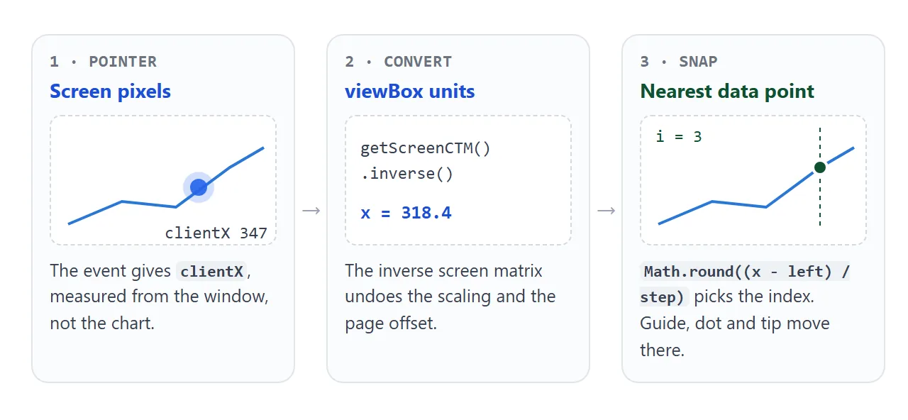
getScreenCTM() returns the matrix that maps SVG units to the screen. Its inverse maps the pointer back:
const p = new DOMPoint(e.clientX, e.clientY)
  .matrixTransform(svg.getScreenCTM().inverse());
const i = Math.round((p.x - m.left) / step);  // clamp it to 0 .. length - 1
The tooltip itself is an HTML <div> placed over the SVG, not an SVG element.
A div wraps text and takes padding and a background without extra work. Keep it inside the chart box by clamping its left between zero and the box width minus its own width.
Phones need three details.
Listen for pointerdown too, so a tap shows the tooltip. Put touch-action: pan-y on the SVG, so a sideways drag scrubs through the points while a vertical swipe still scrolls the page.
Do not hide the tooltip on pointerleave for touch: the browser fires it as soon as the finger lifts, so the tooltip would vanish right after the tap.
Several series in one chart
More lines means one path per series, all drawn with the same scales. Compute the axis maximum from every series that is shown, so no line runs off the top.
<!doctype html>
<html lang="en">
<head>
<meta charset="utf-8">
<meta name="viewport" content="width=device-width, initial-scale=1">
<title>Multi-series line chart</title>
<style>
  body { margin: 0; padding: 14px; font-family: system-ui, sans-serif; background: #fff; color: #1d2330; }
  h3 { margin: 0 0 8px; font-size: 15px; }
  .legend { display: flex; flex-wrap: wrap; gap: 6px; margin-bottom: 8px; }
  .legend button {
    display: flex; align-items: center; gap: 6px; padding: 5px 10px; border-radius: 99px;
    border: 1px solid #d5d9e0; background: #fff; font: 13px system-ui, sans-serif; color: #1d2330; cursor: pointer;
  }
  .legend button[aria-pressed="false"] { opacity: .45; }
  .legend i { width: 14px; height: 3px; border-radius: 2px; }
  .wrap { position: relative; }
  svg { display: block; width: 100%; height: 300px; touch-action: pan-y; }
  .grid { stroke: #e5e7eb; }
  svg text { font-size: 12px; fill: #5b6270; }
  .line { fill: none; stroke-width: 2; stroke-linejoin: round; }
  .guide { stroke: #9aa3b2; stroke-dasharray: 3 3; }
  .tip {
    position: absolute; top: 0; pointer-events: none; visibility: hidden;
    padding: 7px 10px; border-radius: 6px; background: #1d2330; color: #fff; font-size: 13px; line-height: 1.5;
  }
  .tip i { display: inline-block; width: 9px; height: 9px; border-radius: 50%; margin-right: 6px; }
</style>
</head>
<body>
<h3>Sign-ups per week, by channel</h3>
<div class="legend" id="legend"></div>
<div class="wrap">
  <svg id="chart" role="img" aria-label="Line chart of weekly sign-ups for three channels"></svg>
  <div class="tip" id="tip"></div>
</div>

<script>
  const weeks = ['W1', 'W2', 'W3', 'W4', 'W5', 'W6', 'W7', 'W8', 'W9', 'W10'];
  const series = [
    { name: 'Search', color: '#2a78d6', values: [42, 48, 51, 49, 58, 63, 61, 70, 76, 81] },
    { name: 'Social', color: '#eb6834', values: [30, 36, 44, 39, 35, 47, 52, 49, 45, 54] },
    { name: 'Email',  color: '#1baf7a', values: [18, 17, 22, 26, 24, 29, 27, 33, 38, 36] },
  ];
  series.forEach((s) => (s.on = true));
  const svg = document.getElementById('chart'), tip = document.getElementById('tip');
  const m = { top: 12, right: 58, bottom: 28, left: 38 };  // right margin holds the end labels
  let W, H, x, y, step, guide, dots;

  function el(tag, attrs, parent) {
    const n = document.createElementNS('http://www.w3.org/2000/svg', tag);
    for (const k in attrs) n.setAttribute(k, attrs[k]);
    parent.appendChild(n);
    return n;
  }

  // a round tick step (1, 2, 5, 10, 20, 50 ...) that gives about 5 gridlines
  function niceStep(max) {
    const raw = max / 5, p = 10 ** Math.floor(Math.log10(raw));
    return [1, 2, 5, 10].map((k) => k * p).find((s) => s >= raw);
  }

  function draw() {
    // the viewBox matches the real size, so 12px text stays 12px on any screen
    W = svg.clientWidth; H = svg.clientHeight;
    svg.setAttribute('viewBox', `0 0 ${W} ${H}`);
    svg.textContent = '';

    const shown = series.filter((s) => s.on);
    const max = Math.max(1, ...shown.flatMap((s) => s.values));  // all series share one y scale
    const t = niceStep(max), yMax = Math.ceil(max / t) * t;
    step = (W - m.left - m.right) / (weeks.length - 1);
    x = (i) => m.left + i * step;
    y = (v) => H - m.bottom - v / yMax * (H - m.top - m.bottom);

    for (let v = 0; v <= yMax; v += t) {
      el('line', { class: 'grid', x1: m.left, x2: W - m.right, y1: y(v), y2: y(v) }, svg);
      el('text', { x: m.left - 6, y: y(v) + 4, 'text-anchor': 'end' }, svg).textContent = v;
    }
    const every = Math.ceil(36 / step);  // skip labels when weeks are closer than 36px
    weeks.forEach((w, i) => {
      if (i % every === 0) el('text', { x: x(i), y: H - 8, 'text-anchor': 'middle' }, svg).textContent = w;
    });

    shown.forEach((s) => {
      el('path', { class: 'line', stroke: s.color, d: s.values.map((v, i) => (i ? 'L' : 'M') + x(i) + ' ' + y(v)).join(' ') }, svg);
      const last = s.values.length - 1;  // direct label at the end of the line
      el('text', { x: x(last) + 6, y: y(s.values[last]) + 4, 'font-weight': 600 }, svg).textContent = s.name;
    });
    guide = el('line', { class: 'guide', y1: m.top, y2: H - m.bottom, visibility: 'hidden' }, svg);
    dots = shown.map((s) => el('circle', { r: 5, fill: s.color, stroke: '#fff', 'stroke-width': 2, visibility: 'hidden' }, svg));
  }

  function show(e) {
    const r = svg.getBoundingClientRect();
    const i = Math.max(0, Math.min(weeks.length - 1, Math.round((e.clientX - r.left - m.left) / step)));
    const shown = series.filter((s) => s.on);
    guide.setAttribute('x1', x(i)); guide.setAttribute('x2', x(i)); guide.setAttribute('visibility', 'visible');
    dots.forEach((d, k) => {
      d.setAttribute('cx', x(i)); d.setAttribute('cy', y(shown[k].values[i])); d.setAttribute('visibility', 'visible');
    });
    // one tooltip lists every visible series at that week, largest first
    tip.innerHTML = '<b>' + weeks[i] + '</b><br>' + shown
      .slice().sort((a, b) => b.values[i] - a.values[i])
      .map((s) => `<i style="background:${s.color}"></i>${s.name}: ${s.values[i]}`).join('<br>');
    tip.style.visibility = 'visible';
    const gap = 14, right = x(i) + gap + tip.offsetWidth <= W;  // flip to the left near the edge
    tip.style.left = (right ? x(i) + gap : x(i) - gap - tip.offsetWidth) + 'px';
    tip.style.top = m.top + 'px';
  }
  function hide() {
    tip.style.visibility = 'hidden';
    guide.setAttribute('visibility', 'hidden');
    dots.forEach((d) => d.setAttribute('visibility', 'hidden'));
  }
  svg.addEventListener('pointermove', show);
  svg.addEventListener('pointerdown', show);
  svg.addEventListener('pointerleave', (e) => { if (e.pointerType !== 'touch') hide(); });

  // legend buttons turn a series on and off; colors stay tied to the series
  const legend = document.getElementById('legend');
  series.forEach((s) => {
    const b = document.createElement('button');
    b.setAttribute('aria-pressed', 'true');
    b.innerHTML = `<i style="background:${s.color}"></i>${s.name}`;
    b.addEventListener('click', () => {
      if (s.on && series.filter((t) => t.on).length === 1) return;  // keep at least one line
      s.on = !s.on;
      b.setAttribute('aria-pressed', s.on);
      draw(); hide();
    });
    legend.appendChild(b);
  });

  new ResizeObserver(draw).observe(svg);  // redraw when the box changes width
</script>
</body>
</html>
What this version adds:
- A legend and end labels. With more than one line, readers need to know which is which without relying on colour alone. The name also sits at the right end of each line.
- A fixed colour per series. The colour belongs to the series, so hiding one line does not repaint the others.
- One tooltip for all lines. It lists each visible series at the hovered week, largest first, and flips to the left of the guide near the right edge.
- Rescaling on toggle. Turning off the two larger series lets the y axis shrink to fit the remaining line.
Keep one y axis. Two lines measured in different units, such as visitors and revenue, read better as two charts stacked with the same x axis.
A library earns its place when you need zooming, time axes with real dates, or thousands of points. Plotly.js is one option that covers those out of the box.
When it does not work
| What you see | Cause | Fix |
|---|---|---|
| A black filled shape instead of a line | A path's default fill is black | fill: none and a stroke on the path |
| The line goes down when numbers go up | SVG y grows downward | Subtract from the bottom in y(v) |
| Nothing is drawn, but the elements exist | Created with createElement |
Use createElementNS with the SVG namespace |
| The chart sticks out on a phone | Fixed width and height in pixels |
Add a viewBox, set width: 100% and height: auto |
| Labels are tiny on a phone | The viewBox scales text with the drawing | Larger text units, or redraw at the real size |
| The tooltip points at the wrong month | Pointer pixels used as viewBox units | Convert with getScreenCTM().inverse() |
| The tooltip flashes and disappears on tap | pointerleave fires when the finger lifts |
Skip hiding when pointerType is touch |
| The top point touches the edge | Axis maximum equals the largest value | Round the maximum up to the next tick |
Share it as a link
A line chart with a tooltip is meant to be explored, and a screenshot freezes it at one hover state. An attached .html file may open as code, or not at all, on the other person's phone.
To send the working chart, paste the page into a NOS document and choose Create share link. HTML to link walks through it.
The page renders as written and its script runs, so the people you send it to can hover and tap the points themselves. When the numbers change, update the code and the same link shows the new chart.