Charting libraries produce something impressive on a laptop. Two corrections make it usable for everyone else.
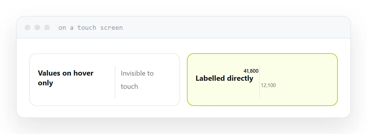
Hover is not a feature on a phone
Interactive charts put the values in a tooltip that appears when the pointer is over a point.
On a touch screen there is no hover. Tapping sometimes shows the tooltip and sometimes selects, zooms or does nothing, and it is never obvious that the information exists.
So anything essential has to be on the chart itself: label the final point of each line, mark the maximum and minimum, put the axis values where they can be read. Treat the tooltip as extra detail for people with a pointer, never as the only route to the numbers.
| Element | Where it must be |
|---|---|
| Key values | On the chart |
| Series names | Beside the lines, not in a legend |
| Units | On the axis |
| The finding | In the title |
| Full figures | A table underneath |
| Extra detail | Tooltip, optionally |
Weight
A full charting library is frequently the largest thing on the page, larger than every image combined.
Most offer a reduced build containing only the chart types you actually use, which is often a fraction of the size. For one chart on one page, that difference is the page feeling instant rather than slow.
If the chart is a single static comparison, consider whether it needs to be interactive at all. An image of a chart with a table underneath loads immediately and works everywhere.
Put the data in the page
For a fixed dataset, write the numbers into the page.
One request instead of two, no chance of the chart failing because a data file was unavailable, and the page works from a folder with no server.
Load data separately only when it genuinely changes, and then show something sensible while it arrives rather than an empty rectangle.
The title does the work
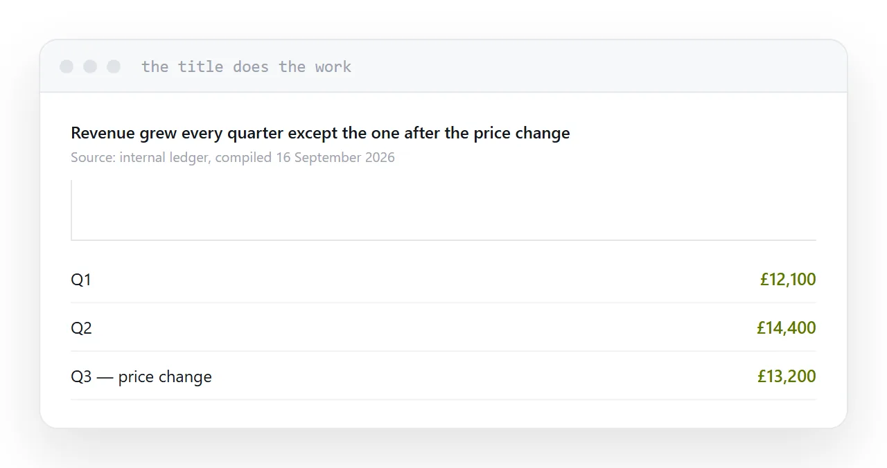
Most chart titles name the variables: "Revenue by quarter, 2024-2026".
That describes the axes, which the reader can already see. Write the finding instead: "Revenue grew every quarter except the one after the price change". Then the chart is evidence for a statement rather than a puzzle.
Add the source and the date it was compiled. A chart without a date is untrustworthy within six months.
The table underneath
Always include it.
It is the only route to the numbers for anyone using a screen reader. It is what search engines can read. It is what somebody copies when they want to use your figure. And it is what makes the chart verifiable rather than decorative.
Two neighbouring cases are worth a look: How to share an interactive chart and How to share a Plotly export.
Put it at an address
Put the key values on the chart rather than in a tooltip, use a reduced library build, state the finding in the title, include the figures as a table, and test the whole thing on a phone.