An interactive chart at an address keeps its tooltips, its zoom and the data behind it. A screenshot keeps none of that, and sometimes a screenshot is still the right answer.
This guide covers when interactivity earns its place, what breaks on touch, and labelling the point.
Interactivity is for the reader's questions
The honest test is whether the reader has a question of their own.
An analyst exploring a dataset needs to zoom, filter and hover. Interactivity is the whole value, and a static image is useless to them.
A client being shown one finding does not have a question yet. They have your conclusion, and the fastest way to deliver it is an image with the conclusion written on it.
Most charts shared in business are the second case dressed up as the first. Interactivity gets added because it is available, and the reader ends up hunting for a number you already knew you wanted them to see.
| Static labelled image | Interactive chart | |
|---|---|---|
| Reader has their own question | Useless | Essential |
| You are making one point | Faster | Slower |
| Works on any device | Yes | Awkward on touch |
| Works in a slide deck | Yes | Flattened |
| Reader can check the data | No | Yes |
Touch removes hover
This is the failure people do not anticipate, because they test on a laptop.
Tooltips that appear on hover have no touch equivalent. On a phone the values they carried are simply not reachable. A chart whose numbers only exist in tooltips is, on a phone, a picture with no numbers.
If phone readers matter, make values reachable by tap, or label the important ones directly on the chart, or provide a table underneath. Any of those; not none of them.
Pinch-zoom on a chart also competes with scrolling the page, and readers regularly find themselves stuck inside a chart they cannot scroll past.
Label the conclusion
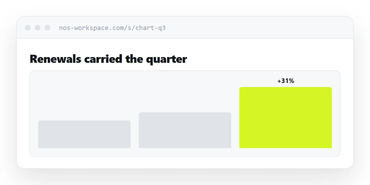
Whatever else the chart does, the point should be readable without touching anything.
The bar that matters, annotated. The number written on it. A line of text above the chart stating the finding in words.
Interactivity is for the detail behind the conclusion, not for the conclusion itself. A reader who has to explore to find out what you meant will mostly not bother.
Give them the data
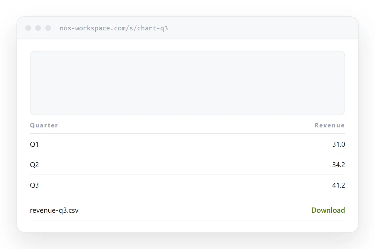
If the audience includes anyone analytical, put a download link under the chart.
They will want it. Without the link they either ask you by email, costing a day, or retype figures from the picture, which produces errors that get attributed to you.
A small comma-separated file under the chart removes both problems.
Decks flatten it anyway
Pasting an interactive chart into a slide deck produces an image. That is fine; the deck is a presentation, not an exploration tool.
Print the address next to the image so anyone who wants to look properly can. During the presentation the image does the work; afterwards the address does.
Two neighbouring cases are worth a look: How to share a Plotly export and How to share an HTML dashboard as a link.
Put it at an address
Label the conclusion on the chart, make values reachable without hover, offer the data underneath, publish at an address rather than as an attachment, and print the address beside images in decks.
Then the reader gets the point immediately and the detail if they want it.