A Plotly figure exports to a single HTML file that keeps its zoom, pan and tooltips. Put that file at an address and a colleague opens a working chart with no Python at all.
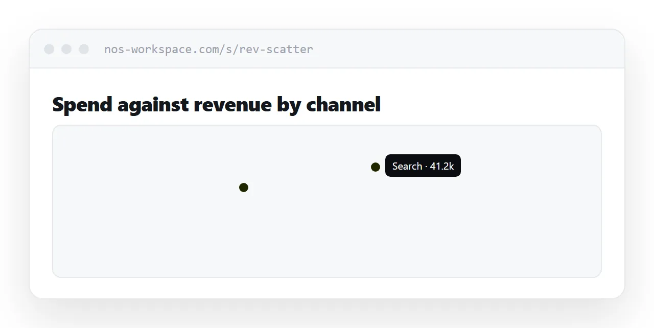
This guide covers the export, file size, and why emailing it fails.
The export is self-contained
import plotly.express as px
fig = px.scatter(df, x='spend', y='revenue', color='channel')
fig.write_html('revenue.html')
That file contains the chart definition, the data and the plotting library. Open it in any browser and the chart works: zoom, pan, hover, legend toggles, the lot.
No Python, no packages, no notebook server. That is what makes it the right artefact to hand to someone who is not a data person.
Size, and the trade behind it
The bundled library is a few megabytes, which surprises people the first time.
fig.write_html('revenue.html', include_plotlyjs='cdn')
That option references the library from a network source instead. The file drops to a fraction of the size and now requires a connection to open.
Bundle it when the reader might be offline, on a plane, or behind a restrictive network. Reference it when the file is going at an address and size matters.
| Bundled library | Referenced library | |
|---|---|---|
| File size | Several MB | Small |
| Works offline | Yes | No |
| Works behind a strict firewall | Yes | Sometimes not |
| Good for | Emailing, archiving | Publishing at an address |
Do not email it
This is where most attempts fail, and the failure is confusing.
Mail scanners treat HTML attachments as a risk. They strip them, quarantine them, or rewrite them into something that no longer runs. The sender sees a message in their sent folder and assumes it arrived.
What sometimes survives is worse: the file opens as raw markup, and the recipient sees a wall of code and concludes something is broken.
Put it at an address and send the address. The reader taps and sees a chart.
A chart is not a finding
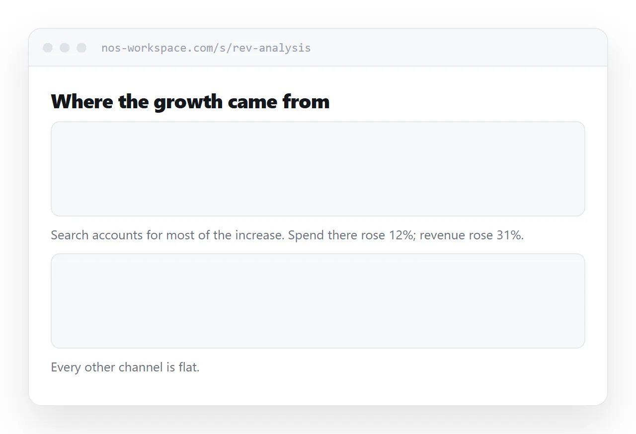
An exported figure on its own leaves the reader to work out what they are looking at and why it matters.
Put a title on it, a sentence above it saying what it shows, and a sentence below saying what you concluded. Three lines of context turn a chart into a piece of analysis.
For several figures, put them on one page in the order of the argument, with commentary between them. That is a report. A folder of exports is raw material.
Mobile is awkward, honestly
The export opens on a phone and the interactions do not translate.
Hover tooltips have no touch equivalent, so the values are simply unavailable. Pinch-zoom on the chart competes with scrolling the page, and readers regularly get stuck.
If the audience is likely to be on a phone, include a static image of the chart with the key values labelled, and keep the interactive version for the desktop readers who will actually use it.
For the surrounding ground, see How to share a Jupyter notebook as a link and How to share an HTML dashboard as a link.
Put it at an address
Export to a single file, choose bundling based on where it opens, publish it at an address rather than emailing it, and surround it with enough words to make it a finding.
Then the chart is still a chart when it reaches the person who needs it.