A dashboard is built for somebody who explores data. Most of a team does not, and they are the people the numbers were supposed to reach.
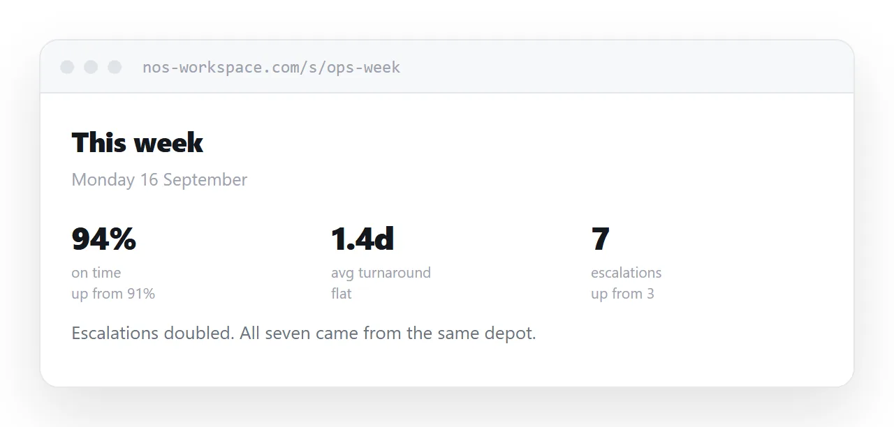
This guide covers why the tool does not reach people, what to publish instead, and the screenshot problem.
Why nobody opens it
Three barriers, each small, together decisive.
A login. Another password, sometimes another application.
An unfamiliar tool. Opened rarely enough that every visit involves relearning it.
Too much. Twenty charts, of which two concern this person, and they have to know which two.
None of that is a criticism of the dashboard. It is the correct shape for an analyst and the wrong shape for a project manager checking one thing between meetings.
Screenshots go stale silently
The common workaround is pasting a screenshot into a chat channel.
It reaches people, which is genuinely better than nothing. And it has no date, no context, and no way of knowing it has aged.
Three weeks later somebody scrolls back, finds it, and quotes it as current. There is nothing about the image that says otherwise.
| Tool link | Screenshot in chat | Summary page | |
|---|---|---|---|
| Reaches non-analysts | No | Yes | Yes |
| Stays current | Yes | No | Yes |
| Dated | Yes | No | Yes |
| Shows only what matters | No | Yes | Yes |
| Explorable | Yes | No | Via a link |
Publish the few numbers
Pick the numbers that matter to this audience. Usually three to five.
For each: the figure, the direction it moved, and a short line saying what that means. A number without interpretation is not information, and interpretation is the part a dashboard cannot supply.
Put the date at the top. Put a link to the full dashboard at the bottom for anyone who wants to explore, so the analysts are served without routing everyone else through a tool.
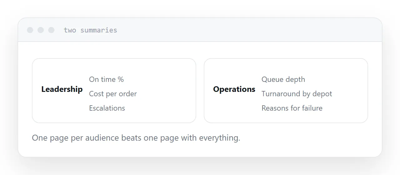
Different audiences, different pages
The leadership number is not the operations number.
One page per audience, each with its own few figures, works better than one page with everything. It takes slightly more effort and it is the difference between a page people read and a page people mean to read.
A rhythm people can rely on
Monday morning. The first of the month. Whatever it is, keep it.
Reliability is what makes something get read. A page updated irregularly produces questions about whether the numbers are current, which is more work than not having the page.
If the underlying data updates continuously, say so on the page, and put the date and time of the last refresh where it can be seen.
Closely related: How to share an HTML dashboard as a link, and How to share a Power BI report outside your organisation for the adjacent problem.
Put it at an address
Choose the few numbers that matter, state the direction and what it means, publish at a dated address, link the tool for the explorers, and update on a fixed rhythm.
Then the numbers reach the people who were never going to open the dashboard.