ApexCharts is a JavaScript library that draws charts as SVG. "Angular" here means the Angular framework, which is what the search "apexcharts angular" is about. In a single HTML file you do not need it: a script tag, a <div> and render() make a chart.
Try it. Hover a bar, or open the menu in the top right corner.
<!doctype html>
<html lang="en">
<head>
<meta charset="utf-8">
<meta name="viewport" content="width=device-width, initial-scale=1">
<title>ApexCharts bar chart</title>
<style>
  body { margin: 0; padding: 16px; font-family: system-ui, sans-serif; background: #fff; }
  #chart { max-width: 640px; margin: 0 auto; }  /* the chart fills this box's width */
</style>
</head>
<body>
<div id="chart"></div>

<!-- 1. load ApexCharts (pinned version) before your own script -->
<script src="https://cdn.jsdelivr.net/npm/apexcharts@7.6.1/dist/apexcharts.min.js"></script>

<!-- 2. the div above exists by now, so the chart can be drawn into it -->
<script>
  const options = {
    chart: { type: 'bar', height: 280 },            // set a height, width defaults to 100%
    series: [{ name: 'Orders', data: [12, 19, 7, 15, 22] }],
    xaxis: { categories: ['Mon', 'Tue', 'Wed', 'Thu', 'Fri'] }
  };

  const chart = new ApexCharts(document.querySelector('#chart'), options);
  chart.render();                                   // nothing is drawn until render()
</script>
</body>
</html>
The library comes from a CDN and the data sits in the page, so one file is all there is to send.
The three parts, and the order they load in
Every ApexCharts chart is the same three things: a place, a recipe and a start button.
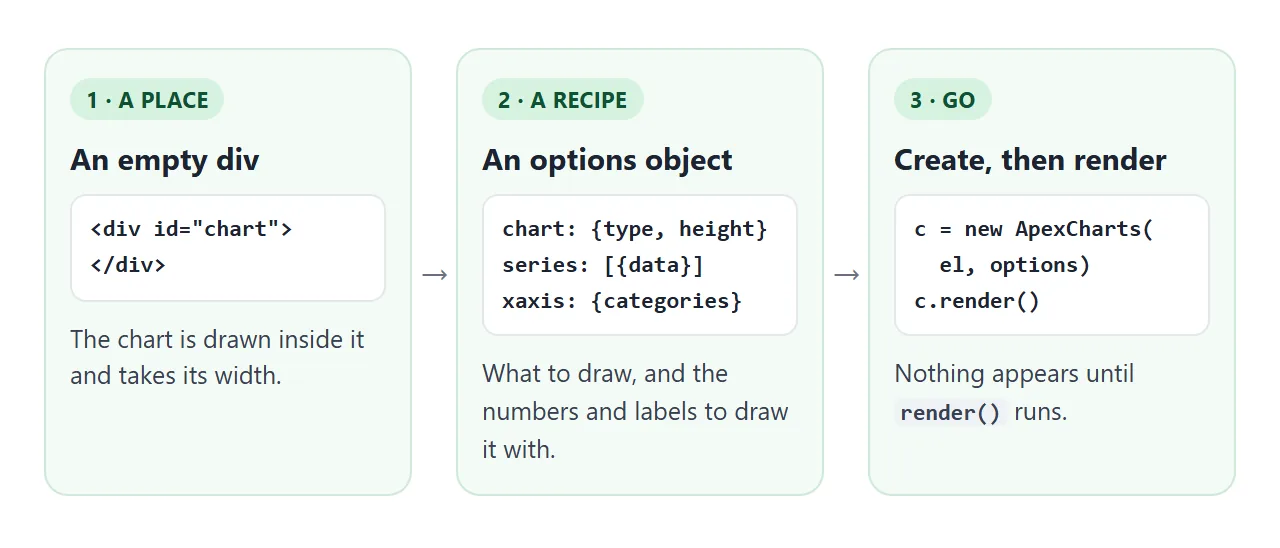
- An empty
<div>. The chart is drawn inside it and takes its width, which is 100% by default. - An options object.
chart.typepicks bar, line, area or donut.seriesholds the numbers.xaxis.categoriesholds the labels under them. new ApexCharts(element, options), thenrender(). The constructor only prepares the chart.render()draws it.
The order of the tags matters too. The browser reads the page from top to bottom, so the library has to load before your script, and the div has to exist before your script asks for it.
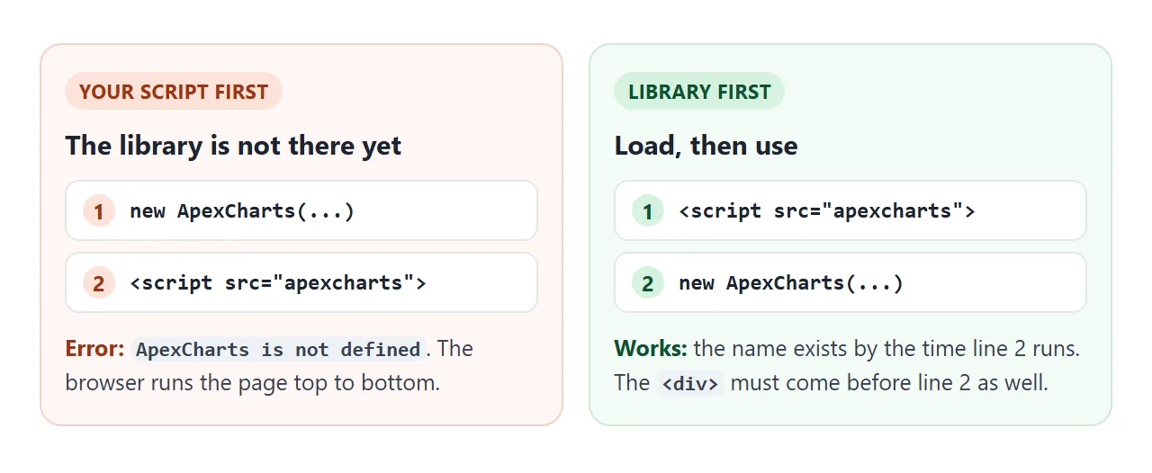
If your script has to sit in the <head>, wrap the three lines in a DOMContentLoaded listener so the div exists by the time they run.
Angular or one file: which one runs
Angular users meet ApexCharts through the ng-apexcharts package. Its documentation shows the install command and a component that uses the apx-chart tag:
ng add ng-apexcharts
import { ChartComponent } from 'ng-apexcharts';

@Component({
  selector: 'app-chart',
  imports: [ChartComponent],
  template: '<apx-chart [series]="series" [chart]="chart" />',
})
export class MyChart {
  chart = { type: 'line' as const, height: 350 };
  series = [{ name: 'Revenue', data: [10, 41, 35, 51] }];
}
That code is for an Angular project. TypeScript has to be compiled and the Angular build has to produce the files you host. A plain HTML page cannot run it.
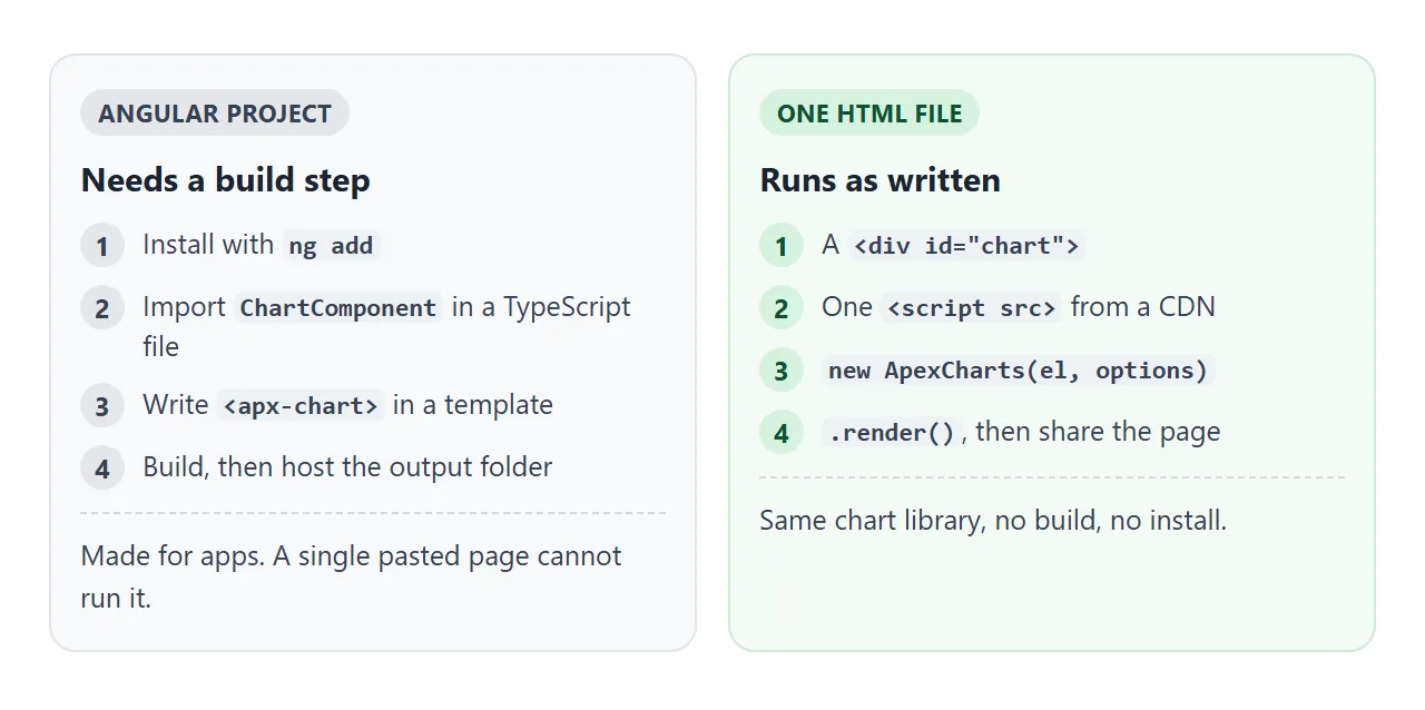
The options object in the Angular example, chart and series, has the same shape as the one in the first example. If you know one, you know the other. For one chart on one page, the single file is the shorter path.
Changing the chart after it is drawn
Do not call new ApexCharts again on the same div. Keep the chart in a variable and tell it what changed.
<!doctype html>
<html lang="en">
<head>
<meta charset="utf-8">
<meta name="viewport" content="width=device-width, initial-scale=1">
<title>Update an ApexCharts chart</title>
<style>
  body { margin: 0; padding: 16px; font-family: system-ui, sans-serif; background: #fff; color: #1d2330; }
  .wrap { max-width: 640px; margin: 0 auto; }
  form, .row { display: flex; flex-wrap: wrap; gap: 8px; margin: 0 0 10px; }
  input, button { font: inherit; padding: 7px 10px; border: 1px solid #cbd2dc; border-radius: 8px; background: #fff; }
  input { width: 90px; }
  button { cursor: pointer; }
  button.primary { background: #2563eb; border-color: #2563eb; color: #fff; }
  #status { font-size: 14px; color: #4b5563; margin: 4px 0 0; }
</style>
</head>
<body>
<div class="wrap">
  <form id="add">
    <input id="label" placeholder="Label" value="Sat" aria-label="Label">
    <input id="value" type="number" placeholder="Value" value="9" aria-label="Value">
    <button class="primary">Add point</button>
  </form>
  <div class="row">
    <button id="random" type="button">Randomize values</button>
    <button id="type" type="button">Switch to line</button>
  </div>
  <div id="chart"></div>
  <p id="status"></p>
</div>

<script src="https://cdn.jsdelivr.net/npm/apexcharts@7.6.1/dist/apexcharts.min.js"></script>
<script>
  const labels = ['Mon', 'Tue', 'Wed', 'Thu', 'Fri'];
  const values = [12, 19, 7, 15, 22];
  let type = 'bar';

  const chart = new ApexCharts(document.querySelector('#chart'), {
    chart: { type, height: 260, toolbar: { show: false } },
    series: [{ name: 'Orders', data: values }],
    xaxis: { categories: labels }
  });
  chart.render();

  function status() {
    document.getElementById('status').textContent = values.length + ' points, ' + type + ' chart';
  }
  status();

  // series AND labels change together: one updateOptions call
  document.getElementById('add').addEventListener('submit', (e) => {
    e.preventDefault();                              // handled here, nothing is sent anywhere
    labels.push(document.getElementById('label').value || '?');
    values.push(Number(document.getElementById('value').value) || 0);
    chart.updateOptions({ series: [{ name: 'Orders', data: values }], xaxis: { categories: labels } });
    status();
  });

  // only the numbers change: updateSeries is enough
  document.getElementById('random').addEventListener('click', () => {
    for (let i = 0; i < values.length; i++) values[i] = Math.round(Math.random() * 25);
    chart.updateSeries([{ name: 'Orders', data: values }]);
  });

  // any other option: updateOptions merges it into the existing config
  document.getElementById('type').addEventListener('click', (e) => {
    type = type === 'bar' ? 'line' : 'bar';
    chart.updateOptions({ chart: { type } });
    e.target.textContent = 'Switch to ' + (type === 'bar' ? 'line' : 'bar');
    status();
  });
</script>
</body>
</html>
updateSeries(newSeries)replaces the numbers. Use it when only the data changes.updateOptions(newOptions)merges new settings into the existing ones. The documentation recommends it when the series and other options change together, such as a new value and its new label.destroy()removes the chart and its event handlers, so a fresh one can take its place.
The form in the example is handled inside the page. Its submit listener calls preventDefault() and nothing is sent to a server.
Height, the toolbar and the licence
If you leave out chart.height, the default is 'auto', a golden-ratio shape. In a 600 pixel wide box the test chart came out 372 pixels tall. Set a height you choose, as the examples do.
The toolbar menu in the top right is on by default. In the tests its menu offered Download SVG, Download PNG and Download CSV. Turn the toolbar off with toolbar: { show: false } when you want a plain chart.
ApexCharts has a free Community License and paid licences, decided by the size of the organization using it. This page does not give legal advice, so read the licence page for your own case before you publish.
A finished example: an orders dashboard
The same pieces make a small dashboard: an area chart with a range switch, a donut chart and a table of the same numbers.
<!doctype html>
<html lang="en">
<head>
<meta charset="utf-8">
<meta name="viewport" content="width=device-width, initial-scale=1">
<title>Orders dashboard</title>
<style>
  * { box-sizing: border-box; }
  body { margin: 0; padding: 16px; font-family: system-ui, sans-serif; background: #f4f5f7; color: #1d2330; }
  .wrap { max-width: 760px; margin: 0 auto; }
  h1 { font-size: 18px; margin: 0 0 10px; }
  .grid { display: grid; grid-template-columns: 3fr 2fr; gap: 12px; }
  .card { background: #fff; border-radius: 12px; padding: 12px 14px; box-shadow: 0 1px 4px rgba(0,0,0,.08); min-width: 0; }
  .card h2 { font-size: 14px; margin: 0 0 4px; color: #4b5563; font-weight: 600; }
  .big { font-size: 26px; font-weight: 700; }
  .btns { display: flex; gap: 6px; margin: 6px 0; }
  .btns button { font: inherit; font-size: 13px; padding: 5px 10px; border: 1px solid #cbd2dc; border-radius: 99px; background: #fff; cursor: pointer; }
  .btns button.on { background: #2563eb; border-color: #2563eb; color: #fff; }
  table { width: 100%; border-collapse: collapse; font-size: 13px; margin-top: 8px; }
  th, td { text-align: left; padding: 4px 0; border-bottom: 1px solid #e5e7eb; }
  td:last-child, th:last-child { text-align: right; }
  @media (max-width: 560px) { .grid { grid-template-columns: 1fr; } }
</style>
</head>
<body>
<div class="wrap">
  <h1>Orders dashboard</h1>
  <div class="grid">
    <div class="card">
      <h2>Orders per day</h2>
      <div class="big"><span id="total">0</span> orders</div>
      <div class="btns" id="range">
        <button data-days="7" class="on">7 days</button>
        <button data-days="14">14 days</button>
      </div>
      <div id="trend"></div>
    </div>
    <div class="card">
      <h2>By channel</h2>
      <div id="channels"></div>
      <table>
        <thead><tr><th>Channel</th><th>Orders</th></tr></thead>
        <tbody id="rows"></tbody>
      </table>
    </div>
  </div>
</div>

<script src="https://cdn.jsdelivr.net/npm/apexcharts@7.6.1/dist/apexcharts.min.js"></script>
<script>
  // data lives in the page: no file to load, so the chart cannot fail on a missing request
  const daily = [18, 22, 19, 27, 31, 24, 29, 21, 25, 33, 28, 35, 30, 38];
  const days = daily.map((_, i) => 'D' + (i + 1));
  const channels = { Web: 120, App: 84, Shop: 46 };

  const trend = new ApexCharts(document.querySelector('#trend'), {
    chart: { type: 'area', height: 180, toolbar: { show: false }, zoom: { enabled: false } },
    series: [{ name: 'Orders', data: daily.slice(0, 7) }],
    xaxis: { categories: days.slice(0, 7) },
    stroke: { curve: 'smooth', width: 2 },
    dataLabels: { enabled: false },
    colors: ['#2563eb']
  });
  trend.render();

  const donut = new ApexCharts(document.querySelector('#channels'), {
    chart: { type: 'donut', height: 170 },
    series: Object.values(channels),
    labels: Object.keys(channels),
    legend: { position: 'bottom' },
    colors: ['#2563eb', '#16a34a', '#f59e0b']
  });
  donut.render();

  const totalEl = document.getElementById('total');
  function show(n) {
    const part = daily.slice(0, n);
    totalEl.textContent = part.reduce((a, b) => a + b, 0);
    trend.updateOptions({ series: [{ name: 'Orders', data: part }], xaxis: { categories: days.slice(0, n) } });
  }
  show(7);

  document.getElementById('range').addEventListener('click', (e) => {
    const btn = e.target.closest('button');
    if (!btn) return;
    document.querySelectorAll('#range button').forEach((b) => b.classList.toggle('on', b === btn));
    show(Number(btn.dataset.days));
  });

  // the numbers again as a table: readable without hovering, and copyable
  document.getElementById('rows').innerHTML = Object.entries(channels)
    .map(([k, v]) => '<tr><td>' + k + '</td><td>' + v + '</td></tr>').join('');
</script>
</body>
</html>
- Data in the page: both charts read arrays written into the script, so there is no request that can fail.
- Range switch: one
updateOptionscall replaces the series and the day labels together. - A table underneath: many touch screens cannot hover, so the donut's numbers are also written out as rows.
For more on charts that survive a phone, see Publishing an interactive chart. For drawing a chart with no library at all, see a bar chart in plain HTML.
When it does not work
| What you see | Cause | Fix |
|---|---|---|
| Console: ApexCharts is not defined | Your script runs before the library has loaded | Put the library script tag above your script |
| Empty space and no error | render() was never called |
Call chart.render() |
| Empty space, script is in the head | The div does not exist yet when the script runs | Move the script below the div, or use DOMContentLoaded |
| Empty space, you passed '#chart' | The tested 7.6.1 drew nothing for a string | Pass document.querySelector('#chart') |
| Two charts stacked in one box | new ApexCharts ran twice on the same div |
Create once and update, or destroy() first |
| The chart is taller than expected | No chart.height, so the default 'auto' is used |
Set chart.height in pixels |
| Console: Failed to resolve module specifier | An import line was copied from an npm or Angular guide |
Use the script tag instead |
| Angular code does nothing in the page | apx-chart is an Angular component and needs the Angular build |
Use a div and a script tag |
Share it as a link
A chart is easier to show than to describe, and a screenshot loses the hover and the buttons. An .html attachment may open as plain code, or not at all, on a phone.
To send the working version, paste the page into a NOS document and choose Create share link. HTML to link walks through it.
The page renders as written and its scripts run, so the people you send it to can hover, switch the range and use the menu themselves. The script tag loads ApexCharts from the jsDelivr CDN, which NOS allows.
If you change the code later, the same link shows the new version. For more on sending charts, see How to share an interactive chart.