An HTML signup page is a short form with correct input types, visible labels, one action, and an action attribute pointing at something that can actually receive the submission.
The last part is the one to settle first. HTML has no storage of its own, so a beautiful form with nowhere to post is a page that silently loses everybody who fills it in.
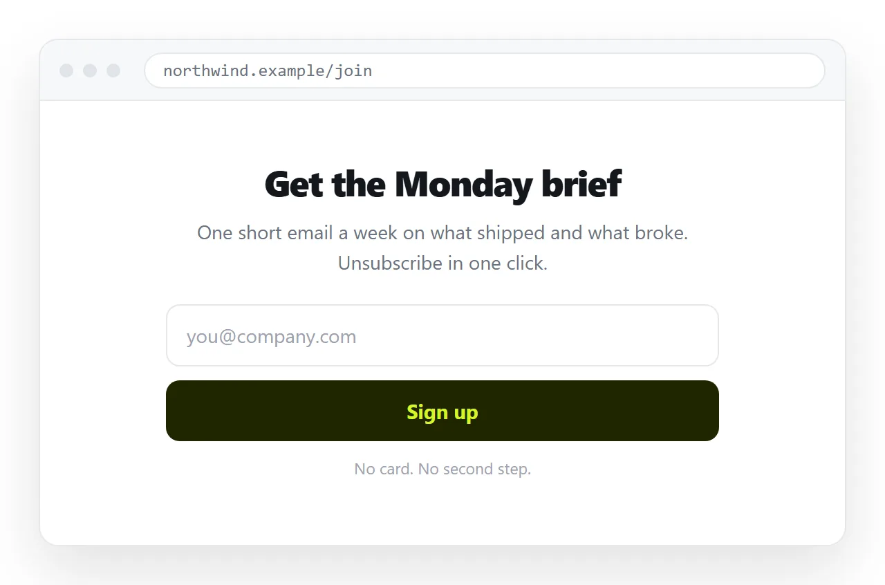
Decide where the HTML signup page posts before you write it
The receiver determines the markup, so choose it first.
| Receiver | What you set | Suits |
|---|---|---|
| Form service endpoint | action to their URL, fields named as they expect |
Most cases, no server needed |
| Mailing tool signup endpoint | Their form markup, copied | Newsletters |
| Spreadsheet connected script | action to the script URL |
Internal lists |
| Your own server | action to your route |
Anything with logic behind it |
| Nothing | The page collects nothing | Only a mockup |
A page with no receiver is fine as a design review artefact. Say so explicitly, or somebody will point real traffic at it.
The markup
Short forms complete better than long ones, so ask for what you will use and nothing else.
<form action="https://forms.example.com/e/abc123" method="post">
  <label for="email">Work email</label>
  <input id="email" name="email" type="email"
         autocomplete="email" required
         placeholder="you@company.com">

  <label for="name">Name</label>
  <input id="name" name="name" type="text"
         autocomplete="name">

  <p class="consent">
    We will send the weekly update and nothing else.
    Unsubscribe from any message.
  </p>

  <button type="submit">Sign up</button>
</form>
Every input has a label joined by for and id. A placeholder is not a label. It disappears when typing starts and it is not announced reliably.
Input types change the keyboard
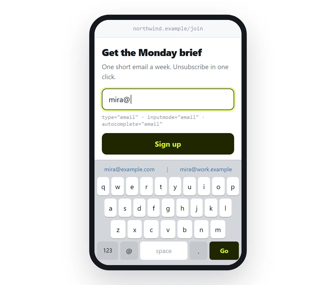
This is the highest return detail on a mobile signup page, and it costs one attribute.
type="email"brings up a keyboard with the at sign visible.type="tel"brings up the number pad.type="url"brings up a keyboard with a slash key.autocomplete="email"andautocomplete="name"let the browser fill the field from its stored profile.
Most people signing up are on a phone. Saving them four taps matters more than the colour of the button.
Validation, and what it is worth
Browser validation is immediate, free and easy to bypass.
required blocks an empty submit. type="email" rejects an entry with no at sign. Neither guarantees the address exists, and both can be removed by anyone with developer tools open.
So keep them for the honest majority, and validate again wherever the data is received. Never treat client side checks as a security measure.
For the error state, show the message next to the field, in words, and keep the invalid value in place. Clearing what someone typed is the fastest way to lose them.
The consent line
Whatever your jurisdiction requires, one plain sentence next to the button serves the reader better than a paragraph in a footer.
Say what you will send, how often, and how to stop. If the address goes to a third party tool, say that too. A page that is vague about this collects fewer addresses and worse ones.
Structure around the form
A signup page is mostly not the form.
- A heading that names the thing. Not a slogan.
- One or two lines saying what arrives and when.
- The form.
- The consent line, next to the button.
- A confirmation state, which people forget to design.
That fifth point is where signup pages most often feel broken. Decide what the user sees after submitting: a thank you page, an inline message, or a redirect.
If the receiver supports a redirect target, point it at a page you wrote rather than their default confirmation screen. A branded page beats a stranger's success message.
Publishing the page
The page has to be reachable at an address. Sending the .html file to someone is not publishing, and it hits every attachment problem on the way.
Paste the HTML into a NOS document. It renders as written, form included, and the share link is the address people open. Use Share, then Share link, then Create link, and tick Public on the web if it should be findable in search.
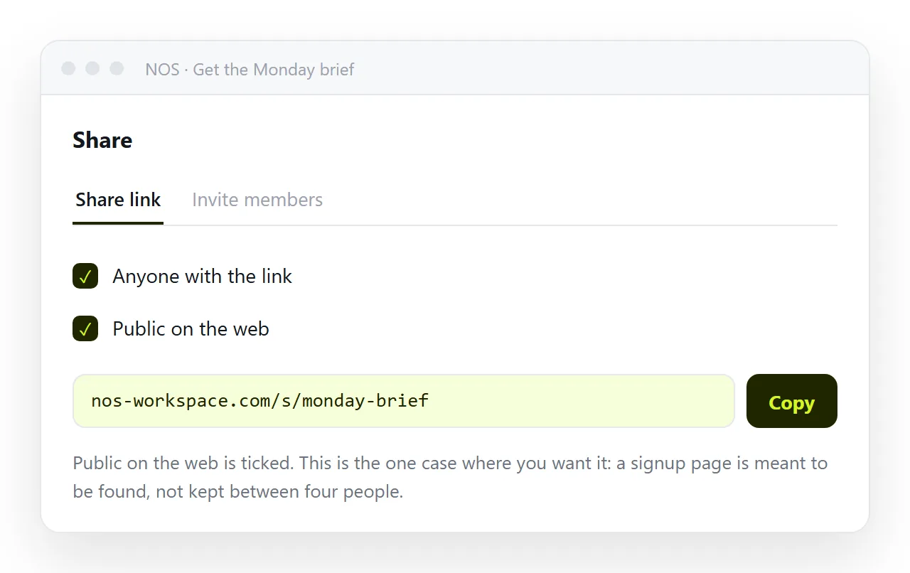
Editing does not change the address, which matters more here than elsewhere. A signup link goes into messages, chat channels and other pages, and correcting the copy should not mean chasing all of them.
Fields to leave out
Every extra field costs completions, so each one has to earn its place.
Company size, job title and phone number are usually asked because a form in another department wanted them once. If nobody reads the answer within a week, remove the field.
Ask for the rest later, once the person has a reason to give it. A second short form after signup completes better than one long form before it.
Test it by submitting it
Before it goes anywhere, do the full round trip yourself.
- Submit a real entry and confirm it arrives at the receiver.
- Check the confirmation state is the one you intended.
- Open the page on a phone and complete it there.
- Confirm the page works over https, since browsers warn on password and payment fields served insecurely.
- Open the file in the HTML file opener to confirm nothing depends on your folder.
A signup page that was never submitted once by its author is a signup page with an unknown failure rate.
Related pages
If the signup follows a plan choice, pricing page HTML covers the table and the button that lead into this form. For the sharing side of forms in general, see form to link, and for the element choices, semantic HTML.