To put dots over Japanese, Chinese or Korean text, use the CSS text-emphasis property. It draws one small mark, such as a sesame shape or a circle, on every character of the element.
Put it on an em or a span around the words you want to stress.
em { text-emphasis: filled sesame red; }
Try the shapes and colors below. The code line under the text updates as you change them.
<!doctype html>
<html lang="en">
<head>
<meta charset="utf-8">
<meta name="viewport" content="width=device-width, initial-scale=1">
<title>CSS text-emphasis</title>
<style>
  body {
    margin: 0; padding: 18px; font-family: system-ui, sans-serif;
    background: #f4f5f7; color: #1d2330;
  }
  .text {
    font-family: "Yu Gothic", "Hiragino Sans", "Noto Sans CJK JP", sans-serif;
    font-size: 24px; line-height: 2.2; margin: 0 0 14px;
    padding: 6px 16px; background: #fff; border-radius: 10px;
  }
  /* the whole feature: one property on the words you want to stress */
  .mark {
    text-emphasis: filled sesame #e11d48;
  }
  .controls { display: flex; flex-wrap: wrap; gap: 8px; font-size: 14px; }
  select, input { font: inherit; }
  code {
    display: block; margin-top: 12px; padding: 8px 10px; border-radius: 8px;
    background: #1d2330; color: #e5e7eb; font-size: 13px;
  }
</style>
</head>
<body>
<p class="text" lang="ja">これは<span class="mark">大事</span>な点です。</p>
<p class="text" lang="en">This is the <span class="mark">key</span> point.</p>

<div class="controls">
  <select id="fill" aria-label="Fill">
    <option>filled</option><option>open</option>
  </select>
  <select id="shape" aria-label="Shape">
    <option>sesame</option><option>dot</option><option>circle</option>
    <option>double-circle</option><option>triangle</option>
  </select>
  <input id="color" type="color" value="#e11d48" aria-label="Color">
</div>
<code id="out">text-emphasis: filled sesame #e11d48;</code>

<script>
  const fill = document.getElementById('fill');
  const shape = document.getElementById('shape');
  const color = document.getElementById('color');
  const out = document.getElementById('out');

  function update() {
    const value = `${fill.value} ${shape.value} ${color.value}`;
    document.querySelectorAll('.mark').forEach((el) => {
      el.style.textEmphasis = value;
    });
    out.textContent = `text-emphasis: ${value};`;
  }
  [fill, shape, color].forEach((el) => el.addEventListener('input', update));
</script>
</body>
</html>
The property has three parts: the shape, the color and the side. The first two share a shorthand. The side has its own property.
Shape and fill: text-emphasis-style
text-emphasis-style takes a fill word and a shape word. The fill is filled or open. The shape is one of five keywords.
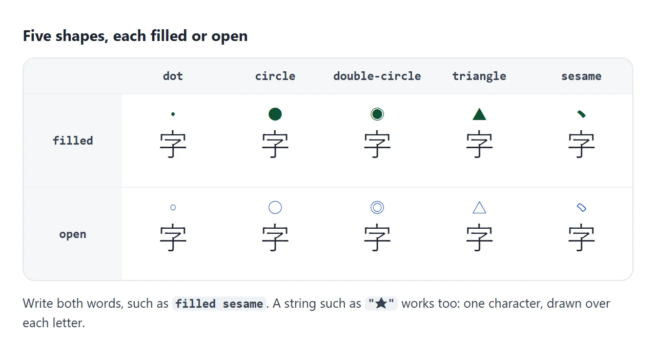
| Keyword | Filled mark | Open mark |
|---|---|---|
sesame |
A short slanted stroke, the Japanese goma dot | An outlined stroke |
dot |
A small round dot | A small ring |
circle |
A larger round dot | A larger ring |
double-circle |
A dot inside a ring | Two rings |
triangle |
A solid triangle | An outlined triangle |
Write both words. With only filled, the browsers we tested drew different shapes: Chromium drew a small dot, Firefox and WebKit drew a circle. Naming the shape, as in filled sesame, gives every browser the same instruction.
A quoted string works as a custom mark, such as "★". Give it one character. Given "ab", Chromium, Firefox and WebKit all drew only the a.
Color and the shorthand
text-emphasis-color sets the mark color. Leave it out and the marks take the text color, currentcolor. The shorthand text-emphasis takes a style and a color in any order:
.key {
  text-emphasis: filled dot #e11d48;
  text-emphasis-position: under right;
}
The shorthand does not include the position. That is why the example above sets it on a second line. Writing the shorthand later does not reset a position set earlier.
Over or under: text-emphasis-position
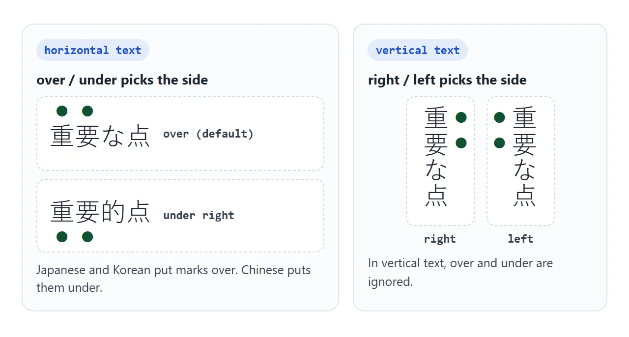
text-emphasis-position takes over or under for horizontal text, and right or left for vertical text. You can write both, such as under right, and each writing mode uses the part that applies to it.
<!doctype html>
<html lang="en">
<head>
<meta charset="utf-8">
<meta name="viewport" content="width=device-width, initial-scale=1">
<title>text-emphasis-position</title>
<style>
  body {
    margin: 0; padding: 16px; font-family: system-ui, sans-serif;
    background: #f4f5f7; color: #1d2330;
  }
  .row { display: flex; gap: 12px; align-items: flex-start; }
  .box {
    background: #fff; border-radius: 10px; padding: 14px;
    font-family: "Yu Gothic", "Hiragino Sans", "Noto Sans CJK JP", sans-serif;
    font-size: 22px; line-height: 2.2;
  }
  .horizontal { flex: 1; min-width: 0; }
  .vertical { writing-mode: vertical-rl; height: 200px; }
  .box span { text-emphasis: filled circle #2563eb; }
  /* the same position value is used by both boxes */
  .box span { text-emphasis-position: var(--pos, over right); }
  .label { font-size: 12px; color: #6b7280; margin: 0 0 4px; }
  .controls { margin-top: 12px; display: flex; flex-wrap: wrap; gap: 6px; }
  button {
    font: 14px system-ui, sans-serif; padding: 7px 10px; border-radius: 8px;
    border: 1px solid #cbd5e1; background: #fff; cursor: pointer;
  }
  button[aria-pressed="true"] { background: #2563eb; color: #fff; border-color: #2563eb; }
</style>
</head>
<body>
<div class="row">
  <div class="horizontal">
    <p class="label">horizontal-tb</p>
    <div class="box" lang="ja"><span>重要</span>な<span>点</span></div>
  </div>
  <div>
    <p class="label">vertical-rl</p>
    <div class="box vertical" lang="ja"><span>重要</span>な<span>点</span></div>
  </div>
</div>

<div class="controls" id="controls">
  <button aria-pressed="true">over right</button>
  <button aria-pressed="false">under right</button>
  <button aria-pressed="false">over left</button>
  <button aria-pressed="false">under left</button>
</div>

<script>
  const buttons = document.querySelectorAll('#controls button');
  buttons.forEach((btn) => {
    btn.addEventListener('click', () => {
      // one custom property feeds text-emphasis-position in both boxes
      document.body.style.setProperty('--pos', btn.textContent);
      buttons.forEach((b) => b.setAttribute('aria-pressed', b === btn));
    });
  });
</script>
</body>
</html>
- Japanese and Korean: marks go over horizontal text and to the right of vertical text. That is the default, so
over rightneeds no rule. - Chinese: marks go under horizontal text. Set
under righton it. In our test Firefox and WebKit already put them under forlang="zh-CN"text, but Chromium put them over. - Vertical text:
overandunderdo nothing. Onlyrightorleftmoves the marks.
If one page mixes languages, scope the rule by the lang attribute:
:lang(zh) em { text-emphasis-position: under right; }
What gets a mark, and line spacing
Each character gets its own mark, including Latin letters and digits. Spaces and punctuation such as 、 and 。 get none.
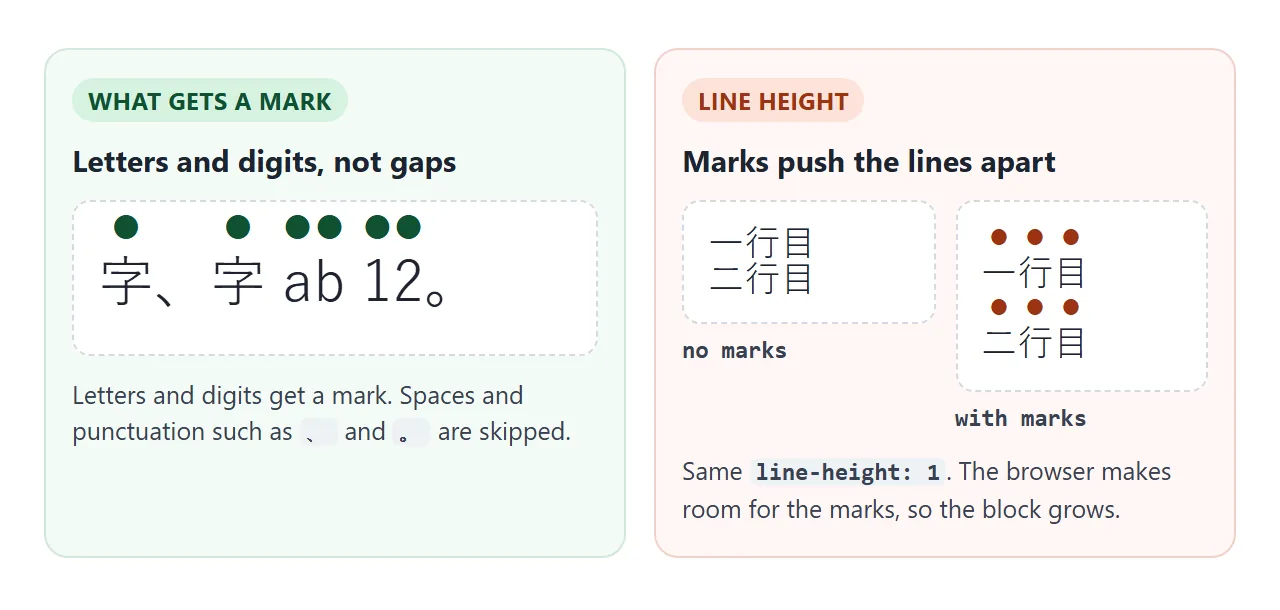
The marks take space above or below the line, like ruby text. We measured a two-line block of 20px text with line-height: 1. It was 40px tall without marks and 78px tall with them in Chromium, Firefox and WebKit.
So a paragraph with a few emphasised words can have uneven line gaps. A looser line height leaves room for the marks.
In our 20px Yu Gothic test, the marked line stopped growing at line-height: 2 in Firefox and at 3 in Chromium and WebKit. At 2 those two added 6px. The exact value depends on the font, so check your own text.
Numbers in vertical text: text-combine-upright
Vertical Japanese text often carries dates. In writing-mode: vertical-rl, a number like 26 lies on its side by default. text-combine-upright: all sets the digits side by side inside one character square:
<p class="card">9月<span class="num">26</span>日</p>
.card { writing-mode: vertical-rl; }
.num  { text-combine-upright: all; }
Keep the span to two or three digits. all squeezes everything into one square, so longer numbers get cramped. The property does nothing in horizontal text, so you can leave it on when the layout switches. CSS writing-mode covers vertical layout in full.
A finished example: a reading card
This card uses both properties. The emphasis marks use over right, so they sit above the words in horizontal mode and move to the right side when the card turns vertical. The date digits use text-combine-upright.
<!doctype html>
<html lang="en">
<head>
<meta charset="utf-8">
<meta name="viewport" content="width=device-width, initial-scale=1">
<title>Reading card with emphasis marks</title>
<style>
  body {
    margin: 0; padding: 16px; font-family: system-ui, sans-serif;
    background: #efe9dc; color: #2b2118;
  }
  .card {
    background: #fffdf7; border-radius: 12px; padding: 18px 20px;
    box-shadow: 0 6px 18px rgba(0, 0, 0, .1);
    font-family: "Yu Mincho", "Hiragino Mincho ProN", "Noto Serif CJK JP", serif;
    font-size: 21px; line-height: 2.1;
  }
  .card.vertical { writing-mode: vertical-rl; height: 260px; overflow-x: auto; }
  .card p { margin: 0; }
  em {
    font-style: normal;                       /* no fake italic on Japanese */
    text-emphasis: filled sesame #b91c1c;
    text-emphasis-position: over right;       /* above in horizontal, right in vertical */
  }
  .num { text-combine-upright: all; }         /* only affects vertical text */
  .controls { display: flex; flex-wrap: wrap; gap: 14px; margin-bottom: 12px; font-size: 14px; }
  button {
    font: 14px system-ui, sans-serif; padding: 7px 12px; border-radius: 8px;
    border: 1px solid #b8a98f; background: #fff; cursor: pointer;
  }
</style>
</head>
<body>
<div class="controls">
  <button id="flip" type="button">Switch to vertical</button>
  <label><input id="tcy" type="checkbox" checked> text-combine-upright</label>
</div>

<div class="card" id="card" lang="ja">
  <p>令和<span class="num">8</span>年<span class="num">9</span>月<span class="num">26</span>日</p>
  <p>本文の<em>要点</em>だけに点を打つ。</p>
  <p>全部に打つと、<em>どこも</em>目立たない。</p>
</div>

<script>
  const card = document.getElementById('card');
  const flip = document.getElementById('flip');
  const tcy = document.getElementById('tcy');

  flip.addEventListener('click', () => {
    const vertical = card.classList.toggle('vertical');
    flip.textContent = vertical ? 'Switch to horizontal' : 'Switch to vertical';
  });

  tcy.addEventListener('change', () => {
    document.querySelectorAll('.num').forEach((el) => {
      el.style.textCombineUpright = tcy.checked ? '' : 'none';
    });
  });
</script>
</body>
</html>
- Semantic tag: the stressed words are
emelements, so the stress is in the HTML, not only in the look. - No italics:
font-style: normalremoves the slanted look thatemhas by default, which suits Japanese type poorly. - One rule for both modes: the position value has a part for each writing mode.
Emphasis marks, em, bold and ruby
text-emphasis is paint only. It adds no meaning to the HTML, so assistive technology gets nothing from it. For stress that carries meaning, use the em tag and style it with emphasis marks, as the card does.
Emphasis marks are not ruby either. Ruby adds a reading, different for each word. Emphasis puts the same mark on every character. For readings such as furigana, use the ruby tag.
When it does not work
| What you see | Cause | Fix |
|---|---|---|
| No marks at all | Only a color was given, so the style is none |
Add a shape, such as filled dot |
| Marks above Chinese text | The default puts them over (Chromium, any language) | Set under right |
Vertical text ignores under |
Vertical text uses right and left |
Write under left or over left |
| A different shape in each browser | Only filled or open was given |
Name the shape too |
| Line gaps jump around | The marks need room above the line | A looser line-height |
| A custom string shows one letter | Only the first character is used | Use a single character |
| Commas and spaces have no mark | This is intended | Nothing to fix |
Share it as a link
Emphasis marks depend on the fonts and the writing mode on the reader's screen. A screenshot hides how they move when the layout turns vertical, and an .html attachment may open as plain code on a phone.
To send the working version, paste the page into a NOS document and choose Create share link. HTML to link walks through it.
The page renders as written and its scripts run, so the people you send it to can switch the card and try the shapes themselves. If you change the code later, the same link shows the new version.