Print CSS is ordinary CSS placed inside @media print { ... }. The browser applies those rules only when the page goes to a printer or to Save as PDF.
That lets you hide the menu, turn the colours to black on white and print link addresses without changing the screen design.
Try it. The button switches the page's print rules on for the screen, which shows roughly what the printed sheet will contain.
<!doctype html>
<html lang="en">
<head>
<meta charset="utf-8">
<meta name="viewport" content="width=device-width, initial-scale=1">
<title>Print CSS preview</title>
<style>
  body { margin: 0; font: 16px/1.55 system-ui, sans-serif; color: #e8eaf0; background: #161a23; }
  .site-nav { display: flex; gap: 16px; padding: 12px 18px; background: #232937; }
  .site-nav a { color: #9ec1ff; text-decoration: none; }
  .hero { padding: 26px 18px; background: linear-gradient(135deg, #5b3df5, #d43f8d); }
  .hero h1 { margin: 0; font-size: 26px; }
  article { padding: 4px 18px 18px; max-width: 620px; }
  article a { color: #9ec1ff; }
  .share { display: flex; gap: 8px; }
  .share button { padding: 8px 12px; border: 0; border-radius: 8px; background: #3a4356; color: #fff; }

  /* Everything below applies only when printing or saving as PDF */
  @media print {
    .site-nav, .share { display: none; }
    body, .hero { background: none; color: #000; }
    .hero { padding: 0; }
    article a { color: #000; }
    article a[href^="http"]::after { content: " (" attr(href) ")"; font-size: 0.85em; }
  }

  /* Preview bar: a teaching aid, not part of a real page */
  .preview-bar { display: flex; align-items: center; gap: 10px; padding: 8px 18px;
    background: #fff4d6; color: #5c4400; font-size: 14px; }
  .preview-bar button { padding: 6px 12px; border: 1px solid #c9a44a; border-radius: 6px; background: #fff; cursor: pointer; }
  @media print { .preview-bar { display: none; } }
  html.previewing .hero { padding: 0 18px; }  /* stands in for the paper margin */
</style>
</head>
<body>
<div class="preview-bar">
  <button id="toggle" aria-pressed="false">Preview print styles</button>
  <span id="state">Showing: screen</span>
</div>

<nav class="site-nav"><a href="#">Home</a><a href="#">Guides</a><a href="#">About</a></nav>
<header class="hero"><h1>Brewing coffee at home</h1></header>
<article>
  <p>Start with fresh beans and a scale. The <a href="https://en.wikipedia.org/wiki/Coffee_preparation">brewing methods</a> differ, but the ratio matters most.</p>
  <p>Use about 60 g of coffee per litre of water. Our <a href="https://example.com/grind-chart">grind chart</a> lists the settings.</p>
  <div class="share"><button>Share</button><button>Save</button></div>
</article>

<script>
  // Find the @media print block and switch it on for the screen too.
  const printRule = [...document.styleSheets[0].cssRules]
    .find((r) => r.media && r.media.mediaText === 'print');
  const btn = document.getElementById('toggle');

  btn.addEventListener('click', () => {
    const on = printRule.media.mediaText === 'print';
    printRule.media.mediaText = on ? 'all' : 'print';  // 'all' = screen and print
    document.documentElement.classList.toggle('previewing', on);
    btn.setAttribute('aria-pressed', on);
    btn.textContent = on ? 'Back to screen' : 'Preview print styles';
    document.getElementById('state').textContent = on ? 'Preview of print styles' : 'Showing: screen';
  });
</script>
</body>
</html>
The preview uses a small trick worth copying: the script finds the @media print rule in the stylesheet and changes its media from print to all. The same rules then apply to the screen, so the preview is the real print CSS.
The @media print block
Five kinds of rule do most of the work. Put them in one block:
@media print {
  nav, .share, .cookie-banner { display: none; }   /* 1. hide */
  body { background: none; color: #000; }          /* 2. black on white */
  a { color: #000; }
  a[href^="http"]::after {                          /* 3. show addresses */
    content: " (" attr(href) ")";
    font-size: 0.85em;
  }
  @page { size: A4; margin: 18mm; }                /* 4. paper */
  tr, figure { break-inside: avoid; }               /* 5. keep whole */
}
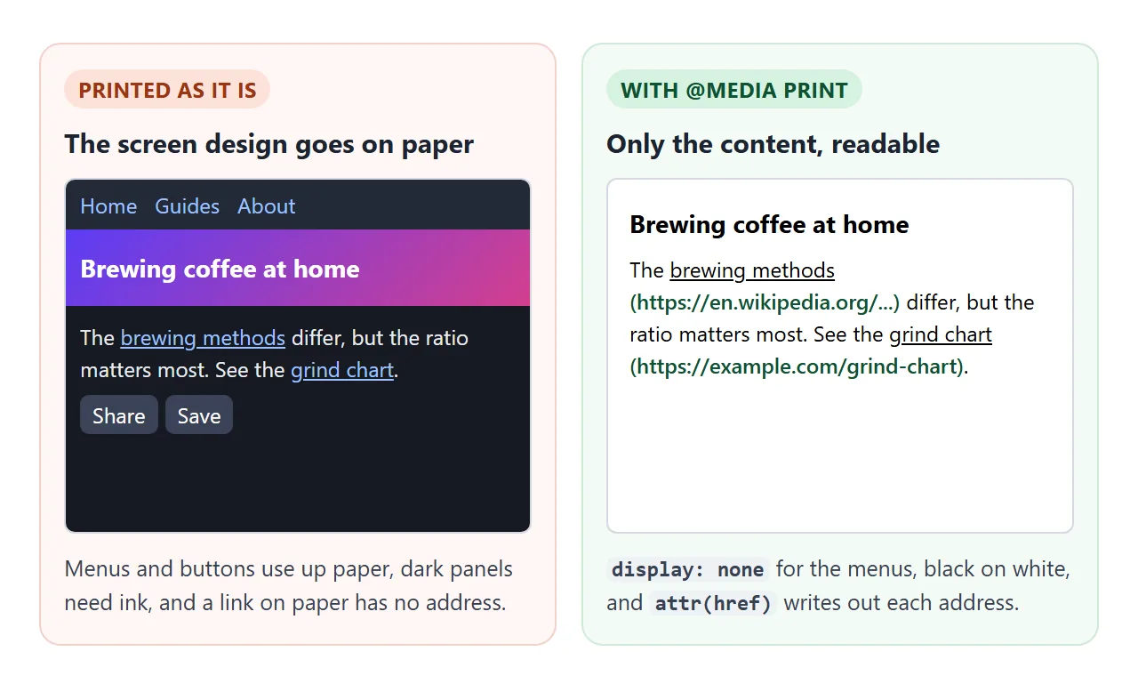
A link on paper cannot be clicked. The ::after rule with attr(href) writes the address after the link text. The ^="http" part skips in-page links such as #top, whose address means nothing on paper.
The same rules also work as a separate file: <link rel="stylesheet" href="print.css" media="print">. For a full checklist of what to include, see print stylesheet CSS.
Put the print rules last
@media print does not make a rule stronger. A print rule and a screen rule with the same selector have the same weight, and the one that comes later wins.
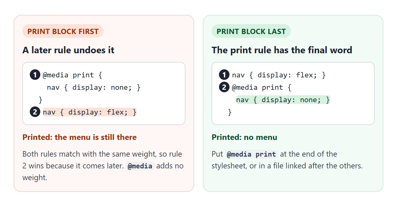
So a nav { display: flex; } written below the print block puts the menu back on paper. Keep @media print at the end of the stylesheet, or link the print file after the others. !important also works, but order is easier to read later.
Background colours and print-color-adjust
Print dialogs leave out background colours and background images unless the reader switches on an option usually called Background graphics. This saves ink, and it is the reason coloured status badges and table header bands vanish on paper.
For the few places where colour carries meaning, ask the browser to keep it:
@media print {
  .badge, thead th {
    -webkit-print-color-adjust: exact;  /* older name */
    print-color-adjust: exact;
  }
}
<!doctype html>
<html lang="en">
<head>
<meta charset="utf-8">
<meta name="viewport" content="width=device-width, initial-scale=1">
<title>Print background colours</title>
<style>
  body { margin: 0; padding: 14px; font: 15px/1.5 system-ui, sans-serif; color: #1d2330; background: #fff; }
  .grid { display: grid; grid-template-columns: repeat(auto-fit, minmax(240px, 1fr)); gap: 12px; }
  .panel { border: 1px solid #dde1e8; border-radius: 10px; padding: 10px 12px; }
  .panel h2 { font-size: 14px; margin: 0 0 8px; }
  code { font: 13px ui-monospace, Consolas, monospace; background: #eef1f5; padding: 0 3px; border-radius: 4px; }
  table { width: 100%; border-collapse: collapse; }
  td { padding: 6px 4px; border-bottom: 1px solid #eceff3; }
  .chip { display: inline-block; padding: 2px 10px; border-radius: 99px; color: #fff; font-weight: 600; font-size: 13px; }
  .paid { background: #15803d; }
  .late { background: #c2410c; }

  /* The fix: keep these colours when the page is printed */
  .keep .chip {
    -webkit-print-color-adjust: exact;  /* older name, still needed by some engines */
    print-color-adjust: exact;
  }

  /* Simulation of the print dialog with "Background graphics" off.
     A teaching aid: real printing does this for you. */
  .sim-off .panel:not(.keep) .chip { background: none; color: #ababab; }
  .bar { display: flex; flex-wrap: wrap; align-items: center; gap: 10px; margin-bottom: 12px;
    padding: 8px 10px; border-radius: 8px; background: #fff4d6; color: #5c4400; font-size: 14px; }
  .bar button { padding: 6px 12px; border: 1px solid #c9a44a; border-radius: 6px; background: #fff; cursor: pointer; }
</style>
</head>
<body>
<div class="bar">
  <button id="sim" aria-pressed="false">Simulate printing (backgrounds off)</button>
  <span id="note">Showing: screen</span>
</div>

<div class="grid">
  <div class="panel">
    <h2>Without print-color-adjust</h2>
    <table>
      <tr><td>Invoice 101</td><td><span class="chip paid">Paid</span></td></tr>
      <tr><td>Invoice 102</td><td><span class="chip late">Overdue</span></td></tr>
    </table>
  </div>
  <div class="panel keep">
    <h2>With <code>print-color-adjust: exact</code></h2>
    <table>
      <tr><td>Invoice 101</td><td><span class="chip paid">Paid</span></td></tr>
      <tr><td>Invoice 102</td><td><span class="chip late">Overdue</span></td></tr>
    </table>
  </div>
</div>
<p style="font-size:13px;color:#555">A screen cannot switch off background printing, so the button only imitates it. Use the browser's print preview for the real result.</p>

<script>
  const sim = document.getElementById('sim');
  sim.addEventListener('click', () => {
    const on = document.body.classList.toggle('sim-off');
    sim.setAttribute('aria-pressed', on);
    sim.textContent = on ? 'Back to screen' : 'Simulate printing (backgrounds off)';
    document.getElementById('note').textContent = on ? 'Simulation, not a real print' : 'Showing: screen';
  });
</script>
</body>
</html>
A screen cannot turn off background printing, so this example imitates it with a class. The real check is the print dialog's preview with Background graphics unticked. Use exact sparingly; a page that prints its whole dark theme uses a lot of ink.
Paper size, margins and page breaks
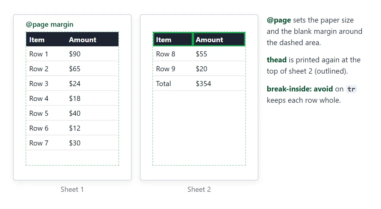
@page describes the sheet. size takes names such as A4 and letter, or two lengths. margin sets the blank border the browser keeps around the content on every sheet.
@page { size: A4; margin: 18mm 16mm; }
Treat size as a request. The reader can still pick other paper or scaling in the dialog.
Where a page splits is controlled with break-before, break-after and break-inside. break-inside: avoid keeps a table row, a figure or a card on one sheet, and break-before: page starts a new one. HTML page break for printing covers those properties in detail.
Repeating table headers and fixed elements
Long tables print better when the header row sits in a <thead>. Chromium-based browsers repeat the thead at the top of every printed page the table runs onto. thead and tbody explains the markup.
position: fixed behaves differently on paper. In Chromium-based browsers a fixed element prints on every page at the same spot, so a fixed site header sits over the text of every sheet. Hide it, or set it to position: static in the print block.
A Print button with window.print()
window.print() opens the same dialog as Ctrl+P (Cmd+P on a Mac). The beforeprint and afterprint events fire around it, which is handy for last changes such as opening every <details> element.
printButton.addEventListener('click', () => window.print());
A page shown inside a sandboxed <iframe> can only print if the frame's sandbox attribute includes allow-modals. Without it, Chromium ignores the call and logs a console message. When the call is allowed, the frame prints its own document, not the page around it.
The finished example puts everything together: an invoice with A4 margins, a repeating header row, kept colours and a Print button.
<!doctype html>
<html lang="en">
<head>
<meta charset="utf-8">
<meta name="viewport" content="width=device-width, initial-scale=1">
<title>Invoice INV-2041</title>
<style>
body { margin: 0; font: 15px/1.5 system-ui, sans-serif; color: #1d2330; background: #eef1f5; }
.toolbar { display: flex; flex-wrap: wrap; align-items: center; gap: 8px; padding: 10px 14px; background: #1d2330; }
.toolbar button { padding: 7px 14px; border: 0; border-radius: 7px; font: inherit; cursor: pointer; }
#print { background: #2563eb; color: #fff; }
#preview { background: #fff; color: #1d2330; }
#msg { flex-basis: 100%; color: #fde68a; font-size: 13px; }
#msg:empty { display: none; }
.sheet { max-width: 640px; margin: 16px auto; padding: 24px; background: #fff; border-radius: 10px;
box-shadow: 0 4px 18px rgba(0, 0, 0, .08); }
.head { display: flex; flex-wrap: wrap; justify-content: space-between; gap: 12px; }
.head h1 { margin: 0; font-size: 24px; }
.muted { color: #6b7280; font-size: 13px; }
table { width: 100%; border-collapse: collapse; margin: 18px 0; }
th, td { padding: 8px 6px; text-align: left; border-bottom: 1px solid #e5e7eb; }
th:last-child, td:last-child { text-align: right; }
thead th { background: #1d2330; color: #fff; font-size: 13px; }
.total td { font-weight: 700; background: #eaf2ff; }
a { color: #2563eb; }
@media print {
@page { size: A4; margin: 18mm 16mm; }
body { background: none; }
.sheet { max-width: none; margin: 0; padding: 0; box-shadow: none; border-radius: 0; }
thead th, .total td { -webkit-print-color-adjust: exact; print-color-adjust: exact; }
tr { break-inside: avoid; } /* no row split across two sheets */
.notes { break-before: avoid; }
a[href^="http"]::after { content: " (" attr(href) ")"; color: #000; }
}
@media print { .toolbar { display: none; } } /* separate block, so the preview keeps its buttons */
html.previewing .sheet { padding: 0 16px; } /* stands in for the @page margin */
</style>
</head>
<body>
<div class="toolbar">
<button id="print">Print or save as PDF</button>
<button id="preview" aria-pressed="false">Preview print styles</button>
<span id="msg" role="status"></span>
</div>
<main class="sheet">
<div class="head">
<div><h1>Invoice INV-2041</h1><div class="muted">Issued 26 Sep 2026 · Due 10 Oct 2026</div></div>
<div class="muted">Harbour Design Studio<br>12 Quay Street</div>
</div>
<table>
<thead><tr><th>Item</th><th>Qty</th><th>Amount</th></tr></thead>
<tbody>
<tr><td>Logo design</td><td>1</td><td>$900.00</td></tr>
<tr><td>Brand guidelines, 12 pages</td><td>1</td><td>$650.00</td></tr>
<tr><td>Business card layout</td><td>2</td><td>$240.00</td></tr>
<tr><td>Revisions (hours)</td><td>3</td><td>$180.00</td></tr>
</tbody>
<tfoot><tr class="total"><td>Total due</td><td></td><td>$1,970.00</td></tr></tfoot>
</table>
<p class="notes">Pay by bank transfer within 14 days. Terms: <a href="https://example.com/terms">example.com/terms</a></p>
</main>
<script>
const msg = document.getElementById('msg');
let printing = false;
addEventListener('beforeprint', () => { printing = true; });
document.getElementById('print').addEventListener('click', () => {
printing = false;
msg.textContent = '';
window.print();
// If the dialog never started, the page is embedded somewhere that blocks it.
setTimeout(() => {
if (!printing) msg.textContent = 'Printing is blocked where this page is embedded. Open the page on its own and press Ctrl+P (Cmd+P on a Mac).';
}, 500);
});
// Preview: switch the @media print block on for the screen as well.
const printRule = [...document.styleSheets[0].cssRules]
.find((r) => r.media && r.media.mediaText === 'print');
const pv = document.getElementById('preview');
pv.addEventListener('click', () => {
const on = printRule.media.mediaText === 'print';
printRule.media.mediaText = on ? 'all' : 'print';
document.documentElement.classList.toggle('previewing', on);
pv.setAttribute('aria-pressed', on);
pv.textContent = on ? 'Back to screen' : 'Preview print styles';
});
</script>
</body>
</html>
The script listens for beforeprint. If the event has not fired shortly after the click, the dialog was blocked, and the page shows a message instead of doing nothing.
Testing print CSS without paper
- Print preview. Press Ctrl+P or Cmd+P and look at the preview. Check the first page, every table and the last page.
- Developer tools. In Chromium-based browsers, open the Rendering panel and set Emulate CSS media type to print. Your print rules then apply in the normal window, where you can inspect them.
- Save as PDF. Choose Save as PDF as the destination and open the file. Export HTML to PDF compares the other ways to make a PDF.
When it does not work
| What you see | Cause | Fix |
|---|---|---|
| Backgrounds and coloured badges are missing | Background graphics is off in the dialog | print-color-adjust: exact on those elements |
| A print rule seems to be ignored | A later rule without a media query overrides it | Move @media print to the end |
| A table row or image is cut across two pages | Nothing asks the browser to keep it whole | break-inside: avoid |
| Links on paper are just underlined words | Paper has no href |
a[href^="http"]::after with attr(href) |
| The site header covers text on every sheet | position: fixed prints on every page |
Hide it or make it static in print |
| The Print button does nothing | The page is in a frame without allow-modals |
Open the page on its own, or add allow-modals |
| Light text prints faint or unreadable | The dark background behind it was dropped | Set color: #000 in the print block |
Share it as a link
Not everyone you send a document to will print it, and a PDF is a fixed copy. A link lets them read it on screen and print it themselves when they need paper, with your print CSS applied.
To send the working page, paste it into a NOS document and choose Create share link. HTML to link walks through it. The page renders as written and its scripts run.
That means the people you send it to can use the preview toggle themselves. If you change the code later, the same link shows the new version.