overflow-inline controls overflow along the inline axis, the direction a line of text runs. It takes the same values as overflow (visible, hidden, clip, scroll, auto). In horizontal text it acts as overflow-x. In vertical text the browser maps it to overflow-y.
Try it. The box holds one long line of code. Pick a value and see what the browser computes for overflow-x and overflow-y.
<!doctype html>
<html lang="en">
<head>
<meta charset="utf-8">
<meta name="viewport" content="width=device-width, initial-scale=1">
<title>overflow-inline values</title>
<style>
  body { margin: 0; padding: 18px; font-family: system-ui, sans-serif; background: #f4f5f7; color: #1d2330; }
  .buttons { display: flex; flex-wrap: wrap; gap: 6px; margin-bottom: 14px; }
  button { font: 600 13px ui-monospace, Consolas, monospace; padding: 7px 10px; border: 1px solid #cfd5de; border-radius: 8px; background: #fff; cursor: pointer; }
  button[aria-pressed="true"] { background: #1d4ed8; border-color: #1d4ed8; color: #fff; }
  .box {
    max-width: 300px;
    padding: 12px;
    border: 2px solid #1d4ed8;
    border-radius: 8px;
    background: #fff;
    white-space: nowrap;   /* one long line, so it overflows the inline axis */
    font: 14px ui-monospace, Consolas, monospace;
    overflow-inline: auto; /* the property under test */
  }
  .out { margin-top: 14px; font: 13px/1.6 ui-monospace, Consolas, monospace; background: #1d2330; color: #e5e7eb; padding: 10px 12px; border-radius: 8px; }
  .out b { color: #86efac; font-weight: 600; }
</style>
</head>
<body>
<div class="buttons" id="buttons">
  <button>visible</button><button>hidden</button><button>clip</button><button>scroll</button><button aria-pressed="true">auto</button>
</div>

<div class="box" id="box">const url = "https://example.com/a/very/long/path/that/does/not/fit/in/the/box";</div>

<div class="out" id="out"></div>

<script>
  const box = document.getElementById('box');
  const out = document.getElementById('out');

  function report() {
    const s = getComputedStyle(box);
    const canScroll = box.scrollWidth > box.clientWidth && ['auto', 'scroll'].includes(s.overflowX);
    out.innerHTML =
      'overflow-inline: <b>' + s.overflowInline + '</b><br>' +
      'computed overflow-x: <b>' + s.overflowX + '</b>  overflow-y: <b>' + s.overflowY + '</b><br>' +
      'can scroll sideways: <b>' + (canScroll ? 'yes' : 'no') + '</b>';
  }

  document.getElementById('buttons').addEventListener('click', (e) => {
    if (e.target.tagName !== 'BUTTON') return;
    document.querySelectorAll('button').forEach((b) => b.setAttribute('aria-pressed', b === e.target));
    box.style.overflowInline = e.target.textContent;  // change only the logical property
    box.scrollLeft = 0;
    report();
  });

  report();
</script>
</body>
</html>
Notice that auto, scroll and hidden also turn overflow-y into auto. That side effect has its own section below.
The inline axis, not "horizontal"
Every box has two axes. The inline axis runs along a line of text. The block axis runs the way lines stack. The writing-mode property decides which physical direction each one points.
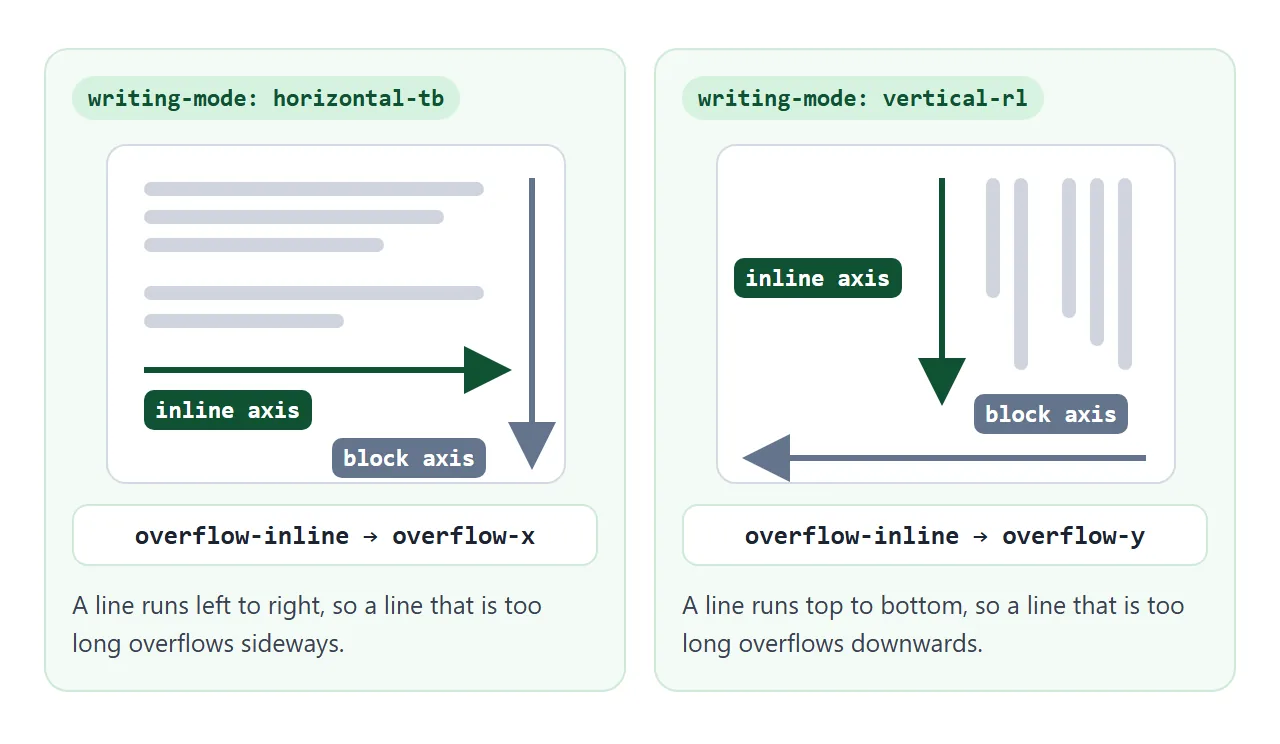
| writing-mode | Inline axis runs | overflow-inline maps to |
|---|---|---|
horizontal-tb |
Left to right | overflow-x |
vertical-rl |
Top to bottom | overflow-y |
vertical-lr |
Top to bottom | overflow-y |
direction: rtl does not change the axis. Right-to-left text still runs along a horizontal line, so overflow-inline still means overflow-x. The line simply starts at the right edge. HTML dir="rtl" covers that side.
overflow-inline is defined in CSS Overflow Module Level 3, a W3C Working Draft. It belongs with inline-size, margin-inline and the other CSS logical properties.
The five values on the inline axis
The values mean what they mean for CSS overflow. They just act on one axis.
visible– the line is not clipped and can run past the box edge. This is the initial value in the specification.hidden– the line is clipped at the padding box and no scrollbar is shown. The user cannot scroll it, but a script can still setscrollLeft.clip– the line is clipped at the overflow clip edge, set withoverflow-clip-margin. The box is not a scroll container, so even a script cannot scroll it.scroll– clipped, with a scrollbar shown whether or not anything overflows.auto– desktop browsers show a scrollbar only when the line does not fit.
The property applies to block containers, flex containers, grid containers and table grid boxes. It is not inherited.
A line has to be too long first
overflow-inline only matters when something is wider than the box along the line. Ordinary text never is: it wraps onto a new line at the edge. The extra text then grows along the block axis instead.
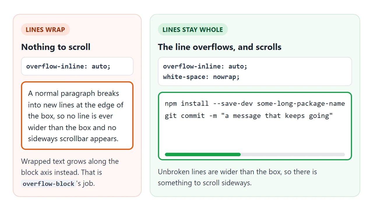
Two ways to keep a line whole:
white-space: nowrapon text, or a<pre>element for code. CSS white-space lists the other values.flex: noneon items in a flex row. By default flex items shrink, so a row of tags squeezes and each tag's text wraps instead of overflowing.
If you would rather cut the line off with "…" than scroll it, that is a job for text-overflow: ellipsis. It does not create overflow itself; it needs overflow and white-space set as well.
Setting one axis changes the other
The CSS Overflow specification has a rule for mixing values. If one axis is scrollable (hidden, scroll or auto), a visible on the other axis computes to auto. MDN's formal definition adds that clip computes to hidden in the same situation.
So overflow-inline: auto on its own also makes the block axis auto. If the box has a fixed height, it can then scroll up and down as well. State the block axis if you want a strip that only scrolls along the line:
.strip {
  overflow-inline: auto;   /* scroll along the line */
  overflow-block: hidden;  /* never across it */
}
overflow-inline, overflow-block, overflow-x, overflow-y and the overflow shorthand form one logical property group. When a logical and a physical property land on the same axis, the declaration that wins the cascade decides. With equal specificity, that is the one written later.
Vertical text: where the logical name pays off
The physical way to write "scroll sideways only" is overflow-x: auto plus overflow-y: hidden. Put that component in vertical-rl text and the line now runs downwards. overflow-y: hidden blocks the only direction the line can be scrolled.
<!doctype html>
<html lang="en">
<head>
<meta charset="utf-8">
<meta name="viewport" content="width=device-width, initial-scale=1">
<title>Physical vs logical overflow in vertical text</title>
<style>
  body { margin: 0; padding: 16px; font-family: system-ui, sans-serif; background: #f4f5f7; color: #1d2330; }
  .row { display: flex; gap: 14px; flex-wrap: wrap; }
  .col { flex: 1 1 150px; }
  h3 { font-size: 14px; margin: 0 0 4px; }
  code { font: 12px ui-monospace, Consolas, monospace; display: block; color: #4b5563; margin-bottom: 8px; }
  .strip {
    writing-mode: vertical-rl;  /* the line runs top to bottom */
    white-space: nowrap;
    block-size: 110px;          /* width here, because the text is vertical */
    inline-size: 220px;         /* height here */
    padding: 8px;
    border: 2px solid #9ca3af;
    border-radius: 8px;
    background: #fff;
    font-size: 15px;
    line-height: 1.8;
  }
  /* "scroll along the line, never across it", written two ways */
  .physical { overflow-x: auto; overflow-y: hidden; border-color: #ea580c; }
  .logical  { overflow-inline: auto; overflow-block: hidden; border-color: #16a34a; }
  .note { font-size: 13px; margin: 8px 0 0; min-height: 4em; }
</style>
</head>
<body>
<div class="row">
  <div class="col">
    <h3>Physical</h3>
    <code>overflow-x: auto;<br>overflow-y: hidden;</code>
    <div class="strip physical">This line is much longer than the box that holds it, so it has to go somewhere.<br>Second line.</div>
    <p class="note" id="n1"></p>
  </div>
  <div class="col">
    <h3>Logical</h3>
    <code>overflow-inline: auto;<br>overflow-block: hidden;</code>
    <div class="strip logical">This line is much longer than the box that holds it, so it has to go somewhere.<br>Second line.</div>
    <p class="note" id="n2"></p>
  </div>
</div>

<script>
  // The line runs downwards, so reaching its end needs vertical scrolling.
  // hidden means the user cannot scroll that way; auto means they can.
  function test(el, note) {
    const y = getComputedStyle(el).overflowY;
    const ok = y === 'auto' || y === 'scroll';
    note.textContent = 'overflow-y computes to ' + y + '. ' + (ok
      ? 'Scroll down to reach the end of the line.'
      : 'You cannot scroll down, so the end of the line is cut off.');
    note.style.color = ok ? '#15803d' : '#c2410c';
  }
  test(document.querySelector('.physical'), document.getElementById('n1'));
  test(document.querySelector('.logical'), document.getElementById('n2'));
</script>
</body>
</html>
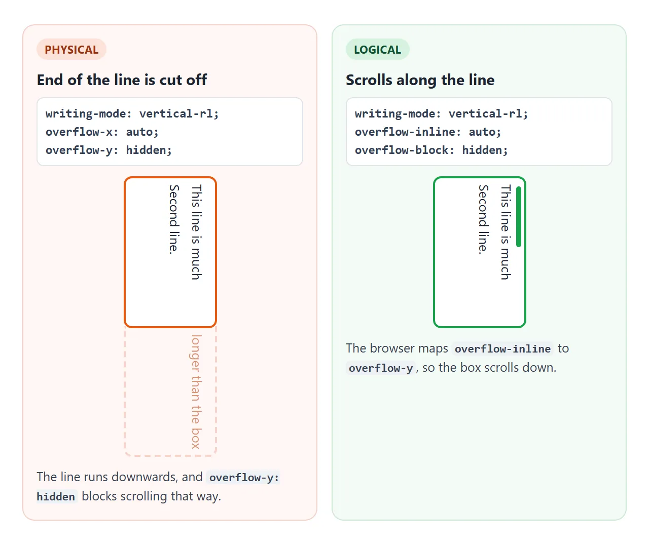
The logical pair says what you mean: scroll along the line, not across it. The browser works out which physical edge that is for the current writing mode.
For a site that only shows horizontal text, overflow-x and overflow-inline give the same result. Choosing the logical name costs nothing and keeps the component correct if it is reused in vertical text.
Browser support and a fallback
MDN's compatibility data lists overflow-inline in Chrome and Edge from version 135, Firefox from 69 and Safari from 26. For the clip value, Firefox is listed from 81.
The demos on this page were run in the Playwright builds of Chromium 147, Firefox 148 and WebKit 26.4. All three computed the same values and scrolled the same way.
A browser that does not know a property ignores the declaration, so in an older browser the box would not scroll at all. For horizontal-only components, writing the physical property first is enough:
.strip {
  overflow-x: auto;        /* older browsers */
  overflow-inline: auto;   /* declared later, so it wins where supported */
}
For components that may appear in vertical text, keep the older rules apart with @supports, as the finished example does:
@supports not (overflow-inline: auto) {
  .strip { overflow-x: auto; overflow-y: hidden; }
}
A finished example: a code card and a tag row
Both parts share one class. The tags use flex: none so they keep their size, and the code uses a <pre>. A fade on the right edge shows while there is more line to see.
<!doctype html>
<html lang="en">
<head>
<meta charset="utf-8">
<meta name="viewport" content="width=device-width, initial-scale=1">
<title>Scrolling code card and tag row</title>
<style>
  body { margin: 0; padding: 16px; font-family: system-ui, sans-serif; background: #f4f5f7; color: #1d2330; }

  /* One reusable rule: scroll along the line, never across it */
  .scroll-inline { overflow-inline: auto; overflow-block: hidden; }
  @supports not (overflow-inline: auto) {
    .scroll-inline { overflow-x: auto; overflow-y: hidden; }  /* older browsers */
  }

  .tags { display: flex; gap: 8px; padding-block-end: 6px; margin-block-end: 12px; }
  .tags span { flex: none; padding: 6px 12px; border-radius: 99px; background: #fff; border: 1px solid #d5d9e0; font-size: 13px; }

  .card { position: relative; border-radius: 10px; background: #1d2330; }
  .bar { display: flex; justify-content: space-between; align-items: center; padding: 8px 12px; color: #cbd5e1; font-size: 13px; }
  .bar label { display: flex; gap: 6px; align-items: center; cursor: pointer; }
  pre { margin: 0; padding: 4px 14px 14px; color: #e5e7eb; font: 13px/1.6 ui-monospace, Consolas, monospace; }
  pre.wrap { white-space: pre-wrap; overflow-wrap: anywhere; }
  /* fade on the right edge while there is more line to see */
  .card.more::after { content: ""; position: absolute; inset-block: 40px 0; inset-inline-end: 0; inline-size: 36px;
    background: linear-gradient(to right, transparent, #1d2330); border-end-end-radius: 10px; pointer-events: none; }
  .status { font-size: 13px; margin-top: 10px; color: #4b5563; }
</style>
</head>
<body>
<div class="tags scroll-inline" id="tags">
  <span>All</span><span>CSS</span><span>HTML</span><span>JavaScript</span><span>Layout</span><span>Overflow</span><span>Writing modes</span><span>Tables</span>
</div>

<div class="card" id="card">
  <div class="bar"><span>styles.css</span><label><input type="checkbox" id="wrap"> Wrap lines</label></div>
  <pre class="scroll-inline" id="code">.panel { overflow-inline: auto; overflow-block: hidden; } /* long lines scroll sideways, the page does not */
.panel { white-space: nowrap; }  /* keep each line in one piece so it can overflow */
@supports not (overflow-inline: auto) { .panel { overflow-x: auto; overflow-y: hidden; } }</pre>
</div>
<p class="status" id="status"></p>

<script>
  const code = document.getElementById('code');
  const card = document.getElementById('card');
  const status = document.getElementById('status');

  function update() {
    const extra = code.scrollWidth - code.clientWidth;          // how much line is hidden
    const left = Math.round(extra - Math.abs(code.scrollLeft));  // how much is still to the right
    card.classList.toggle('more', left > 1);
    status.textContent = extra > 1
      ? 'Code: ' + left + 'px of line still to the right. Scroll the code sideways.'
      : 'Code: every line fits. Nothing to scroll.';
  }

  code.addEventListener('scroll', update);
  window.addEventListener('resize', update);
  document.getElementById('wrap').addEventListener('change', (e) => {
    code.classList.toggle('wrap', e.target.checked);  // wrapped lines never overflow the inline axis
    code.scrollLeft = 0;
    update();
  });
  update();
</script>
</body>
</html>
- One rule, two components:
.scroll-inlinesetsoverflow-inline: autoandoverflow-block: hidden. - Fade: the script compares
scrollWidthwithclientWidthandscrollLeftto know when the end is reached. - Wrap toggle:
white-space: pre-wrapbreaks the lines, which removes the inline overflow.
When it does not work
| What you see | Cause | Fix |
|---|---|---|
| No scrollbar, text just wraps | Nothing is wider than the box | white-space: nowrap or <pre> |
| Tags squeeze and wrap inside | Flex items shrink by default | flex: none on each tag |
| An extra up-and-down scrollbar | visible next to auto computes to auto |
Add overflow-block: hidden |
| Vertical text is cut off at the bottom | Physical overflow-y: hidden |
Use overflow-inline and overflow-block |
| Spills out in an older browser | The property is not supported there | Add an overflow-x fallback |
overflow-inline seems ignored |
A later overflow or overflow-x overrides it |
Put overflow-inline after it |
Share it as a link
A scrolling strip is easier to try than to describe. A screenshot cannot be scrolled, and a reviewer may want to check how their own browser handles the logical property.
Paste the page into a NOS document and choose Create share link. HTML to link walks through it.
The page renders as written and its scripts run, so the people you send it to can scroll the strips and toggle wrapping themselves. If you change the code later, the same link shows the new version.