overflow-clip-margin sets how far outside its box an element with overflow: clip may paint before it is cut. Give a box overflow: clip and a 20px clip margin, and content stays visible for 20px past the padding edge, then stops.
Drag the slider. The bar is cut that far outside the dashed box.
<!doctype html>
<html lang="en">
<head>
<meta charset="utf-8">
<meta name="viewport" content="width=device-width, initial-scale=1">
<title>overflow-clip-margin basics</title>
<style>
  body { margin: 0; padding: 20px; font-family: system-ui, sans-serif; background: #f4f5f7; color: #1d2330; }
  .stage { display: grid; place-items: center; height: 190px; }
  .box {
    width: 200px; height: 110px; background: #fff;
    border: 2px dashed #9aa3b2; border-radius: 10px;
    position: relative;
    overflow: clip;              /* the margin only works with clip */
    overflow-clip-margin: 20px;  /* paint up to 20px past the padding box */
  }
  .bar {
    position: absolute; left: -60px; right: -60px; top: 38px; height: 34px;
    background: linear-gradient(90deg, #f97316, #2563eb);
    border-radius: 6px;
  }
  label { display: block; font-size: 15px; }
  input { width: 100%; max-width: 320px; }
  .note { font-size: 13px; color: #555; margin: 6px 0 0; }
</style>
</head>
<body>
<div class="stage"><div class="box" id="box"><div class="bar"></div></div></div>
<label>overflow-clip-margin: <b id="out">20px</b><br>
  <input id="range" type="range" min="0" max="50" value="20">
</label>
<p class="note" id="note"></p>

<script>
  const box = document.getElementById('box');
  const range = document.getElementById('range');
  const out = document.getElementById('out');

  range.addEventListener('input', () => {
    box.style.overflowClipMargin = range.value + 'px';
    out.textContent = range.value + 'px';
  });

  // Tell the reader if this browser ignores the property
  document.getElementById('note').textContent =
    CSS.supports('overflow-clip-margin', '1px')
      ? 'The bar is cut that far outside the dashed box.'
      : 'This browser does not support overflow-clip-margin, so the bar is cut at the box edge at every value.';
</script>
</body>
</html>
The property works in Chromium browsers and Firefox. Safari does not support it, so there the bar is cut at the box edge at every value. Support is covered in detail below.
What the property does
With overflow: clip, anything that does not fit is cut at the box's overflow clip edge. By default that edge is the padding edge. overflow-clip-margin moves it.
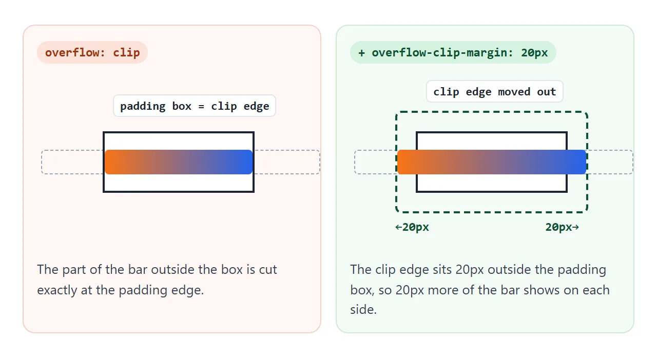
The value is a length, a box keyword, or both:
.box {
  overflow: clip;
  overflow-clip-margin: 20px;             /* 20px past the padding edge */
  overflow-clip-margin: content-box 5px;  /* 5px past the content edge */
}
The initial value is 0px, and the property is not inherited. Only painting changes: content shows further out, while the box's size and the layout around it stay the same.
It needs overflow: clip
The margin is ignored on boxes with overflow: hidden, scroll or auto. Those values make the box a scroll container, and clip does not. CSS overflow explains the other ways hidden and clip differ.
<!doctype html>
<html lang="en">
<head>
<meta charset="utf-8">
<meta name="viewport" content="width=device-width, initial-scale=1">
<title>overflow-clip-margin compared</title>
<style>
  body { margin: 0; padding: 16px; font-family: system-ui, sans-serif; background: #f4f5f7; color: #1d2330; }
  .grid { display: grid; grid-template-columns: repeat(auto-fit, minmax(150px, 1fr)); gap: 24px 20px; }
  .cell { display: flex; flex-direction: column; align-items: center; text-align: center; }
  .box {
    width: 110px; height: 70px; background: #fff;
    border: 2px dashed #9aa3b2; position: relative;
    overflow-clip-margin: 16px;  /* the same margin on every box */
  }
  .bar {
    position: absolute; left: -40px; right: -40px; top: 20px; height: 28px;
    background: linear-gradient(90deg, #f97316, #2563eb); border-radius: 6px;
  }
  code { font-size: 12.5px; background: #e8ebf0; padding: 2px 5px; border-radius: 4px; margin-top: 12px; }
  small { font-size: 12.5px; color: #555; margin-top: 4px; max-width: 170px; }
  .hidden { overflow: hidden; }
  .clip   { overflow: clip; }
  .xclip  { overflow-x: clip; }  /* y stays visible */
  .paint  { contain: paint; }
</style>
</head>
<body>
<div class="grid">
  <div class="cell">
    <div class="box hidden"><div class="bar"></div></div>
    <code>overflow: hidden</code><small>Margin ignored. Cut at the box.</small>
  </div>
  <div class="cell">
    <div class="box clip"><div class="bar"></div></div>
    <code>overflow: clip</code><small>Cut 16px outside the box.</small>
  </div>
  <div class="cell">
    <div class="box xclip"><div class="bar"></div></div>
    <code>overflow-x: clip</code><small>Firefox: 16px outside. Chromium: cut at the box.</small>
  </div>
  <div class="cell">
    <div class="box paint"><div class="bar"></div></div>
    <code>contain: paint</code><small>Also cut 16px outside the box.</small>
  </div>
</div>
</body>
</html>
contain: paint also clips to the overflow clip edge, so the margin works there too. That rule comes from the CSS Containment spec, and Chromium and Firefox both follow it in the demo.
| Box has | Clip margin used? |
|---|---|
overflow: hidden |
No |
overflow: scroll or auto |
No, it cannot extend the clip |
overflow: clip on both axes |
Yes |
overflow-x: clip only |
Firefox yes, Chromium no |
contain: paint |
Yes |
The CSS Overflow Editor's Draft goes further and lets the property shrink the clip of a scroll container, but never grow it.
Choosing the edge: content-box, padding-box, border-box
A keyword in front of the length picks which edge the margin is measured from. Leave it out and the browser uses padding-box.
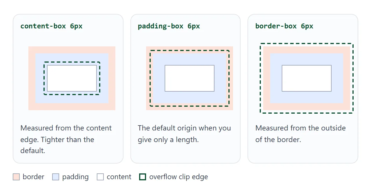
content-boxclips tighter than the default. Padding stops being a safe zone for overflow.padding-boxis the default. At 0px it matches plainoverflow: clip.border-boxstarts outside the border, so even at 0px, content can paint over the border.
MDN lists the length as non-negative, and every browser tested here rejected a negative length, dropping the declaration. To clip inside the padding, use content-box instead.
Rounded corners
If the box has border-radius, the extended clip edge has rounded corners too. The spec shapes them like the outer edge of a box-shadow with the same spread.
Chromium and Firefox both cut the corners of a large child this way in testing. CSS border-radius covers the radius itself.
Browser support
The support below comes from MDN's compatibility data. Each row was also checked by running the demos above in Chromium, Firefox and WebKit builds.
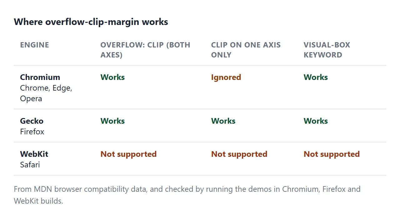
- Chromium (Chrome, Edge, Opera): works only when both axes are
clip, which MDN marks as partial support. - Firefox: works, including on a single clipped axis.
- Safari: not supported. The declaration is ignored and content is cut at the padding edge.
Because Safari ignores it, treat the clip margin as an extra, not something the layout depends on.
A practical use: keep focus rings and shadows
A row of cards with overflow: clip cuts off the cards that do not fit. It also cuts their shadows and the keyboard focus ring, because both paint outside the card. Press Tab in the demo to compare the two rows.
<!doctype html>
<html lang="en">
<head>
<meta charset="utf-8">
<meta name="viewport" content="width=device-width, initial-scale=1">
<title>Clip a row without cutting focus rings</title>
<style>
  body { margin: 0; padding: 24px 20px; font-family: system-ui, sans-serif; background: #f4f5f7; color: #1d2330; }
  h2 { font-size: 15px; margin: 0 0 12px; }
  .row {
    display: flex; gap: 14px;
    overflow: clip;             /* cut the cards that do not fit */
    overflow-clip-margin: 12px; /* but leave room for rings and shadows */
    margin-bottom: 30px;
  }
  .row.tight { overflow-clip-margin: 0px; }
  .card {
    flex: 0 0 120px; height: 64px; border: 0; border-radius: 10px;
    background: #fff; font: inherit; font-size: 14px;
    box-shadow: 0 4px 10px rgba(0, 0, 0, .18);
  }
  .card:focus-visible { outline: 3px solid #2563eb; outline-offset: 4px; }
  /* Fallback where overflow-clip-margin is not supported (Safari today) */
  @supports not (overflow-clip-margin: 1px) {
    .row:not(.tight) { padding: 12px; margin: -12px -12px 18px; }
  }
</style>
</head>
<body>
<h2>overflow-clip-margin: 0px</h2>
<div class="row tight">
  <button class="card">One</button><button class="card">Two</button>
  <button class="card">Three</button><button class="card">Four</button>
</div>
<h2>overflow-clip-margin: 12px</h2>
<div class="row">
  <button class="card">One</button><button class="card">Two</button>
  <button class="card">Three</button><button class="card">Four</button>
</div>
<p style="font-size:13px;color:#555">Press Tab to move the focus ring along each row.</p>
</body>
</html>
A 12px margin leaves room for a 3px outline with a 4px offset, and for a small box shadow. For Safari, add padding instead. The demo uses the same idea:
@supports not (overflow-clip-margin: 1px) {
  .row { padding: 12px; margin: -12px; }
}
The negative margin cancels the padding, so the row stays in the same place.
When it does not work
| What you see | Cause | Fix |
|---|---|---|
| No change at any value | The box uses overflow: hidden |
Use overflow: clip |
| Works in Firefox, not in Chrome | Only one axis is clip |
Set overflow: clip on both axes |
| No change in Safari | Safari does not support it | Add padding in an @supports not block |
| The declaration is dropped | The length is negative | Use a positive length or content-box |
| Content still cut by an outer box | An ancestor also clips | Add the margin, or padding, to that ancestor |
Share it as a link
Clipping is hard to judge from a screenshot, and the result depends on the browser. Sending the live page lets people open it in their own browser and see what it does there.
Paste the page into a NOS document and choose Create share link. HTML to link walks through it.
The page renders as written and its scripts run, so the people you send it to can drag the slider and tab through the cards themselves. If you change the code later, the same link shows the new version.