The CSS resize property lets the user resize a box by dragging a handle in its corner. Set resize: both (or horizontal or vertical) and give the element an overflow value other than visible. That is the whole recipe.
.box {
  resize: both;
  overflow: auto;
}
Try it. Drag the bottom-right corner of the blue box with a mouse.
<!doctype html>
<html lang="en">
<head>
<meta charset="utf-8">
<meta name="viewport" content="width=device-width, initial-scale=1">
<title>CSS resize: both</title>
<style>
  body { margin: 0; padding: 20px; font-family: system-ui, sans-serif; background: #f4f5f7; }
  .box {
    resize: both;     /* show a handle in the corner, drag in both directions */
    overflow: auto;   /* required: resize does nothing while overflow is visible */
    width: 240px; height: 140px;
    max-width: 100%;  /* never wider than the page */
    min-width: 120px; min-height: 60px;
    box-sizing: border-box;
    padding: 14px 16px; border-radius: 10px;
    background: #fff; border: 2px solid #2563eb;
  }
  code { font: 13px ui-monospace, Consolas, monospace; }
  #out { margin-top: 12px; color: #374151; font-size: 14px; }
</style>
</head>
<body>
<div class="box" id="box"><b>Drag my bottom-right corner.</b><br>The browser draws the handle. No JavaScript moves this box.</div>
<p id="out">style="<code id="attr"></code>"</p>

<script>
  // Only to show what the browser writes: the resize itself needs no script.
  const box = document.getElementById('box');
  const attr = document.getElementById('attr');
  new ResizeObserver(() => { attr.textContent = box.getAttribute('style') || ''; }).observe(box);
</script>
</body>
</html>
The script in that example only prints the style attribute. The browser draws the handle and does the resizing on its own.
The overflow rule
resize does nothing on a plain <div>. The spec says the property applies to elements that are scroll containers. A div starts with overflow: visible, so it is not one.
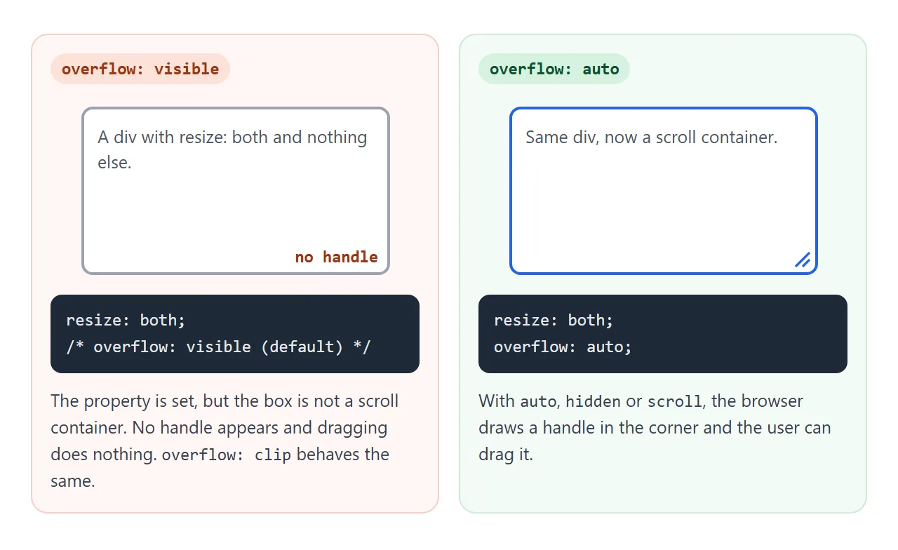
MDN lists the cases where resize does not apply:
- inline elements, such as a
<span> - block elements whose
overflowisvisibleorclip
overflow: auto is usually the right pick. It shows scrollbars only when the content no longer fits. hidden also works, but content that no longer fits is cut off with no scrollbar.
The six values
The property takes one keyword. The initial value is none, and the property is not inherited, so it has to be set on each box you want to resize.
| Value | What the user can change |
|---|---|
none |
Nothing. No handle is shown |
both |
Width and height |
horizontal |
Width only |
vertical |
Height only |
block |
Size along the block axis |
inline |
Size along the inline axis |
block and inline follow the text direction. In horizontal text, inline means width and block means height. In vertical writing modes they swap.
<!doctype html>
<html lang="en">
<head>
<meta charset="utf-8">
<meta name="viewport" content="width=device-width, initial-scale=1">
<title>CSS resize values</title>
<style>
  body { margin: 0; padding: 16px; font-family: system-ui, sans-serif; background: #f4f5f7; }
  .grid { display: grid; grid-template-columns: repeat(auto-fill, minmax(160px, 1fr)); gap: 12px; }
  .box {
    width: 150px; height: 80px; max-width: 100%;
    box-sizing: border-box; padding: 10px; border-radius: 8px;
    background: #fff; border: 2px solid #2563eb;
    font: 13px/1.4 ui-monospace, Consolas, monospace;
  }
  .scroll { overflow: auto; }            /* the four boxes that can resize */
  .none { resize: none; }
  .horizontal { resize: horizontal; }
  .vertical { resize: vertical; }
  .both { resize: both; }
  .visible { resize: both; overflow: visible; border-color: #c2410c; }  /* no handle */
  .inline { resize: inline; overflow: auto; }  /* width, in left-to-right text */
</style>
</head>
<body>
<div class="grid">
  <div class="box scroll none">resize: none</div>
  <div class="box scroll horizontal">resize: horizontal</div>
  <div class="box scroll vertical">resize: vertical</div>
  <div class="box scroll both">resize: both</div>
  <div class="box inline">resize: inline</div>
  <div class="box visible">resize: both<br>overflow: visible</div>
</div>
</body>
</html>
MDN's compatibility data lists block and inline in Chrome, Edge, Firefox and desktop Safari. In the Chromium I tested with, inline changed only the width, as expected for horizontal text.
What the browser writes when you drag
A resize is not stored in some hidden place. The spec says the browser sets width and height in the element's own style attribute, in px. If the user resizes in one direction only, only that one property is set.
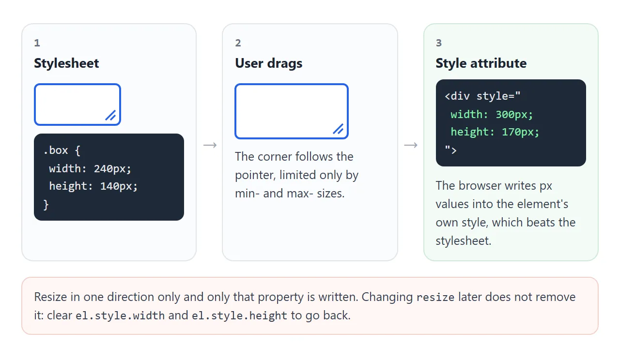
Three things follow from this:
- A
widthin your stylesheet no longer applies after a drag. The style attribute replaces it, unless the stylesheet rule uses!important. - Changing
resizeback tononelater does not undo the size. The spec says so directly. - To reset the box, clear the inline values in script.
box.style.width = '';
box.style.height = '';
The size is also not saved anywhere. Reload the page and the box is back to its stylesheet size.
Setting limits with min and max
Without limits, a user can drag a box past the edge of its card, or down to a sliver. The spec says the browser must let the user resize with no other constraints than min-width, max-width, min-height and max-height.
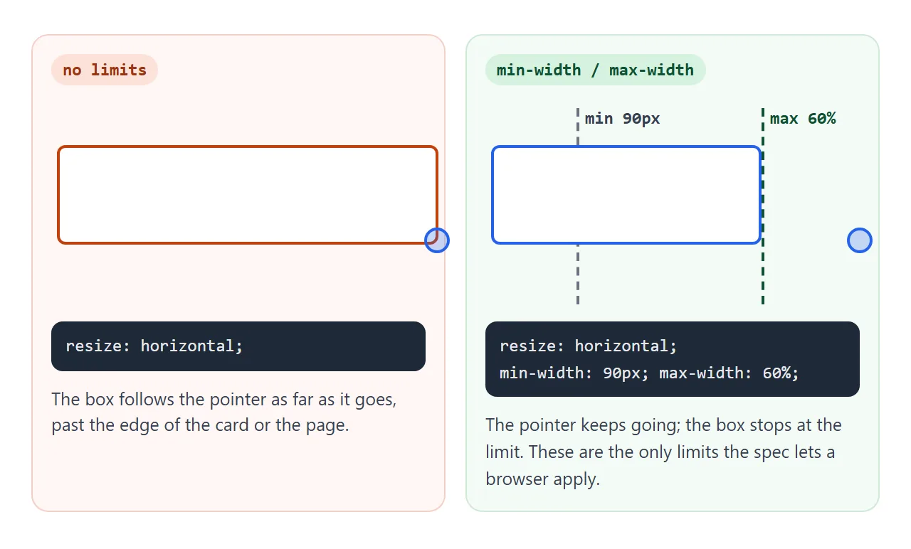
So those four properties are the controls. A few pairings that work well:
max-width: 100%keeps a box inside its parent.- A
min-heightstops the box collapsing to nothing. - A percentage
max-widthon a sidebar leaves room for the main column.
In my test, the boxes in the examples shrank below their starting size, down to their min-width and min-height, and never past them. css min-width explains how those limits interact with width.
A finished example: a resizable sidebar and notes panel
The same two lines build a small app layout. The sidebar uses resize: horizontal, and the notes panel uses resize: vertical.
<!doctype html>
<html lang="en">
<head>
<meta charset="utf-8">
<meta name="viewport" content="width=device-width, initial-scale=1">
<title>Resizable sidebar and notes panel</title>
<style>
  body { margin: 0; padding: 12px; font-family: system-ui, sans-serif; background: #f4f5f7; }
  * { box-sizing: border-box; }  /* sizes include padding */
  .app { display: flex; gap: 10px; min-height: 300px; }
  .side {
    resize: horizontal;   /* drag the corner left or right */
    overflow: auto;
    width: 160px;
    min-width: 90px;      /* the user cannot drag past these */
    max-width: 60%;
    flex-shrink: 0;       /* keep the width the user chose */
    background: #1e293b; color: #e2e8f0; border-radius: 10px; padding: 12px;
  }
  .side a { display: block; color: inherit; text-decoration: none; padding: 6px 0; }
  .main { flex: 1; min-width: 0; display: flex; flex-direction: column; gap: 10px; }
  .card { background: #fff; border-radius: 10px; padding: 12px; }
  .notes {
    resize: vertical;     /* only the height changes */
    overflow: auto;
    height: 90px; min-height: 50px; max-height: 200px;
    flex-shrink: 0;       /* keep the height the user chose */
    border: 1px solid #cbd5e1;
  }
  button { font: inherit; padding: 6px 12px; border-radius: 8px; border: 1px solid #94a3b8; background: #fff; cursor: pointer; align-self: flex-start; }
</style>
</head>
<body>
<div class="app">
  <nav class="side" id="side">
    <b>Pages</b>
    <a href="#">Overview</a><a href="#">Reports</a><a href="#">Settings</a>
  </nav>
  <div class="main">
    <div class="card">Drag the sidebar's bottom-right corner to change its width.</div>
    <div class="card notes" id="notes">Notes panel. Drag its bottom-right corner to make it taller, up to 200px.</div>
    <button id="reset">Reset sizes</button>
  </div>
</div>

<script>
  // Resizing writes width/height into the style attribute.
  // Clearing them returns each panel to its stylesheet size.
  document.getElementById('reset').addEventListener('click', () => {
    document.getElementById('side').style.width = '';
    document.getElementById('notes').style.height = '';
  });
</script>
</body>
</html>
Three details make it behave:
flex-shrink: 0on both panels. Without it, flexbox can squeeze a panel smaller than the size the user chose.box-sizing: border-box, somin-widthandmax-widthinclude the padding and match what you see.- A reset button that clears
style.widthandstyle.height, because that is where the user's sizes live.
If other code needs to react when the user resizes, such as redrawing a chart, use a ResizeObserver. The first example uses one to print the style attribute.
Textareas are already resizable
MDN notes that in many browsers, a <textarea> is resizable by default. In the Chromium I tested with, a textarea's computed resize value is both. That is why the corner handle appears without any CSS.
textarea { resize: vertical; }  /* taller only */
textarea { resize: none; }      /* no handle */
The HTML textarea guide covers rows, cols and auto height. For a textarea that grows as you type, field-sizing is another approach.
Browser support
MDN's compatibility data lists resize in Chrome, Edge, Firefox and Safari on desktop, and in Chrome on Android. For Safari on iOS, it says the property is recognized but has no effect.
So on an iPhone the box stays at its stylesheet size. If people on phones must be able to change the size, give them another control too, such as buttons.
When it does not work
| What you see | Cause | Fix |
|---|---|---|
| No handle on a div | overflow is visible |
overflow: auto |
| No handle, overflow is set | overflow: clip |
Use auto or hidden |
| No handle on a span | Inline elements are not resizable | display: block or inline-block, plus overflow |
| Box can be dragged off the page | No upper limit | max-width: 100% |
| Box shrinks to a sliver | No lower limit | min-width and min-height |
| Panel ignores the chosen size in a flex row | Flexbox shrinks it | flex-shrink: 0 |
| Drag works, but the size snaps back | An !important width or height in CSS |
Remove !important |
| No handle on an iPhone | Safari on iOS has no effect for resize |
Offer buttons as well |
Share it as a link
A resizable layout is easier to show than to describe. A screenshot cannot be dragged, and the person you send it to wants to try the handle themselves.
Paste the page into a NOS document and choose Create share link. HTML to link walks through it.
The page renders as written and its scripts run, so anyone with the link can drag the corners. If you change the code later, the same link shows the new version.