Add field-sizing: content to a form control and it sizes itself to what is inside. An <input> widens as you type, a <textarea> grows a line at a time, and a <select> fits the chosen option.
Pair it with minimum and maximum limits, and keep a short script for browsers without it.
Try it first. Type a longer name, add lines, pick the long option.
<!doctype html>
<html lang="en">
<head>
<meta charset="utf-8">
<meta name="viewport" content="width=device-width, initial-scale=1">
<title>field-sizing: content</title>
<style>
  body { margin: 0; padding: 18px; font: 16px/1.45 system-ui, sans-serif; background: #f4f5f7; color: #1d2330; }
  label { display: block; margin: 0 0 14px; font-size: 13px; color: #4b5563; }
  input, textarea, select {
    display: block; margin-top: 4px;
    font: inherit; padding: 6px 10px; box-sizing: border-box;
    border: 1px solid #c9ced6; border-radius: 8px; background: #fff;
  }

  /* The whole trick: size the box to what is inside it */
  .fit { field-sizing: content; }

  /* Limits, so the box never gets too small or too wide */
  input.fit    { min-width: 6ch; max-width: 100%; }
  textarea.fit { min-width: 12ch; max-width: 100%; min-height: 2lh; }
</style>
</head>
<body>
  <label>Input (type a longer name)
    <input class="fit" value="Ada">
  </label>
  <label>Textarea (press Enter for new lines)
    <textarea class="fit">One line to start.</textarea>
  </label>
  <label>Select (pick the long option)
    <select class="fit">
      <option>Short</option>
      <option>A much longer option label</option>
    </select>
  </label>
</body>
</html>
The CSS that does the work is one line, plus limits:
.fit { field-sizing: content; }

input.fit    { min-width: 6ch; max-width: 100%; }
textarea.fit { min-width: 12ch; max-width: 100%; min-height: 2lh; }
What field-sizing changes
Form fields normally have a fixed default size. The browser picks a width for an input and a number of rows for a textarea, and the text scrolls inside that box. That default is field-sizing: fixed.
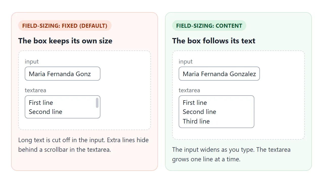
With field-sizing: content the box measures its content instead:
| Element | Size with field-sizing: content |
|---|---|
<input> |
Width follows the typed value, or the placeholder when empty |
<textarea> |
Height follows the lines, width follows the longest line |
<select> |
Width follows the selected option, not the longest one |
The property does not change how the value is read or sent. input.value and form data work as before.
Why min and max limits matter
Content sizing has two bad edges. An empty input with no placeholder shrinks to a sliver that is hard to tap. A long line makes the box wider than its container, and the page can scroll sideways.
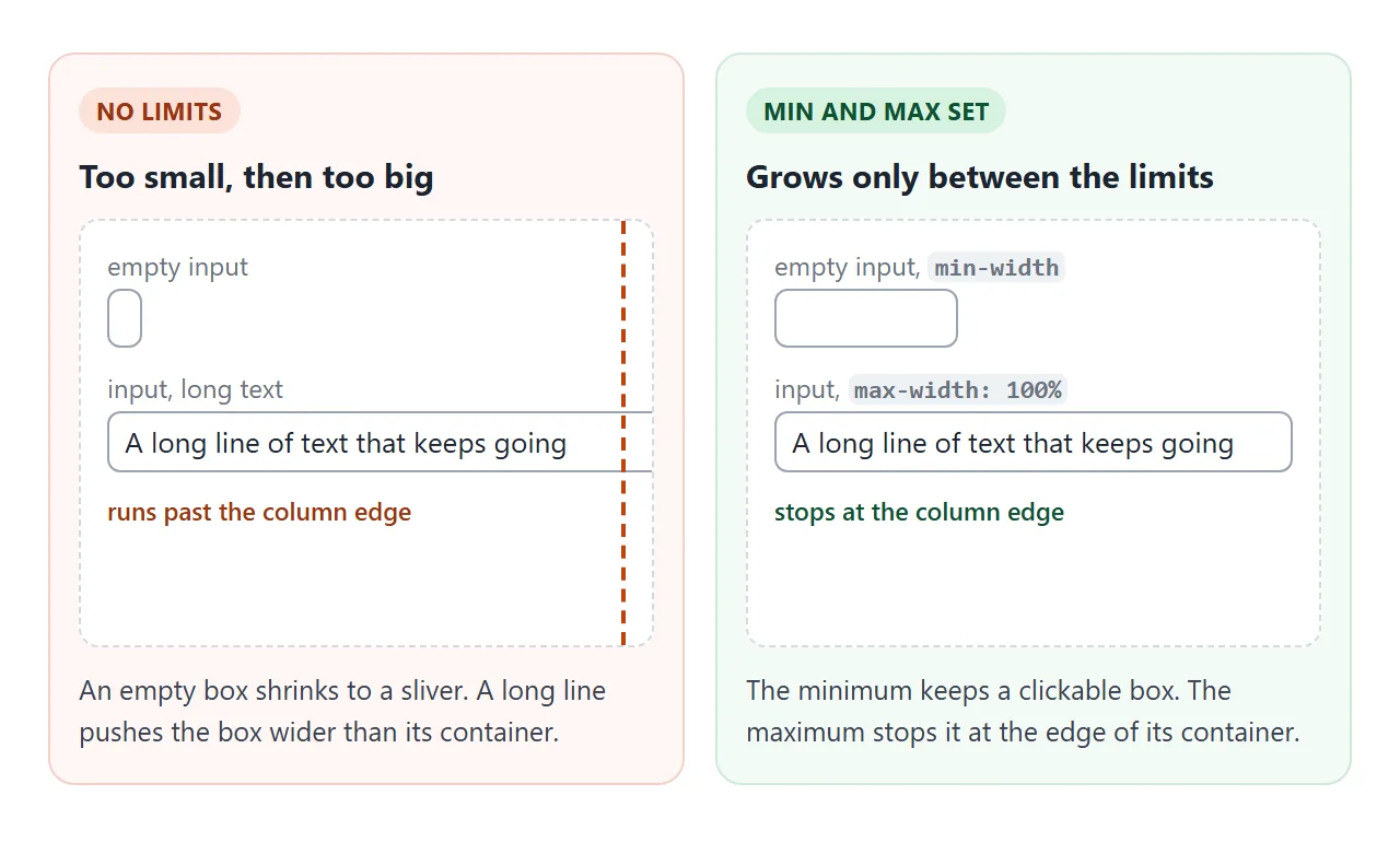
Press Fill and Clear in the example below to see both edges, and how limits fix them.
<!doctype html>
<html lang="en">
<head>
<meta charset="utf-8">
<meta name="viewport" content="width=device-width, initial-scale=1">
<title>field-sizing with and without limits</title>
<style>
  body { margin: 0; padding: 14px; font: 15px/1.45 system-ui, sans-serif; background: #f4f5f7; color: #1d2330; }
  .grid { display: grid; grid-template-columns: repeat(auto-fit, minmax(160px, 1fr)); gap: 12px; }
  .col { background: #fff; border: 1px solid #e1e4ea; border-radius: 10px; padding: 10px 12px; min-width: 0; overflow: hidden; }
  h3 { margin: 0 0 8px; font-size: 13px; }
  .col.bad h3 { color: #9a3412; } .col.good h3 { color: #0f5132; }
  input, textarea {
    display: block; margin: 0 0 10px; font: inherit; padding: 5px 8px;
    border: 1px solid #c9ced6; border-radius: 6px;
    box-sizing: border-box;  /* so max-width: 100% includes padding and border */
    field-sizing: content;
  }

  /* Right column only: a floor and a ceiling */
  .good input    { min-width: 8ch; max-width: 100%; }
  .good textarea { min-width: 100%; min-height: 2lh; max-height: 4lh; }
  button { font: inherit; font-size: 13px; padding: 4px 10px; }
</style>
</head>
<body>
<div class="grid">
  <div class="col bad">
    <h3>No limits</h3>
    <input id="in1" value="">
    <textarea id="ta1"></textarea>
  </div>
  <div class="col good">
    <h3>min and max set</h3>
    <input id="in2" value="">
    <textarea id="ta2"></textarea>
  </div>
</div>
<p><button id="fill">Fill both with long text</button> <button id="clear">Clear both</button></p>

<script>
  const long = 'A long line of text that keeps going past the edge of the column.'
    + '\nLine two\nLine three\nLine four\nLine five\nLine six\nLine seven\nLine eight';
  const boxes = document.querySelectorAll('input, textarea');
  document.getElementById('fill').addEventListener('click', () => {
    boxes.forEach((b) => { b.value = b.tagName === 'INPUT' ? long.split('\n')[0] : long; });
  });
  document.getElementById('clear').addEventListener('click', () => {
    boxes.forEach((b) => { b.value = ''; });
  });
</script>
</body>
</html>
min-widthon inputs keeps an empty field clickable.chunits, the width of the zero character, suit text fields.max-width: 100%stops a field at its container. Addbox-sizing: border-box, or padding and border push it past the edge.min-heighton a textarea replaces therowsattribute, which content sizing ignores. Thelhunit is one line height.max-heightstops a textarea from growing. After that it scrolls, like a normal textarea.
Check support before you rely on it
field-sizing is newer than most form CSS. When we tested in September 2026, the Chromium engine (Chrome, Edge) and the WebKit engine (Safari) applied it, and the Firefox engine ignored it.
Where it is ignored, fields keep their normal fixed size, so nothing breaks. They just do not grow.
JavaScript can ask the browser directly:
const cssWorks = CSS.supports('field-sizing', 'content');
CSS has the same test as a block. Use it to give unsupported browsers a taller fixed textarea instead:
@supports not (field-sizing: content) {
  textarea { min-height: 6lh; }
}
The JavaScript fallback for textareas
For a textarea, the fallback is short. On every input event, set the height to auto so the box can shrink, then set it from scrollHeight. Only run it where CSS cannot do the job.
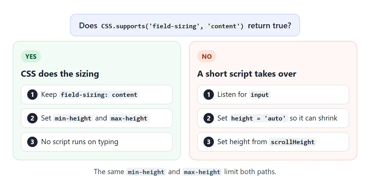
const box = document.querySelector('textarea');

if (!CSS.supports('field-sizing', 'content')) {
  box.addEventListener('input', () => {
    box.style.height = 'auto';
    box.style.height = box.scrollHeight + 'px';
  });
}
scrollHeight includes padding but not the border, so this exact line fits a textarea with box-sizing: border-box only after you add the border widths. The textarea guide covers that arithmetic and the other textarea basics.
For an input, a rough fallback sets its size attribute to the number of characters typed. size counts average character widths, so the fit is approximate.
A finished example: a message box
A chat composer is the classic use. The box starts at one line, grows to six, then scrolls. It uses CSS where supported and the script everywhere else. Tick Force the JS fallback to watch the script path in any browser.
<!doctype html>
<html lang="en">
<head>
<meta charset="utf-8">
<meta name="viewport" content="width=device-width, initial-scale=1">
<title>Growing message box with fallback</title>
<style>
  body { margin: 0; padding: 14px; font: 15px/1.45 system-ui, sans-serif; background: #eceef1; color: #1d2330; }
  .chat { max-width: 520px; margin: 0 auto; background: #fff; border-radius: 12px; box-shadow: 0 4px 16px rgba(0,0,0,.08); overflow: hidden; }
  .log { height: 170px; overflow-y: auto; padding: 12px; display: flex; flex-direction: column; gap: 6px; }
  .msg { align-self: flex-end; max-width: 80%; background: #2563eb; color: #fff; padding: 6px 11px; border-radius: 12px; white-space: pre-wrap; overflow-wrap: anywhere; }
  form { display: flex; gap: 8px; align-items: flex-end; padding: 10px; border-top: 1px solid #e5e7eb; }
  textarea {
    flex: 1; font: inherit; padding: 8px 10px; resize: none;
    border: 1px solid #c9ced6; border-radius: 10px;
    field-sizing: content;
    min-height: 1lh; max-height: 6lh;  /* 1 to 6 lines, then it scrolls */
    box-sizing: content-box;
  }
  button { font: inherit; padding: 8px 14px; border: 0; border-radius: 10px; background: #2563eb; color: #fff; }
  .meta { display: flex; justify-content: space-between; flex-wrap: wrap; gap: 6px; padding: 0 12px 10px; font-size: 12.5px; color: #6b7280; }
  .meta b { color: #0f5132; }

  /* Test switch: turn CSS sizing off to watch the JavaScript fallback */
  .force-js textarea { field-sizing: fixed; }
</style>
</head>
<body>
<div class="chat" id="chat">
  <div class="log" id="log"><div class="msg">Type a few lines below.</div></div>
  <form id="form">
    <textarea id="box" rows="1" placeholder="Message"></textarea>
    <button>Send</button>
  </form>
  <div class="meta">
    <span>Sizing by: <b id="mode"></b></span>
    <label><input type="checkbox" id="force"> Force the JS fallback</label>
  </div>
</div>

<script>
  const box = document.getElementById('box');
  const chat = document.getElementById('chat');
  const mode = document.getElementById('mode');
  const cssWorks = CSS.supports('field-sizing', 'content');
  let useJs = !cssWorks;

  // Fallback: shrink to auto, then grow to the content height
  function fit() {
    if (!useJs) return;
    box.style.height = 'auto';
    box.style.height = box.scrollHeight - 16 + 'px';  // 16 = top + bottom padding (content-box)
  }

  function setMode() {
    chat.classList.toggle('force-js', useJs && cssWorks);
    if (!useJs) box.style.height = '';  // hand sizing back to CSS
    mode.textContent = useJs ? 'JavaScript fallback' : 'CSS field-sizing';
    fit();
  }

  box.addEventListener('input', fit);

  document.getElementById('force').addEventListener('change', (e) => {
    useJs = e.target.checked || !cssWorks;
    setMode();
  });

  // Enter sends, Shift+Enter adds a line
  box.addEventListener('keydown', (e) => {
    if (e.key === 'Enter' && !e.shiftKey) { e.preventDefault(); document.getElementById('form').requestSubmit(); }
  });

  document.getElementById('form').addEventListener('submit', (e) => {
    e.preventDefault();
    const text = box.value.trim();
    if (!text) return;
    const div = document.createElement('div');
    div.className = 'msg';
    div.textContent = text;
    const log = document.getElementById('log');
    log.append(div);
    log.scrollTop = log.scrollHeight;
    box.value = '';
    fit();
    box.focus();
  });

  setMode();
</script>
</body>
</html>
The parts:
field-sizing: contentwithmin-height: 1lhandmax-height: 6lh.resize: noneso a dragged handle does not fix the height.- The fallback, run only when the support check fails.
- Reset after sending. Clearing the value shrinks the CSS path by itself. The script path needs one more call to the sizing function.
When it does not work
| What you see | Cause | Fix |
|---|---|---|
| The field never changes size | The browser does not support the property | Check with CSS.supports and add the fallback |
| An empty input is a thin sliver | Nothing to size to | min-width or a placeholder |
| The field runs off the right edge | No maximum | max-width: 100% |
| It still sticks out a few pixels | Padding and border are added to the max | box-sizing: border-box |
rows or size has no effect |
Content sizing replaces them | min-height or min-width |
| It stopped growing after a resize | The resize handle set a fixed height | resize: none, or accept the fixed size |
| The box does not grow at all | An explicit width or height wins |
Remove it, use min and max |
Share it as a link
A form that grows as you type is easier to try than to describe. A screenshot shows one size, and a pasted snippet cannot be typed into. For single-line fields, see the text input guide, and for dropdowns, the select tag guide.
To send the working version, paste the page into a NOS document and choose Create share link. HTML to link walks through it.
The page renders as written and its scripts run, so the people you send it to can type into the fields themselves. If you change the code later, the same link shows the new version.