A carousel is two boxes. The inner one, the track, holds every slide side by side in one row. The outer one, the viewport, is the size of one slide and hides the rest. Moving the track moves the slides. No library is needed.
The shortest working version uses CSS scroll-snap. Swipe it on a phone, scroll it with a trackpad, or use the buttons.
<!doctype html>
<html lang="en">
<head>
<meta charset="utf-8">
<meta name="viewport" content="width=device-width, initial-scale=1">
<title>Scroll-snap carousel</title>
<style>
body { margin: 0; padding: 16px; font-family: system-ui, sans-serif; background: #f4f5f7; }
.carousel { position: relative; max-width: 560px; margin: 0 auto; }
.track {
display: flex; gap: 12px; /* slides sit in one row */
overflow-x: auto; /* the row scrolls sideways */
scroll-snap-type: x mandatory; /* and always stops on a slide */
scroll-behavior: smooth;
padding-bottom: 8px;
}
.slide {
flex: 0 0 80%; /* each slide is 80% of the track, never shrinks */
scroll-snap-align: start;
height: 200px; border-radius: 14px; color: #fff;
display: flex; align-items: flex-end; padding: 18px; box-sizing: border-box;
font-size: 22px; font-weight: 700;
}
.s1 { background: linear-gradient(135deg, #2563eb, #7c3aed); }
.s2 { background: linear-gradient(135deg, #059669, #0ea5e9); }
.s3 { background: linear-gradient(135deg, #ea580c, #db2777); }
.s4 { background: linear-gradient(135deg, #0f766e, #65a30d); }
.s5 { background: linear-gradient(135deg, #7c2d12, #d97706); }
.buttons { display: flex; justify-content: center; gap: 10px; margin-top: 10px; }
button {
font: inherit; font-size: 15px; padding: 8px 16px; border-radius: 8px;
border: 1px solid #cbd5e1; background: #fff; cursor: pointer;
}
</style>
</head>
<body>
<div class="carousel" role="region" aria-roledescription="carousel" aria-label="Featured">
<div class="track" id="track" tabindex="0">
<div class="slide s1" role="group" aria-label="Slide 1 of 5">Plan</div>
<div class="slide s2" role="group" aria-label="Slide 2 of 5">Design</div>
<div class="slide s3" role="group" aria-label="Slide 3 of 5">Build</div>
<div class="slide s4" role="group" aria-label="Slide 4 of 5">Test</div>
<div class="slide s5" role="group" aria-label="Slide 5 of 5">Ship</div>
</div>
<div class="buttons">
<button id="prev" aria-label="Previous slide">← Prev</button>
<button id="next" aria-label="Next slide">Next →</button>
</div>
</div>
<script>
const track = document.getElementById('track');
// one step = one slide width + the gap between slides
function step() {
const slide = track.querySelector('.slide');
const gap = parseFloat(getComputedStyle(track).columnGap) || 0;
return slide.offsetWidth + gap;
}
document.getElementById('prev').addEventListener('click', () => track.scrollBy({ left: -step() }));
document.getElementById('next').addEventListener('click', () => track.scrollBy({ left: step() }));
</script>
</body>
</html>
The slides are CSS gradients with a title, so the example has no image files. Put an <img> inside each slide and the code stays the same.
The layout: a row behind a window
Every carousel, with or without JavaScript, rests on the same three CSS rules.
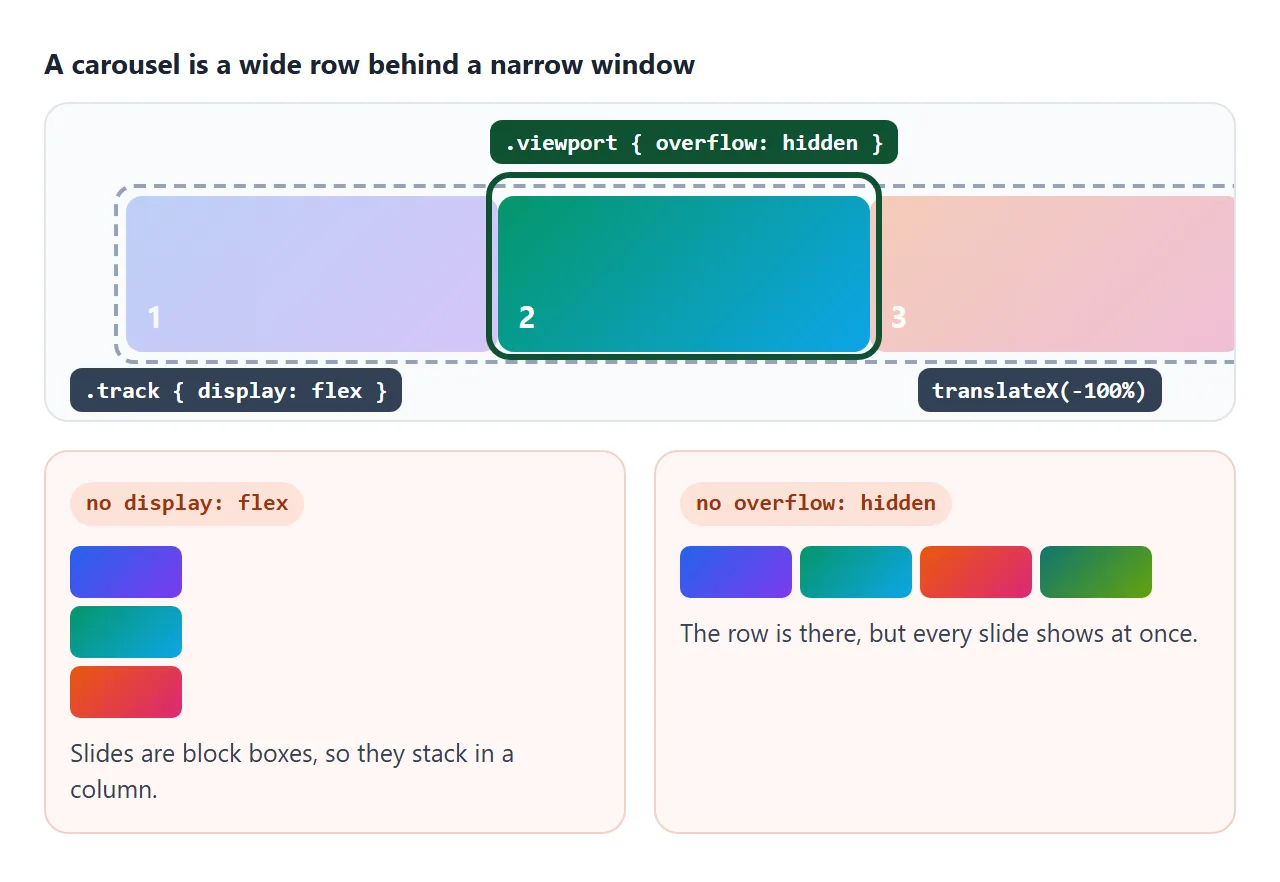
display: flexon the track. Slides are normally block boxes, which stack in a column. Flex puts them in one row.flex: 0 0 100%on each slide. The zeros stop slides from growing or shrinking to fit, so each one keeps its full width. Use 80% to let the next slide peek in.overflow: hiddenon the viewport. Without it the row spills past the frame and every slide shows at once.
For more on how flex rows size their children, see CSS flexbox.
Version 1: scroll-snap, swipe for free
In the first example, the viewport and the track are the same element. It gets overflow-x: auto, so it scrolls sideways, and scroll-snap-type: x mandatory, so scrolling always ends on a slide. Each slide gets scroll-snap-align: start.
.track { display: flex; gap: 12px; overflow-x: auto;
         scroll-snap-type: x mandatory; scroll-behavior: smooth; }
.slide { flex: 0 0 80%; scroll-snap-align: start; }
Because it is a real scroll area, touch swiping, trackpads and scroll bars work without any script. The buttons only call scrollBy. The one thing to get right is how far one click moves.
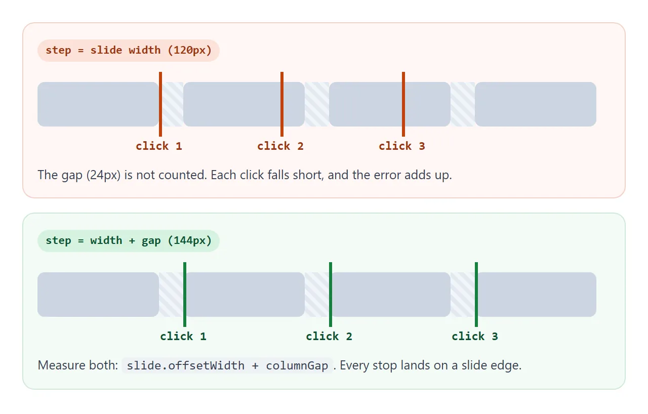
const gap = parseFloat(getComputedStyle(track).columnGap) || 0;
track.scrollBy({ left: slide.offsetWidth + gap });
Measure the width on each click rather than storing a number. The slide width changes when the window is resized or a phone rotates.
Version 2: a sliding track with dots
Scroll-snap cannot wrap from the last slide back to the first, and the edge of the next slide is often visible. When you want exactly one slide in the frame, move the track with transform instead.
<!doctype html>
<html lang="en">
<head>
<meta charset="utf-8">
<meta name="viewport" content="width=device-width, initial-scale=1">
<title>Carousel with dots</title>
<style>
body { margin: 0; padding: 16px; font-family: system-ui, sans-serif; background: #f4f5f7; }
.carousel { max-width: 560px; margin: 0 auto; }
.viewport { overflow: hidden; border-radius: 14px; } /* hides the slides outside the frame */
.track {
display: flex; /* one row, no wrapping */
transition: transform .4s ease;
}
.slide {
flex: 0 0 100%; /* exactly one slide per frame */
height: 210px; color: #fff; box-sizing: border-box; padding: 20px;
display: flex; flex-direction: column; justify-content: flex-end;
}
.slide h2 { margin: 0; font-size: 24px; }
.slide p { margin: 4px 0 0; opacity: .9; }
.s1 { background: linear-gradient(135deg, #2563eb, #7c3aed); }
.s2 { background: linear-gradient(135deg, #059669, #0ea5e9); }
.s3 { background: linear-gradient(135deg, #ea580c, #db2777); }
.s4 { background: linear-gradient(135deg, #0f766e, #65a30d); }
.controls { display: flex; align-items: center; justify-content: center; gap: 12px; margin-top: 12px; }
.arrow {
font: inherit; font-size: 18px; width: 40px; height: 40px; border-radius: 50%;
border: 1px solid #cbd5e1; background: #fff; cursor: pointer;
}
.dots { display: flex; gap: 4px; }
.dot {
width: 24px; height: 24px; padding: 0; border: 0; background: none; cursor: pointer;
display: grid; place-items: center; /* bigger click area than the dot you see */
}
.dot::before { content: ""; width: 10px; height: 10px; border-radius: 50%; background: #cbd5e1; }
.dot[aria-current="true"]::before { background: #1d2330; }
</style>
</head>
<body>
<div class="carousel" role="region" aria-roledescription="carousel" aria-label="Product tour">
<div class="viewport">
<div class="track" id="track">
<div class="slide s1" role="group" aria-label="Slide 1 of 4"><h2>Write</h2><p>Paste any HTML.</p></div>
<div class="slide s2" role="group" aria-label="Slide 2 of 4"><h2>Preview</h2><p>See it render.</p></div>
<div class="slide s3" role="group" aria-label="Slide 3 of 4"><h2>Share</h2><p>Send one link.</p></div>
<div class="slide s4" role="group" aria-label="Slide 4 of 4"><h2>Update</h2><p>Same link, new version.</p></div>
</div>
</div>
<div class="controls">
<button class="arrow" id="prev" aria-label="Previous slide">‹</button>
<div class="dots" id="dots"></div>
<button class="arrow" id="next" aria-label="Next slide">›</button>
</div>
</div>
<script>
const track = document.getElementById('track');
const slides = track.children;
const dots = document.getElementById('dots');
let index = 0;
// one dot button per slide
for (let i = 0; i < slides.length; i++) {
const b = document.createElement('button');
b.className = 'dot';
b.setAttribute('aria-label', 'Go to slide ' + (i + 1));
b.addEventListener('click', () => goTo(i));
dots.appendChild(b);
}
function goTo(i) {
index = (i + slides.length) % slides.length; // wrap around at both ends
track.style.transform = 'translateX(' + (-100 * index) + '%)';
[...dots.children].forEach((d, n) => d.setAttribute('aria-current', n === index));
}
document.getElementById('prev').addEventListener('click', () => goTo(index - 1));
document.getElementById('next').addEventListener('click', () => goTo(index + 1));
goTo(0);
</script>
</body>
</html>
The whole carousel is one function. It stores the index, wraps it at both ends, moves the track and marks the current dot:
function goTo(i) {
  index = (i + slides.length) % slides.length;
  track.style.transform = 'translateX(' + (-100 * index) + '%)';
  dots.forEach((d, n) => d.setAttribute('aria-current', n === index));
}
A percentage in translateX is a share of the element's own width. The track is exactly as wide as the viewport, so -100% is one slide. This only holds while the slides have no gap between them.
A transition: transform .4s on the track makes the move smooth. Every arrow and dot just calls goTo.
Version 3: a finished hero slideshow
The last example adds what a real page needs: autoplay, a pause button, keyboard arrows, swipe, and a "2 / 5" counter.
<!doctype html>
<html lang="en">
<head>
<meta charset="utf-8">
<meta name="viewport" content="width=device-width, initial-scale=1">
<title>Hero slideshow</title>
<style>
body { margin: 0; padding: 16px; font-family: system-ui, sans-serif; background: #f4f5f7; }
.hero { position: relative; max-width: 600px; margin: 0 auto; }
.viewport { overflow: hidden; border-radius: 16px; touch-action: pan-y; user-select: none; } /* vertical swipes still scroll the page */
.track { display: flex; transition: transform .5s ease; }
.slide {
flex: 0 0 100%; height: 250px; box-sizing: border-box; padding: 22px 22px 56px;
color: #fff; display: flex; flex-direction: column; justify-content: flex-end;
}
.slide h2 { margin: 0; font-size: 26px; }
.slide p { margin: 6px 0 0; opacity: .92; }
.slide svg { width: 56px; height: 56px; margin-bottom: auto; }
.s1 { background: linear-gradient(135deg, #1e3a8a, #6d28d9); }
.s2 { background: linear-gradient(135deg, #065f46, #0891b2); }
.s3 { background: linear-gradient(135deg, #9a3412, #be185d); }
.s4 { background: linear-gradient(135deg, #115e59, #4d7c0f); }
.s5 { background: linear-gradient(135deg, #1f2937, #b45309); }
.bar {
position: absolute; left: 12px; right: 12px; bottom: 12px;
display: flex; align-items: center; gap: 8px; color: #fff;
}
.bar button {
font: inherit; font-size: 15px; min-width: 38px; height: 38px; padding: 0 10px; border-radius: 19px;
border: 0; background: rgba(0, 0, 0, .38); color: #fff; cursor: pointer;
}
.bar button:focus-visible { outline: 3px solid #fff; outline-offset: 2px; }
.count { margin-left: auto; font-variant-numeric: tabular-nums; background: rgba(0, 0, 0, .38); padding: 8px 12px; border-radius: 19px; }
@media (prefers-reduced-motion: reduce) { .track { transition: none; } }
</style>
</head>
<body>
<section class="hero" id="hero" role="region" aria-roledescription="carousel" aria-label="Highlights">
<div class="viewport" id="viewport">
<div class="track" id="track" aria-live="off">
<div class="slide s1" role="group" aria-roledescription="slide" aria-label="Slide 1 of 5">
<svg viewBox="0 0 24 24" fill="none" stroke="#fff" stroke-width="2" aria-hidden="true"><circle cx="12" cy="12" r="9"/><path d="M12 7v5l3 3"/></svg>
<h2>Fast to start</h2><p>One file, no install.</p></div>
<div class="slide s2" role="group" aria-roledescription="slide" aria-label="Slide 2 of 5">
<svg viewBox="0 0 24 24" fill="none" stroke="#fff" stroke-width="2" aria-hidden="true"><rect x="4" y="4" width="16" height="16" rx="3"/><path d="M8 12l3 3 5-6"/></svg>
<h2>Works on phones</h2><p>Swipe or tap the arrows.</p></div>
<div class="slide s3" role="group" aria-roledescription="slide" aria-label="Slide 3 of 5">
<svg viewBox="0 0 24 24" fill="none" stroke="#fff" stroke-width="2" aria-hidden="true"><path d="M4 17l6-6 4 4 6-8"/></svg>
<h2>Keyboard ready</h2><p>Left and right arrow keys.</p></div>
<div class="slide s4" role="group" aria-roledescription="slide" aria-label="Slide 4 of 5">
<svg viewBox="0 0 24 24" fill="none" stroke="#fff" stroke-width="2" aria-hidden="true"><rect x="6" y="5" width="4" height="14"/><rect x="14" y="5" width="4" height="14"/></svg>
<h2>Pauses politely</h2><p>Hover, focus or the pause button.</p></div>
<div class="slide s5" role="group" aria-roledescription="slide" aria-label="Slide 5 of 5">
<svg viewBox="0 0 24 24" fill="none" stroke="#fff" stroke-width="2" aria-hidden="true"><path d="M5 12h14M13 6l6 6-6 6"/></svg>
<h2>No library</h2><p>About 50 lines of JavaScript.</p></div>
</div>
</div>
<div class="bar">
<button id="play" aria-label="Pause slideshow">❚❚</button>
<button id="prev" aria-label="Previous slide">←</button>
<button id="next" aria-label="Next slide">→</button>
<span class="count" id="count">1 / 5</span>
</div>
</section>
<script>
const hero = document.getElementById('hero');
const track = document.getElementById('track');
const count = document.getElementById('count');
const playBtn = document.getElementById('play');
const total = track.children.length;
const DELAY = 4000;
let index = 0, timer = null;
let stopped = matchMedia('(prefers-reduced-motion: reduce)').matches; // user choice: no autoplay
let hovered = false, focused = false;
function goTo(i) {
index = (i + total) % total;
track.style.transform = 'translateX(' + (-100 * index) + '%)';
count.textContent = (index + 1) + ' / ' + total;
[...track.children].forEach((s, n) => s.inert = n !== index); // hidden slides: no tab stops
}
// run the timer only when nothing asks it to wait
function update() {
clearInterval(timer); timer = null;
const run = !stopped && !hovered && !focused && !document.hidden;
if (run) timer = setInterval(() => goTo(index + 1), DELAY);
track.setAttribute('aria-live', run ? 'off' : 'polite'); // announce slides only when the user moves them
playBtn.innerHTML = stopped ? '▶' : '❚❚';
playBtn.setAttribute('aria-label', stopped ? 'Start slideshow' : 'Pause slideshow');
}
playBtn.addEventListener('click', () => { stopped = !stopped; update(); });
document.getElementById('prev').addEventListener('click', () => goTo(index - 1));
document.getElementById('next').addEventListener('click', () => goTo(index + 1));
hero.addEventListener('mouseenter', () => { hovered = true; update(); });
hero.addEventListener('mouseleave', () => { hovered = false; update(); });
hero.addEventListener('focusin', () => { focused = true; update(); });
hero.addEventListener('focusout', (e) => { focused = hero.contains(e.relatedTarget); update(); });
document.addEventListener('visibilitychange', update); // stop in a background tab
hero.addEventListener('keydown', (e) => {
if (e.key === 'ArrowLeft') goTo(index - 1);
if (e.key === 'ArrowRight') goTo(index + 1);
});
// swipe: compare where the finger went down and came up
let startX = null;
const vp = document.getElementById('viewport');
vp.addEventListener('pointerdown', (e) => { startX = e.clientX; });
vp.addEventListener('pointerup', (e) => {
if (startX === null) return;
const dx = e.clientX - startX; startX = null;
if (Math.abs(dx) > 40) goTo(index + (dx < 0 ? 1 : -1));
});
goTo(0); update();
</script>
</body>
</html>
Autoplay is setInterval, but it must know when to wait. Keep one update() function that stops the timer and only restarts it when nothing asks it to stay still.
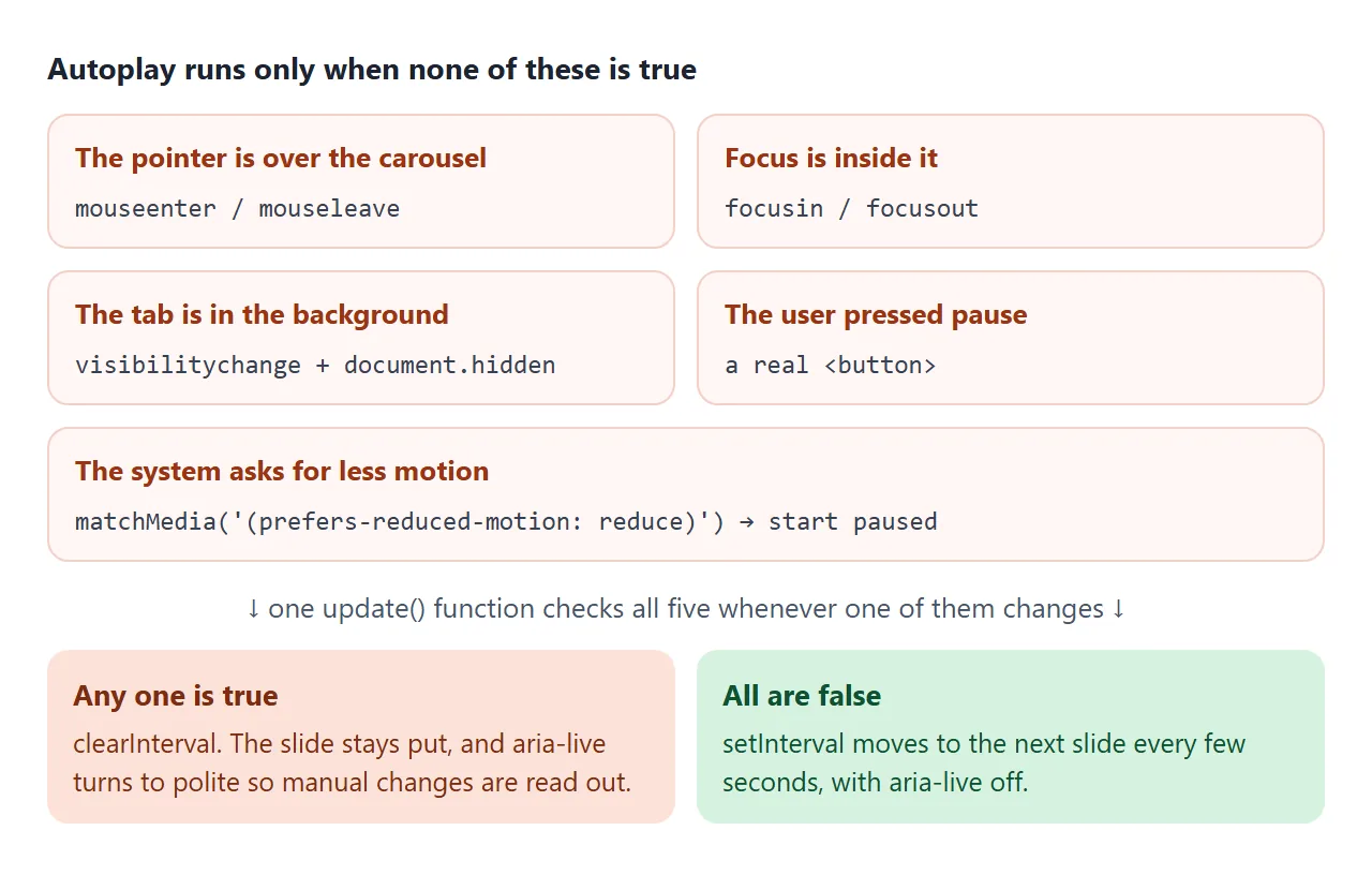
- Hover and focus:
mouseenter,mouseleave,focusinandfocusouton the carousel set a flag. - Background tab: browsers slow timers in hidden tabs but do not stop them. Listen for
visibilitychangeand checkdocument.hidden. - Reduced motion: if
matchMedia('(prefers-reduced-motion: reduce)')matches, start paused and drop the transition. - Pause button: WCAG 2.2.2 asks that moving content which starts by itself and lasts over five seconds can be paused. A visible button covers it.
Keyboard, swipe and screen readers
A keydown listener on the carousel moves on ArrowLeft and ArrowRight while focus is inside it. The prev and next controls are real <button> elements, so they are already reachable with Tab. tabindex explains when a non-button needs to join the tab order.
Swipe on the transform track uses two pointer events. Record clientX on pointerdown, compare it on pointerup, and move if the difference is over 40 pixels. touch-action: pan-y on the viewport lets vertical swipes keep scrolling the page.
For screen readers, the labels follow the carousel pattern in the WAI-ARIA Authoring Practices:
| Element | Attributes |
|---|---|
| Carousel | role="region", aria-roledescription="carousel", aria-label="Highlights" |
| Each slide | role="group", aria-roledescription="slide", aria-label="Slide 2 of 5" |
| Track | aria-live="off" while autoplaying, "polite" when stopped |
| Hidden slides | inert, so Tab skips links inside slides you cannot see |
Scroll-snap or transform: which one
| Scroll-snap | Transform track | |
|---|---|---|
| Swipe on a phone | Built in | A few lines of pointer code |
| Wrap from last to first | No | Yes |
| Slides in view | Can show part of the next one | Exactly one |
| Dots | Possible, needs scroll tracking | One index, easy |
| JavaScript needed | Only for buttons | For all movement |
For a strip of product cards, scroll-snap is less code. For a single hero banner with dots and autoplay, the transform track is the easier fit. A grid that shows everything at once may suit photos better: see HTML image gallery.
When it does not work
| What you see | Cause | Fix |
|---|---|---|
| Slides stack under each other | The track is not a flex row | display: flex on the track |
| Slides squeeze to fit on one line | Flex items shrink by default | flex: 0 0 100% (or a fixed width) on each slide |
| All slides are visible at once | The viewport does not clip | overflow: hidden on the element around the track |
| Buttons move too little or drift further each click | The step ignores the gap, or is a fixed number | Step = offsetWidth + columnGap, measured on click |
| translateX lands between slides | A gap was added to the transform track | Remove the gap, or move by calc() with the gap included |
| Autoplay keeps running in a background tab | setInterval never stops |
Stop it on visibilitychange when document.hidden |
| Slides change while someone reads or clicks | No pause on hover or focus | Pause on mouseenter and focusin, add a pause button |
| Swiping the carousel will not scroll the page | touch-action: none on the carousel |
Use touch-action: pan-y |
| Swipe stops after a few pixels | The browser took the gesture and sent pointercancel |
touch-action: pan-y on the viewport |
| Text turns blue while swiping with a mouse | The drag is selecting text | user-select: none on the viewport |
Share it as a link
A carousel does not survive a screenshot. It is the movement, the swipe and the timing that someone needs to check, and an .html attachment may open as plain code on a phone.
To send the working version, paste the page into a NOS document and choose Create share link. HTML to link walks through it.
The page renders as written and its scripts run, so the people you send it to can swipe and click through the slides themselves. If you change the code later, the same link shows the new version.