Splide is a JavaScript carousel library, and a single HTML file is enough to use it. Load its stylesheet and script from a CDN, write four nested elements, then call new Splide('.splide').mount(). This guide uses version 4.1.4, the latest on jsDelivr when it was written.
Here is the smallest working page. Click the arrows or dots, or drag the slides with a mouse or a finger.
<!doctype html>
<html lang="en">
<head>
<meta charset="utf-8">
<meta name="viewport" content="width=device-width, initial-scale=1">
<title>Splide basic</title>
<link rel="stylesheet" href="https://cdn.jsdelivr.net/npm/@splidejs/splide@4.1.4/dist/css/splide.min.css">
<style>
  body { margin: 0; padding: 16px; font-family: system-ui, sans-serif; background: #f4f5f7; }
  .splide__slide {
    display: grid; place-items: center; height: 150px;
    border-radius: 12px; color: #fff; font-size: 22px; font-weight: 700;
  }
  .s1 { background: linear-gradient(135deg, #2563eb, #7c3aed); }
  .s2 { background: linear-gradient(135deg, #059669, #0ea5e9); }
  .s3 { background: linear-gradient(135deg, #ea580c, #db2777); }
</style>
</head>
<body>
<section class="splide" aria-label="Three slides">
  <div class="splide__track">
    <ul class="splide__list">
      <li class="splide__slide s1">Slide 1</li>
      <li class="splide__slide s2">Slide 2</li>
      <li class="splide__slide s3">Slide 3</li>
    </ul>
  </div>
</section>

<script src="https://cdn.jsdelivr.net/npm/@splidejs/splide@4.1.4/dist/js/splide.min.js"></script>
<script>
  // The script tag above is before this one, and the .splide element is above both.
  new Splide('.splide').mount();
</script>
</body>
</html>
Splide ships its own arrows and pagination dots, and it handles dragging and touch swiping. The slides above are plain li elements with a gradient background, so there are no image files to host.
The markup Splide expects
Splide looks for fixed class names. Your carousel is a section (or any element) with class splide, holding a splide__track, which holds a splide__list, which holds one splide__slide per slide.
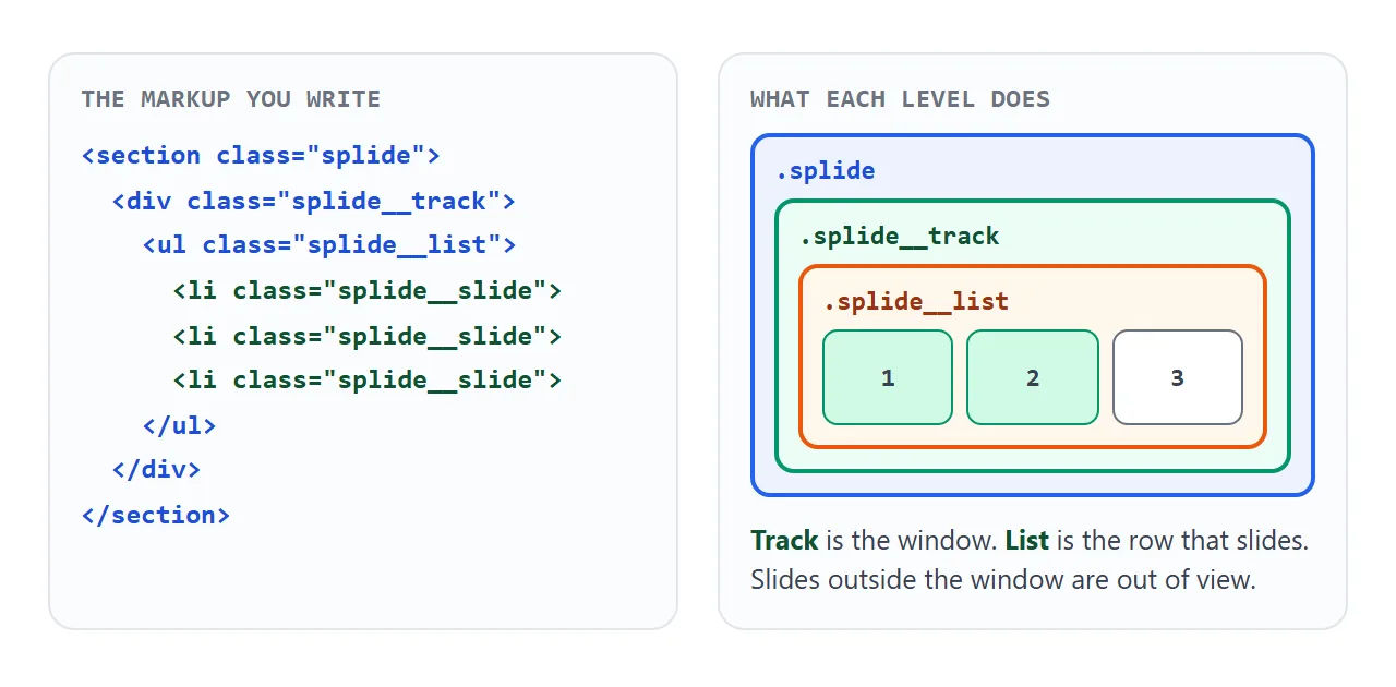
Anything can go inside a slide: text, an inline SVG, a card with several elements. Give the outer element an aria-label so assistive technology can name the carousel. The Splide docs ask you to add an accessible name.
Load it from a CDN with a pinned version
Two tags bring the library in. Put the stylesheet in head and the script just before </body>.
<link rel="stylesheet"
  href="https://cdn.jsdelivr.net/npm/@splidejs/splide@4.1.4/dist/css/splide.min.css">
<script
  src="https://cdn.jsdelivr.net/npm/@splidejs/splide@4.1.4/dist/js/splide.min.js"></script>
Pinning @4.1.4 in the address means the page keeps loading that version even after newer ones come out. The official guide also lists splide-core.min.css, which has only the core styles, and themed stylesheets. The full splide.min.css is the easiest start.
Page structure in general is covered in external stylesheet. If a carousel page does nothing at all, JavaScript not working in HTML is a good checklist.
Mount it after the markup exists
The Getting Started guide says the target element must be loaded before you construct the Splide instance. The simplest way is to put your script below the carousel, as the first demo does.
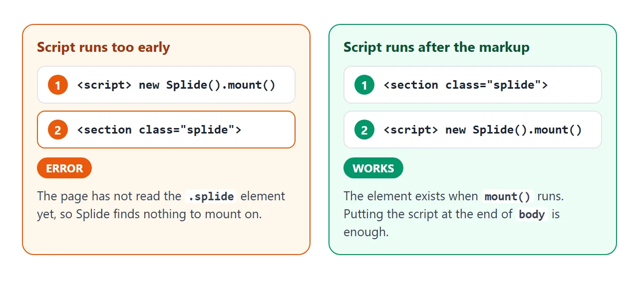
If your script has to live in head, wrap it so it waits for the page:
document.addEventListener('DOMContentLoaded', function () {
  new Splide('.splide').mount();
});
The options you will actually change
Options go in an object as the second argument. These are the ones most pages need, with the defaults from the options reference.
| Option | What it does | Default |
|---|---|---|
type |
'slide', 'loop' or 'fade' |
'slide' |
perPage |
How many slides show at once | 1 |
gap |
Space between slides, as a number or CSS value | none |
autoplay |
Moves on its own | false |
interval |
Autoplay delay in milliseconds | 5000 |
breakpoints |
Different options at narrower widths | none |
keyboard |
Arrow-key shortcuts | false |
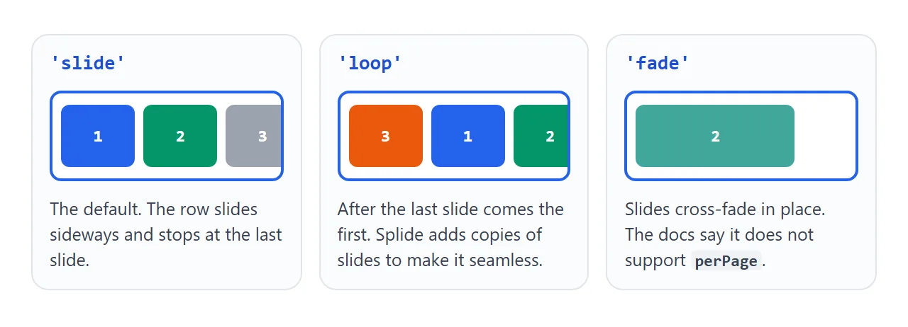
Change them below and watch the code line update. The panel rebuilds the carousel by calling destroy() and mounting a new one.
<!doctype html>
<html lang="en">
<head>
<meta charset="utf-8">
<meta name="viewport" content="width=device-width, initial-scale=1">
<title>Splide options</title>
<link rel="stylesheet" href="https://cdn.jsdelivr.net/npm/@splidejs/splide@4.1.4/dist/css/splide.min.css">
<style>
  body { margin: 0; padding: 16px; font-family: system-ui, sans-serif; background: #f4f5f7; color: #1d2330; }
  .controls { display: flex; flex-wrap: wrap; gap: 10px 16px; margin-bottom: 14px; font-size: 14px; }
  .controls label { display: flex; align-items: center; gap: 6px; }
  .controls select { font: inherit; padding: 4px 6px; }
  .splide__slide {
    display: grid; place-items: center; height: 110px;
    border-radius: 10px; color: #fff; font-size: 20px; font-weight: 700; background: #2563eb;
  }
  .splide__slide:nth-child(2n) { background: #059669; }
  .splide__slide:nth-child(3n) { background: #ea580c; }
  pre { margin: 14px 0 0; padding: 10px 12px; background: #fff; border-radius: 8px; font-size: 12.5px; line-height: 1.5; overflow-x: auto; }
</style>
</head>
<body>
<div class="controls">
  <label>type
    <select id="type"><option>slide</option><option>loop</option><option>fade</option></select>
  </label>
  <label>perPage
    <select id="perPage"><option>1</option><option selected>2</option><option>3</option></select>
  </label>
  <label>gap
    <select id="gap"><option value="0">0</option><option value="12" selected>12px</option><option value="24">24px</option></select>
  </label>
</div>

<section class="splide" aria-label="Options demo">
  <div class="splide__track">
    <ul class="splide__list">
      <li class="splide__slide">1</li>
      <li class="splide__slide">2</li>
      <li class="splide__slide">3</li>
      <li class="splide__slide">4</li>
      <li class="splide__slide">5</li>
      <li class="splide__slide">6</li>
    </ul>
  </div>
</section>
<pre id="code"></pre>

<script src="https://cdn.jsdelivr.net/npm/@splidejs/splide@4.1.4/dist/js/splide.min.js"></script>
<script>
  let splide = null;

  function build() {
    const options = {
      type: document.getElementById('type').value,
      perPage: Number(document.getElementById('perPage').value),
      gap: Number(document.getElementById('gap').value),
      // below 480px wide, show one slide at a time
      breakpoints: { 480: { perPage: 1 } },
    };
    // the docs say fade does not support perPage
    if (options.type === 'fade') options.perPage = 1;

    if (splide) splide.destroy();      // remove the old carousel
    splide = new Splide('.splide', options);
    splide.mount();

    document.getElementById('code').textContent =
      'new Splide(\'.splide\', ' + JSON.stringify(options) + ').mount();';
  }

  ['type', 'perPage', 'gap'].forEach((id) =>
    document.getElementById(id).addEventListener('change', build));
  build();
</script>
</body>
</html>
Breakpoints use the screen width and, by default, work as max-width: an entry for 480 applies at 480px and narrower. The docs call this desktop-first, and a mediaQuery option switches it to min-width.
A finished example: a plan picker with autoplay
This page combines a looping carousel, three slides on wide screens, autoplay with a pause button, a progress bar and a status line that updates from the moved event.
<!doctype html>
<html lang="en">
<head>
<meta charset="utf-8">
<meta name="viewport" content="width=device-width, initial-scale=1">
<title>Splide card carousel</title>
<link rel="stylesheet" href="https://cdn.jsdelivr.net/npm/@splidejs/splide@4.1.4/dist/css/splide.min.css">
<style>
  body { margin: 0; padding: 16px; font-family: system-ui, sans-serif; background: #f4f5f7; color: #1d2330; }
  h1 { margin: 0 0 10px; font-size: 18px; }
  .card {
    height: 150px; border-radius: 12px; padding: 16px; box-sizing: border-box;
    color: #fff; display: flex; flex-direction: column; justify-content: flex-end;
    box-shadow: 0 6px 18px rgba(0, 0, 0, .14);
  }
  .card b { font-size: 18px; }
  .card span { font-size: 13px; opacity: .9; }
  .c1 { background: linear-gradient(135deg, #1d4ed8, #60a5fa); }
  .c2 { background: linear-gradient(135deg, #047857, #34d399); }
  .c3 { background: linear-gradient(135deg, #c2410c, #fb923c); }
  .c4 { background: linear-gradient(135deg, #7e22ce, #c084fc); }
  .c5 { background: linear-gradient(135deg, #be123c, #fb7185); }
  .c6 { background: linear-gradient(135deg, #0f766e, #5eead4); }
  .bar { display: flex; align-items: center; justify-content: space-between; margin-top: 12px; font-size: 14px; }
  .splide__toggle {
    border: 1px solid #c9ced8; background: #fff; border-radius: 8px;
    padding: 6px 12px; font: inherit; cursor: pointer;
  }
  .splide__progress__bar { height: 3px; background: #2563eb; }
</style>
</head>
<body>
<h1>Pick a plan</h1>

<section class="splide" id="plans" aria-label="Plans">
  <div class="splide__track">
    <ul class="splide__list">
      <li class="splide__slide"><div class="card c1"><b>Starter</b><span>For one page</span></div></li>
      <li class="splide__slide"><div class="card c2"><b>Team</b><span>For a small group</span></div></li>
      <li class="splide__slide"><div class="card c3"><b>Studio</b><span>For many pages</span></div></li>
      <li class="splide__slide"><div class="card c4"><b>School</b><span>For a class</span></div></li>
      <li class="splide__slide"><div class="card c5"><b>Club</b><span>For members</span></div></li>
      <li class="splide__slide"><div class="card c6"><b>Event</b><span>For one day</span></div></li>
    </ul>
  </div>
  <div class="splide__progress"><div class="splide__progress__bar"></div></div>
  <div class="bar">
    <span id="status">Slide 1 of 6</span>
    <button class="splide__toggle" type="button">
      <span class="splide__toggle__play">Play</span>
      <span class="splide__toggle__pause">Pause</span>
    </button>
  </div>
</section>

<script src="https://cdn.jsdelivr.net/npm/@splidejs/splide@4.1.4/dist/js/splide.min.js"></script>
<script>
  const splide = new Splide('#plans', {
    type: 'loop',
    perPage: 3,
    gap: 12,
    autoplay: true,
    interval: 2500,
    breakpoints: {
      700: { perPage: 2 },
      480: { perPage: 1 },
    },
  });

  // "moved" fires after each move; the first argument is the new index
  splide.on('moved', (newIndex) => {
    document.getElementById('status').textContent =
      'Slide ' + (newIndex + 1) + ' of ' + splide.length;
  });

  splide.mount();
</script>
</body>
</html>
- Play and pause: the
splide__togglebutton markup is built into Splide, so no extra JavaScript is needed. - Status line:
splide.on('moved', fn)runs after each move, andsplide.lengthis the number of slides. - Phones:
breakpointsdropsperPageto 2 and then 1.
Add the viewport meta tag so phones lay the page out at their real width. If you would rather not use a library, a carousel in plain HTML, CSS and JS shows that route, and CSS scroll snap covers a swipe-only row.
When it does not work
| What you see | Cause | Fix |
|---|---|---|
Console says [splide] null is invalid. |
The script ran before the markup, or the selector matches nothing | Move the script below the section, and check the selector |
| Slides are not laid out in a row, arrows look plain | The Splide stylesheet is not loaded | Add the link tag for splide.min.css |
Console says Splide is not defined |
The script tag failed to load, or comes after your code | Check the address and put it first |
| Autoplay does not move while you test | pauseOnHover is true and the pointer is over it |
Move the pointer away |
| Fade shows one slide even with perPage 3 | The docs say fade does not support perPage | Use slide or loop |
| Arrow keys do nothing | keyboard is off by default in version 4 |
Set keyboard to 'focused' or 'global' |
| Several slides are squeezed onto a phone | perPage is set and no narrower breakpoint overrides it |
Add a breakpoints entry such as 480 |
Share it as a link
A carousel only makes sense when it can be swiped. A screenshot cannot be dragged, and an .html attachment may open as plain code on a phone. Opening an HTML file on a phone covers why.
To send the working version, paste the page into a NOS document and choose Create share link. HTML to link walks through it. Scripts run on the shared page, and scripts and styles from CDN hosts such as jsDelivr load, so the people you send it to can swipe the slides themselves.
Use gradients, inline SVG or data: URIs for pictures, because outside images are blocked there.
If you change the code later, the same link shows the new version.