To make an element fullscreen in HTML, call element.requestFullscreen() from a click handler. To leave, call document.exitFullscreen() or press Esc. There is no HTML attribute that does it, and the call is refused if it does not come from a user action.
Try the button below. Then read the grey line: it is the live state the API reports.
<!doctype html>
<html lang="en">
<head>
<meta charset="utf-8">
<meta name="viewport" content="width=device-width, initial-scale=1">
<title>Fullscreen button</title>
<style>
  body { margin: 0; padding: 16px; font-family: system-ui, sans-serif; background: #f4f5f7; color: #1d2330; }
  .card {
    max-width: 420px; padding: 18px 20px; border-radius: 12px;
    background: #fff; box-shadow: 0 6px 20px rgba(0, 0, 0, .1);
  }
  .card h2 { margin: 0 0 6px; font-size: 18px; }
  .card p { margin: 0 0 14px; font-size: 14px; color: #4b5563; }
  /* while the card is fullscreen: fill the screen and center the content */
  .card:fullscreen {
    max-width: none; border-radius: 0; box-sizing: border-box;
    display: flex; flex-direction: column; justify-content: center; align-items: center;
    font-size: 1.4em;
  }
  button { font: inherit; font-size: 14px; padding: 9px 14px; border: 0; border-radius: 8px; background: #1d4ed8; color: #fff; cursor: pointer; }
  .log { margin-top: 12px; font: 13px/1.5 ui-monospace, Consolas, monospace; }
  .log div { padding: 6px 8px; border-radius: 6px; background: #eef1f5; margin-top: 6px; overflow-wrap: anywhere; }
  .log .err { background: #fde2da; color: #9a3412; }
</style>
</head>
<body>
<div class="card" id="card">
  <h2>Quarterly numbers</h2>
  <p>Press the button to show this card fullscreen. Esc or the button again exits.</p>
  <button id="btn" type="button">Go fullscreen</button>
</div>
<div class="log">
  <div id="state"></div>
  <div id="msg" hidden></div>
</div>

<script>
  const card = document.getElementById('card');
  const btn = document.getElementById('btn');
  const state = document.getElementById('state');
  const msg = document.getElementById('msg');

  function showState() {
    const el = document.fullscreenElement;  // null when nothing is fullscreen
    state.textContent = 'fullscreenEnabled: ' + document.fullscreenEnabled +
      ' | fullscreenElement: ' + (el ? '#' + el.id : 'null');
    btn.textContent = el ? 'Exit fullscreen' : 'Go fullscreen';
  }

  btn.addEventListener('click', () => {
    msg.hidden = true;
    if (document.fullscreenElement) {
      document.exitFullscreen();
      return;
    }
    // must run inside a click (a user gesture); it returns a promise
    card.requestFullscreen().catch((err) => {
      msg.className = 'err';
      msg.hidden = false;
      msg.textContent = 'Refused: ' + err.name + ': ' + err.message +
        (document.fullscreenEnabled ? '' :
          '. This page is inside an embedded frame without the fullscreen permission. Opened as its own page, the same code works.');
    });
  });

  // fires on enter and on exit, including when the user presses Esc
  document.addEventListener('fullscreenchange', showState);
  showState();
</script>
</body>
</html>
Inside this article, the example runs in an embedded frame without the fullscreen permission. So here the button shows the refusal instead: fullscreenEnabled is false and the promise rejects with a TypeError.
Opened as its own page, the same code fills the screen. The sections below explain both outcomes.
The whole API in four pieces
| Piece | What it does |
|---|---|
el.requestFullscreen() |
Asks to show el fullscreen. Returns a promise |
document.exitFullscreen() |
Leaves fullscreen. Also returns a promise |
document.fullscreenElement |
The element that is fullscreen now, or null |
fullscreenchange / fullscreenerror |
Events on the document for enter/exit, and for refusals |
A toggle button needs only these four:
btn.addEventListener('click', () => {
  if (document.fullscreenElement) {
    document.exitFullscreen();
  } else {
    card.requestFullscreen().catch((err) => console.log(err.message));
  }
});

// runs on enter and on every exit, including Esc
document.addEventListener('fullscreenchange', () => {
  btn.textContent = document.fullscreenElement ? 'Exit fullscreen' : 'Go fullscreen';
});
To show the whole page instead of one element, call it on the root: document.documentElement.requestFullscreen().
It must come from a click
The browser only goes fullscreen in response to a user action, such as a click or a key press. A call on page load or from a timer is refused. The promise rejects, fullscreenerror fires, and nothing changes on screen.
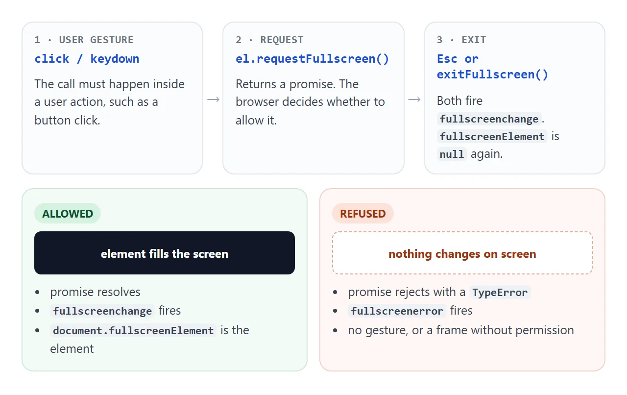
Because it is a promise, always attach a .catch(). Without one, a refusal is silent apart from a console message. With one, you can tell the user, or switch to a fallback as the finished example does.
Exiting, and knowing when it happened
Users leave fullscreen with Esc more often than with your button. Esc does not run your click handler, so a label that you only update inside the handler ends up wrong.
Listen for fullscreenchange on document instead. It fires on every enter and every exit, whatever caused it. Inside the listener, document.fullscreenElement tells you which one: an element means you just entered, null means you just left.
Styling with :fullscreen and ::backdrop
While an element is fullscreen, the :fullscreen selector matches it. The browser stretches it to fill the screen and paints a ::backdrop behind it, black by default.
The common surprise: an element with no background of its own is transparent, so the black backdrop shows through. Dark text then nearly disappears. Give the element a background in its :fullscreen rule.
<!doctype html>
<html lang="en">
<head>
<meta charset="utf-8">
<meta name="viewport" content="width=device-width, initial-scale=1">
<title>:fullscreen and ::backdrop styling</title>
<style>
  body { margin: 0; padding: 14px; font-family: system-ui, sans-serif; background: #f4f5f7; color: #1d2330; }
  .bar { display: flex; flex-wrap: wrap; gap: 8px 14px; align-items: center; margin-bottom: 12px; font-size: 14px; }
  button { font: inherit; padding: 8px 12px; border: 0; border-radius: 8px; background: #1d4ed8; color: #fff; cursor: pointer; }
  .note { font-size: 12px; color: #6b7280; margin: 0 0 10px; }

  .chart { padding: 16px; border-radius: 12px; border: 1px solid #dfe3e8; max-width: 420px; }
  .chart.with-bg { background: #fff; }
  .chart h3 { margin: 0 0 12px; font-size: 16px; }
  .bars { display: flex; align-items: flex-end; gap: 10px; height: 110px; }
  .bars span { flex: 1; border-radius: 6px 6px 0 0; background: #60a5fa; }

  /* the real fullscreen rules, and the same rules for the simulation class */
  .chart:fullscreen, .chart.sim {
    max-width: none; border: 0; border-radius: 0; padding: 6vmin; box-sizing: border-box;
  }
  .chart:fullscreen .bars, .chart.sim .bars { height: 60vh; }
  .chart:fullscreen h3, .chart.sim h3 { font-size: 5vmin; }

  /* ::backdrop sits behind the fullscreen element; the default is black */
  .chart::backdrop { background: #0b1220; }

  /* simulation only: pin the card over the frame, with a fake backdrop */
  .chart.sim { position: fixed; inset: 0; z-index: 2; }
  .fake-backdrop { position: fixed; inset: 0; background: #0b1220; z-index: 1; }
  .sim-label { position: fixed; right: 10px; bottom: 10px; z-index: 3; font-size: 12px; padding: 6px 9px; border-radius: 6px; background: #f59e0b; color: #111; }
</style>
</head>
<body>
<div class="bar">
  <button id="real" type="button">Real fullscreen</button>
  <button id="sim" type="button">Simulate fullscreen</button>
  <label><input id="bg" type="checkbox" checked> card has a background</label>
</div>
<p class="note" id="note">"Simulate" applies the :fullscreen rules with a class, so you can see them even where real fullscreen is refused.</p>

<div class="chart with-bg" id="chart">
  <h3>Sign-ups per week</h3>
  <div class="bars">
    <span style="height:40%"></span><span style="height:65%"></span><span style="height:50%"></span><span style="height:85%"></span><span style="height:100%"></span>
  </div>
</div>
<div class="fake-backdrop" id="fake" hidden></div>
<div class="sim-label" id="label" hidden>SIMULATION: click anywhere to close</div>

<script>
  const chart = document.getElementById('chart');
  const fake = document.getElementById('fake');
  const label = document.getElementById('label');
  const note = document.getElementById('note');

  document.getElementById('bg').addEventListener('change', (e) => {
    chart.classList.toggle('with-bg', e.target.checked);
  });

  document.getElementById('real').addEventListener('click', () => {
    chart.requestFullscreen().catch((err) => {
      note.textContent = 'Real fullscreen was refused here (' + err.message + '). Try "Simulate fullscreen".';
    });
  });

  function setSim(on) {
    chart.classList.toggle('sim', on);
    fake.hidden = !on;
    label.hidden = !on;
  }
  document.getElementById('sim').addEventListener('click', (e) => {
    e.stopPropagation();
    setSim(true);
  });
  document.addEventListener('click', (e) => {
    if (chart.classList.contains('sim') && e.target.id !== 'sim') setSim(false);
  });
</script>
</body>
</html>
Real fullscreen is refused in this frame, so the demo has a Simulate fullscreen button. It adds a class that carries the same rules, pins the card over the frame, and draws a fake backdrop. It shows what would change; it is not the API.
.chart:fullscreen {
  background: #fff;   /* otherwise the backdrop shows through */
  padding: 6vmin;
}
.chart:fullscreen .bars { height: 60vh; }
.chart::backdrop { background: #0b1220; }
Inside an iframe: allow="fullscreen"
A page in an <iframe> from another origin, or in a sandboxed iframe, can only go fullscreen if the page that embeds it allows it. The parent grants it with the allow attribute.
Without it, document.fullscreenEnabled is false inside the frame and every request is refused.
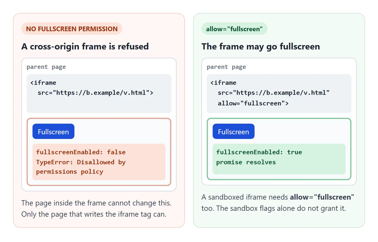
<iframe src="https://other.example/viewer.html" allow="fullscreen"></iframe>
The older allowfullscreen attribute does the same job. A frame from the same origin as the parent, without a sandbox, is allowed by default.
This applies to sandboxed frames too. None of the sandbox flags grants fullscreen, so a sandboxed iframe also needs allow="fullscreen". The sandbox attribute covers what the flags do, and the iframe guide covers embedding in general.
If you cannot change the parent page, the framed page cannot fix it. Check document.fullscreenEnabled first and offer a fallback.
A fallback that fills the window with CSS
When fullscreen is not available, fill the window instead. position: fixed with inset: 0 makes the element cover the whole viewport of the page or frame it is in. It is plain CSS, so no permission or gesture is needed.
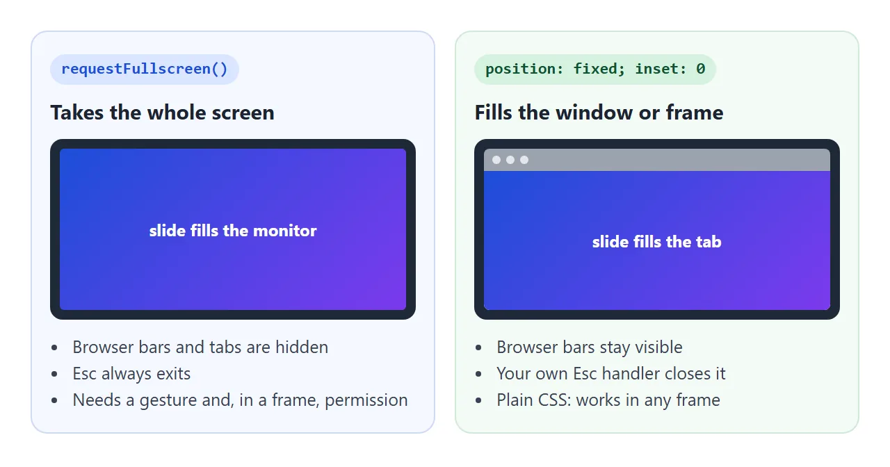
.viewer.expanded { position: fixed; inset: 0; z-index: 10; }
The trade-off: the browser bars stay visible, and Esc does nothing unless you listen for it. It is a good second choice, and on phones where the API is limited it may be the only one.
Finished example: a slide viewer
This viewer uses real fullscreen where it is allowed and falls back to filling the window where it is not. In this article, the fallback is what you see. The arrow keys move between slides in both modes.
<!doctype html>
<html lang="en">
<head>
<meta charset="utf-8">
<meta name="viewport" content="width=device-width, initial-scale=1">
<title>Slide viewer with fullscreen</title>
<style>
body { margin: 0; padding: 14px; font-family: system-ui, sans-serif; background: #eceef1; }
.viewer {
position: relative; height: 330px; border-radius: 12px; overflow: hidden;
background: #111827; color: #fff; outline: none;
}
.slide {
position: absolute; inset: 0 0 52px; display: none;
place-items: center; text-align: center; padding: 20px;
font-size: clamp(20px, 6vmin, 64px); font-weight: 700;
}
.slide.on { display: grid; }
.s1 { background: linear-gradient(135deg, #1d4ed8, #7c3aed); }
.s2 { background: linear-gradient(135deg, #047857, #0ea5e9); }
.s3 { background: linear-gradient(135deg, #b45309, #db2777); }
.controls {
position: absolute; left: 0; right: 0; bottom: 0; height: 52px;
display: flex; align-items: center; gap: 8px; padding: 0 10px; background: #111827;
}
.controls button { font: inherit; font-size: 14px; padding: 7px 11px; border: 0; border-radius: 7px; background: #374151; color: #fff; cursor: pointer; }
.controls .grow { flex: 1; font-size: 13px; color: #9ca3af; }
/* real fullscreen and the fallback share one look */
.viewer:fullscreen { border-radius: 0; }
.viewer.expanded { position: fixed; inset: 0; height: auto; border-radius: 0; z-index: 10; }
</style>
</head>
<body>
<div class="viewer" id="viewer" tabindex="0">
<div class="slide s1 on">Q3 review</div>
<div class="slide s2">Sign-ups +18%</div>
<div class="slide s3">Next: launch in October</div>
<div class="controls">
<button id="prev" type="button" aria-label="Previous slide">←</button>
<button id="next" type="button" aria-label="Next slide">→</button>
<span class="grow" id="info"></span>
<button id="full" type="button">Fullscreen</button>
</div>
</div>
<script>
const viewer = document.getElementById('viewer');
const slides = viewer.querySelectorAll('.slide');
const info = document.getElementById('info');
const full = document.getElementById('full');
let i = 0;
function show(n) {
slides[i].classList.remove('on');
i = (n + slides.length) % slides.length;
slides[i].classList.add('on');
render();
}
function isFull() {
return !!(document.fullscreenElement || document.webkitFullscreenElement);
}
function render() {
const mode = isFull() ? 'fullscreen' : viewer.classList.contains('expanded') ? 'filling the window' : 'normal';
info.textContent = (i + 1) + ' / ' + slides.length + ' · ' + mode;
full.textContent = mode === 'normal' ? 'Fullscreen' : 'Exit';
}
// Fallback when fullscreen is not allowed: fill the window with CSS
function expand(on) {
viewer.classList.toggle('expanded', on);
render();
}
function enter() {
const req = viewer.requestFullscreen || viewer.webkitRequestFullscreen; // older Safari uses the prefix
const allowed = document.fullscreenEnabled || document.webkitFullscreenEnabled;
if (!req || !allowed) return expand(true);
Promise.resolve(req.call(viewer)).catch(() => expand(true));
}
function exit() {
if (isFull()) (document.exitFullscreen || document.webkitExitFullscreen).call(document);
else expand(false);
}
full.addEventListener('click', () => (isFull() || viewer.classList.contains('expanded') ? exit() : enter()));
document.getElementById('prev').addEventListener('click', () => show(i - 1));
document.getElementById('next').addEventListener('click', () => show(i + 1));
document.addEventListener('keydown', (e) => {
if (e.key === 'ArrowRight') show(i + 1);
if (e.key === 'ArrowLeft') show(i - 1);
if (e.key === 'Escape') expand(false); // real fullscreen handles Esc itself
});
document.addEventListener('fullscreenchange', render);
document.addEventListener('webkitfullscreenchange', render);
viewer.addEventListener('pointerdown', () => viewer.focus());
render();
</script>
</body>
</html>
- Feature check: if
document.fullscreenEnabledis false, or the method is missing, it goes straight to the CSS fallback. - Older Safari: it also tries
webkitRequestFullscreen,webkitExitFullscreenandwebkitfullscreenchange, the prefixed names older Safari versions use. - Refusals: if the promise rejects anyway, the
.catch()switches to the fallback. - Esc: real fullscreen handles Esc itself. The fallback listens for it on
keydown.
For a single picture rather than slides, zooming an image on click is often enough and needs no permission.
On iPhone
iPhone Safari has had limits on the Fullscreen API. For a long time, only video elements could go fullscreen there, and requestFullscreen was not available on other elements.
Do not assume either way: test on a real iPhone, and keep the fill-the-window fallback so the button always does something.
When it does not work
| What you see | Cause | Fix |
|---|---|---|
| Nothing happens on page load | No user gesture | Call it inside a click or key handler |
TypeError, and fullscreenEnabled is false |
Inside a cross-origin or sandboxed iframe without allow="fullscreen" |
Add allow="fullscreen" to the iframe tag, or use the CSS fallback |
requestFullscreen is not a function in older Safari |
Only the prefixed name exists | Also try webkitRequestFullscreen |
| Text vanishes on a black screen | The element has no background, so ::backdrop shows through |
Set a background in the :fullscreen rule |
:fullscreen styles never apply |
F11 browser fullscreen, not the API | Enter with requestFullscreen() |
| Button still says "Exit" after Esc | State only updated in the click handler | Listen for fullscreenchange |
| Nothing happens on iPhone | Safari limits fullscreen on iPhone | Feature-check and fall back to position: fixed |
Share it as a link
A fullscreen viewer is easier to show than to describe. A screenshot cannot be clicked through, and an .html attachment may open as plain code on a phone.
To send the working version, paste the page into a NOS document and choose Create share link. HTML to link walks through it.
The page renders as written and its scripts run, so the people you send it to can flip through the slides themselves.
Build it with the fallback, as above, so the button does something whether or not the page is allowed to go fullscreen. If you change the code later, the same link shows the new version.