A CSS carousel with scroll markers needs no script for its dots or arrows. Put scroll-marker-group on the scroll container, give each slide a ::scroll-marker, and add ::scroll-button() for the arrows. The browser generates them, keeps the current dot marked and scrolls when you click.
Try it first. Click the arrows and the dots, or swipe the row.
<!doctype html>
<html lang="en">
<head>
<meta charset="utf-8">
<meta name="viewport" content="width=device-width, initial-scale=1">
<title>CSS-only carousel with scroll markers</title>
<style>
  body { margin: 0; padding: 16px; font-family: system-ui, sans-serif; background: #f4f5f7; }
  .wrap { position: relative; max-width: 520px; margin: 0 auto; }  /* the arrows are placed against this box */

  .carousel {
    display: flex; overflow-x: auto;
    scroll-snap-type: x mandatory;   /* always stop on a slide */
    scroll-marker-group: after;      /* draw one dot per slide, after the row */
    scrollbar-width: none;
  }
  .slide {
    flex: 0 0 100%; scroll-snap-align: center;
    height: 200px; box-sizing: border-box; padding: 18px; border-radius: 14px;
    display: flex; align-items: flex-end; color: #fff; font-size: 22px; font-weight: 700;
  }
  .s1 { background: linear-gradient(135deg, #2563eb, #7c3aed); }
  .s2 { background: linear-gradient(135deg, #059669, #0ea5e9); }
  .s3 { background: linear-gradient(135deg, #ea580c, #db2777); }
  .s4 { background: linear-gradient(135deg, #0f766e, #65a30d); }

  /* the dots: one ::scroll-marker per slide, inside ::scroll-marker-group */
  .carousel::scroll-marker-group { display: flex; justify-content: center; gap: 10px; padding: 12px 0; }
  .slide::scroll-marker {
    content: '' / attr(aria-label);  /* an empty dot, named for screen readers */
    width: 12px; height: 12px; border-radius: 50%; background: #cbd5e1;
  }
  .slide::scroll-marker:target-current { background: #2563eb; }  /* the slide in view */

  /* the arrows: ::scroll-button() on the scroll container */
  .carousel::scroll-button(*) {
    position: absolute; top: 80px; width: 40px; height: 40px; border: 0; border-radius: 50%;
    background: #fff; color: #111827; font-size: 18px; cursor: pointer;
    box-shadow: 0 2px 8px rgba(0, 0, 0, .2);
  }
  .carousel::scroll-button(left)  { content: '\2190' / 'Previous slide'; left: 8px; }
  .carousel::scroll-button(right) { content: '\2192' / 'Next slide'; right: 8px; }
  .carousel::scroll-button(*):disabled { opacity: .35; cursor: default; }

  .note { display: none; max-width: 520px; margin: 12px auto 0; font-size: 14px; color: #9a3412; }
  @supports not selector(::scroll-marker) { .note { display: block; } }
</style>
</head>
<body>
<div class="wrap">
  <div class="carousel" id="carousel">
    <div class="slide s1" aria-label="Plan">Plan</div>
    <div class="slide s2" aria-label="Design">Design</div>
    <div class="slide s3" aria-label="Build">Build</div>
    <div class="slide s4" aria-label="Ship">Ship</div>
  </div>
</div>
<p class="note">This browser does not draw scroll markers or scroll buttons yet. The row still scrolls and snaps: swipe it, or hold Shift and use the mouse wheel.</p>
</body>
</html>
This only fully works in Chromium right now. We tested the browsers bundled with Playwright on 2026-09-26: Chromium 147 drew the dots and arrows, while Firefox 148 and WebKit 26.4 showed a plain snapping row. The last example adds a fallback for those engines.
The parts of a scroll-marker carousel
Everything hangs off one element, the scroll container. It is the row that scrolls sideways. The new pseudo-elements are generated from it and from its slides.
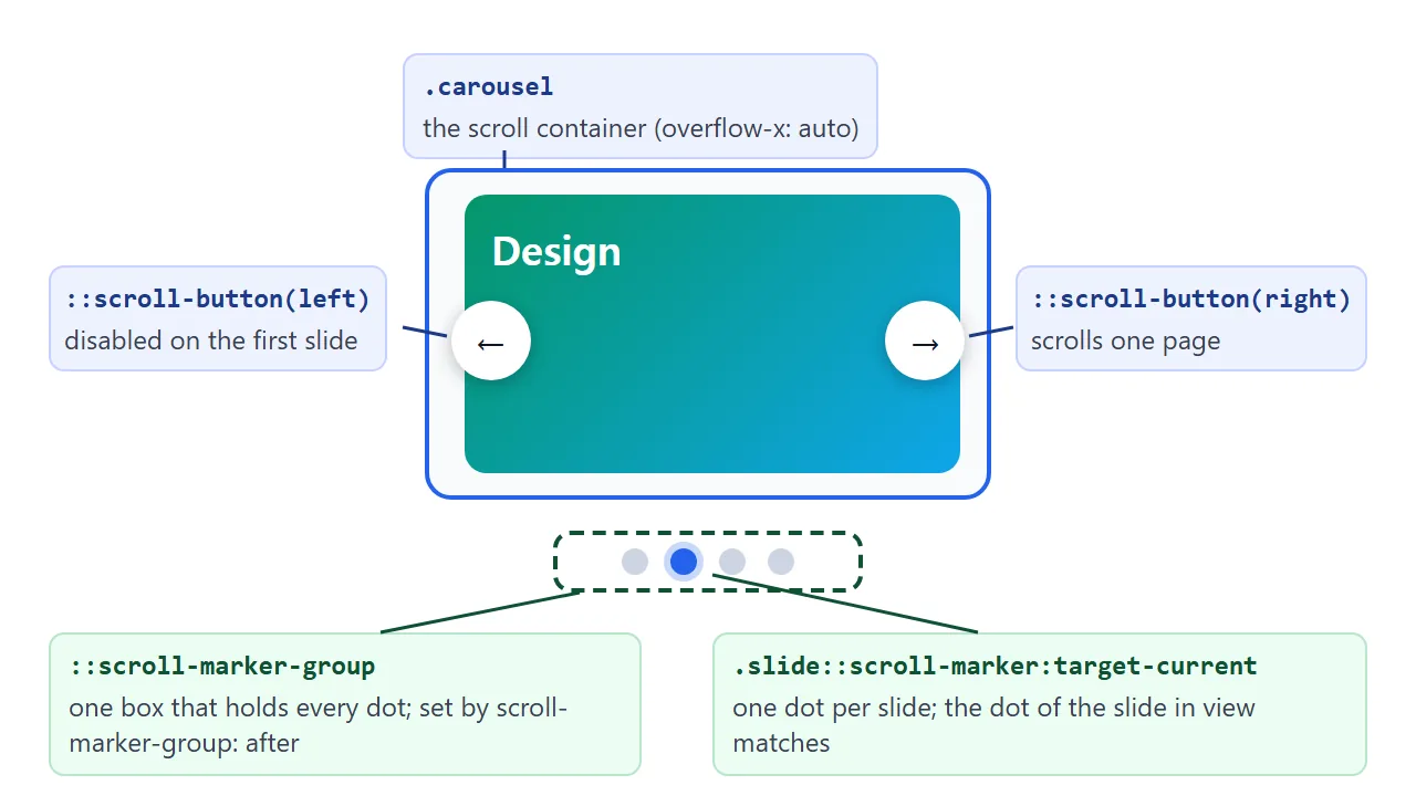
| Piece | Written on | What it gives you |
|---|---|---|
scroll-marker-group |
Scroll container | Turns the marker box on, before or after the row |
::scroll-marker-group |
Scroll container | The box that holds the dots, for layout |
::scroll-marker |
Each slide | One dot that scrolls to its slide |
:target-current |
A marker or link | Matches the one for the slide in view |
::scroll-button() |
Scroll container | An arrow button: left, right, up, down |
The row itself is ordinary CSS scroll snap. Snap is what makes every stop land on a whole slide, so keep it.
Step by step: the dots
Three rules make the dots. The first turns the group on. Without it, no markers appear, even if you style them.
.carousel { scroll-marker-group: after; }
.carousel::scroll-marker-group { display: flex; gap: 10px; justify-content: center; }
.slide::scroll-marker { content: ''; width: 12px; height: 12px; border-radius: 50%; background: #cbd5e1; }
.slide::scroll-marker:target-current { background: #2563eb; }
scroll-marker-group: afterputs the dot box after the row. Usebeforeto put it above.contentis required, like on::before. In our test, markers without it did not render at all.:target-currentmatches the dot of the slide in view. It updates while you swipe, not only when you click.
Clicking a dot scrolls its slide into view. You do not write a click handler.
Screen readers. In Chromium's accessibility tree, the marker group appeared as a tab list and each marker as a tab. The current marker was reported as selected, and the arrows appeared as buttons.
Give every marker a name. An empty dot has none, so put alternative text after a slash in content. Reading it from an attribute avoids writing one rule per slide:
.slide::scroll-marker { content: '' / attr(aria-label); }
Step by step: the arrows
Arrows are ::scroll-button() pseudo-elements on the scroll container. Name a direction in the brackets, and use * to style every button at once.
.wrap { position: relative; }
.carousel::scroll-button(*) { position: absolute; top: 80px; width: 40px; height: 40px; }
.carousel::scroll-button(left)  { content: '\2190' / 'Previous slide'; left: 8px; }
.carousel::scroll-button(right) { content: '\2192' / 'Next slide'; right: 8px; }
.carousel::scroll-button(*):disabled { opacity: .35; }
- Content is required here too. A button without it did not appear in our test.
- The part after the slash is the button's name for screen readers. The arrow character alone says nothing useful.
- Placement: with
position: absolute, the buttons were placed against the wrapper withposition: relativearound the row.
Each click scrolls by a page of the row, and snap then settles on a slide. With slides at 100% and at 78% of the row width, one click moved exactly one slide.
At the first slide the left button is disabled, so :disabled can dim it.
Your own links as markers: scroll-target-group
Generated dots are small and plain. When you want real labels, write ordinary links to each section and add scroll-target-group: auto to their parent. The links then act as scroll markers, and the current one matches :target-current.
<!doctype html>
<html lang="en">
<head>
<meta charset="utf-8">
<meta name="viewport" content="width=device-width, initial-scale=1">
<title>scroll-target-group and scroll-initial-target</title>
<style>
  body { margin: 0; padding: 16px; font-family: system-ui, sans-serif; background: #f4f5f7; color: #1d2330; }
  .planner { max-width: 520px; margin: 0 auto; }

  /* your own links act as scroll markers */
  nav { display: flex; gap: 6px; scroll-target-group: auto; }
  nav a {
    flex: 1; text-align: center; padding: 8px 0; border-radius: 8px;
    background: #fff; color: #334155; text-decoration: none; font-weight: 600;
  }
  nav a:target-current { background: #2563eb; color: #fff; }  /* the day in view */

  .days {
    height: 230px; margin-top: 10px; overflow-y: auto;
    scroll-snap-type: y mandatory; border-radius: 12px; background: #fff;
  }
  .day { height: 230px; box-sizing: border-box; padding: 18px; scroll-snap-align: start; border-bottom: 1px solid #e2e8f0; }
  .day h2 { margin: 0 0 8px; font-size: 20px; }
  .day p { margin: 4px 0; color: #475569; }
  .today { scroll-initial-target: nearest; background: #f0f7ff; }  /* the list opens here */

  .note { display: none; font-size: 14px; color: #9a3412; margin: 10px 0 0; }
  @supports not (scroll-target-group: auto) { .note { display: block; } }
</style>
</head>
<body>
<div class="planner">
  <nav aria-label="Days">
    <a href="#mon">Mon</a><a href="#tue">Tue</a><a href="#wed">Wed</a><a href="#thu">Thu</a><a href="#fri">Fri</a>
  </nav>
  <div class="days" id="days" tabindex="0">
    <section class="day" id="mon"><h2>Monday</h2><p>09:00 Team call</p><p>14:00 Review drafts</p></section>
    <section class="day" id="tue"><h2>Tuesday</h2><p>10:00 Client visit</p></section>
    <section class="day" id="wed"><h2>Wednesday</h2><p>All day: writing</p></section>
    <section class="day today" id="thu"><h2>Thursday (today)</h2><p>11:00 Launch check</p><p>16:00 Send report</p></section>
    <section class="day" id="fri"><h2>Friday</h2><p>13:00 Plan next week</p></section>
  </div>
  <p class="note">This browser ignores scroll-target-group and scroll-initial-target. The links still jump to each day, but no link lights up and the list opens on Monday.</p>
</div>
</body>
</html>
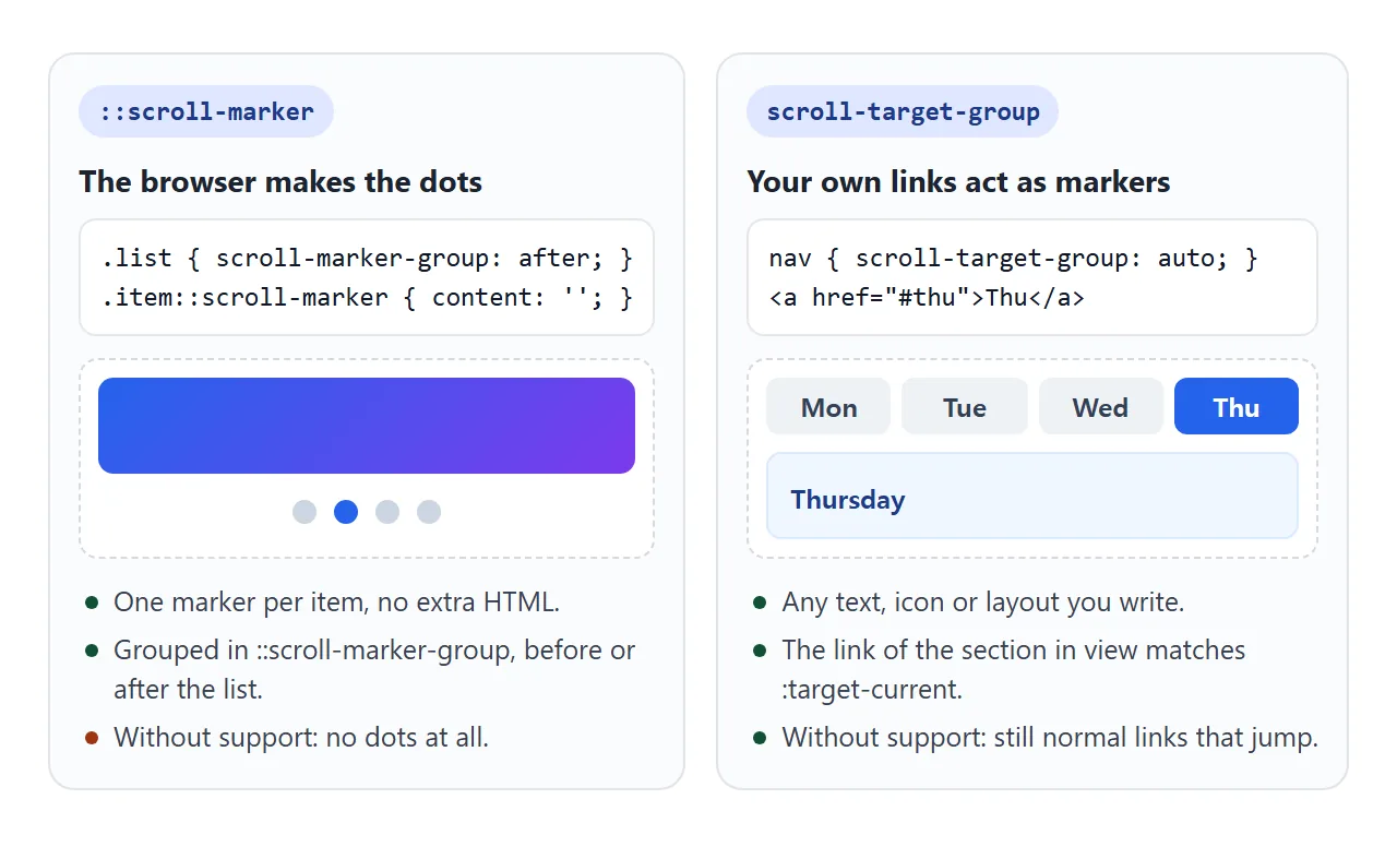
This works well for a table of contents or tabs.
A side benefit: without support, the links are still normal #id links that jump to their section. Firefox 148 and WebKit 26.4 did exactly that in our test. For a static version, see HTML table of contents.
Start on a chosen slide: scroll-initial-target
scroll-initial-target: nearest on one item makes its scroll container open scrolled to that item. In the planner above, Thursday has it, so the list starts on Thursday instead of Monday.
.today { scroll-initial-target: nearest; }
It only sets the starting position. The user can scroll away freely, and nothing moves back. Engines without support simply start at the top or left edge.
Fallback: a small script where CSS markers are missing
The finished example checks for support once. If ::scroll-marker works, the script stops and CSS does everything. If not, it builds the same arrows and dots from real <button> elements.
<!doctype html>
<html lang="en">
<head>
<meta charset="utf-8">
<meta name="viewport" content="width=device-width, initial-scale=1">
<title>Scroll-marker carousel with a script fallback</title>
<style>
  body { margin: 0; padding: 16px; font-family: system-ui, sans-serif; background: #f4f5f7; color: #1d2330; }
  .wrap { position: relative; max-width: 560px; margin: 0 auto; }
  .mode { font-size: 13px; color: #475569; margin: 0 0 8px; }

  .track {
    display: flex; gap: 12px; overflow-x: auto;
    scroll-snap-type: x mandatory; scrollbar-width: none;
    scroll-marker-group: after;
  }
  @media (prefers-reduced-motion: no-preference) { .track { scroll-behavior: smooth; } }
  .card {
    flex: 0 0 78%; scroll-snap-align: start; box-sizing: border-box;
    height: 220px; padding: 16px; border-radius: 14px; color: #fff;
    display: flex; flex-direction: column; justify-content: flex-end;
  }
  .card b { font-size: 20px; } .card span { font-size: 14px; opacity: .9; }
  .c1 { background: linear-gradient(135deg, #1e3a8a, #3b82f6); }
  .c2 { background: linear-gradient(135deg, #065f46, #10b981); }
  .c3 { background: linear-gradient(135deg, #9a3412, #f97316); }
  .c4 { background: linear-gradient(135deg, #581c87, #c084fc); }
  .c5 { background: linear-gradient(135deg, #134e4a, #84cc16); }

  /* CSS path: the browser draws the dots and arrows */
  .track::scroll-marker-group { display: flex; justify-content: center; gap: 8px; padding: 12px 0; }
  .card::scroll-marker { content: '' / attr(aria-label); width: 26px; height: 6px; border-radius: 3px; background: #cbd5e1; }
  .card::scroll-marker:target-current { background: #1d2330; }
  .track::scroll-button(*) {
    position: absolute; top: 120px; width: 38px; height: 38px; border: 0; border-radius: 50%;
    background: #fff; font-size: 17px; cursor: pointer; box-shadow: 0 2px 8px rgba(0, 0, 0, .2);
  }
  .track::scroll-button(left)  { content: '\2190' / 'Previous'; left: 6px; }
  .track::scroll-button(right) { content: '\2192' / 'Next'; right: 6px; }
  .track::scroll-button(*):disabled { opacity: .35; }

  /* script path: the same look, built from real elements */
  .fb-btn {
    position: absolute; top: 120px; width: 38px; height: 38px; border: 0; border-radius: 50%;
    background: #fff; font-size: 17px; cursor: pointer; box-shadow: 0 2px 8px rgba(0, 0, 0, .2);
  }
  .fb-btn:disabled { opacity: .35; }
  .fb-dots { display: flex; justify-content: center; gap: 8px; padding: 12px 0; }
  .fb-dots button { width: 26px; height: 6px; padding: 0; border: 0; border-radius: 3px; background: #cbd5e1; cursor: pointer; }
  .fb-dots button[aria-current="true"] { background: #1d2330; }
</style>
</head>
<body>
<div class="wrap" id="wrap">
  <p class="mode" id="mode"></p>
  <div class="track" id="track" tabindex="0" aria-label="Plans">
    <div class="card c1" aria-label="Starter"><b>Starter</b><span>One project, free</span></div>
    <div class="card c2" aria-label="Team"><b>Team</b><span>Shared folders</span></div>
    <div class="card c3" aria-label="Studio"><b>Studio</b><span>Client review links</span></div>
    <div class="card c4" aria-label="School"><b>School</b><span>Class spaces</span></div>
    <div class="card c5" aria-label="Business"><b>Business</b><span>Admin controls</span></div>
  </div>
</div>

<script>
  const wrap = document.getElementById('wrap');
  const track = document.getElementById('track');
  const cards = [...track.querySelectorAll('.card')];
  const native = CSS.supports('selector(::scroll-marker)');
  document.getElementById('mode').textContent = native
    ? 'Running on: CSS scroll markers (no script)'
    : 'Running on: script fallback';

  if (!native) {
    // arrows: scroll by one card plus the gap
    const step = () => cards[0].offsetWidth + (parseFloat(getComputedStyle(track).columnGap) || 0);
    const makeButton = (label, text, side, dir) => {
      const b = document.createElement('button');
      b.className = 'fb-btn'; b.textContent = text; b.style[side] = '6px';
      b.setAttribute('aria-label', label);
      b.addEventListener('click', () => track.scrollBy({ left: dir * step() }));
      wrap.append(b);
      return b;
    };
    const prev = makeButton('Previous', '←', 'left', -1);
    const next = makeButton('Next', '→', 'right', 1);

    // dots: one button per card
    const dots = document.createElement('div');
    dots.className = 'fb-dots';
    const dotButtons = cards.map((card) => {
      const d = document.createElement('button');
      d.setAttribute('aria-label', card.getAttribute('aria-label'));
      d.addEventListener('click', () => track.scrollTo({ left: card.offsetLeft - track.offsetLeft }));
      dots.append(d);
      return d;
    });
    wrap.append(dots);

    // on every scroll: mark the nearest card, disable the arrows at the ends
    const update = () => {
      const i = Math.round(track.scrollLeft / step());
      dotButtons.forEach((d, n) => d.setAttribute('aria-current', n === i));
      prev.disabled = track.scrollLeft <= 1;
      next.disabled = track.scrollLeft >= track.scrollWidth - track.clientWidth - 1;
    };
    track.addEventListener('scroll', update);
    update();
  }
</script>
</body>
</html>
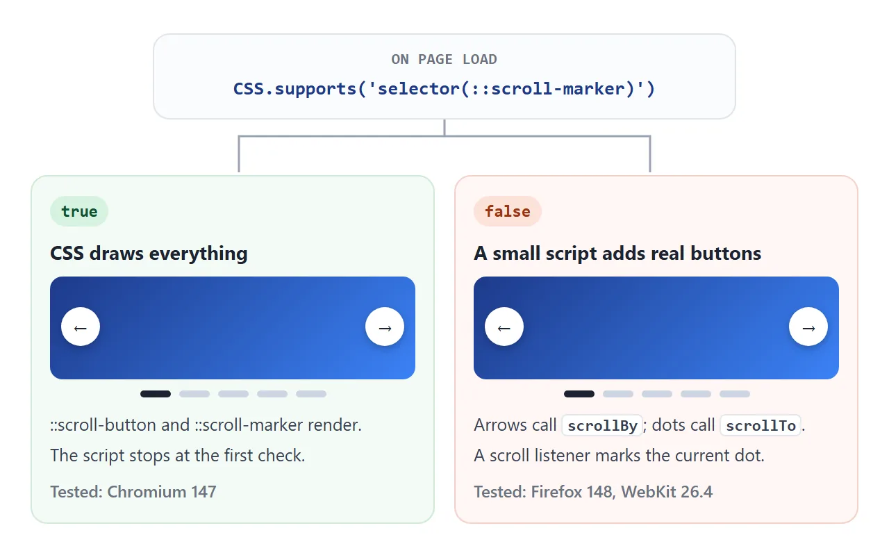
if (!CSS.supports('selector(::scroll-marker)')) {
  // build prev / next buttons and one dot per card
}
- Arrows call
scrollBywith one card width plus the gap. - Dots call
scrollTowith the card'soffsetLeft. - A scroll listener marks the nearest dot with
aria-currentand disables the arrows at the ends.
Both paths share the same scroll-snap row, so swiping feels the same. For a carousel that works the same everywhere today, the script-only HTML carousel guide covers autoplay and more.
When it does not work
| What you see | Cause | Fix |
|---|---|---|
| No dots at all | scroll-marker-group missing on the container |
Add scroll-marker-group: after |
| Dots have no size | Markers lack width, height or a flex group | Style the group and set a size |
| A dot or arrow never renders | No content on the pseudo-element |
Add content: '' or a character |
| Arrows sit below the row | They are not positioned | Absolute position, relative wrapper |
| Clicks stop between slides | No scroll snap on the row | Add scroll-snap-type and align |
| Works in Chrome only | Firefox and WebKit lack these features | Add the script fallback above |
Share it as a link
A carousel is easier to show than to describe. A screenshot cannot be swiped, and a single link lets people open it in their own browser to see which path they get.
To send the working version, paste the page into a NOS document and choose Create share link. HTML to link walks through it.
The page renders as written and its scripts run, so the people you send it to can click the dots themselves. If you change the code later, the same link shows the new version.