In HTML, "Swiper" means the Swiper JavaScript library, a touch slider for carousels, galleries and onboarding screens. There is no slider element in HTML, so the page needs the library's CSS file, its JavaScript file and a fixed set of nested elements.
Here is the smallest working page. Swipe it, tap the arrows or the dots.
<!doctype html>
<html lang="en">
<head>
<meta charset="utf-8">
<meta name="viewport" content="width=device-width, initial-scale=1">
<title>Swiper basic</title>
<!-- 1. Swiper's stylesheet -->
<link rel="stylesheet" href="https://cdn.jsdelivr.net/npm/swiper@14.3.0/swiper-bundle.min.css">
<style>
  body { margin: 0; padding: 14px; font-family: system-ui, sans-serif; background: #eceef1; }
  /* White arrows and active dot on the colored slides */
  :root { --swiper-theme-color: #fff; --swiper-pagination-bullet-inactive-color: #fff; }
  /* 2. The container needs a size */
  .swiper { width: 100%; height: 220px; border-radius: 12px; }
  .swiper-slide { display: flex; align-items: center; justify-content: center; font-size: 26px; font-weight: 700; color: #fff; }
  .s1 { background: linear-gradient(135deg, #2563eb, #7c3aed); }
  .s2 { background: linear-gradient(135deg, #059669, #0ea5e9); }
  .s3 { background: linear-gradient(135deg, #ea580c, #db2777); }
</style>
</head>
<body>

<!-- 3. Markup: container > wrapper > slides -->
<div class="swiper">
  <div class="swiper-wrapper">
    <div class="swiper-slide s1">Slide 1</div>
    <div class="swiper-slide s2">Slide 2</div>
    <div class="swiper-slide s3">Slide 3</div>
  </div>
  <div class="swiper-pagination"></div>
  <div class="swiper-button-prev"></div>
  <div class="swiper-button-next"></div>
</div>

<!-- 4. The library, then your init code (after the markup) -->
<script src="https://cdn.jsdelivr.net/npm/swiper@14.3.0/swiper-bundle.min.js"></script>
<script>
  const swiper = new Swiper('.swiper', {
    pagination: { el: '.swiper-pagination', clickable: true },
    navigation: { nextEl: '.swiper-button-next', prevEl: '.swiper-button-prev' },
  });
</script>
</body>
</html>
All of it is one file: no install, no build step. Swiper's get-started page shows the same CDN setup. This guide pins version 14.3.0, the latest on jsDelivr when it was written.
The four pieces
A Swiper page has four parts, and the order matters.
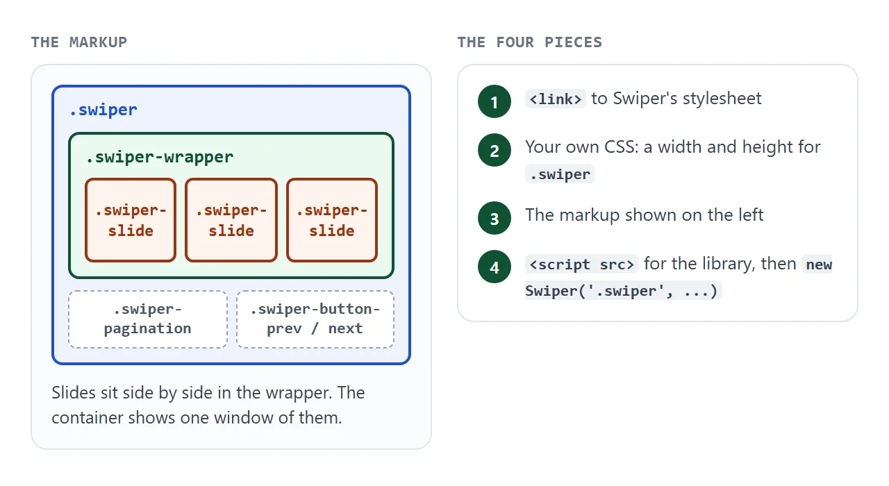
- A stylesheet link to
swiper-bundle.min.css. It makes the slides sit in a row and draws the arrows and dots. - Your own CSS for the size. The container needs a width and, usually, a height.
- The markup:
.swiperholds.swiper-wrapper, which holds one.swiper-slideper slide. - Two script parts: the library file, then your
new Swiper(...)call.
The library file and the stylesheet are both from the swiper-bundle build. The bundle includes the optional modules, so pagination, navigation, keyboard control and the fade effect work without importing anything.
Put the init code after the markup
new Swiper('.swiper') looks for the container when it runs. If that script sits in the head, the browser has not read the container yet.
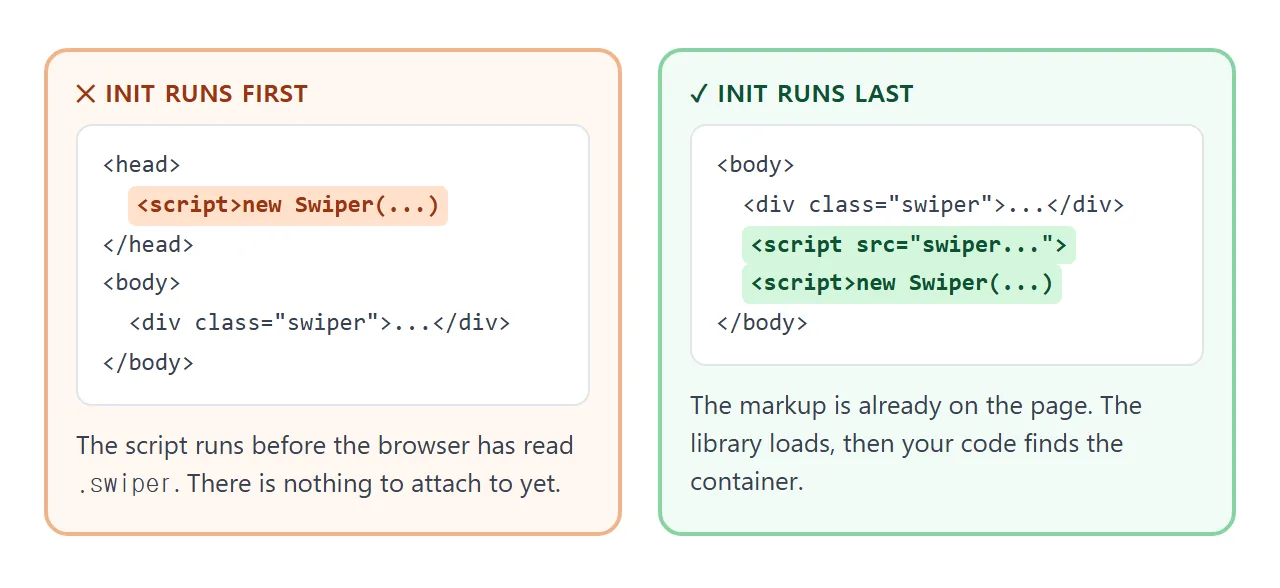
The safe layout is the one in the first example: markup, then the library script, then your init script, all at the bottom of the body.
Options that change how it behaves
Everything beyond the basics is an option in the object you pass to new Swiper. The next example lets you flip two of them and watch the instance.
<!doctype html>
<html lang="en">
<head>
<meta charset="utf-8">
<meta name="viewport" content="width=device-width, initial-scale=1">
<title>Swiper options</title>
<link rel="stylesheet" href="https://cdn.jsdelivr.net/npm/swiper@14.3.0/swiper-bundle.min.css">
<style>
  body { margin: 0; padding: 14px; font-family: system-ui, sans-serif; background: #eceef1; color: #1d2330; }
  .controls { display: flex; flex-wrap: wrap; gap: 8px 16px; align-items: center; margin-bottom: 10px; font-size: 14px; }
  .controls select { font: inherit; padding: 3px 6px; }
  .swiper { height: 170px; border-radius: 12px; background: #fff; }
  .swiper-slide { display: flex; align-items: center; justify-content: center; border-radius: 10px; font-size: 22px; font-weight: 700; color: #fff; }
  .swiper-slide:nth-child(5n+1) { background: #2563eb; }
  .swiper-slide:nth-child(5n+2) { background: #059669; }
  .swiper-slide:nth-child(5n+3) { background: #ea580c; }
  .swiper-slide:nth-child(5n+4) { background: #7c3aed; }
  .swiper-slide:nth-child(5n+5) { background: #db2777; }
  .swiper-pagination { position: static; margin-top: 8px; }
  #out { margin: 10px 0 0; font: 13px/1.5 ui-monospace, Consolas, monospace; background: #fff; border-radius: 8px; padding: 8px 10px; }
</style>
</head>
<body>

<div class="controls">
  <label><input type="checkbox" id="loop"> loop</label>
  <label>slidesPerView
    <select id="spv"><option>1</option><option selected>2</option><option>3</option></select>
  </label>
</div>

<div class="swiper">
  <div class="swiper-wrapper">
    <div class="swiper-slide">1</div>
    <div class="swiper-slide">2</div>
    <div class="swiper-slide">3</div>
    <div class="swiper-slide">4</div>
    <div class="swiper-slide">5</div>
  </div>
</div>
<div class="swiper-pagination"></div>
<p id="out"></p>

<script src="https://cdn.jsdelivr.net/npm/swiper@14.3.0/swiper-bundle.min.js"></script>
<script>
  const loopBox = document.getElementById('loop');
  const spvSel = document.getElementById('spv');
  const out = document.getElementById('out');
  let swiper;

  function show() {
    out.textContent = 'activeIndex: ' + swiper.activeIndex + '   realIndex: ' + swiper.realIndex;
  }

  function build() {
    if (swiper) swiper.destroy(true, true);   // remove the old instance before making a new one
    swiper = new Swiper('.swiper', {
      slidesPerView: Number(spvSel.value),
      spaceBetween: 10,
      loop: loopBox.checked,
      grabCursor: true,
      keyboard: true,
      pagination: { el: '.swiper-pagination', clickable: true },
      on: { slideChange: show },
    });
    show();
  }

  loopBox.addEventListener('change', build);
  spvSel.addEventListener('change', build);
  build();
</script>
</body>
</html>
| Option | What it does |
|---|---|
slidesPerView |
How many slides are visible at once. Default 1. |
spaceBetween |
Gap between slides, in pixels. |
loop |
Continuous mode when set to true. Default false. |
breakpoints |
Different options at different screen widths. |
keyboard |
Arrow-key control when enabled. |
grabCursor |
Shows a grab cursor over the slider. |
autoplay |
Moves on its own. The delay defaults to 3000 ms. |
The readout shows two numbers. activeIndex is the current slide's index. realIndex is the same index counted against your original slides, which matters in loop mode, where Swiper rearranges them.
Control it from your own buttons
The instance has methods you can call from your own code: slideNext(), slidePrev() and slideTo(index, speed). It also has properties such as isBeginning and isEnd, and events such as slideChange.
That is enough to build a custom interface, as in this four-step tour.
<!doctype html>
<html lang="en">
<head>
<meta charset="utf-8">
<meta name="viewport" content="width=device-width, initial-scale=1">
<title>Product tour</title>
<link rel="stylesheet" href="https://cdn.jsdelivr.net/npm/swiper@14.3.0/swiper-bundle.min.css">
<style>
  body { margin: 0; padding: 14px; font-family: system-ui, sans-serif; background: #eceef1; color: #1d2330; }
  .card { max-width: 440px; margin: 0 auto; background: #fff; border-radius: 16px; overflow: hidden; box-shadow: 0 6px 20px rgba(0,0,0,.1); }
  .swiper { height: 250px; }
  .swiper-slide { display: flex; flex-direction: column; align-items: center; justify-content: center; text-align: center; padding: 0 28px; color: #fff; }
  .swiper-slide h2 { margin: 0 0 6px; font-size: 22px; }
  .swiper-slide p { margin: 0; font-size: 15px; line-height: 1.45; opacity: .95; }
  .t1 { background: linear-gradient(135deg, #2563eb, #4f46e5); }
  .t2 { background: linear-gradient(135deg, #059669, #0d9488); }
  .t3 { background: linear-gradient(135deg, #ea580c, #d97706); }
  .t4 { background: linear-gradient(135deg, #7c3aed, #db2777); }
  .bar { display: flex; align-items: center; justify-content: space-between; padding: 12px 14px; }
  .bar button { font: inherit; font-weight: 600; padding: 8px 16px; border-radius: 8px; border: 1px solid #cfd4dc; background: #fff; cursor: pointer; }
  .bar button.go { background: #2563eb; border-color: #2563eb; color: #fff; }
  .bar button:disabled { opacity: .4; cursor: default; }
  .dots { display: flex; gap: 6px; }
  .dots i { width: 8px; height: 8px; border-radius: 50%; background: #cfd4dc; }
  .dots i.on { background: #2563eb; }
  #done { display: none; margin: 14px auto 0; max-width: 440px; padding: 12px 14px; border-radius: 10px; background: #d4f5dc; font-size: 15px; }
</style>
</head>
<body>

<div class="card">
  <div class="swiper">
    <div class="swiper-wrapper">
      <div class="swiper-slide t1"><h2>Welcome</h2><p>Swipe, or use the buttons below.</p></div>
      <div class="swiper-slide t2"><h2>Share</h2><p>One link opens the page for anyone.</p></div>
      <div class="swiper-slide t3"><h2>Edit</h2><p>Change the code and the link stays.</p></div>
      <div class="swiper-slide t4"><h2>Ready</h2><p>That is the whole tour.</p></div>
    </div>
  </div>
  <div class="bar">
    <button id="back" type="button">Back</button>
    <div class="dots" id="dots"></div>
    <button id="next" type="button" class="go">Next</button>
  </div>
</div>
<p id="done">Tour finished. Your own code would start the app here.</p>

<script src="https://cdn.jsdelivr.net/npm/swiper@14.3.0/swiper-bundle.min.js"></script>
<script>
  const back = document.getElementById('back');
  const next = document.getElementById('next');
  const dots = document.getElementById('dots');
  const done = document.getElementById('done');

  const swiper = new Swiper('.swiper', {
    effect: 'fade',                 // fade between slides instead of sliding
    speed: 400,
    on: { slideChange: sync },
  });

  // Our own dots and buttons, driven by the swiper instance
  swiper.slides.forEach(() => dots.appendChild(document.createElement('i')));

  function sync() {
    [...dots.children].forEach((d, i) => d.classList.toggle('on', i === swiper.activeIndex));
    back.disabled = swiper.isBeginning;
    next.textContent = swiper.isEnd ? 'Done' : 'Next';
    done.style.display = 'none';
  }

  back.addEventListener('click', () => swiper.slidePrev());
  next.addEventListener('click', () => {
    if (swiper.isEnd) done.style.display = 'block';
    else swiper.slideNext();
  });
  sync();
</script>
</body>
</html>
const swiper = new Swiper('.swiper', {
  effect: 'fade',                 // fade instead of slide
  on: { slideChange: sync },      // runs after every change
});
next.addEventListener('click', () => swiper.slideNext());
If you add, remove or show and hide slides with your own code, call swiper.update() afterwards. To remove a slider completely, call swiper.destroy().
Without the stylesheet, nothing slides
A first attempt that shows the slides as stacked blocks usually has no stylesheet. The stylesheet is what turns the wrapper into a row and hides the overflow.
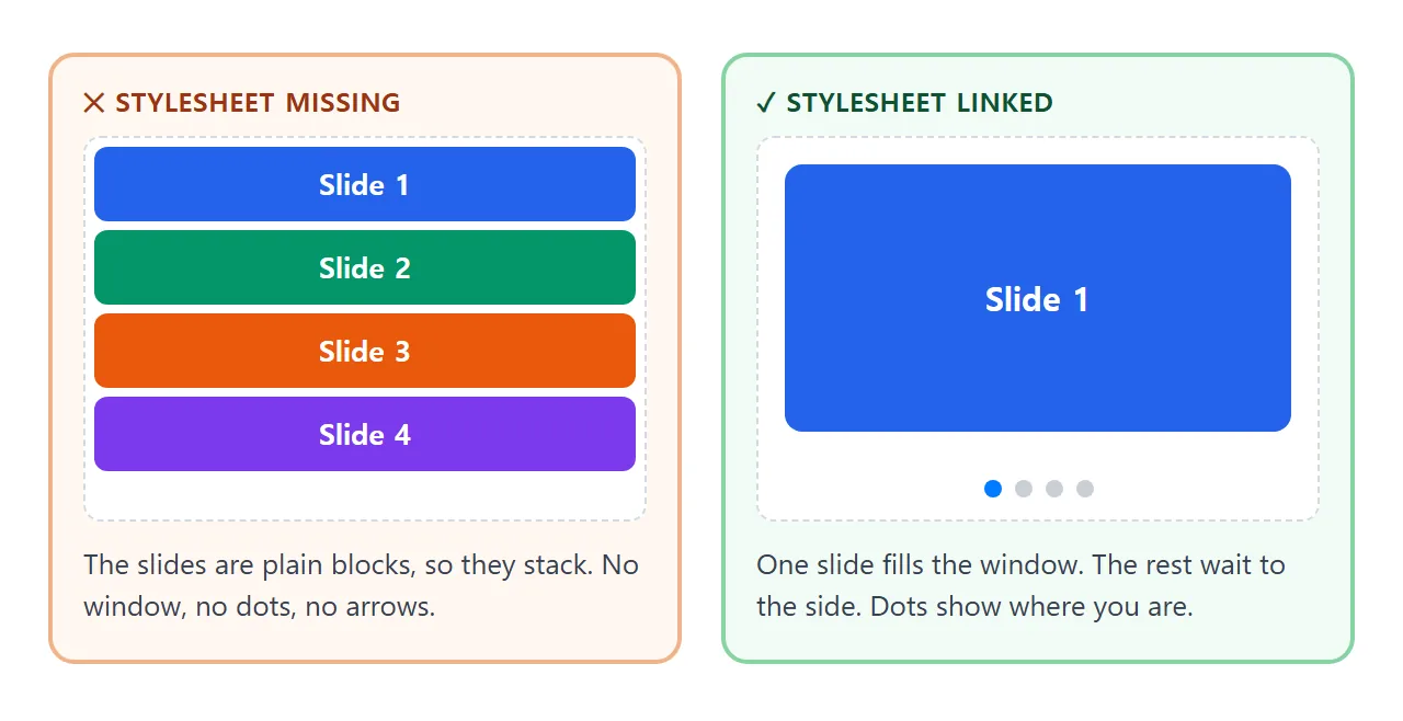
Open the browser's developer tools and look at the Network tab. A red swiper-bundle.min.css means the address is wrong or blocked. If you write the address by hand, keep the exact version and file name from the CDN.
Bundlers and modules: not for a single file
Projects with a build tool install Swiper from npm and import what they need. That is a different workflow and does not run as one pasted HTML file.
npm install swiper
import Swiper from 'swiper/bundle';
import 'swiper/css/bundle';
Those two lines are for a bundler. In a plain HTML file, stay with the two CDN tags. If you want a module import there, Swiper also publishes swiper-bundle.min.mjs on the same CDN, loaded with type="module".
When it does not work
| What you see | Cause | Fix |
|---|---|---|
| Slides stack in a column, no dots | The stylesheet did not load | Check the link address and the Network tab |
| Nothing happens, no error shown | Init script runs before the markup | Move both scripts below the slider |
| Console says Swiper is not defined | The library script failed or comes after your code | Load the library file first |
| The slider is only as tall as its text | The container has no height | Set a height on .swiper |
| Arrows or dots are hard to see | The default blue matches your slides | Set --swiper-theme-color |
| Dots show but do not respond to taps | clickable is off by default |
Set clickable: true inside pagination |
| Slides added by script do not appear | Swiper has not measured the new slides | Call swiper.update() |
| It will not move by dragging | allowTouchMove is false |
Remove it or set it to true |
Share it as a link
A slider is something to swipe, and a screenshot cannot be swiped. An .html attachment may open as plain code on a phone. Opening an HTML file on a phone explains why.
To send the working version, paste the page into a NOS document and choose Create share link. HTML to link walks through it. The page renders as written and its scripts run, and scripts and styles from cdn.jsdelivr.net load. The people you send it to can swipe the slider themselves.
If you change the code later, the same link shows the new version.
Keep slide images inside the page, as CSS gradients or inline SVG. NOS blocks outside images, so a slide that points at another site's picture shows nothing.
For a slider without any library, see swipe in HTML, which uses pointer events, or carousel in HTML.