To make HTML mobile friendly you usually change five lines, not the layout.
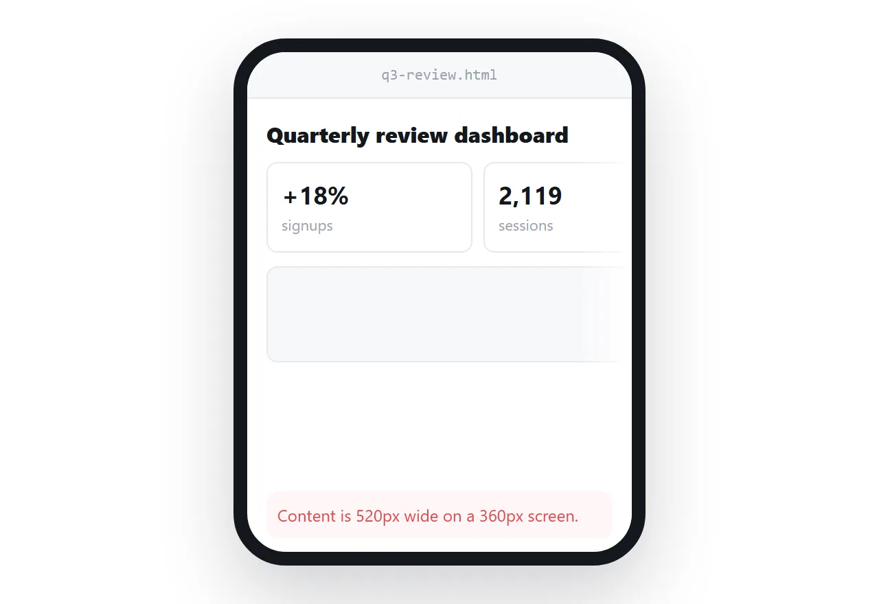
A page that looks right on a laptop and arrives on a phone as a tiny shrunken copy that still scrolls sideways was built at laptop width, because that is where it was described.
Five specific things break when the screen is narrow: the viewport line is missing, widths are fixed, the column count is hard-coded, box-sizing is missing, and something cannot shrink.
This guide shows the five, how to find which element is overflowing, and the four steps to a page that reads on the device most people will open it on.
Test by narrowing your browser window to about 360 pixels. Everything below shows up within seconds.
To make HTML mobile friendly, cause 1: the viewport line is missing
<meta name="viewport" content="width=device-width,initial-scale=1">
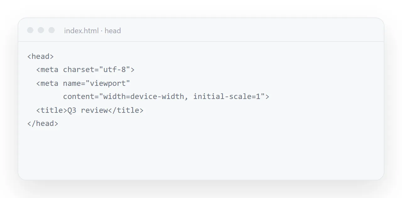
Without it a phone assumes the page was built for a desktop, renders it at about 980px wide, and scales the result down to fit — so the text is technically all there and too small to read.
This is the first thing to check and the most common single cause. See the viewport meta tag.
2. Fixed widths
/* found */ .wrap { width: 1200px; }
/* want  */ .wrap { max-width: 1200px; width: 100%; }
width is a demand; max-width is a ceiling. One word, and the container shrinks on a phone instead of forcing the page sideways.
3. A hard-coded column count
/* found */ .cards { display: grid; grid-template-columns: repeat(4, 1fr); }
/* want  */ .cards { display: grid; grid-template-columns: repeat(auto-fit, minmax(170px, 1fr)); }
The second version fits as many columns as will comfortably hold 170px and stacks the rest — four on a laptop, one on a phone, with no media query. This is the highest-value single substitution in generated CSS. See CSS grid.
4. Missing box-sizing
* { box-sizing: border-box; }
Without it, padding is added outside the declared width. A column set to width: 50% with padding: 20px is actually 50% plus 40px, so two of them overflow the row and the page scrolls sideways. One line at the top of the stylesheet. See box-sizing.
5. Something that cannot shrink
Three usual suspects:
A wide table. Do not squash it — let it scroll inside its own box:
.scroller { overflow-x: auto; }
table { min-width: 560px; }
A long unbroken string — a URL, an ID, a long word:
.cell { overflow-wrap: anywhere; }
A fixed-size image:
img, svg { max-width: 100%; height: auto; }
That last pair of lines is worth adding to every page unconditionally.
Finding which element overflows
* { outline: 1px solid red; }
Paste that in the inspector's style panel temporarily. The element extending past the screen edge is immediately visible. Faster than reasoning about it.
Type sizes without a stack of media queries
h1 { font-size: clamp(24px, 5vw, 40px); }
body { font-size: clamp(15px, 2vw, 16.5px); }
A minimum, a size that scales with the viewport, and a maximum. One line per element, and no breakpoints to maintain. See media queries for when you still need one — mostly for layout changes rather than type.
Text size on a phone
Once the layout reflows, the type is the next thing readers notice. Body text under 16px is hard to read on a phone and, on some phones, zooms the page when a field is tapped.
Set body to 16px, use clamp() for headings so they scale between a phone and a laptop, and leave the line height at 1.5 or more. Three rules, no media queries, and the page reads on a train.
Opening an HTML file on a phone covers the same step on a handset.
Ask for it up front
Mobile first. Must be readable at 360px wide with no sideways scrolling.
- * { box-sizing: border-box }
- max-width, never fixed width
- grids with repeat(auto-fit, minmax(...))
- font sizes with clamp()
- img, svg { max-width: 100%; height: auto }
- wide tables in an overflow-x: auto wrapper
Why it matters more than it used to
The page is going into a message, and messages are read on phones. A page that only works on a laptop is a page most recipients see badly — and they will not tell you it looked broken, they will just not engage with it.
Check it at 360px in the HTML viewer before sending, then publish it so the link opens directly in the phone browser instead of becoming a file nobody can open.
The substitutions, in one table
| Found in generated CSS | Replace with |
|---|---|
width: 1200px |
max-width: 1200px; width: 100% |
grid-template-columns: repeat(4, 1fr) |
repeat(auto-fit, minmax(170px, 1fr)) |
font-size: 40px on a heading |
clamp(24px, 5vw, 40px) |
No box-sizing rule |
*, *::before, *::after { box-sizing: border-box } |
height: 100vh |
min-height: 100svh |
A bare wide <table> |
Wrap in overflow-x: auto |
<img> with no constraint |
img, svg { max-width: 100%; height: auto } |
Seven substitutions, and between them they fix nearly every mobile fault in a generated page. Most are one word.
Two related traps
A grid track declared 1fr has an implicit minimum of its content, so an item containing a long address or a wide table pushes the column out — minmax(0, 1fr) allows it to shrink. See CSS grid.
A flex item behaves the same way and needs min-width: 0. See flexbox. Both produce sideways scrolling with nothing visibly wrong in the markup, which is why they are worth knowing by name rather than rediscovering.
Tables on a phone
A table is the one element that legitimately cannot shrink to 360px and stay readable. Do not force it. Wrap it in a container with overflow-x: auto so the table scrolls sideways inside its box while the rest of the page stays put.
That is the one place horizontal scrolling is the right answer, and sharing a table covers the rest of the table-specific rules.
Fixing the mobile layout: 4 steps
- Narrow the window to 360px. In the HTML viewer. If the whole page shrinks instead of reflowing, the viewport line is missing; if it scrolls sideways, something has a fixed width.
- Find the element that overflows. The console one-liner above lists every element wider than the screen.
- Apply the five lines. The viewport meta tag,
max-widthinstead ofwidth,repeat(auto-fit, minmax(170px, 1fr)),box-sizing: border-box, andmax-width: 100%on images and full-width bands. - Check it again, then publish. 360px and full width. Then publish it from a NOS document and hand out the address: Share, then Share link, then Create link. The reader on a phone gets the page, not a postage stamp of it.