shape-outside changes the outline that text wraps around. Put it on a floated element with a width and height, give it a shape such as circle(50%), and the lines beside it follow the curve instead of stopping at a straight edge.
.pic {
  float: left;
  width: 150px;
  height: 150px;
  shape-outside: circle(50%);
}
Try the four shape functions below. The dashed square is the float's box and the orange area is the shape. With polygon() selected, drag the blue dots.
<!doctype html>
<html lang="en">
<head>
<meta charset="utf-8">
<meta name="viewport" content="width=device-width, initial-scale=1">
<title>shape-outside playground</title>
<style>
  body { margin: 0; padding: 14px; font-family: system-ui, sans-serif; background: #f4f5f7; color: #1d2330; }
  .bar { display: flex; flex-wrap: wrap; gap: 8px 14px; align-items: center; margin-bottom: 8px; font-size: 13px; }
  .bar button { font: inherit; padding: 5px 10px; border: 1px solid #c9cdd4; border-radius: 99px; background: #fff; cursor: pointer; }
  .bar button[aria-pressed="true"] { background: #1d4ed8; border-color: #1d4ed8; color: #fff; }
  .bar input { vertical-align: middle; width: 110px; }
  pre { margin: 0 0 10px; padding: 8px 10px; border-radius: 8px; background: #1d2330; color: #d6f2df; font-size: 12px; white-space: pre-wrap; }
  .text { background: #fff; border-radius: 10px; padding: 14px; font-size: 14px; line-height: 1.5; }

  .shape {
    float: left;                  /* shape-outside only works on a float */
    width: 150px; height: 150px;  /* ...that has a size */
    margin: 0 40px 10px 0;        /* room for shape-margin to grow into */
    position: relative;
    outline: 1px dashed #9aa3b2;  /* the float's box, for comparison */
  }
  /* paint the same shape so you can see what the text is wrapping around */
  .fill { position: absolute; inset: 0; background: #fbbf77; }
  .handle {
    position: absolute; width: 16px; height: 16px; margin: -8px 0 0 -8px;
    border-radius: 50%; background: #1d4ed8; border: 2px solid #fff;
    touch-action: none; cursor: grab;
  }
</style>
</head>
<body>
<div class="bar">
  <span>
    <button aria-pressed="true" data-shape="circle">circle()</button>
    <button data-shape="ellipse">ellipse()</button>
    <button data-shape="inset">inset()</button>
    <button data-shape="polygon">polygon()</button>
  </span>
  <label>shape-margin <input id="gap" type="range" min="0" max="40" value="10"> <b id="gapOut">10px</b></label>
</div>
<pre id="code"></pre>
<div class="text">
  <div class="shape" id="shape"><div class="fill" id="fill"></div></div>
  The dashed square is the float's box. The orange area is the shape the text wraps around, and the gap between them is shape-margin. Switch shapes above and watch each line of text move to the new edge. With polygon() selected, drag the blue dots to edit the points. The text only wraps on one side: a left float pushes lines to the right, so dents on the left of the shape change nothing. Raise shape-margin to push the text away from the orange edge. The gap can grow into the float's 40px right margin but no further, because a shape is always cut off at the margin box. Below the float, the text returns to the full width.
</div>

<script>
  const shape = document.getElementById('shape');
  const fill = document.getElementById('fill');
  const code = document.getElementById('code');
  const gap = document.getElementById('gap');
  let kind = 'circle';
  let points = [[0, 0], [100, 0], [60, 50], [100, 100], [0, 100]];  // polygon, in %

  const shapes = {
    circle: () => 'circle(50%)',
    ellipse: () => 'ellipse(45% 30%)',
    inset: () => 'inset(10% 20% round 16px)',
    polygon: () => 'polygon(' + points.map(p => p[0] + '% ' + p[1] + '%').join(', ') + ')',
  };

  function draw() {
    const value = shapes[kind]() + ' border-box';  // measure % from the box, not the margin
    shape.style.shapeOutside = value;
    shape.style.shapeMargin = gap.value + 'px';
    fill.style.clipPath = shapes[kind]();          // same shape, drawn
    document.getElementById('gapOut').textContent = gap.value + 'px';
    code.textContent = 'shape-outside: ' + value + ';\nshape-margin: ' + gap.value + 'px;';
    shape.querySelectorAll('.handle').forEach((h, i) => {
      h.hidden = kind !== 'polygon';
      h.style.left = points[i][0] + '%';
      h.style.top = points[i][1] + '%';
    });
  }

  // one draggable dot per polygon point
  points.forEach((p, i) => {
    const h = document.createElement('div');
    h.className = 'handle';
    shape.append(h);
    h.addEventListener('pointerdown', (e) => h.setPointerCapture(e.pointerId));
    h.addEventListener('pointermove', (e) => {
      if (!h.hasPointerCapture(e.pointerId)) return;
      const r = shape.getBoundingClientRect();
      const x = Math.round((e.clientX - r.left) / r.width * 100);
      const y = Math.round((e.clientY - r.top) / r.height * 100);
      points[i] = [Math.min(100, Math.max(0, x)), Math.min(100, Math.max(0, y))];
      draw();
    });
  });

  document.querySelectorAll('[data-shape]').forEach(b => b.addEventListener('click', () => {
    kind = b.dataset.shape;
    document.querySelectorAll('[data-shape]').forEach(x => x.setAttribute('aria-pressed', x === b));
    draw();
  }));
  gap.addEventListener('input', draw);
  draw();
</script>
</body>
</html>
The short intro in CSS float covers the circle case. This guide goes through every shape, image-based wraps, spacing, and what to do on phones.
The two requirements: a float with a size
shape-outside is a float property. On an element that is not floated it does nothing, even if the shape is valid. The text flows as if the property were not there.
The element also needs real dimensions. Percentages in circle(50%) and polygon(0 0, 100% 0, ...) are measured from the element's box. An empty div with no width or height has a zero-size box, so the shape is zero size too.
The shape can only pull text in, never push it further out. It is cut off at the float's margin box, so nothing you draw outside that box affects the text.
The shape functions
Each function describes an area inside the float's box. Lines of text stop at the edge of that area instead of at the edge of the box.
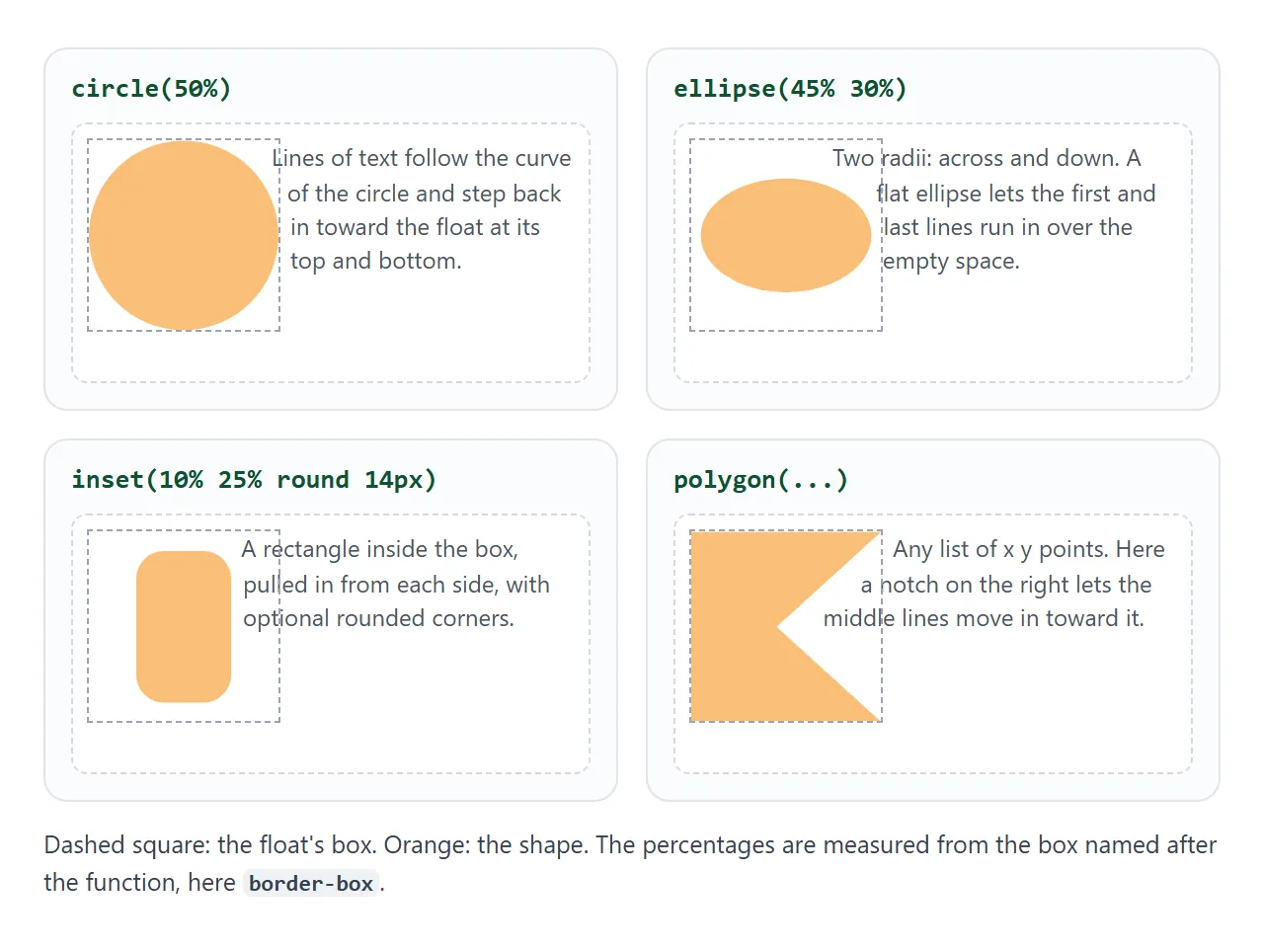
| Function | What it draws | Example |
|---|---|---|
circle() |
A circle, radius from the box | circle(50%) |
ellipse() |
An ellipse with two radii | ellipse(45% 30%) |
inset() |
A rectangle pulled in from each side | inset(10% 20% round 16px) |
polygon() |
Any list of x y points | polygon(0 0, 100% 0, 0 100%) |
url() |
The solid pixels of an image | url(tree.svg) |
| a box keyword | The box itself, with its rounded corners | border-box |
A box keyword on its own is handy for round pictures. With border-radius: 50% and shape-outside: border-box, the text follows the rounded corners.
Text wraps on one side only. A left float pushes lines to its right, so a notch on the left edge of the shape changes nothing. Put the interesting side of the shape where the text is.
Editing a polygon
Points in polygon() are x y pairs, measured from the top-left corner of the box. Write them in percentages and the shape scales with the element, so the same polygon works at any size.
.peak {
  float: left;
  width: 190px;
  height: 150px;
  shape-outside: polygon(0 100%, 0 45%, 28% 8%, 52% 50%, 70% 26%, 100% 100%);
}
Finding good points by typing numbers is slow. Two faster ways:
- Drag the points in the playground above and copy the code line it prints.
Wrap around an image's transparent areas
shape-outside: url() takes an image and uses its alpha channel, the part that says how see-through each pixel is. Transparent pixels are outside the shape; solid pixels are inside. That lets text follow a cut-out drawing without writing any points.
<!doctype html>
<html lang="en">
<head>
<meta charset="utf-8">
<meta name="viewport" content="width=device-width, initial-scale=1">
<title>shape-outside from an image</title>
<style>
  :root {
    /* a tree with a soft glow: solid canopy, see-through edges, transparent corners */
    --tree: url("data:image/svg+xml,%3Csvg xmlns='http://www.w3.org/2000/svg' viewBox='0 0 120 160'%3E%3CradialGradient id='g'%3E%3Cstop offset='.55' stop-color='%2386efac'/%3E%3Cstop offset='1' stop-color='%2386efac' stop-opacity='0'/%3E%3C/radialGradient%3E%3Ccircle cx='60' cy='58' r='58' fill='url(%23g)'/%3E%3Ccircle cx='60' cy='58' r='34' fill='%2316a34a'/%3E%3Crect x='53' y='88' width='14' height='72' rx='3' fill='%2392400e'/%3E%3C/svg%3E");
  }
  body { margin: 0; padding: 14px; font-family: system-ui, sans-serif; background: #f4f5f7; color: #1d2330; }
  label { display: block; font-size: 13px; margin-bottom: 10px; }
  label input { vertical-align: middle; width: 150px; }
  .cols { display: grid; grid-template-columns: 1fr 1fr; gap: 12px; }
  @media (max-width: 520px) { .cols { grid-template-columns: 1fr; } }
  .text { background: #fff; border-radius: 10px; padding: 12px; font-size: 13.5px; line-height: 1.45; }
  h3 { margin: 0 0 6px; font-size: 13px; }

  .tree {
    float: left;
    width: 120px; height: 160px;   /* same ratio as the SVG viewBox */
    margin-right: 8px;
    background: var(--tree) center / 100% 100% no-repeat;
  }
  .shaped {
    shape-outside: var(--tree);    /* wrap along the image's alpha channel */
    shape-image-threshold: 0.5;    /* pixels more opaque than this count as "shape" */
    shape-margin: 6px;             /* a little air between text and trunk */
  }
</style>
</head>
<body>
<label>shape-image-threshold <input id="t" type="range" min="0" max="0.95" step="0.05" value="0.5"> <b id="tOut">0.5</b></label>
<div class="cols">
  <div class="text">
    <h3>Plain float</h3>
    <div class="tree"></div>
    The image has transparent corners, but the text does not know. Every line stops at the edge of the float's rectangle, so the space beside the trunk stays empty and the page looks boxy. The float is a rectangle, and a rectangle is all the text ever sees, no matter what the picture looks like inside it.
  </div>
  <div class="text">
    <h3>shape-outside: url()</h3>
    <div class="tree shaped" id="shaped"></div>
    Here the same image is also the shape. The text slides in under the canopy and runs along the trunk. Move the slider: at 0 even the faint glow counts, higher values ignore it and hug the dark green. Lower down, the lines reach in next to the thin trunk, because the pixels around it are fully transparent.
  </div>
</div>

<script>
  const t = document.getElementById('t');
  t.addEventListener('input', () => {
    document.getElementById('shaped').style.shapeImageThreshold = t.value;
    document.getElementById('tOut').textContent = t.value;
  });
</script>
</body>
</html>
shape-image-threshold decides how solid a pixel must be to count. It takes a number from 0 to 1 and defaults to 0, so even a faint glow is part of the shape. At 0.5, only pixels more than half opaque count.
Keep the image the same size as the float. With SVG, the simplest way is to give it only a viewBox in the float's proportions and no fixed width or height.
Why an image shape is ignored
Browsers only build a shape from an image they are allowed to read. Three things commonly get in the way:
- Another domain. An image from a different origin needs an
Access-Control-Allow-Originheader. Without it, the console shows a CORS error and the float wraps as a plain rectangle. CORS explains the header. - A page opened from disk. In Chrome, a page opened as
file://cannot use a local image file as a shape. Serve the folder over HTTP, or embed the image. - Nothing is transparent. A JPEG has no alpha channel, so its shape is the full rectangle.
A data: URI avoids the first two problems. The image travels inside the CSS, so there is no other server or file to ask permission from:
:root {
  --tree: url("data:image/svg+xml,%3Csvg xmlns='http://www.w3.org/2000/svg' viewBox='0 0 120 160'%3E...%3C/svg%3E");
}
.tree {
  float: left;
  width: 120px;
  height: 160px;
  background: var(--tree) center / 100% 100% no-repeat;
  shape-outside: var(--tree);
  shape-image-threshold: 0.5;
}
One custom property feeds both the painted background and the shape, so they cannot drift apart.
Space around the shape: shape-margin, not margin
Plain margin does not give an even gap. Shapes are measured from the margin box by default, so a bigger margin makes the whole circle bigger and moves its centre.
shape-margin adds a band of fixed width around the shape. There is one catch: the result is still cut off at the margin box. With no margin, the gap stops at the float's edge, and at the widest point the text touches the box.
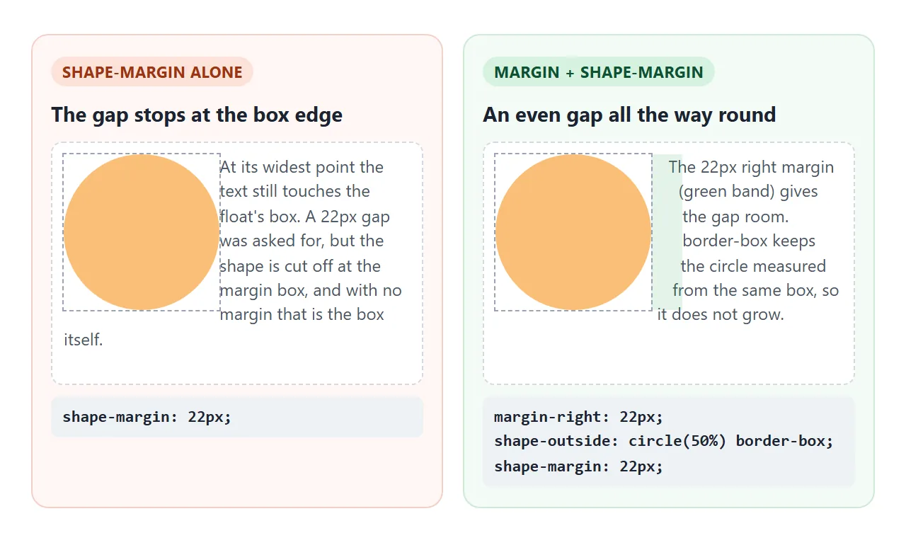
The pattern that works:
.pic {
  float: left;
  width: 150px;
  height: 150px;
  margin-right: 16px;                    /* room for the gap */
  shape-outside: circle(50%) border-box; /* measure from the box, not the margin */
  shape-margin: 16px;                    /* the gap itself */
}
The keyword after the shape names the reference box: margin-box (the default), border-box, padding-box or content-box.
Cut the picture too, with clip-path
shape-outside moves text. It does not change how the element is painted. A square photo with a circular wrap still shows its corners, and the words near the top and bottom are drawn over them.
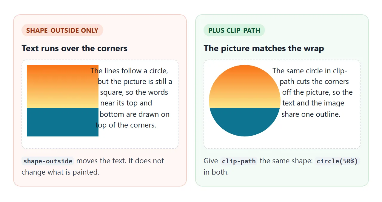
Give clip-path the same shape. clip-path measures from the border box by default, which is one more reason to write border-box after the shape in shape-outside: both properties then use the same box. For simple circles, border-radius does the same cutting job.
A finished example: a magazine page
This page has a round pull picture on the right and a mountain illustration on the left. Both are cut with clip-path and wrapped with shape-outside, and the ridge polygon lives in one custom property used by both.
<!doctype html>
<html lang="en">
<head>
<meta charset="utf-8">
<meta name="viewport" content="width=device-width, initial-scale=1">
<title>Magazine layout with shape-outside</title>
<style>
  body { margin: 0; padding: 18px; font-family: Georgia, serif; background: #faf7f2; color: #2b2622; }
  h1 { margin: 0 0 4px; font-size: 26px; }
  .by { margin: 0 0 14px; font: 13px system-ui, sans-serif; color: #7a6f66; }
  p { margin: 0 0 12px; font-size: 15px; line-height: 1.6; }

  /* 1. round pull image: the photo is square, clip-path cuts it, shape-outside wraps it */
  .portrait {
    float: right;
    width: 170px; height: 170px;
    margin: 0 0 12px 16px;               /* room for shape-margin */
    clip-path: circle(50%);              /* what you see */
    shape-outside: circle(50%) border-box; /* where the text stops, same box as clip-path */
    shape-margin: 12px;
  }

  /* 2. polygon illustration: one variable feeds both properties */
  .peak {
    --ridge: polygon(0 100%, 0 45%, 28% 8%, 52% 50%, 70% 26%, 100% 100%);
    float: left;
    width: 190px; height: 150px;
    margin: 4px 16px 8px 0;
    background: linear-gradient(#64748b, #334155 60%, #1e293b);
    clip-path: var(--ridge);
    shape-outside: var(--ridge) border-box;
    shape-margin: 10px;
  }

  /* 3. on narrow screens a float leaves a column only a few words wide: switch it off */
  @media (max-width: 480px) {
    .portrait, .peak { float: none; display: block; margin: 0 auto 14px; shape-outside: none; }
    .portrait { width: 140px; height: 140px; }
    .peak { width: 100%; height: 110px; }
  }
</style>
</head>
<body>
<h1>Two days on the ridge</h1>
<p class="by">Field notes · 4 min read</p>

<img class="portrait" alt="Sunset over a lake"
  src="data:image/svg+xml,%3Csvg xmlns='http://www.w3.org/2000/svg' viewBox='0 0 100 100'%3E%3ClinearGradient id='s' x2='0' y2='1'%3E%3Cstop offset='0' stop-color='%23f97316'/%3E%3Cstop offset='.6' stop-color='%23fde68a'/%3E%3C/linearGradient%3E%3Crect width='100' height='100' fill='url(%23s)'/%3E%3Ccircle cx='50' cy='58' r='16' fill='%23fff7ed'/%3E%3Crect y='62' width='100' height='38' fill='%230e7490'/%3E%3C/svg%3E">

<p>We left the car at the lower gate before sunrise and followed the stream until the trees thinned out. By the time the light reached the water, the valley was already behind us and the path had turned to loose stone. Nobody spoke much on the climb.</p>

<div class="peak" role="img" aria-label="Mountain ridge"></div>

<p>The ridge itself is a long saw blade of rock with two summits. The path keeps to the right side of the first peak, drops into a saddle and climbs again toward the second, lower one. From the saddle you can see both lakes at once, and on a still day the far shore shows up in the water upside down.</p>

<p>We camped just below the second summit, where a ledge breaks the wind. Dinner was soup and bread warmed on a stone, and the stars came out so quickly that we forgot to take the photos we had carried the camera for. In the morning the cloud sat below us like a floor.</p>
</body>
</html>
On a phone, a 170px float beside the text leaves a column only a few words wide, and the curve is lost anyway. Switch it off in a media query:
@media (max-width: 480px) {
  .portrait, .peak {
    float: none;
    display: block;
    margin: 0 auto 14px;
    shape-outside: none;
  }
}
clip-path can stay on, so the picture keeps its shape while it sits on its own line.
When it does not work
| What you see | Cause | Fix |
|---|---|---|
| No effect at all | The element is not floated | Add float: left or right |
| No effect, and the element is empty | It has no width or height | Give it both |
| An image shape wraps as a rectangle | Cross-origin image without CORS, or a file:// page |
Send Access-Control-Allow-Origin, or use a data: URI |
| The image shape is too loose | The threshold counts faint pixels | Raise shape-image-threshold |
| Text wraps a curve, the picture is still square | shape-outside does not paint |
Add clip-path with the same shape |
| margin makes the circle bigger instead of adding a gap | Shapes are measured from the margin box | Use shape-margin and add border-box |
| shape-margin stops at the box edge | The shape is cut off at the margin box | Give the float a margin at least as large |
| A thin column of text on phones | The float takes most of the width | float: none and shape-outside: none in a media query |
Share it as a link
A text wrap is easy to break by accident, and a screenshot hides how it behaves at other widths. Sending the live page lets people resize it and see the text reflow for themselves.
Paste the page into a NOS document and choose Create share link. HTML to link walks through it. The page renders as written and its scripts run, so the sliders and draggable points work for whoever opens it.
If you change the code later, the same link shows the new version.