To make an HTML button with a link, style an anchor to look like a button rather than putting a link inside a <button> element.
<a href="/pricing" class="btn">See pricing</a>
.btn {
  display: inline-block;
  padding: 12px 20px;
  background: #2563eb;
  color: #fff;
  border-radius: 8px;
  text-decoration: none;
  font-weight: 600;
}
That is a button to the reader and a link to the browser, which is the combination you want.
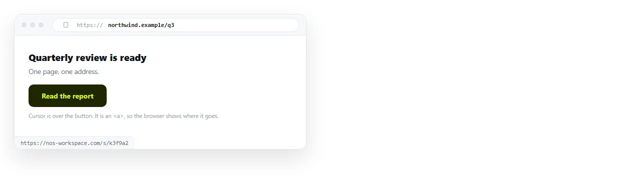
Why not a button element
A <button> does not navigate. On its own it does nothing outside a form, so making it go somewhere means adding script:
<button onclick="location.href='/pricing'">See pricing</button>
That looks equivalent and is not. Four things are lost.
- Middle click and right click. There is no URL, so open in new tab and copy link address are not offered.
- The status bar. Hovering shows nothing, so the reader cannot see where they are about to go.
- Screen reader meaning. It is announced as a button, so the reader expects an action and gets a page change.
- Script dependence. With script blocked or failing, the link is dead. An anchor works with no script at all.
| Styled anchor | Button with onclick | |
|---|---|---|
| Open in new tab | Yes | No |
| Shows destination on hover | Yes | No |
| Works without JavaScript | Yes | No |
| Announced as | Link | Button |
| Crawlable by search engines | Yes | No |
| Keyboard activation | Enter | Enter and space |
The only row favouring the button is the last one, and it is a minor difference.
The markup patterns to avoid
A button inside an anchor. Interactive elements cannot nest. Browsers recover from it differently and assistive technology reports it inconsistently.
<!-- do not do this -->
<a href="/pricing"><button>See pricing</button></a>
An anchor with no href. Without href an anchor is not focusable and is not announced as a link. If you have no destination, you have an action, so use a button.
A form wrapped around a link for navigation. A GET form to change page adds a query string you did not ask for, and hides the destination.
The inline version
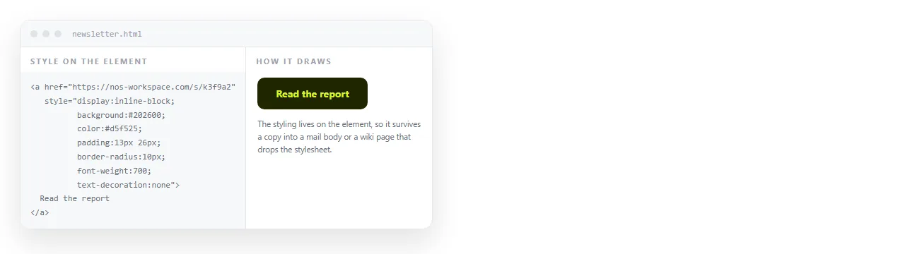
If the page has to travel as a single file, put the styling in the tag so it cannot be separated from it.
<a href="/pricing"
   style="display:inline-block;padding:12px 20px;background:#2563eb;color:#fff;border-radius:8px;text-decoration:none;font-weight:600">
  See pricing
</a>
This is the standard approach in HTML email, where stylesheet support is inconsistent. Inline CSS covers when to prefer it.
The trade off is that a style attribute cannot express hover or focus states. Those need a <style> block in the document.
States
A button that is the main action on a page needs three states beyond its default.
.btn:hover { background: #1d4ed8; }
.btn:active { background: #1e40af; }
.btn:focus-visible {
  outline: 2px solid #1d4ed8;
  outline-offset: 2px;
}
Write them after the base rule. Pseudo-class order matters, as covered in link hover colour.
Do not remove the outline without replacing it. On a primary action, an invisible focus state means keyboard users cannot tell when they have reached it.
Labels that work out of context
Screen reader users can pull up a list of every link on the page. In that list, only the link text appears.
"Click here" three times is useless. "See pricing", "Download the Q3 report", "Email the team" are not.
If the visible text genuinely cannot carry it, an aria-label supplies an accessible name. Use it as a fallback, not as a habit.
Size and spacing
Buttons are tapped as often as they are clicked. A comfortable target is around 44 pixels tall, which padding: 12px 20px with normal text reaches.
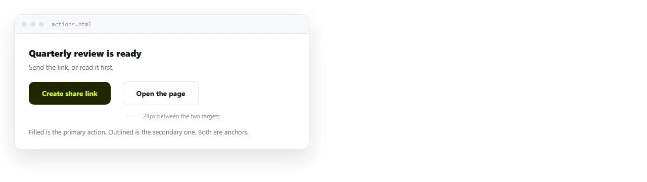
Leave space between adjacent buttons. Two primary actions touching each other produce mistaps on a phone, and the mistake is only visible after it happens.
Use one filled button per section. If everything is filled, nothing is primary, and secondary actions read better as an outlined button or a plain link.
Buttons that are not navigation
Some buttons really are actions, and those should be <button> elements.
- Mail and phone actions are still navigation.
mailto:andtel:are links, so they stay anchors. Mailto with multiple recipients shows the styled version. - Submitting a form is an action. Use
<button type="submit">. - Toggling a panel is an action. Use a button with
aria-expanded. - Copying a value is an action, with no destination at all.
The test is one question: does the reader end up somewhere else? If yes, it is a link.
After the page is written
A button only works once the page is somewhere the reader can open it. Sending the HTML file itself means the button never gets clicked, because the file often never renders.
Turning HTML into a link puts the page at an address. In a NOS document the pasted HTML renders as written, buttons, hover states and all, and editing the page does not move its address.
If the button collects information rather than sending people onward, turning a form into a link covers that case.
A block to copy
<a href="/pricing" class="btn">See pricing</a>
<a href="/docs" class="btn btn-quiet">Read the docs</a>
.btn {
  display: inline-block;
  padding: 12px 20px;
  border-radius: 8px;
  text-decoration: none;
  font-weight: 600;
  background: #2563eb;
  color: #fff;
}
.btn-quiet {
  background: transparent;
  color: #2563eb;
  box-shadow: inset 0 0 0 1px currentColor;
}
.btn:hover { filter: brightness(.92); }
.btn:focus-visible { outline: 2px solid #1d4ed8; outline-offset: 2px; }
One primary and one secondary, both anchors, both with real destinations. The secondary uses an inset shadow rather than a border, so the two buttons stay the same height.
Removing the underline here is safe, because the shape already identifies the element. Links without underlines covers where that reasoning stops applying.