A flip card in HTML is three nested boxes: an outer box that stays still, a card that turns, and two faces stacked inside the card. CSS does the turning with rotateY(180deg). A few lines of JavaScript decide when it turns.
Try it. Click the card, tap it on a phone, or Tab to it and press Enter.
<!doctype html>
<html lang="en">
<head>
<meta charset="utf-8">
<meta name="viewport" content="width=device-width, initial-scale=1">
<title>Flip card</title>
<style>
  body {
    margin: 0; min-height: 100vh; display: grid; place-items: center;
    font-family: system-ui, sans-serif; background: #eef1f6;
  }
  /* 1. The button: stays still and gives the scene depth */
  .flip {
    width: 240px; height: 260px; padding: 0; border: 0; background: none;
    font: inherit; text-align: left; cursor: pointer;
    perspective: 900px;
  }
  /* 2. The card: the part that turns */
  .card {
    display: block; position: relative; width: 100%; height: 100%;
    transform-style: preserve-3d;   /* keep both faces in 3D */
    transition: transform .6s;
  }
  .flip[aria-pressed="true"] .card { transform: rotateY(180deg); }
  /* 3. The faces: stacked on top of each other */
  .face {
    position: absolute; inset: 0; border-radius: 14px; padding: 20px;
    display: flex; flex-direction: column; justify-content: center; gap: 8px;
    box-shadow: 0 8px 24px rgba(15, 23, 42, .15);
    backface-visibility: hidden;    /* hide a face while it points away */
  }
  .front { background: linear-gradient(160deg, #4f46e5, #0ea5e9); color: #fff; }
  .back  { background: #fff; color: #1d2330; transform: rotateY(180deg); } /* starts turned away */
  .face b { font-size: 22px; }
  .face span { font-size: 15px; line-height: 1.45; }
  .flip:focus-visible { outline: 3px solid #f59e0b; outline-offset: 6px; border-radius: 16px; }
</style>
</head>
<body>
<button class="flip" id="flip" aria-pressed="false">
  <span class="card">
    <span class="face front"><b>Front</b><span>Click, tap, or press Enter.</span></span>
    <span class="face back"><b>Back</b><span>This face started at rotateY(180deg). The card turned another 180.</span></span>
  </span>
</button>

<script>
  const flip = document.getElementById('flip');
  flip.addEventListener('click', () => {
    const on = flip.getAttribute('aria-pressed') === 'true';
    flip.setAttribute('aria-pressed', String(!on));  // the CSS reads this
  });
</script>
</body>
</html>
The whole flip is one line: .flip[aria-pressed="true"] .card { transform: rotateY(180deg); }. Everything else is there to make that turn look like a solid card.
The three layers of a flip card
Each layer has one job. Most fixes in the table at the end come down to a job sitting on the wrong layer.
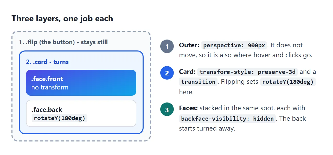
- The outer box gets
perspective. Without it, a 3D turn looks like the card just gets narrower and wider again. This box never moves, which matters for hover below. - The card gets
transform-style: preserve-3dand thetransition. This is the element you rotate. - The faces sit on top of each other and each gets
backface-visibility: hidden. The back face starts atrotateY(180deg), already turned away.
When the card turns 180 degrees, the back face has turned 360 in total, so its text reads the right way round. CSS perspective explains how the depth value works, and CSS transform covers rotateY and the other functions.
Why backface-visibility: hidden matters
Both faces are ordinary boxes in the same place. Without backface-visibility: hidden, the browser draws both of them.
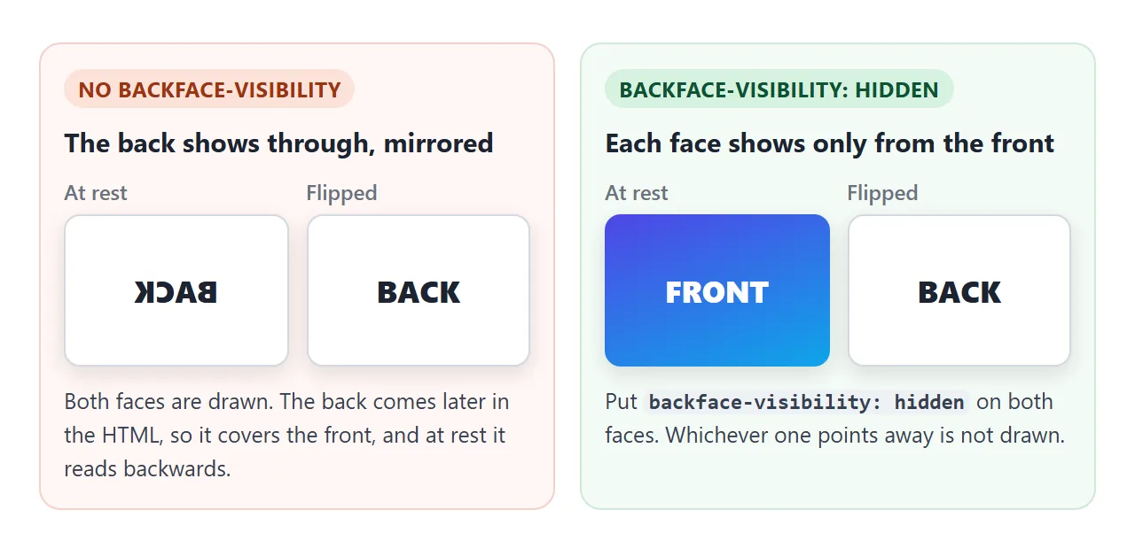
In Chromium, with no backface-visibility, the back face covers the front at rest and its text reads backwards. With hidden on both faces, only the face pointing at the viewer is drawn.
That rule only works while the faces are in 3D. If the card loses preserve-3d, both faces are flattened into one picture. Flipping it then shows the front face, mirrored.
Hover flip or click flip
A hover flip needs no JavaScript and is quick to peek at with a mouse. A click flip works with every kind of input and stays open while someone reads the back.
<!doctype html>
<html lang="en">
<head>
<meta charset="utf-8">
<meta name="viewport" content="width=device-width, initial-scale=1">
<title>Hover flip vs click flip</title>
<style>
  body { margin: 0; padding: 16px; font-family: system-ui, sans-serif; background: #eef1f6; color: #1d2330; }
  .grid { display: grid; grid-template-columns: repeat(auto-fit, minmax(220px, 1fr)); gap: 18px; }
  .col h2 { font-size: 14px; margin: 0 auto 8px; max-width: 260px; color: #4b5563; }
  .scene {
    display: block; width: 100%; max-width: 260px; height: 190px; margin: 0 auto;
    padding: 0; border: 0; background: none; font: inherit; color: inherit;
    text-align: left; cursor: pointer;
    perspective: 900px;
  }
  .card { display: block; position: relative; height: 100%; transform-style: preserve-3d; transition: transform .6s; }
  .face {
    position: absolute; inset: 0; border-radius: 12px; padding: 16px;
    display: flex; flex-direction: column; justify-content: center; gap: 6px;
    box-shadow: 0 6px 18px rgba(15, 23, 42, .14); backface-visibility: hidden;
  }
  .front { background: linear-gradient(160deg, #059669, #0ea5e9); color: #fff; }
  .back  { background: #fff; transform: rotateY(180deg); }
  .face b { font-size: 18px; }
  .face span { font-size: 14px; line-height: 1.4; }

  /* Left: hover on the still scene, not on the turning card. focus-visible for keyboards. */
  .hover:hover .card, .hover:focus-visible .card { transform: rotateY(180deg); }
  /* Right: a button that stays flipped until clicked again */
  .click[aria-pressed="true"] .card { transform: rotateY(180deg); }

  .scene:focus-visible { outline: 3px solid #f59e0b; outline-offset: 5px; border-radius: 14px; }
  .note { font-size: 13px; line-height: 1.45; color: #4b5563; margin: 10px auto 0; max-width: 260px; }
</style>
</head>
<body>
<div class="grid">
  <div class="col">
    <h2>Flips on hover</h2>
    <div class="scene hover" tabindex="0">
      <span class="card">
        <span class="face front"><b>Hover me</b><span>Or Tab to me.</span></span>
        <span class="face back"><b>Back</b><span>Move the pointer away and it turns back.</span></span>
      </span>
    </div>
    <p class="note">Good for a quick peek with a mouse. A finger cannot hover, so on a phone this card has no dependable way to flip.</p>
  </div>
  <div class="col">
    <h2>Flips on click or tap</h2>
    <button class="scene click" aria-pressed="false">
      <span class="card">
        <span class="face front"><b>Click me</b><span>Tap, Enter or Space.</span></span>
        <span class="face back"><b>Back</b><span>Stays here until you click again.</span></span>
      </span>
    </button>
    <p class="note">Works the same with a mouse, a finger and a keyboard, and the back stays open to read.</p>
  </div>
</div>

<script>
  const btn = document.querySelector('.click');
  btn.addEventListener('click', () => {
    btn.setAttribute('aria-pressed', String(btn.getAttribute('aria-pressed') !== 'true'));
  });
</script>
</body>
</html>
| Hover flip | Click flip | |
|---|---|---|
| Mouse | Flips while the pointer is over it | Flips on click, stays flipped |
| Phone | A finger cannot hover, so it has no dependable trigger | Flips on tap |
| Keyboard | Only if you add :focus-visible and tabindex="0" |
Enter and Space work, because it is a button |
| JavaScript | None | A click listener |
| Good for | A short extra line of detail | Flashcards, quizzes, anything to read |
If you want both, flip on hover only where hover exists and keep the click for everyone:
@media (hover: hover) {
  .flip:hover .card { transform: rotateY(180deg); }
}
.flip[aria-pressed="true"] .card { transform: rotateY(180deg); }
Put :hover on the box that stays still
It is tempting to write .card:hover { transform: rotateY(180deg); }. It flickers when the pointer is near the card's edge.
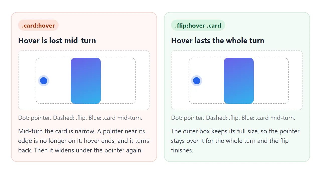
Mid-turn, the card is seen almost edge-on and covers only a thin strip. A pointer near the edge is no longer over it, so hover ends and the card turns back. It widens under the pointer, hover starts again, and the loop repeats.
We measured this in Chromium with the pointer 10px inside the card's edge. With .card:hover, the card went back and forth between about 15 and 55 degrees and never finished. With .flip:hover .card, it reached 180 degrees. Hover belongs on the outer box.
Keyboard and screen reader support
Make the outer box a <button>. A button can be reached with Tab and pressed with Enter or Space, with no key handling of your own. aria-pressed tells screen readers whether it is flipped, and the CSS can read the same attribute.
Two details come from the rules of <button>:
- Use
<span>inside, not<div>or headings. A button may only contain phrasing content. Give the spansdisplay: blockorgridin CSS. - No links inside. Interactive elements are not allowed in a button. If the back needs a link, keep the card a plain box and flip it with a separate button inside it.
backface-visibility only affects what is painted. In our Chromium test, a button holding both faces got an accessible name with the text of both, even with one face turned away.
The finished example below adds aria-hidden to whichever face is turned away, so only the visible face is read. tabindex covers making a non-button element focusable when you need the hover version.
A flip card that fits its text
The basic card has a fixed height because both faces use position: absolute. Absolute boxes do not stretch their parent, so a long answer spills out of the card.
Stack the faces with grid instead. Both faces go into the same grid cell, and the card becomes as tall as the taller face:
.card { display: grid; transform-style: preserve-3d; }
.face { grid-area: 1 / 1; backface-visibility: hidden; }
A finished example: flashcards
Three cards with different amounts of text. The third flips vertically. "Turn all back" resets the deck.
<!doctype html>
<html lang="en">
<head>
<meta charset="utf-8">
<meta name="viewport" content="width=device-width, initial-scale=1">
<title>Flip card flashcards</title>
<style>
  body { margin: 0; padding: 16px; font-family: system-ui, sans-serif; background: #eef1f6; color: #1d2330; }
  .top { display: flex; justify-content: space-between; align-items: center; gap: 10px; margin-bottom: 12px; }
  .top h2 { font-size: 16px; margin: 0; }
  .reset { font: inherit; font-size: 14px; padding: 7px 12px; border-radius: 8px; border: 1px solid #cbd2dc; background: #fff; cursor: pointer; }
  .deck { display: grid; grid-template-columns: repeat(auto-fit, minmax(160px, 1fr)); gap: 14px; align-items: start; }

  .flip {
    display: block; width: 100%; padding: 0; border: 0; background: none;
    font: inherit; color: inherit; text-align: left; cursor: pointer;
    perspective: 900px;
  }
  /* Both faces share one grid cell, so the card is as tall as the taller face. No fixed height. */
  .card { display: grid; transform-style: preserve-3d; transition: transform .6s; }
  .face {
    grid-area: 1 / 1; border-radius: 12px; padding: 16px; min-height: 120px;
    display: flex; flex-direction: column; justify-content: center; gap: 6px;
    box-shadow: 0 6px 18px rgba(15, 23, 42, .14);
    backface-visibility: hidden;
  }
  .front { background: linear-gradient(160deg, #7c3aed, #db2777); color: #fff; }
  .face small { font-size: 12px; opacity: .85; }
  .face b { font-size: 19px; overflow-wrap: anywhere; }
  .back { background: #fff; font-size: 14px; line-height: 1.45; }

  /* Horizontal flip (default) */
  .back { transform: rotateY(180deg); }
  .flip[aria-pressed="true"] .card { transform: rotateY(180deg); }
  /* Vertical flip: swap Y for X in both places */
  .flip.vertical .back { transform: rotateX(180deg); }
  .flip.vertical[aria-pressed="true"] .card { transform: rotateX(180deg); }

  .flip:focus-visible { outline: 3px solid #f59e0b; outline-offset: 4px; border-radius: 14px; }

  /* Less motion requested: no spin, the answer just appears */
  @media (prefers-reduced-motion: reduce) { .card { transition: none; } }
</style>
</head>
<body>
<div class="top">
  <h2>Flashcards</h2>
  <button class="reset" id="reset">Turn all back</button>
</div>

<div class="deck">
  <button class="flip" aria-pressed="false">
    <span class="card">
      <span class="face front"><small>Question</small><b>perspective</b></span>
      <span class="face back">Goes on the part that stays still. It sets how far away the viewer is, so the turn has depth.</span>
    </span>
  </button>
  <button class="flip" aria-pressed="false">
    <span class="card">
      <span class="face front"><small>Question</small><b>preserve-3d</b></span>
      <span class="face back">Goes on the part that turns. Without it the faces are flattened into one picture, the back face stays hidden, and the card shows its mirrored front. This answer is longer on purpose: the card grows to fit it.</span>
    </span>
  </button>
  <button class="flip vertical" aria-pressed="false">
    <span class="card">
      <span class="face front"><small>Question, flips up</small><b>backface-visibility</b></span>
      <span class="face back">Set to hidden on each face, so a face disappears while it points away.</span>
    </span>
  </button>
</div>

<script>
  const cards = document.querySelectorAll('.flip');

  function set(card, on) {
    card.setAttribute('aria-pressed', String(on));
    // backface-visibility only hides pixels. Hide the turned-away face from screen readers too.
    card.querySelector('.front').setAttribute('aria-hidden', String(on));
    card.querySelector('.back').setAttribute('aria-hidden', String(!on));
  }

  cards.forEach((card) => {
    set(card, false);
    card.addEventListener('click', () => set(card, card.getAttribute('aria-pressed') !== 'true'));
  });
  document.getElementById('reset').addEventListener('click', () => cards.forEach((c) => set(c, false)));
</script>
</body>
</html>
- Auto height: the grid stacking above, so each card fits its longer face.
- Vertical flip:
rotateX(180deg)on the back face and on the flipped card, instead ofrotateY. - Reduced motion:
@media (prefers-reduced-motion: reduce) { .card { transition: none; } }. The answer still appears, without the turn. - Screen readers:
aria-pressedon the button andaria-hiddenon the face that is turned away.
For laying several cards out in rows, HTML card layout covers the grid side.
When it does not work
| What you see | Cause | Fix |
|---|---|---|
| The card squashes flat and back, no depth | No perspective on the outer box |
Add perspective: 900px to the outer box |
| The back reads backwards, or covers the front at rest | Faces are missing backface-visibility: hidden |
Add it to both faces |
| Flipped, it shows the front mirrored | The card lost 3D, often from a missing preserve-3d or overflow: hidden on the card |
transform-style: preserve-3d on the card, and move clipping onto the faces |
| Back face upside down on a vertical flip | rotateX on the card but rotateY on the back |
Use the same axis in both places |
| Flickers when hovered near the edge | :hover is on the turning card |
Use .flip:hover .card |
| Long text spills out of the card | Faces are position: absolute in a fixed-height card |
Stack the faces with grid-area: 1 / 1 |
| Keyboard cannot flip it | The card is a <div> with only a click listener |
Use a <button> |
Share it as a link
A flip card has to be clicked to make sense. A screenshot shows one side, and an .html attachment may open as plain code on a phone.
To send the working version, paste the page into a NOS document and choose Create share link. HTML to link walks through it.
The page renders as written and its scripts run, so the people you send it to can flip the cards themselves. If you change the code later, the same link shows the new version.