You can show 3D in the browser with plain CSS. Put a few elements inside a parent that has perspective, keep them in one 3D space with transform-style: preserve-3d, and turn each one with rotateX(), rotateY() and translateZ(). No canvas, no library, no plugin.
Try it first. Drag the cube with a mouse, or with a finger on a phone.
<!doctype html>
<html lang="en">
<head>
<meta charset="utf-8">
<meta name="viewport" content="width=device-width, initial-scale=1">
<title>CSS 3D cube</title>
<style>
  body {
    margin: 0; height: 100vh; display: grid; place-items: center;
    font-family: system-ui, sans-serif; background: #f4f5f7;
  }
  .scene {
    width: 260px; height: 260px; display: grid; place-items: center;
    perspective: 700px;              /* the viewer, 700px from the screen */
    cursor: grab; touch-action: none; user-select: none;
  }
  .cube {
    position: relative; width: 120px; height: 120px;
    transform-style: preserve-3d;    /* keep the faces in 3D */
    transform: rotateX(-20deg) rotateY(30deg);
  }
  .face {
    position: absolute; inset: 0; display: grid; place-items: center;
    border-radius: 6px; color: #fff; font-weight: 700;
    border: 2px solid rgba(255, 255, 255, .6);
  }
  /* turn each face toward its side, then push it out by half the size */
  .front  { background: #2563eb; transform: translateZ(60px); }
  .back   { background: #7c3aed; transform: rotateY(180deg) translateZ(60px); }
  .right  { background: #059669; transform: rotateY(90deg) translateZ(60px); }
  .left   { background: #ea580c; transform: rotateY(-90deg) translateZ(60px); }
  .top    { background: #db2777; transform: rotateX(90deg) translateZ(60px); }
  .bottom { background: #475569; transform: rotateX(-90deg) translateZ(60px); }
  p { position: fixed; bottom: 8px; margin: 0; font-size: 13px; color: #555; }
</style>
</head>
<body>
<div class="scene" id="scene">
  <div class="cube" id="cube">
    <div class="face front">front</div><div class="face back">back</div>
    <div class="face right">right</div><div class="face left">left</div>
    <div class="face top">top</div><div class="face bottom">bottom</div>
  </div>
</div>
<p>Drag to rotate</p>

<script>
  const scene = document.getElementById('scene');
  const cube = document.getElementById('cube');
  let rx = -20, ry = 30;   // current angles in degrees
  let lastX = 0, lastY = 0;

  scene.addEventListener('pointerdown', (e) => {
    lastX = e.clientX; lastY = e.clientY;
    scene.setPointerCapture(e.pointerId);
  });

  scene.addEventListener('pointermove', (e) => {
    if (!scene.hasPointerCapture(e.pointerId)) return;
    ry += (e.clientX - lastX) * 0.5;   // 2px of drag = 1 degree
    rx -= (e.clientY - lastY) * 0.5;
    rx = Math.max(-90, Math.min(90, rx));  // never tip over the top
    lastX = e.clientX; lastY = e.clientY;
    cube.style.transform = `rotateX(${rx}deg) rotateY(${ry}deg)`;
  });
</script>
</body>
</html>
This page builds up to a small product viewer. For how perspective itself works, and what flattens a 3D scene, see CSS perspective.
Six divs make a cube
A CSS cube is six flat squares. Each one starts in the middle of the cube, turns to face its side, and then moves out along its own z axis by half the cube size.
<div class="scene">
  <div class="cube">
    <div class="face front">front</div>
    <div class="face back">back</div>
    <div class="face right">right</div>
    <div class="face left">left</div>
    <div class="face top">top</div>
    <div class="face bottom">bottom</div>
  </div>
</div>
.scene { perspective: 700px; }
.cube  { position: relative; width: 120px; height: 120px;
         transform-style: preserve-3d; }
.face  { position: absolute; inset: 0; }
.front  { transform: translateZ(60px); }
.back   { transform: rotateY(180deg) translateZ(60px); }
.right  { transform: rotateY(90deg) translateZ(60px); }
.left   { transform: rotateY(-90deg) translateZ(60px); }
.top    { transform: rotateX(90deg) translateZ(60px); }
.bottom { transform: rotateX(-90deg) translateZ(60px); }
The order inside each face matters. Rotate first, then translateZ, so the face moves out in the direction it now points. Swap them and every face turns in place and then moves toward you, so all six end up crossing each other at the front.
A box that is not a cube
Real products are rarely cubes. A box has a width, a height and a depth, and each pair of faces uses a different pair of those sizes.
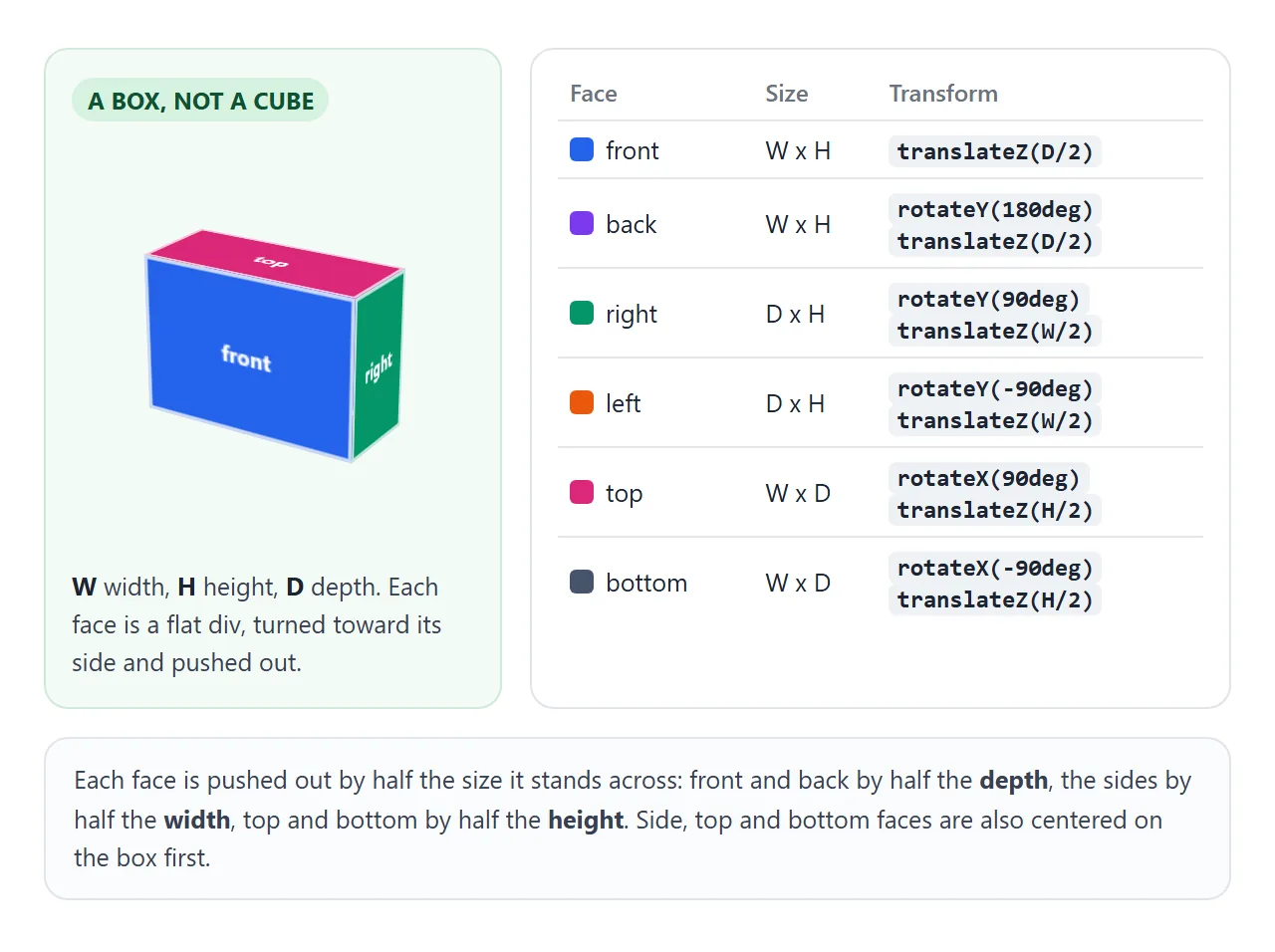
CSS custom properties keep the numbers in one place. The side faces are narrower than the box, so they are centered on it first:
.box   { --w: 200px; --h: 140px; --d: 80px;
         width: var(--w); height: var(--h); }
.front { width: var(--w); height: var(--h);
         transform: translateZ(calc(var(--d) / 2)); }
.right { width: var(--d); height: var(--h);
         left: calc((var(--w) - var(--d)) / 2);
         transform: rotateY(90deg) translateZ(calc(var(--w) / 2)); }
Change the three numbers and the whole box resizes. The same pattern builds a book, a phone, a room or a shelf.
Drag to rotate: pixels become degrees
Turning the cube with the pointer takes three pointer events, the same ones that move a card in a draggable div. The difference is what the movement changes. Instead of moving the element, each pixel of movement becomes a fraction of a degree.
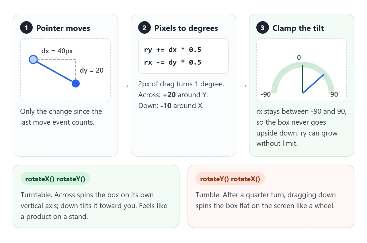
let rx = -20, ry = 30, lastX = 0, lastY = 0;

scene.addEventListener('pointerdown', (e) => {
  lastX = e.clientX; lastY = e.clientY;
  scene.setPointerCapture(e.pointerId);
});

scene.addEventListener('pointermove', (e) => {
  if (!scene.hasPointerCapture(e.pointerId)) return;
  ry += (e.clientX - lastX) * 0.5;
  rx -= (e.clientY - lastY) * 0.5;
  rx = Math.max(-90, Math.min(90, rx));
  lastX = e.clientX; lastY = e.clientY;
  cube.style.transform = `rotateX(${rx}deg) rotateY(${ry}deg)`;
});
- Listen on the scene, not the cube. The scene is a steady rectangle. The turning cube changes shape under the pointer on every frame.
- Use the change since the last event. Adding the whole distance from the first press makes the cube speed up the longer you drag.
- Stop the page from scrolling.
touch-action: noneon the scene lets a finger turn the cube instead of scrolling. CSS touch-action explains the values.
Rotation order: turntable or tumble
The two angles can be written in either order, and the result feels completely different. Drag either cube below; both get the same two numbers.
<!doctype html>
<html lang="en">
<head>
<meta charset="utf-8">
<meta name="viewport" content="width=device-width, initial-scale=1">
<title>Rotation order</title>
<style>
  body { margin: 0; font-family: system-ui, sans-serif; background: #f4f5f7; color: #1d2330; }
  .stage {
    display: flex; justify-content: center; gap: 12px; padding: 14px 8px 4px;
    cursor: grab; touch-action: none; user-select: none;
  }
  .col { width: 170px; text-align: center; }
  .col code { font-size: 12px; background: #e6e9ef; padding: 2px 5px; border-radius: 4px; }
  .col b { display: block; margin: 6px 0 2px; font-size: 14px; }
  .scene { height: 180px; display: grid; place-items: center; perspective: 600px; }
  .cube { position: relative; width: 90px; height: 90px; transform-style: preserve-3d; }
  .face {
    position: absolute; inset: 0; display: grid; place-items: center;
    color: #fff; font: 700 13px system-ui; border: 2px solid rgba(255, 255, 255, .6);
  }
  .front  { background: #2563eb; transform: translateZ(45px); }
  .back   { background: #7c3aed; transform: rotateY(180deg) translateZ(45px); }
  .right  { background: #059669; transform: rotateY(90deg) translateZ(45px); }
  .left   { background: #ea580c; transform: rotateY(-90deg) translateZ(45px); }
  .top    { background: #db2777; transform: rotateX(90deg) translateZ(45px); }
  .bottom { background: #475569; transform: rotateX(-90deg) translateZ(45px); }
  .bar { display: flex; justify-content: center; gap: 8px; flex-wrap: wrap; padding: 6px; font-size: 13px; }
  button { font: inherit; padding: 6px 10px; border-radius: 8px; border: 1px solid #c9ced8; background: #fff; cursor: pointer; }
</style>
</head>
<body>
<div class="stage" id="stage">
  <div class="col">
    <b>Turntable</b><code>rotateX() rotateY()</code>
    <div class="scene"><div class="cube" id="a">
      <div class="face front">front</div><div class="face back">back</div>
      <div class="face right">right</div><div class="face left">left</div>
      <div class="face top">top</div><div class="face bottom">bottom</div>
    </div></div>
  </div>
  <div class="col">
    <b>Tumble</b><code>rotateY() rotateX()</code>
    <div class="scene"><div class="cube" id="b">
      <div class="face front">front</div><div class="face back">back</div>
      <div class="face right">right</div><div class="face left">left</div>
      <div class="face top">top</div><div class="face bottom">bottom</div>
    </div></div>
  </div>
</div>
<div class="bar">
  <button id="turn">Turn to the side (Y = 90)</button>
  <button id="reset">Reset</button>
  <span id="out"></span>
</div>

<script>
  const stage = document.getElementById('stage');
  const a = document.getElementById('a'), b = document.getElementById('b');
  const out = document.getElementById('out');
  let rx = -20, ry = 30, lastX = 0, lastY = 0;

  function draw() {
    // same two angles, only the order differs
    a.style.transform = `rotateX(${rx}deg) rotateY(${ry}deg)`;
    b.style.transform = `rotateY(${ry}deg) rotateX(${rx}deg)`;
    out.textContent = `X ${Math.round(rx)}  Y ${Math.round(ry)}`;
  }

  stage.addEventListener('pointerdown', (e) => {
    lastX = e.clientX; lastY = e.clientY;
    stage.setPointerCapture(e.pointerId);
  });
  stage.addEventListener('pointermove', (e) => {
    if (!stage.hasPointerCapture(e.pointerId)) return;
    ry += (e.clientX - lastX) * 0.5;
    rx = Math.max(-90, Math.min(90, rx - (e.clientY - lastY) * 0.5));
    lastX = e.clientX; lastY = e.clientY;
    draw();
  });
  document.getElementById('turn').addEventListener('click', () => { rx = 0; ry = 90; draw(); });
  document.getElementById('reset').addEventListener('click', () => { rx = -20; ry = 30; draw(); });
  draw();
</script>
</body>
</html>
| Transform | Across | Up and down | Feels like |
|---|---|---|---|
rotateX() rotateY() |
Spins the box on its own vertical axis | Tilts the box toward or away from you | A product on a turntable |
rotateY() rotateX() |
Spins around the screen's vertical axis | Turns around the box's own X axis, wherever that points | A ball rolled by hand |
For product viewers, write rotateX() first and clamp it. Transforms apply from right to left, so rotateY turns the box on its own axis and rotateX then tilts the result toward you.
The clamp at 90 degrees stops the box from going upside down, where left and right drag would reverse.
A finished product viewer
The viewer puts the pieces together: a box with custom sizes, drag with a short coast after release, buttons for preset views, arrow keys, and a button on the front face.
<!doctype html>
<html lang="en">
<head>
<meta charset="utf-8">
<meta name="viewport" content="width=device-width, initial-scale=1">
<title>CSS 3D product viewer</title>
<style>
  body { margin: 0; min-height: 100vh; font-family: system-ui, sans-serif; background: linear-gradient(#eef1f6, #dfe4ec); color: #1d2330; }
  .scene {
    --w: 200px; --h: 140px; --d: 80px;       /* box width, height, depth */
    height: 300px; display: grid; place-items: center; position: relative;
    perspective: 900px; cursor: grab; touch-action: none; user-select: none; outline: none;
  }
  .scene:focus-visible { box-shadow: inset 0 0 0 3px #2563eb; }
  .shadow {
    position: absolute; bottom: 38px; width: 220px; height: 26px; border-radius: 50%;
    background: radial-gradient(rgba(0, 0, 0, .28), transparent 70%);
  }
  .box { position: relative; width: var(--w); height: var(--h); transform-style: preserve-3d; }
  .box.animate { transition: transform .6s ease; }
  .face {
    position: absolute; box-sizing: border-box; padding: 10px; color: #fff;
    display: flex; flex-direction: column; justify-content: center; align-items: center; gap: 6px;
  }
  /* front and back: width x height */
  .front, .back { width: var(--w); height: var(--h); }
  .front { background: linear-gradient(135deg, #1e3a8a, #2563eb); transform: translateZ(calc(var(--d) / 2)); }
  .back  { background: #1e3a8a; transform: rotateY(180deg) translateZ(calc(var(--d) / 2)); font-size: 12px; }
  /* sides: depth x height, centred on the box */
  .right, .left { width: var(--d); height: var(--h); left: calc((var(--w) - var(--d)) / 2); }
  .right { background: #1d4ed8; transform: rotateY(90deg) translateZ(calc(var(--w) / 2)); }
  .left  { background: #1e40af; transform: rotateY(-90deg) translateZ(calc(var(--w) / 2)); }
  /* top and bottom: width x depth */
  .top, .bottom { width: var(--w); height: var(--d); top: calc((var(--h) - var(--d)) / 2); }
  .top    { background: #3b82f6; transform: rotateX(90deg) translateZ(calc(var(--h) / 2)); }
  .bottom { background: #172554; transform: rotateX(-90deg) translateZ(calc(var(--h) / 2)); }
  .front b { font-size: 20px; letter-spacing: .5px; }
  .side-text { writing-mode: vertical-rl; font-weight: 700; letter-spacing: 2px; }
  .face button { font: 600 13px system-ui; padding: 6px 12px; border: 0; border-radius: 99px; background: #fff; color: #1e3a8a; cursor: pointer; }
  .bar { display: flex; justify-content: center; flex-wrap: wrap; gap: 6px; padding: 4px 8px; }
  .bar button { font: 14px system-ui; padding: 7px 12px; border-radius: 8px; border: 1px solid #c3c9d4; background: #fff; cursor: pointer; }
  #status { text-align: center; font-size: 13px; color: #444; margin: 6px 0 0; min-height: 18px; }
</style>
</head>
<body>
<div class="scene" id="scene" tabindex="0" aria-label="Product box. Drag, or use the arrow keys, to turn it.">
  <div class="shadow"></div>
  <div class="box" id="box">
    <div class="face front">
      <svg width="48" height="40" viewBox="0 0 48 40" aria-hidden="true"><path d="M6 28V22a18 18 0 0 1 36 0v6" fill="none" stroke="#fff" stroke-width="4"/><rect x="2" y="24" width="10" height="14" rx="3" fill="#fff"/><rect x="36" y="24" width="10" height="14" rx="3" fill="#fff"/></svg>
      <b>AURA ONE</b>
      <button id="buy">Add to cart</button>
    </div>
    <div class="face back"><b>In the box</b>Headphones<br>USB-C cable<br>Travel pouch</div>
    <div class="face right"><span class="side-text">AURA ONE</span></div>
    <div class="face left"><span class="side-text">WIRELESS</span></div>
    <div class="face top">Open here</div>
    <div class="face bottom">Made with care</div>
  </div>
</div>
<div class="bar">
  <button data-x="-15" data-y="-25">Front</button>
  <button data-x="0" data-y="-90">Side</button>
  <button data-x="0" data-y="180">Back</button>
  <button data-x="-90" data-y="0">Top</button>
</div>
<p id="status"></p>

<script>
  const scene = document.getElementById('scene');
  const box = document.getElementById('box');
  const reduce = matchMedia('(prefers-reduced-motion: reduce)').matches;
  let rx = -15, ry = -25, vx = 0, vy = 0, lastX = 0, lastY = 0, spin = 0;

  const draw = () => { box.style.transform = `rotateX(${rx}deg) rotateY(${ry}deg)`; };
  const clampX = (x) => Math.max(-90, Math.min(90, x));

  scene.addEventListener('pointerdown', (e) => {
    if (e.target.closest('button')) return;       // let the face button take the click
    cancelAnimationFrame(spin);
    box.classList.remove('animate');
    lastX = e.clientX; lastY = e.clientY; vx = vy = 0;
    scene.setPointerCapture(e.pointerId);
  });

  scene.addEventListener('pointermove', (e) => {
    if (!scene.hasPointerCapture(e.pointerId)) return;
    vy = (e.clientX - lastX) * 0.5;               // degrees moved this event
    vx = -(e.clientY - lastY) * 0.5;
    ry += vy; rx = clampX(rx + vx);
    lastX = e.clientX; lastY = e.clientY;
    draw();
  });

  // after release, keep turning and slow down (skipped with reduced motion)
  scene.addEventListener('lostpointercapture', () => {
    if (reduce) return;
    const coast = () => {
      vx *= 0.93; vy *= 0.93;
      if (Math.abs(vx) + Math.abs(vy) < 0.05) return;
      ry += vy; rx = clampX(rx + vx); draw();
      spin = requestAnimationFrame(coast);
    };
    spin = requestAnimationFrame(coast);
  });

  // go to a named view by the shortest way round
  function goTo(x, y) {
    cancelAnimationFrame(spin);
    if (!reduce) box.classList.add('animate');
    ry += ((y - ry) % 360 + 540) % 360 - 180;
    rx = x; draw();
  }
  document.querySelectorAll('.bar button').forEach((b) =>
    b.addEventListener('click', () => goTo(+b.dataset.x, +b.dataset.y)));

  scene.addEventListener('keydown', (e) => {
    const step = { ArrowLeft: [0, -15], ArrowRight: [0, 15], ArrowUp: [15, 0], ArrowDown: [-15, 0] }[e.key];
    if (!step) return;
    e.preventDefault();
    goTo(clampX(rx + step[0]), ry + step[1]);
  });

  document.getElementById('buy').addEventListener('click', () => {
    document.getElementById('status').textContent = 'Added to cart. The button is plain HTML on a 3D face.';
  });
  draw();
</script>
</body>
</html>
- Coast after release. On
lostpointercapture, keep adding the last movement to the angles and multiply it by 0.93 each frame with requestAnimationFrame. Stop when it is tiny. - Preset views with a transition. A class adds
transition: transform .6sonly while a button animates the box. During a drag the class is removed, or every move would lag. - Take the short way round. Before going to a view, the code adjusts the Y target by whole turns so the box never spins 300 degrees to reach a view 60 degrees away.
- Keyboard. The scene has
tabindex="0"and turns 15 degrees per arrow key. - Reduced motion. With
prefers-reduced-motion: reduce, the box jumps straight to each view and does not coast.
The faces are real elements, so text stays text and buttons stay buttons. The Add to cart button was clicked on the turned face in Chromium and Firefox. These demos were not tested in Safari.
When to move to WebGL
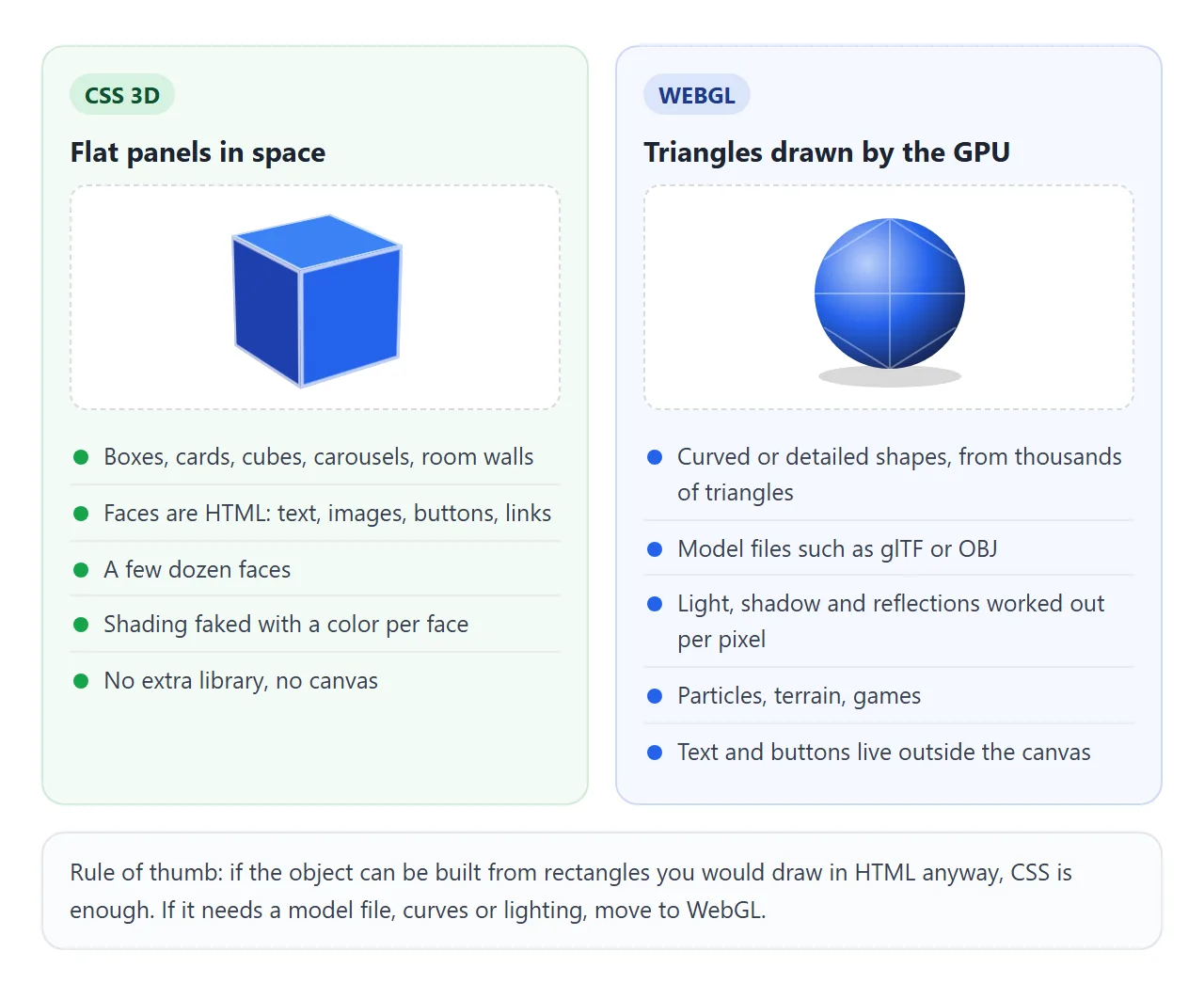
CSS 3D places flat rectangles in space. That covers a lot: boxes, cards, cubes, 3D carousels, the walls of a room. It stops being the right tool when the object is not made of rectangles.
| Need | CSS 3D | WebGL |
|---|---|---|
| Box, card, cube, carousel | Yes, a handful of elements | Works, but more code |
| Text, buttons, links on the object | Yes, they are normal HTML | Drawn as pixels; controls sit outside the canvas |
| Curved or detailed shapes | Only by faking with many small faces | Yes, built from triangles |
| Load a glTF or OBJ model file | No | Yes, usually through a library |
| Light, shadow, reflections | No light source; color each face by hand | Yes, worked out in shaders |
| Extra download | None | None for raw WebGL; a library if you use one |
A useful test: if you would draw the object's parts as divs anyway, stay with CSS. If you would reach for a 3D modeling program, move to WebGL.
WebGL in HTML starts from a blank canvas, and libraries such as three.js handle models and lights for you.
When it does not work
| What you see | Cause | Fix |
|---|---|---|
| All six faces sit on top of each other | No preserve-3d on the cube element |
Add transform-style: preserve-3d |
| The cube turns but has no depth | No perspective on the parent |
Put perspective: 700px on the scene |
| Faces all cross at the front of the cube | translateZ written before the rotation |
Rotate first, then translateZ |
| One side face sits inside the box, the other floats outside | Side faces not centered on the box | Offset them by half of W minus D |
| Up and down drag spins the box flat | Order is rotateY() rotateX() |
Write rotateX() first |
| The box flips upside down | X angle not limited | Clamp it between -90 and 90 |
| The cube speeds up during a long drag | Adding the total distance each move | Add only the change since the last event |
| On a phone, the page scrolls instead | The browser treats the finger as a scroll | touch-action: none on the scene |
| Preset views lag behind the pointer | The transition is on during drags | Add the transition class only for button moves |
For flip cards, which use the same pieces with two faces, see CSS flip card.
Share it as a link
3D does not survive a screenshot. The depth only shows while the box turns, and a still image of a cube is just three colored shapes. An .html attachment may open as plain code on a phone.
To send the working version, paste the page into a NOS document and choose Create share link. HTML to link walks through it.
The page renders as written and its scripts run, so the people you send it to can grab the box and turn it themselves. If you change the code later, the same link shows the new version.