will-change tells the browser that a property of an element is about to change, so it can prepare in advance. For transform and opacity that often means giving the element its own layer.
The short rule: add it just before an animation, remove it right after, and animate only transform and opacity.
Hover the card, then click it. The readout shows the hint being added and removed around the animation.
<!doctype html>
<html lang="en">
<head>
<meta charset="utf-8">
<meta name="viewport" content="width=device-width, initial-scale=1">
<title>will-change just in time</title>
<style>
  body { margin: 0; padding: 16px; font-family: system-ui, sans-serif; background: #f4f5f7; color: #1d2330; }
  .card {
    display: block; width: 220px; padding: 16px 18px; border: 0; border-radius: 12px;
    background: #fff; box-shadow: 0 6px 20px rgba(0, 0, 0, .12);
    font: inherit; text-align: left; cursor: pointer;
    transition: transform .6s ease;
  }
  .card span { display: block; color: #6b7280; font-size: 14px; margin-top: 4px; }
  .card.up { transform: translateY(-6px) scale(1.08); }
  .now { margin: 20px 0 8px; font-size: 15px; }
  .now b { font-family: ui-monospace, Consolas, monospace; }
  .now b.on { color: #9a3412; } .now b.off { color: #0f5132; }
  ol { margin: 0; padding-left: 22px; font: 13px/1.6 ui-monospace, Consolas, monospace; color: #374151; }
</style>
</head>
<body>
<button class="card" id="card"><b>Hover, then click</b><span>Or tap it on a phone.</span></button>
<div class="now">will-change right now: <b id="now"></b></div>
<ol id="log"></ol>

<script>
  const card = document.getElementById('card');
  const now = document.getElementById('now');
  const logEl = document.getElementById('log');
  let moving = false;

  function log(msg) {
    const li = document.createElement('li');
    li.textContent = msg;
    logEl.append(li);
    while (logEl.children.length > 5) logEl.firstChild.remove();
    const v = getComputedStyle(card).willChange;
    now.textContent = v;
    now.className = v === 'auto' ? 'off' : 'on';
  }

  // 1. Before the animation: the user is about to click.
  function prepare(why) {
    if (card.style.willChange === 'transform') return;
    card.style.willChange = 'transform';
    log(why + ': will-change added');
  }
  card.addEventListener('pointerenter', () => prepare('hover'));
  card.addEventListener('focus', () => prepare('focus'));
  card.addEventListener('pointerdown', () => prepare('press'));  // phones have no hover

  // 2. The animation itself.
  card.addEventListener('click', () => {
    moving = true;
    card.classList.toggle('up');
    log('click: transition starts');
  });

  // 3. After it: hand the memory back.
  card.addEventListener('transitionend', (e) => {
    if (e.propertyName !== 'transform') return;
    moving = false;
    card.style.willChange = '';
    log('transitionend: will-change removed');
  });

  // The user left without clicking: remove it too.
  function giveUp() {
    if (moving || !card.style.willChange) return;
    card.style.willChange = '';
    log('left without animating: removed');
  }
  card.addEventListener('pointerleave', giveUp);
  card.addEventListener('blur', giveUp);

  log('page loaded');
</script>
</body>
</html>
The rule is short. The rest of this guide covers why the timing matters, and the two side effects that surprise people.
What will-change actually does
The value is a list of property names:
.card { will-change: transform; }
.panel { will-change: transform, opacity; }
.reset { will-change: auto; }  /* the default: no hint */
Nothing moves because of it. The element looks exactly the same. It only tells the browser what is coming, and the browser decides what to do with that. Two special keywords also exist: scroll-position and contents.
For transform and opacity, the usual preparation is a separate layer. The element is drawn once into its own bitmap, and later frames can move or fade that bitmap without drawing the element again.
Add it just before, remove it after
A layer is not free. It holds the element's pixels in memory for as long as the hint stays. One card is nothing. Hundreds of elements with a permanent hint can use a lot of memory, which hurts most on phones.
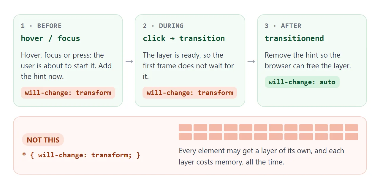
- Before: add the hint when the user is about to start the animation, on
pointerenter,focusorpointerdown. - During: start the animation. The layer is already there.
- After: on
transitionendoranimationend, set the hint back toauto.
In CSS alone, a hover rule covers the "before" part, and the class that animates does the rest:
.card { transition: transform .4s ease; }
.card:hover, .card:focus-visible { will-change: transform; }
.card.open { transform: scale(1.08); }
Adding the hint in the same moment as the animation is too late to prepare anything. That is why the demo above adds it on hover and press, not on click.
Side effects: z-index and position: fixed
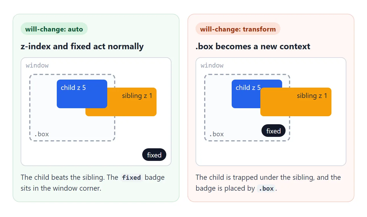
The specification gives will-change one more job. If any non-initial value of the named property would create a stacking context, the hint creates one too. The same holds for the box that position: fixed children are placed in.
Switch the value on .box and watch the readout. It measures what the browser actually does.
<!doctype html>
<html lang="en">
<head>
<meta charset="utf-8">
<meta name="viewport" content="width=device-width, initial-scale=1">
<title>will-change side effects</title>
<style>
  body { margin: 0; padding: 14px; font-family: system-ui, sans-serif; background: #f4f5f7; color: #1d2330; }
  label { font-size: 15px; }
  select { font: inherit; padding: 4px 6px; margin-left: 4px; }
  .out { margin: 10px 0 14px; font-size: 14px; line-height: 1.6; }
  .out b.yes { color: #9a3412; } .out b.no { color: #0f5132; }
  .stage { position: relative; height: 190px; }
  .box {
    position: relative; width: 210px; height: 170px;
    background: #fff; border: 2px dashed #9aa3b2; border-radius: 10px;
  }
  .box > .name { position: absolute; left: 10px; bottom: 8px; font: 13px ui-monospace, Consolas, monospace; color: #6b7280; }
  .child {
    position: absolute; left: 70px; top: 20px; z-index: 5;   /* higher than the sibling */
    width: 120px; height: 70px; padding: 8px; box-sizing: border-box;
    background: #2563eb; color: #fff; border-radius: 8px; font-size: 13px;
  }
  .sibling {
    position: absolute; left: 150px; top: 45px; z-index: 1;  /* lower than the child */
    width: 130px; height: 80px; padding: 8px; box-sizing: border-box;
    background: #f59e0b; color: #1d2330; border-radius: 8px; font-size: 13px; text-align: right;
  }
  .badge {
    position: fixed; right: 8px; bottom: 8px;  /* normally: corner of the window */
    padding: 5px 9px; border-radius: 99px; background: #111827; color: #fff; font-size: 12px;
  }
</style>
</head>
<body>
<label>will-change on .box:
  <select id="wc">
    <option>auto</option><option>transform</option><option>opacity</option><option>filter</option>
  </select>
</label>
<div class="out">
  New stacking context: <b id="sc"></b><br>
  Fixed badge is placed by: <b id="cb"></b>
</div>
<div class="stage">
  <div class="box" id="box">
    <div class="child" id="child">child<br>z-index: 5</div>
    <div class="badge" id="badge">position: fixed</div>
    <span class="name">.box</span>
  </div>
  <div class="sibling" id="sibling">sibling<br>z-index: 1</div>
</div>

<script>
  const box = document.getElementById('box');
  const child = document.getElementById('child');
  const sibling = document.getElementById('sibling');
  const badge = document.getElementById('badge');
  const sc = document.getElementById('sc');
  const cb = document.getElementById('cb');
  const wc = document.getElementById('wc');

  function report() {
    // Which one is drawn on top where the two overlap?
    const c = child.getBoundingClientRect(), s = sibling.getBoundingClientRect();
    const x = (Math.max(c.left, s.left) + Math.min(c.right, s.right)) / 2;
    const y = (Math.max(c.top, s.top) + Math.min(c.bottom, s.bottom)) / 2;
    const trapped = !child.contains(document.elementFromPoint(x, y));
    sc.textContent = trapped ? 'yes, the z-index 5 child is now under the z-index 1 sibling' : 'no';
    sc.className = trapped ? 'yes' : 'no';

    // Is the fixed badge pinned to the window, or to .box?
    const b = badge.getBoundingClientRect(), bx = box.getBoundingClientRect();
    const inBox = Math.abs(b.right - (bx.right - 2 - 8)) < 3;  // 2px border + right: 8px
    cb.textContent = inBox ? '.box (it jumped inside the box)' : 'the window';
    cb.className = inBox ? 'yes' : 'no';
  }

  wc.addEventListener('change', () => {
    box.style.willChange = wc.value;
    report();
  });
  addEventListener('resize', report);
  report();
</script>
</body>
</html>
will-change value |
New stacking context | Contains position: fixed children |
|---|---|---|
transform |
Yes | Yes |
opacity |
Yes | No |
filter |
Yes | Yes |
left, top, width |
No | No |
The table is what the demo measured in Chromium, and it matches what the specification asks for. A stacking context traps the z-index of everything inside. CSS z-index explains why a z-index of 9999 then still loses.
The fixed-position change is the more confusing one. A "fixed" header inside the element stops sticking to the window and scrolls with its parent. CSS position covers what fixed normally does. The fix is to move the fixed element out of the hinted parent.
Why it will not fix a slow width animation
will-change: width is allowed, but it cannot remove the work. A new width moves the element's neighbors, so the browser has to calculate layout and paint again on every frame.
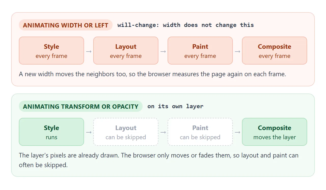
The fix is to change what you animate, not to add a hint:
| Instead of | Animate |
|---|---|
left, top, margin |
transform: translate() |
width, height |
transform: scale() |
A growing box-shadow |
opacity of a pseudo-element that already has the big shadow |
CSS transform covers translate and scale in detail. For motion driven by script, requestAnimationFrame keeps the updates in step with the screen.
Blurry text during and after a transform
Text on a layer can look softer than the text around it. There are two common reasons.
- Scaling up a layer. In Chromium, a layer hinted with
will-change: transformis not redrawn at each new scale, so enlarged text can look stretched. Removing the hint afterwards lets the browser redraw it sharp. - Half-pixel positions. A translate that ends on a value such as 10.5px can blur edges. Round the end position to whole pixels.
Both are one more reason to take the hint off after the animation.
Checking it in DevTools
Guessing about layers goes wrong easily, so look. In Chrome DevTools:
- Performance panel: record while the animation plays. Purple "Layout" blocks on every frame mean you are animating a layout property.
- Layers panel (under More tools): lists the layers on the page and why each one exists.
- Rendering tab: Paint flashing shows what gets repainted, and Layer borders outlines each layer.
Other browsers have their own profilers. Compare before and after on the same page, and on a real phone if the page is meant for one.
A finished example: an animated card grid
This grid applies the rules together. Cards fly in with transform and opacity only. The hint goes on six cards just before the animation, and each card drops it when its own animation finishes.
<!doctype html>
<html lang="en">
<head>
<meta charset="utf-8">
<meta name="viewport" content="width=device-width, initial-scale=1">
<title>Animated card grid</title>
<style>
  body { margin: 0; padding: 14px; font-family: system-ui, sans-serif; background: #eceef1; color: #1d2330; }
  .bar { display: flex; flex-wrap: wrap; gap: 8px 14px; align-items: center; font-size: 14px; }
  button { font: inherit; padding: 7px 16px; border: 0; border-radius: 8px; background: #2563eb; color: #fff; cursor: pointer; }
  .state { margin: 10px 0; font-size: 13px; color: #374151; }
  .state b { font-family: ui-monospace, Consolas, monospace; }
  .grid { display: grid; grid-template-columns: repeat(auto-fill, minmax(150px, 1fr)); gap: 10px; }
  .card {
    position: relative;  /* only needed for the left mode */
    height: 76px; padding: 12px; box-sizing: border-box; border-radius: 10px;
    background: #fff; box-shadow: 0 3px 10px rgba(0, 0, 0, .1); font-size: 14px;
  }
  .card i { display: block; width: 34px; height: 8px; border-radius: 4px; margin-top: 10px; }
  .note { margin-top: 12px; font-size: 13px; color: #6b7280; line-height: 1.45; }
</style>
</head>
<body>
<div class="bar">
  <button id="play">Play</button>
  <label><input type="radio" name="mode" value="fast" checked> transform + opacity</label>
  <label><input type="radio" name="mode" value="layout"> width + left</label>
</div>
<div class="state">Cards with will-change now: <b id="count">0</b> of 6</div>
<div class="grid" id="grid"></div>
<p class="note">Record both modes in your browser's DevTools Performance panel. The width + left mode makes the browser redo layout on every frame.</p>

<script>
  const colors = ['#60a5fa', '#34d399', '#fbbf24', '#f87171', '#a78bfa', '#2dd4bf'];
  const grid = document.getElementById('grid');
  const count = document.getElementById('count');
  const cards = colors.map((c, i) => {
    const el = document.createElement('div');
    el.className = 'card';
    el.innerHTML = 'Card ' + (i + 1) + '<i style="background:' + c + '"></i>';
    grid.append(el);
    return el;
  });

  const frames = {
    // Composited properties: no layout work while it plays.
    fast: [{ transform: 'translateY(24px) scale(.92)', opacity: 0 }, { transform: 'none', opacity: 1 }],
    // Layout properties: every frame changes the box size and position.
    layout: [{ left: '-30px', width: '40%', opacity: 0 }, { left: '0px', width: '100%', opacity: 1 }],
  };

  const show = () => (count.textContent = cards.filter((c) => c.style.willChange).length);

  function play() {
    const mode = document.querySelector('input[name=mode]:checked').value;
    cards.forEach((card) => {
      card.getAnimations().forEach((a) => a.cancel());  // stop a run in progress
      // Hint only the properties that will change, and only in this mode.
      card.style.willChange = mode === 'fast' ? 'transform, opacity' : '';
    });
    show();

    // Give the browser a frame to prepare, then start.
    requestAnimationFrame(() => {
      cards.forEach((card, i) => {
        const a = card.animate(frames[mode], { duration: 700, delay: i * 90, easing: 'ease-out', fill: 'backwards' });
        a.onfinish = () => {
          card.style.willChange = '';  // done: release the layer
          show();
        };
      });
    });
  }

  document.getElementById('play').addEventListener('click', play);
  play();
</script>
</body>
</html>
- Prepare a frame early: set
will-change, then start the animation insiderequestAnimationFrame. - Release per card: the animation's
onfinishsets the hint back, so the counter shows how many layers are still requested. - Compare honestly: the width + left mode looks similar on a fast computer. The difference shows up in the Performance recording, not by eye.
For the same idea on a whole page of moving layers, see the parallax guide. For animations that play on their own, CSS keyframes covers the syntax.
When it does not work
| What you see | Cause | Fix |
|---|---|---|
| No improvement at all | The animation changes width, height, left or top |
Animate transform and opacity instead |
| A fixed header or button jumps into a box and scrolls away | An ancestor has will-change: transform or filter |
Move the fixed element out, or remove the hint |
| A dropdown or tooltip falls behind something with a lower z-index | The hint made its ancestor a stacking context | Remove the hint after the animation, or raise the ancestor's z-index |
| Text looks soft while or after scaling | The layer is not redrawn at the new scale, or sits on a half pixel | Remove the hint when done, round positions |
| The page gets slower, or crashes on a phone | will-change on many elements, or in a * rule |
Hint only the elements about to move, and only for as long as they move |
Share it as a link
Animation problems are hard to show in a screenshot, and a video does not let anyone open DevTools on it. The working page does.
To send it, paste the page into a NOS document and choose Create share link. HTML to link walks through it.
The page renders as written and its scripts run, so the people you send it to can play the animation and profile it themselves. If you change the code later, the same link shows the new version.