content-visibility is a CSS property that lets the browser skip the rendering work for an element's contents. With content-visibility: auto, sections far from the screen are not laid out or painted until the user scrolls near them. Two lines on each repeated block are enough:
.section {
  content-visibility: auto;
  contain-intrinsic-size: auto 500px;
}
Scroll the frame below. The line at the top lists the sections the browser is rendering right now. The rest are skipped.
<!doctype html>
<html lang="en">
<head>
<meta charset="utf-8">
<meta name="viewport" content="width=device-width, initial-scale=1">
<title>content-visibility: auto</title>
<style>
  body { margin: 0; font-family: system-ui, sans-serif; background: #f4f5f7; color: #1d2330; }
  header {
    position: sticky; top: 0; z-index: 1; padding: 10px 14px;
    background: #fff; border-bottom: 1px solid #e1e4ea; font-size: 13px;
  }
  header label { display: block; margin-bottom: 4px; }
  #out { color: #0f5132; font-weight: 600; }
  main { padding: 12px 14px; }
  .sec {
    content-visibility: auto;  /* skip layout and paint while off-screen */
    margin-bottom: 12px; padding: 12px 14px; border-radius: 10px;
    background: #fff; box-shadow: 0 1px 4px rgba(0, 0, 0, .08);
  }
  .cis .sec { contain-intrinsic-size: auto 120px; }  /* placeholder height */
  .sec h2 { margin: 0 0 6px; font-size: 16px; }
  .sec p { margin: 0; font-size: 14px; line-height: 1.5; color: #4b5563; }
  .bar { height: 40px; margin-top: 10px; border-radius: 6px; background: linear-gradient(90deg, #cfe8ff, #d4f5dc); }
</style>
</head>
<body>
<header>
  <label><input type="checkbox" id="cis" checked> contain-intrinsic-size: auto 120px</label>
  <div id="out">Scroll this frame.</div>
</header>
<main id="list"></main>

<script>
  const list = document.getElementById('list');
  const out = document.getElementById('out');
  const rendered = new Set();

  function show() {
    const ids = [...rendered].sort((a, b) => a - b);
    out.textContent = 'Rendered: ' + (ids.length ? ids.join(', ') : 'none') +
      ' (' + ids.length + ' of 40) · page height ' + document.documentElement.scrollHeight + 'px';
  }

  function build() {
    rendered.clear();
    list.className = document.getElementById('cis').checked ? 'cis' : '';
    list.innerHTML = '';
    for (let i = 1; i <= 40; i++) {
      const s = document.createElement('section');
      s.className = 'sec';
      s.innerHTML = '<h2>Section ' + i + '</h2><p>This text is laid out and painted only ' +
        'when the section is near the screen.</p><div class="bar"></div>';
      // fires when the browser starts or stops skipping this section
      s.addEventListener('contentvisibilityautostatechange', (e) => {
        e.skipped ? rendered.delete(i) : rendered.add(i);
        show();
      });
      list.append(s);
    }
    scrollTo(0, 0);
    requestAnimationFrame(() => requestAnimationFrame(show));
  }

  document.getElementById('cis').addEventListener('change', build);
  addEventListener('scroll', show);
  build();
</script>
</body>
</html>
What the browser skips
Normally the browser works out the position and look of every element on the page before it shows the first frame. That includes sections a reader may never scroll to.
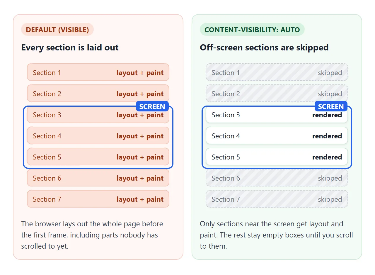
With auto, a section that is far from the screen keeps its box, but its children are skipped: no style calculation, no layout, no paint. When it comes close to the screen, the browser renders it before it scrolls into view.
The demo listens for the contentvisibilityautostatechange event, which fires when a section starts or stops being skipped. Its skipped property says which. You can use the same event to pause work, such as a canvas animation, while a section is off-screen.
Measured on a long page
The next demo builds 1,500 posts, each with a heading, a paragraph and a grid of 12 tags. Each button rebuilds the page and times the gap from inserting the HTML to the first painted frame.
<!doctype html>
<html lang="en">
<head>
<meta charset="utf-8">
<meta name="viewport" content="width=device-width, initial-scale=1">
<title>Long page timing</title>
<style>
  body { margin: 0; font-family: system-ui, sans-serif; background: #f4f5f7; color: #1d2330; font-size: 14px; }
  header {
    position: sticky; top: 0; z-index: 1; padding: 10px 14px;
    background: #fff; border-bottom: 1px solid #e1e4ea;
  }
  .btns { display: flex; flex-wrap: wrap; gap: 6px; }
  button { font: inherit; font-size: 13px; padding: 6px 10px; border-radius: 8px; border: 1px solid #c9cdd4; background: #fff; cursor: pointer; }
  table { width: 100%; margin-top: 8px; border-collapse: collapse; font-size: 13px; }
  td, th { padding: 3px 4px; text-align: left; border-bottom: 1px solid #eef0f3; }
  td:last-child, th:last-child { text-align: right; }
  #page { padding: 12px 14px; }

  /* the page being measured */
  .post { margin-bottom: 12px; padding: 12px; border-radius: 10px; background: #fff; }
  .post h3 { margin: 0 0 6px; font-size: 15px; }
  .post p { margin: 0 0 8px; line-height: 1.5; color: #4b5563; }
  .post ul { display: grid; grid-template-columns: repeat(auto-fill, minmax(90px, 1fr)); gap: 6px; margin: 0; padding: 0; list-style: none; }
  .post li { padding: 6px; border-radius: 6px; background: #eef4ff; font-size: 12px; }
  .auto .post { content-visibility: auto; }
  .auto.cis .post { contain-intrinsic-size: auto 260px; }
</style>
</head>
<body>
<header>
  <div class="btns">
    <button data-mode="">visible</button>
    <button data-mode="auto">auto, no size</button>
    <button data-mode="auto cis">auto + intrinsic size</button>
  </div>
  <table>
    <thead><tr><th>Run (1,500 posts)</th><th>Posts rendered</th><th>Time to first frame</th></tr></thead>
    <tbody id="runs"></tbody>
  </table>
</header>
<main id="page"></main>

<script>
  const page = document.getElementById('page');
  const runs = document.getElementById('runs');
  const N = 1500;

  // one post: a heading, text and a small grid of tags
  let tags = '';
  for (let t = 1; t <= 12; t++) tags += '<li>tag ' + t + '</li>';
  const post = (i) => '<article class="post"><h3>Post ' + i + '</h3><p>Lorem ipsum dolor sit amet, ' +
    'consectetur adipiscing elit. Sed do eiusmod tempor incididunt ut labore.</p><ul>' + tags + '</ul></article>';
  let html = '';
  for (let i = 1; i <= N; i++) html += post(i);

  function run(mode, label) {
    page.innerHTML = '';
    page.className = mode;
    scrollTo(0, 0);
    const t0 = performance.now();
    page.innerHTML = html;
    // two frames later, the first frame has been laid out and painted
    requestAnimationFrame(() => requestAnimationFrame(() => {
      const ms = Math.round(performance.now() - t0);
      // a post is rendered if its heading is not being skipped
      const shown = [...page.children].filter((p) =>
        p.firstElementChild.checkVisibility({ contentVisibilityAuto: true })).length;
      const row = runs.insertRow(0);
      row.innerHTML = '<td>' + label + '</td><td>' + shown + '</td><td>' + ms + ' ms</td>';
      while (runs.rows.length > 4) runs.deleteRow(4);
    }));
  }

  document.querySelectorAll('button[data-mode]').forEach((b) =>
    b.addEventListener('click', () => run(b.dataset.mode, b.textContent)));
</script>
</body>
</html>
Our run in headless Chromium on a desktop PC, with a 420px-tall frame, two runs per mode at 900px and 390px widths:
| Mode | Posts rendered | Time to first frame |
|---|---|---|
visible (default) |
1,500 | 145-176 ms |
auto, no size |
24-26 | 25-34 ms |
auto + intrinsic size |
3-4 | 29-30 ms |
Your numbers will differ with the device and the page. Run the demo on the phone you care about. The pattern holds: the cost of the first frame follows the number of posts rendered, not the number on the page.
Note the middle row. Without a size, skipped posts collapse, so two dozen of them fit on the screen and all get rendered. That is the problem the next section fixes.
contain-intrinsic-size keeps the scrollbar steady
While a section is skipped, it is sized as if it were empty. Without a hint, its content height is 0. The page looks much shorter than it is, the scrollbar thumb is too big, and it jumps as sections render.
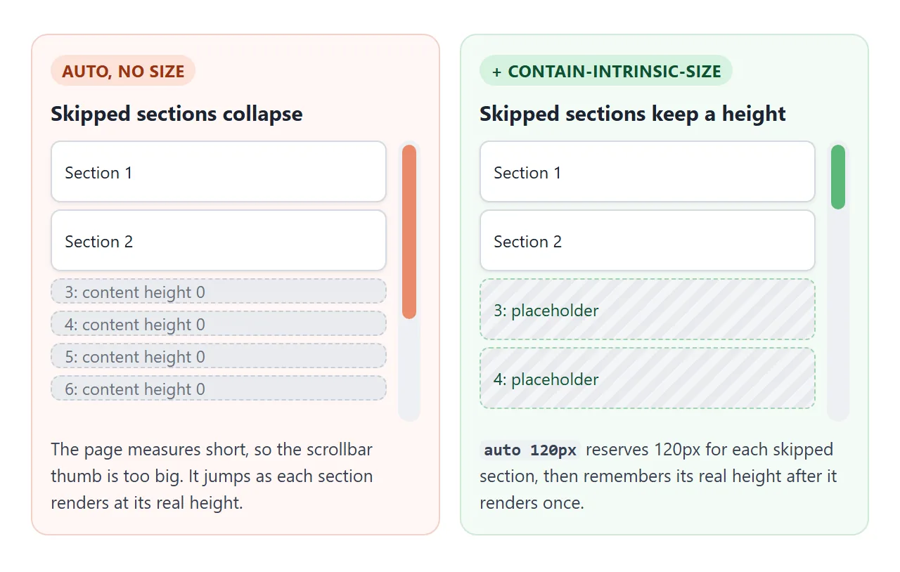
In the first demo, the 40 sections gave a page 6,149px tall with auto 120px and 4,269px without it, at 900px wide. contain-intrinsic-size gives skipped sections a placeholder size:
/* width and height */
contain-intrinsic-size: auto 300px auto 500px;
/* height only (block size), in a normal top-to-bottom page */
contain-intrinsic-block-size: auto 500px;
The auto keyword matters. Once a section has been rendered, the browser remembers its real size and uses that instead of your guess when the section is skipped again.
Pick a guess close to a typical section; it only has to be right until the first render.
auto and hidden: find-in-page, focus and screen readers
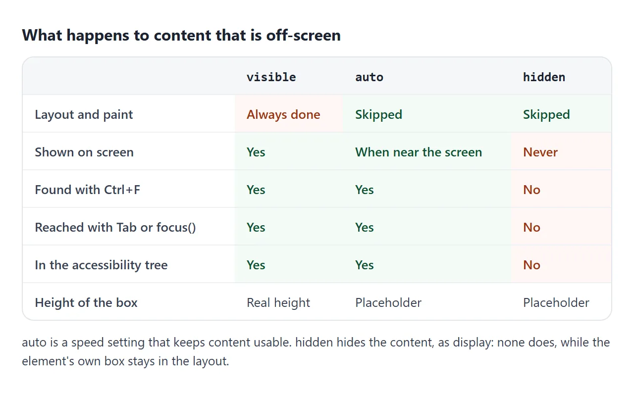
content-visibility has three values. visible is the default. auto skips work but keeps the content usable. hidden hides the contents outright.
Try it below. Pick a value for the section at the bottom, then press the button, which calls focus() on a button inside that section. Then try Ctrl+F (Cmd+F on a Mac).
<!doctype html>
<html lang="en">
<head>
<meta charset="utf-8">
<meta name="viewport" content="width=device-width, initial-scale=1">
<title>auto vs hidden: find and focus</title>
<style>
  body { margin: 0; font-family: system-ui, sans-serif; background: #f4f5f7; color: #1d2330; font-size: 14px; }
  header {
    position: sticky; top: 0; z-index: 1; padding: 10px 14px;
    background: #fff; border-bottom: 1px solid #e1e4ea;
  }
  .modes { display: flex; flex-wrap: wrap; gap: 6px 14px; margin-bottom: 8px; }
  header p { margin: 4px 0 0; font-size: 13px; color: #4b5563; }
  #out { font-weight: 600; color: #0f5132; }
  #out.no { color: #9a3412; }
  .spacer { height: 700px; margin: 14px; border: 2px dashed #c9cdd4; border-radius: 10px;
    display: grid; place-items: center; color: #6b7280; }
  #target {
    margin: 14px; padding: 14px; border-radius: 10px;
    background: #fff; box-shadow: 0 1px 4px rgba(0, 0, 0, .1);
  }
  #target h2 { margin: 0 0 6px; font-size: 16px; }
</style>
</head>
<body>
<header>
  <div class="modes">
    <label><input type="radio" name="cv" value="visible" checked> visible</label>
    <label><input type="radio" name="cv" value="auto"> auto</label>
    <label><input type="radio" name="cv" value="hidden"> hidden</label>
    <button id="go">Focus the button below</button>
  </div>
  <div id="out">Pick a value, then press the button.</div>
  <p>Also try Ctrl+F (Cmd+F on a Mac) and search for <b>lighthouse</b>.</p>
</header>

<div class="spacer">Scroll down, or use the controls above.</div>

<section id="target">
  <h2>The lighthouse section</h2>
  <p>This section sits far below the screen.</p>
  <button id="inner">Button inside the section</button>
</section>

<script>
  const target = document.getElementById('target');
  const inner = document.getElementById('inner');
  const out = document.getElementById('out');

  document.querySelectorAll('input[name=cv]').forEach((r) => {
    r.addEventListener('change', () => {
      target.style.contentVisibility = r.value;
      scrollTo(0, 0);
      out.className = '';
      out.textContent = 'content-visibility: ' + r.value + '. Now press the button.';
    });
  });

  document.getElementById('go').addEventListener('click', () => {
    inner.focus();
    const ok = document.activeElement === inner;
    out.className = ok ? '' : 'no';
    out.textContent = ok
      ? 'Focus reached the button and the page scrolled to it.'
      : 'Focus did not move. The button cannot be focused.';
  });
</script>
</body>
</html>
In our test with auto, focus moved and the page scrolled to the section, and the button stayed in the accessibility tree. With hidden, focus() did nothing and the button was missing from the tree. Under hidden the contents are also not selectable.
Use hidden for panels you plan to show again, such as inactive tabs.
It works like display: none for the contents, but the element's own box stays in the layout at its placeholder size, and the browser may keep its earlier rendering work.
For a plain show and hide, show and hide a div covers the usual ways.
The contain property underneath
content-visibility is built on CSS containment. The contain property promises the browser that part of the page does not affect the rest, so the browser can limit its work to that part.
contain value |
What it promises | Side effect you may notice |
|---|---|---|
layout |
Nothing inside changes layout outside | Becomes the containing block for fixed and absolute children |
paint |
Nothing inside draws outside the box | Children are clipped at the edge |
size |
Its size does not depend on its children | Sized as if empty, unless you set a size |
style |
Counters and quotes stay inside | Rarely visible |
content |
Shorthand for layout, paint, style | As above |
strict |
Shorthand for size, layout, paint, style | As above |
content-visibility: auto turns on layout, style and paint containment all the time, and adds size containment while the element is skipped. hidden applies all four.
So the side effects in the right column apply to any element you mark auto, even while it is on screen.
Where to use it
- Good fits: long articles split into sections, feeds of cards, comment threads, documentation pages.
- Poor fits: the first screen of the page, which is rendered anyway, and small pages where there is little to skip.
- Put it on repeated blocks, not on
bodyor one wrapper around everything. A wrapper that is on screen is never skipped.
If you need to act when something scrolls into view, rather than just skip its rendering, use IntersectionObserver. For animation hints, will-change is the related property, and it solves a different problem.
When it does not work
| What you see | Cause | Fix |
|---|---|---|
| The scrollbar jumps while scrolling | Skipped sections have no height | Add contain-intrinsic-size with auto |
| A dropdown or shadow is cut off at the section edge | auto adds paint containment, which clips |
Move the popup outside the section, or leave that section without auto |
A position: fixed child scrolls with the section |
Layout containment makes the section its containing block | Move the fixed element out of the section |
| Nothing gets faster | The property is on a wrapper that is always on screen | Put it on each repeated block |
| Ctrl+F cannot find the text | The value is hidden, not auto |
Use auto for content people should find |
| Anchor links land in the wrong spot | Placeholder heights differ from real heights | Set a closer contain-intrinsic-size guess |
Share it as a link
Rendering speed is easier to show than to describe. A screenshot of the timing table proves nothing to the person reading it, and an .html attachment may not open on their phone.
To let someone run the long-page test on their own device, paste the page into a NOS document and choose Create share link. HTML to link walks through it.
The page renders as written and its scripts run, so they can press the buttons and see their own numbers. If you change the code later, the same link shows the new version.