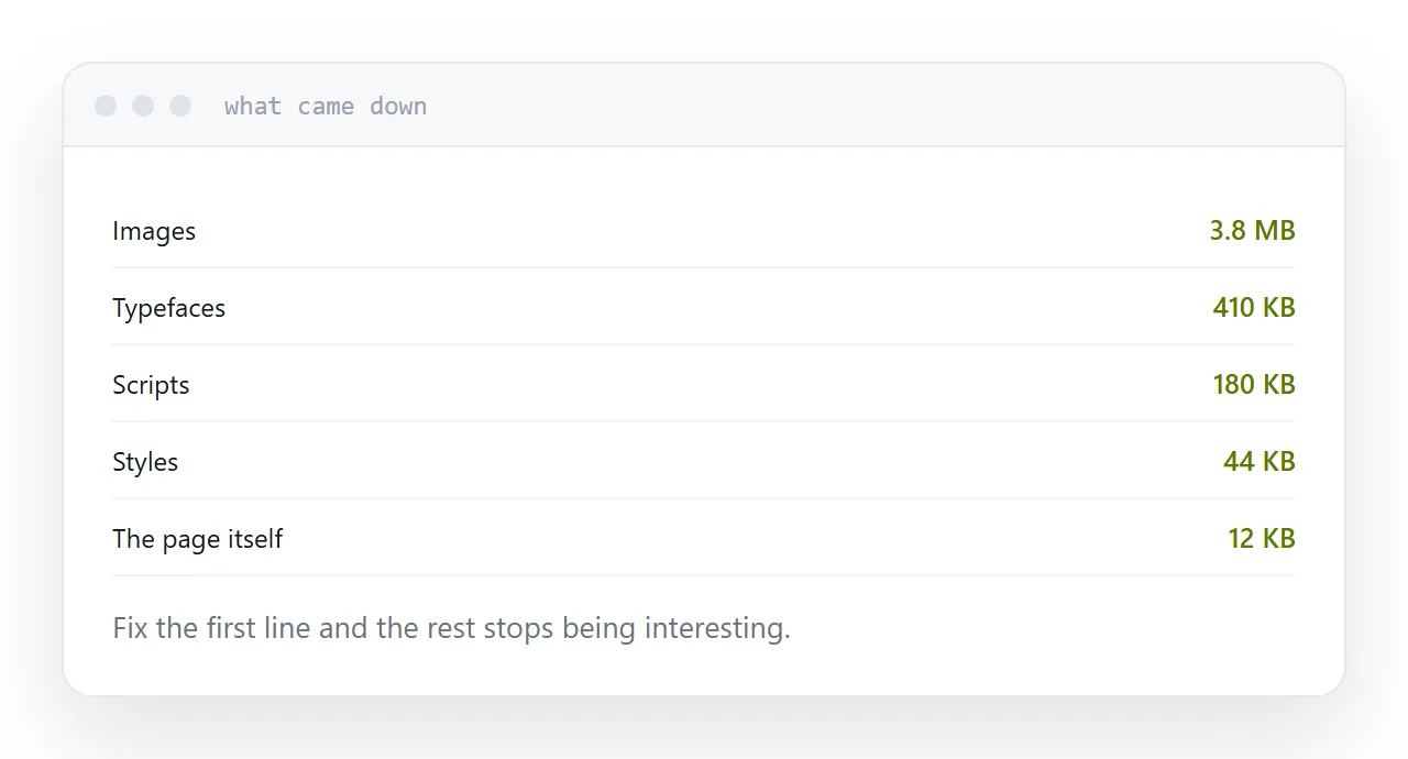
Open the developer tools, load the page, and look at what came down and what it consists of. The answer decides everything and it is nearly always the same.
Images are the problem
The usual pattern: a photograph exported at four thousand pixels wide, displayed at eight hundred, in a format chosen fifteen years ago.
Three fixes, in order of effect.
Resize. Export at roughly twice the display width, so it stays sharp on a high-resolution screen and no larger. This alone routinely removes eighty percent.
Modern format. Current formats produce substantially smaller files at the same visual quality, and every browser in use supports them.
Defer. Images below the fold should load when the reader approaches them. One attribute, and the initial load only carries what is visible.
| Change | Typical saving |
|---|---|
| Resize to display size | 60-85% of image weight |
| Modern format | A further 25-35% |
| Defer below the fold | Most of the initial load |
| Cut typeface weights | 100-400 KB |
| Remove unused libraries | Varies, often large |
Typefaces
Each weight of each family is a separate file.
A template loading four families in six weights is downloading twenty-four files before a word can be shown in the right typeface, and the reader watches the text change when they arrive.
Two weights of one family covers almost any small site. Set a system fallback so text is readable immediately rather than invisible while waiting.
Reserve space
Not strictly speed, measured alongside it, and more annoying to readers than slowness.
An image with no dimensions arrives and pushes everything below it down. Somebody mid-sentence loses their line, and somebody about to tap a link taps something else.
Give every image its dimensions. The layout is then final before anything loads.
Unused code
Templates and frameworks bring sliders, animation libraries and icon sets, most of which a given page does not use.
They still download. Removing what you are not using is often the second largest saving after images, and it costs nothing but attention.
Test properly
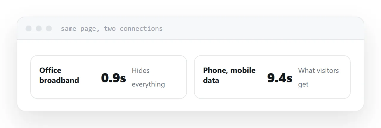
On a real phone, on mobile data, away from your office.
Every measurement tool offers a throttled mode, which is a good approximation and still runs on your connection. The real device on a real connection is the honest test, and it is where a page that felt fine turns out to take nine seconds.
Two neighbouring cases are worth a look: What a static website is and Search basics for a static site.
Put it at an address
Measure the weight and its split first, resize images to their display size, defer everything below the fold, cut the typeface weights, and test on a phone on mobile data.