SVG animation means making the shapes inside an <svg> move, fade, change colour or draw themselves. An HTML page has three ways to do it: CSS @keyframes, SVG's own animation elements (SMIL), and JavaScript, either element.animate() or a library such as GSAP.
All three work in a single HTML file. The one condition is that the SVG is inline: the <svg> code sits in the page, not behind an <img> tag.
Here is the CSS way. A star turns, a dot pulses and a line draws itself, with no JavaScript at all.
<!doctype html>
<html lang="en">
<head>
<meta charset="utf-8">
<meta name="viewport" content="width=device-width, initial-scale=1">
<title>SVG animation with CSS</title>
<style>
  body { margin: 0; padding: 16px; font-family: system-ui, sans-serif; background: #fff; }
  svg { display: block; width: 100%; max-width: 360px; height: auto; margin: 0 auto; }

  /* rotate around the shape's own centre, not the SVG's top-left corner */
  .sun {
    transform-box: fill-box;
    transform-origin: center;
    animation: spin 6s linear infinite;
  }
  .dot { animation: pulse 1.2s ease-in-out infinite alternate; }

  /* pathLength="1" makes the dash maths 1 instead of the real length */
  .line {
    stroke-dasharray: 1;
    stroke-dashoffset: 1;
    animation: draw 2.5s ease-out infinite;
  }

  @keyframes spin  { to { transform: rotate(360deg); } }
  @keyframes pulse { from { opacity: .3; } to { opacity: 1; } }
  @keyframes draw  { 70%, 100% { stroke-dashoffset: 0; } }

  /* people who ask for less motion get a still picture */
  @media (prefers-reduced-motion: reduce) {
    .sun, .dot, .line { animation: none; stroke-dashoffset: 0; }
  }
</style>
</head>
<body>
<svg viewBox="0 0 300 200" role="img" aria-label="A turning sun over a hill">
  <path class="line" pathLength="1" d="M10 170 Q 80 100 150 150 T 290 140"
        fill="none" stroke="#16a34a" stroke-width="6" stroke-linecap="round"/>
  <polygon class="sun" fill="#f59e0b"
           points="220,20 228,42 250,36 240,56 260,70 238,76 242,98 222,86 208,104 202,82 180,84 192,64 176,48 198,46 196,24 214,36"/>
  <circle class="dot" cx="60" cy="60" r="14" fill="#3b82f6"/>
</svg>
</body>
</html>
The smallest working file
Copy this into an empty .html file and open it in a browser. The circle fades in and out forever.
<!doctype html>
<meta name="viewport" content="width=device-width, initial-scale=1">
<style>
  .dot { animation: pulse 1s ease-in-out infinite alternate; }
  @keyframes pulse { from { opacity: .2; } to { opacity: 1; } }
</style>
<svg viewBox="0 0 100 100" width="200">
  <circle class="dot" cx="50" cy="50" r="30" fill="#3b82f6"/>
</svg>
The shape takes a class like any HTML element, and the keyframes rule is the same one you would write for a <div>. CSS keyframes covers the animation property itself.
Good properties to animate on SVG shapes are transform, opacity, fill, stroke and stroke-dashoffset. The last one gives the line-drawing effect in the first example.
Three ways to animate an SVG
The same square turns in each box below, written three different ways. Each one also has its own pause switch.
<!doctype html>
<html lang="en">
<head>
<meta charset="utf-8">
<meta name="viewport" content="width=device-width, initial-scale=1">
<title>Three ways to animate SVG</title>
<style>
  body { margin: 0; padding: 16px; font-family: system-ui, sans-serif; background: #fff; color: #1d2330; }
  .row { display: grid; grid-template-columns: repeat(3, 1fr); gap: 10px; max-width: 560px; margin: 0 auto; }
  figure { margin: 0; border: 1px solid #e1e4ea; border-radius: 10px; padding: 10px; text-align: center; }
  figcaption { font-size: 14px; font-weight: 600; margin-bottom: 6px; }
  svg { width: 100%; max-width: 120px; height: auto; }
  button { margin-top: 8px; font: inherit; font-size: 14px; padding: 6px 10px; border-radius: 6px; border: 1px solid #cbd2dc; background: #f5f7fa; cursor: pointer; }

  /* 1. CSS: a keyframes rule on an SVG element */
  #css-sq { transform-box: fill-box; transform-origin: center; animation: spin 3s linear infinite; }
  #css-sq.paused { animation-play-state: paused; }
  @keyframes spin { to { transform: rotate(360deg); } }
</style>
</head>
<body>
<div class="row">
  <figure>
    <figcaption>CSS</figcaption>
    <svg viewBox="0 0 100 100"><rect id="css-sq" x="30" y="30" width="40" height="40" rx="6" fill="#3b82f6"/></svg>
    <button id="css-btn">Pause</button>
  </figure>

  <figure>
    <figcaption>SMIL</figcaption>
    <!-- 2. SMIL: an <animateTransform> element inside the shape -->
    <svg id="smil-svg" viewBox="0 0 100 100">
      <rect x="30" y="30" width="40" height="40" rx="6" fill="#16a34a">
        <animateTransform attributeName="transform" type="rotate"
          from="0 50 50" to="360 50 50" dur="3s" repeatCount="indefinite"/>
      </rect>
    </svg>
    <button id="smil-btn">Pause</button>
  </figure>

  <figure>
    <figcaption>JavaScript</figcaption>
    <svg viewBox="0 0 100 100"><rect id="js-sq" x="30" y="30" width="40" height="40" rx="6" fill="#f59e0b"/></svg>
    <button id="js-btn">Pause</button>
  </figure>
</div>

<script>
  // 3. JavaScript: the Web Animations API, element.animate()
  const jsSq = document.getElementById('js-sq');
  jsSq.style.transformBox = 'fill-box';
  jsSq.style.transformOrigin = 'center';
  const anim = jsSq.animate(
    [{ transform: 'rotate(0deg)' }, { transform: 'rotate(360deg)' }],
    { duration: 3000, iterations: Infinity }
  );

  // Each way has its own pause switch
  const toggle = (btn, isPaused, pause, play) => {
    btn.addEventListener('click', () => {
      isPaused() ? play() : pause();
      btn.textContent = isPaused() ? 'Play' : 'Pause';
    });
  };
  const cssSq = document.getElementById('css-sq');
  const smil = document.getElementById('smil-svg');
  toggle(document.getElementById('css-btn'),
    () => cssSq.classList.contains('paused'),
    () => cssSq.classList.add('paused'), () => cssSq.classList.remove('paused'));
  toggle(document.getElementById('smil-btn'),
    () => smil.animationsPaused(),
    () => smil.pauseAnimations(), () => smil.unpauseAnimations());
  toggle(document.getElementById('js-btn'),
    () => anim.playState === 'paused',
    () => anim.pause(), () => anim.play());
</script>
</body>
</html>
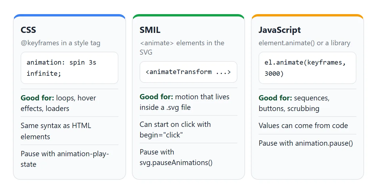
- CSS. A
@keyframesrule plus theanimationproperty. Pause by settinganimation-play-state: paused. - SMIL. An
<animate>,<animateTransform>,<animateMotion>or<set>element placed inside the shape. Pause every SMIL animation in an SVG withsvg.pauseAnimations(). - Web Animations API.
element.animate()starts an animation from JavaScript and returns anAnimationobject withpause()andplay().
SMIL can also start on a click without any script. begin="click" on the animate element waits for a click on the shape:
<circle cx="20" cy="50" r="15">
  <animate attributeName="cx" to="180" dur="0.4s"
           begin="click" fill="freeze"/>
</circle>
Why a shape spins around the corner
You add rotate(360deg) to a shape and it swings in a big circle across the SVG instead of turning in place.
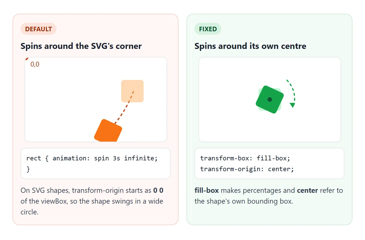
On SVG shapes, transform-origin starts at 0 0 and transform-box starts at view-box, so the turn happens around the top-left of the SVG's coordinate system. Two lines fix it:
.shape {
  transform-box: fill-box;
  transform-origin: center;
}
fill-box makes center and percentages refer to the shape's own bounding box. CSS transform-origin explains the property in more detail.
When the shape jumps to the top-left
SVG shapes often arrive with a transform attribute, such as transform="translate(160 110)". A CSS transform on the same element takes priority over that attribute and replaces it. The shape drops back to 0,0 the moment the animation starts.
The fix is to leave the attribute on an outer <g> and animate an inner one:
<g transform="translate(160 110)">
  <g class="pop"> ...shapes... </g>
</g>
The finished example below uses exactly this for the check-mark badge.
Inline SVG or an img tag
An SVG file shown with <img src="logo.svg"> is treated as a picture. In our Chromium test, CSS and SMIL animations inside the file still played, but a script inside it did not run.
The page's own CSS also could not reach the shapes inside.
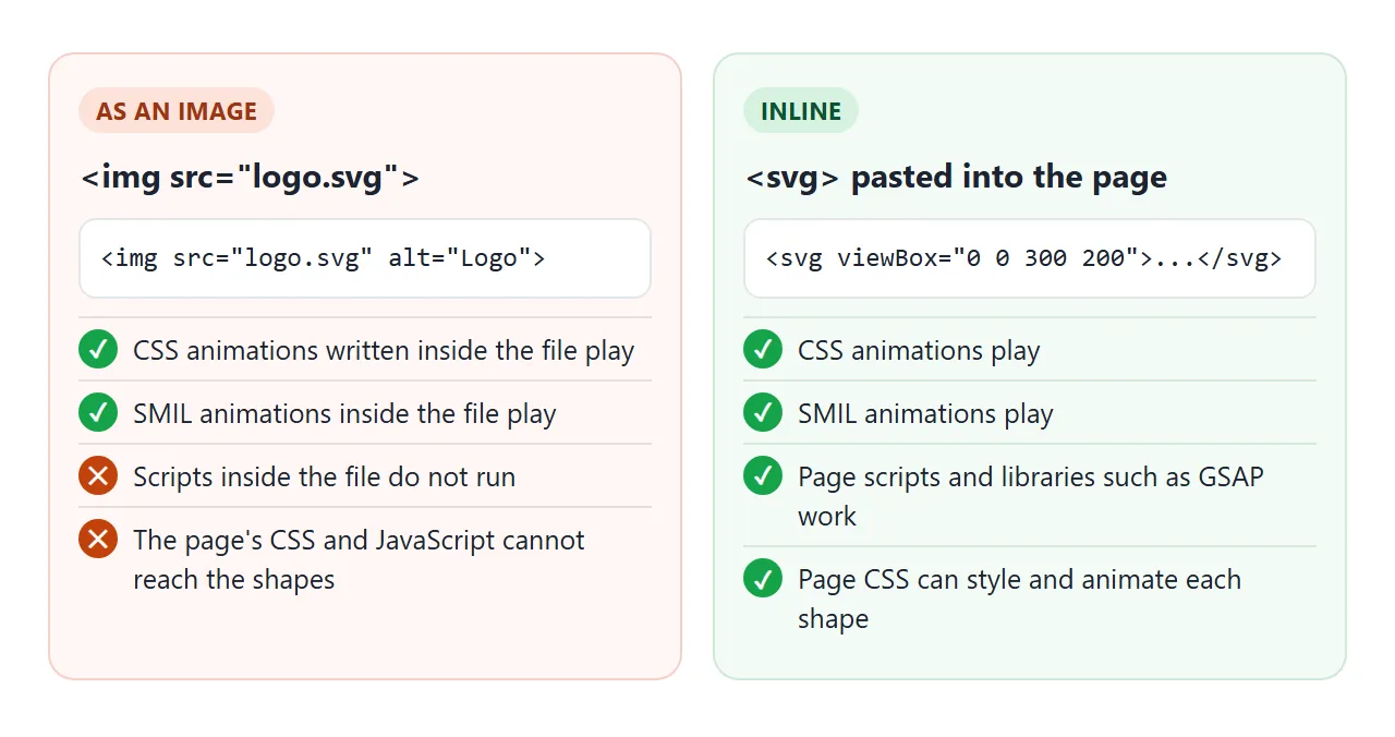
So if the motion should react to buttons, scrolling or a library, paste the SVG into the page. SVG in HTML compares the ways to put an SVG on a page.
A finished example with GSAP
For a sequence of steps, a library saves arithmetic. GSAP is a JavaScript animation library that loads with one script tag. Its timeline plays tweens one after another, and the whole timeline can be restarted, reversed or scrubbed.
<!doctype html>
<html lang="en">
<head>
<meta charset="utf-8">
<meta name="viewport" content="width=device-width, initial-scale=1">
<title>SVG animation with a GSAP timeline</title>
<style>
  body { margin: 0; padding: 16px; font-family: system-ui, sans-serif; background: #fff; color: #1d2330; }
  .wrap { max-width: 420px; margin: 0 auto; }
  svg { display: block; width: 100%; height: auto; background: #f4f7fb; border-radius: 12px; }
  .controls { display: flex; flex-wrap: wrap; gap: 8px; align-items: center; margin-top: 12px; }
  button { font: inherit; font-size: 14px; padding: 7px 12px; border-radius: 6px; border: 1px solid #cbd2dc; background: #f5f7fa; cursor: pointer; }
  input[type=range] { flex: 1 1 140px; }
</style>
</head>
<body>
<div class="wrap">
  <svg viewBox="0 0 320 200" role="img" aria-label="A route drawn between two pins, then a check mark">
    <path id="route" d="M50 150 C 110 40, 200 190, 270 60" fill="none"
          stroke="#3b82f6" stroke-width="5" stroke-linecap="round" pathLength="1"
          stroke-dasharray="1" stroke-dashoffset="1"/>
    <circle class="pin" cx="50" cy="150" r="12" fill="#16a34a"/>
    <circle class="pin" cx="270" cy="60" r="12" fill="#f59e0b"/>
    <g transform="translate(160 110)">
      <!-- GSAP animates this inner group, so the outer transform stays intact -->
      <g id="badge">
        <circle r="26" fill="#16a34a"/>
        <path d="M-11 0 L-3 9 L12 -9" fill="none" stroke="#fff" stroke-width="5" stroke-linecap="round" stroke-linejoin="round"/>
      </g>
    </g>
  </svg>
  <div class="controls">
    <button id="play">Play</button>
    <button id="reverse">Reverse</button>
    <input id="scrub" type="range" min="0" max="1" step="0.01" value="0" aria-label="Timeline position">
  </div>
</div>

<!-- 1. load GSAP (pinned version) before your own script -->
<script src="https://cdn.jsdelivr.net/npm/gsap@3.15.0/dist/gsap.min.js"></script>

<!-- 2. build one timeline: each step starts after the one before -->
<script>
  const scrub = document.getElementById('scrub');
  const tl = gsap.timeline({
    paused: true,
    onUpdate: () => { scrub.value = tl.progress(); }
  });

  tl.from('.pin', { scale: 0, transformOrigin: '50% 50%', duration: 0.4, stagger: 0.15 })
    .to('#route', { attr: { 'stroke-dashoffset': 0 }, duration: 1.2, ease: 'power1.inOut' })
    .from('#badge', { scale: 0, rotation: -90, transformOrigin: '50% 50%', duration: 0.5, ease: 'back.out(2)' });

  document.getElementById('play').addEventListener('click', () => tl.restart());
  document.getElementById('reverse').addEventListener('click', () => tl.reverse());
  scrub.addEventListener('input', () => tl.pause().progress(+scrub.value));

  tl.play();
</script>
</body>
</html>
The three steps are three chained calls:
const tl = gsap.timeline();
tl.from('.pin', { scale: 0, transformOrigin: '50% 50%', stagger: 0.15 })
  .to('#route', { attr: { 'stroke-dashoffset': 0 }, duration: 1.2 })
  .from('#badge', { scale: 0, rotation: -90, transformOrigin: '50% 50%' });
- Load it first. The
<script src>for GSAP must come before your own script. The other order throwsgsap is not defined. - Pin the version. The example loads
gsap@3.15.0from jsDelivr, the latest version on npm on 1 October 2026. - Licence. The GSAP licensing page says GSAP is free for everyone, including commercial use, under its own standard licence.
- Origin. GSAP's docs say its
transformOriginworks on SVG elements consistently across browsers, so thefill-boxlines are not needed here.
The line-drawing step uses pathLength="1" with stroke-dasharray="1", so the offset runs from 1 to 0 whatever the real length is. SVG stroke-dasharray explains that trick step by step.
Reduced motion
Some people turn on a "reduce motion" setting on their device. The prefers-reduced-motion media query detects it, and the first example uses it to show a still picture instead:
@media (prefers-reduced-motion: reduce) {
  .sun, .dot, .line { animation: none; stroke-dashoffset: 0; }
}
When it does not work
| What you see | Cause | Fix |
|---|---|---|
| The shape circles around the SVG's corner | Default origin is 0 0 of the viewBox | transform-box: fill-box and transform-origin: center |
| The shape jumps to the top-left when it starts | A CSS transform replaced the transform attribute |
Keep the attribute on an outer <g>, animate an inner one |
| Page CSS has no effect on the SVG | It is loaded with <img> or as a background |
Paste the <svg> inline |
| A script inside the .svg file does nothing | Scripts do not run in SVG used as an image | Move the script into the page and use an inline SVG |
gsap is not defined in the console |
Your code runs before the GSAP script tag | Put the GSAP <script src> above your code |
| The line is drawn from the start, no animation | Dash length does not match the path length | Add pathLength="1", use 1 for dasharray and offset |
| Nothing moves for one visitor | Their device asks for reduced motion | Expected; keep the still frame readable |
Share it as a link
An animation is hard to show in a screenshot, and a GIF loses the buttons and the slider. A link to the working page keeps all of it.
Paste the page into a NOS document and choose Create share link. HTML to link walks through it. The page renders as written, its scripts run and GSAP loads from jsDelivr.
The people you send it to can press Play and scrub the timeline themselves. Anyone with the link can open it without an account, and if you change the code later, the same link shows the new version.