To move an element along a curve in CSS, give it an offset-path and animate offset-distance from 0% to 100%. The path is the route, and the distance is how far along the route the element is. No JavaScript is involved.
Here is a dot following a curve. The dashed line is the same path, drawn with SVG so you can see it.
<!doctype html>
<html lang="en">
<head>
<meta charset="utf-8">
<meta name="viewport" content="width=device-width, initial-scale=1">
<title>A dot following a curve</title>
<style>
  body { margin: 0; padding: 16px; font-family: system-ui, sans-serif; background: #f4f5f7; }
  /* the SVG and the dot share this box, so the path coordinates line up */
  .stage { position: relative; width: 340px; height: 200px; margin: 0 auto; background: #fff; border-radius: 12px; }
  .stage svg { position: absolute; left: 0; top: 0; }
  .dot {
    position: absolute; left: 0; top: 0;       /* path() starts from here */
    width: 18px; height: 18px; border-radius: 50%;
    background: #2563eb; box-shadow: 0 0 0 5px rgba(37, 99, 235, .2);
    offset-path: path('M 20 170 C 70 20, 150 20, 170 100 S 270 190, 320 30');
    animation: follow 3s ease-in-out infinite alternate;
  }
  @keyframes follow {
    from { offset-distance: 0%; }
    to   { offset-distance: 100%; }
  }
  p { margin: 10px 0 0; text-align: center; font-size: 13px; color: #5b6270; }
</style>
</head>
<body>
<div class="stage">
  <!-- the same path, drawn so you can see it -->
  <svg width="340" height="200" aria-hidden="true">
    <path d="M 20 170 C 70 20, 150 20, 170 100 S 270 190, 320 30"
          fill="none" stroke="#c9cfd8" stroke-width="3" stroke-dasharray="6 6"/>
  </svg>
  <div class="dot"></div>
</div>
<p>No JavaScript: offset-path draws the route, offset-distance moves the dot.</p>
</body>
</html>
The whole motion is these lines:
.dot {
  position: absolute; left: 0; top: 0;
  offset-path: path('M 20 170 C 70 20, 150 20, 170 100 S 270 190, 320 30');
  animation: follow 3s ease-in-out infinite alternate;
}
@keyframes follow {
  from { offset-distance: 0%; }
  to   { offset-distance: 100%; }
}
Draw the path once, use it twice
path() takes the same path data as the d attribute of an SVG <path>: M moves, L draws a line, C and S draw curves. You can copy a d string from a drawing tool or from an SVG file and paste it in.
The numbers are CSS pixels, and 0 0 is the element's own top-left corner, where it would sit without the path. That is why the dot above has left: 0; top: 0 inside the same box as the SVG.
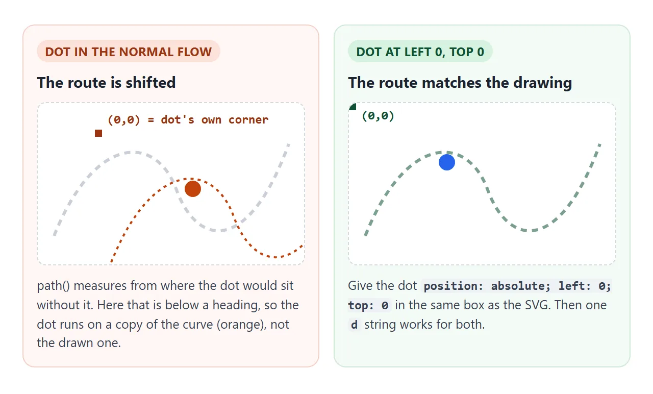
Two more things surprise people at first. Adding offset-path moves the element right away, to the start of the path, even with no animation. And it does not change layout: like a transform, the element keeps its original space and nothing around it moves.
Animate offset-distance
offset-distance is a length along the path. 0% is the start, 100% is the end, and pixel values such as 50px work too. Any keyframes animation can drive it, so duration, delay, iteration count and timing function all work as usual.
- Constant speed: use
linear. Witheaseorease-in-outthe element slows down near the ends. - Back and forth: add
alternate, as the first example does. - Open path: values below
0%stay at the start and values above100%stay at the end. - Closed shape: a circle or a path ending in
Zwraps around, so125%lands at the same spot as25%.
Turn with the curve: offset-rotate
By default the element turns so its right side points the way it is going. That is offset-rotate: auto. Drag the slider below, and switch the rotation and anchor to compare. The red dot marks the exact point on the path.
<!doctype html>
<html lang="en">
<head>
<meta charset="utf-8">
<meta name="viewport" content="width=device-width, initial-scale=1">
<title>offset-rotate and offset-anchor</title>
<style>
  body { margin: 0; padding: 14px; font-family: system-ui, sans-serif; background: #f4f5f7; color: #1d2330; }
  .stage { position: relative; width: 340px; height: 180px; margin: 0 auto; background: #fff; border-radius: 12px; }
  .stage svg { position: absolute; left: 0; top: 0; }
  .car, .pin {
    position: absolute; left: 0; top: 0;
    offset-path: path('M 30 140 C 100 -10, 200 200, 310 50');
  }
  .car {
    width: 56px; height: 26px; border-radius: 6px 14px 14px 6px;
    background: linear-gradient(90deg, #93c5fd, #2563eb); outline: 1px dashed #1d4ed8;
    font: 700 11px/26px system-ui, sans-serif; color: #fff; text-align: right; padding-right: 6px; box-sizing: border-box;
  }
  .pin { width: 8px; height: 8px; border-radius: 50%; background: #c2410c; offset-rotate: 0deg; } /* the exact point on the path */
  .playing .car, .playing .pin { animation: drive 4s linear infinite; }
  @keyframes drive { from { offset-distance: 0%; } to { offset-distance: 100%; } }
  form { max-width: 340px; margin: 12px auto 0; display: grid; grid-template-columns: auto 1fr; gap: 8px 10px; align-items: center; font-size: 13px; }
  select, input, button { font: inherit; }
  button { grid-column: 1 / -1; padding: 6px; border: 1px solid #c9cdd4; border-radius: 8px; background: #fff; cursor: pointer; }
  pre { max-width: 340px; margin: 10px auto 0; padding: 8px 10px; border-radius: 8px; background: #1d2330; color: #d6f2df; font-size: 12px; white-space: pre-wrap; }
</style>
</head>
<body>
<div class="stage" id="stage">
  <svg width="340" height="180" aria-hidden="true">
    <path d="M 30 140 C 100 -10, 200 200, 310 50" fill="none" stroke="#c9cfd8" stroke-width="3" stroke-dasharray="6 6"/>
  </svg>
  <div class="car" id="car">GO</div>
  <div class="pin" id="pin"></div>
</div>

<form id="f">
  <label for="dist">offset-distance</label>
  <input type="range" id="dist" min="0" max="100" value="35">
  <label for="rot">offset-rotate</label>
  <select id="rot"><option>auto</option><option>0deg</option><option>reverse</option><option>auto 90deg</option><option>30deg</option></select>
  <label for="anc">offset-anchor</label>
  <select id="anc"><option>auto</option><option>left center</option><option>right center</option><option>left top</option></select>
  <button type="button" id="play">Play</button>
</form>
<pre id="code"></pre>

<script>
  const car = document.getElementById('car'), pin = document.getElementById('pin');
  const dist = document.getElementById('dist'), rot = document.getElementById('rot'), anc = document.getElementById('anc');
  const stage = document.getElementById('stage'), play = document.getElementById('play'), code = document.getElementById('code');

  function update() {
    const d = dist.value + '%';
    car.style.offsetDistance = d;
    pin.style.offsetDistance = d;             // the pin marks the point on the path
    car.style.offsetRotate = rot.value;
    car.style.offsetAnchor = anc.value;
    code.textContent = '.car {\n  offset-distance: ' + d + ';\n  offset-rotate: ' + rot.value +
      ';\n  offset-anchor: ' + anc.value + ';\n}';
  }
  document.getElementById('f').addEventListener('input', update);

  play.addEventListener('click', () => {
    const on = stage.classList.toggle('playing');  // the animation overrides the slider value
    dist.disabled = on;
    play.textContent = on ? 'Stop' : 'Play';
  });
  update();
</script>
</body>
</html>
| Value | What the element does |
|---|---|
auto (default) |
Faces the direction of travel |
0deg |
Never turns; stays upright |
reverse |
Faces the direction of travel, turned around |
auto 90deg |
Faces the direction of travel, plus a quarter turn |
30deg |
Stays at a fixed 30 degree tilt |
Use auto for arrows, cars and planes. Use 0deg for a dot, an icon or any text that must stay readable.
Which point sits on the line: offset-anchor
The path is a thin line and the element is a box. offset-anchor picks which point of the box is placed on the line. The default auto uses the element's transform-origin, which is the center unless you change the transform origin.
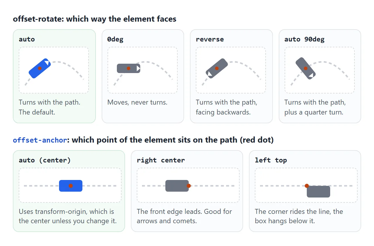
offset-anchor: right center makes the front edge lead, which suits a comet or a pointer. With the default center anchor, remember that half the element hangs past the path, so a path that starts at 0 0 pushes half the element outside the box.
ray(): a straight line at an angle
ray() is a straight line from a starting point. 0deg points up and angles turn clockwise, so 90deg points right. A size keyword sets the length: closest-side stops at the nearest edge of the box, and farthest-corner reaches the far corner.
.spark {
  offset-path: ray(45deg closest-side);
  offset-position: 50% 50%;   /* where the ray starts */
}
The start point is offset-position. Its default, normal, is the center of the containing block. auto starts from the element's own position, and a position such as left top or 20% 80% starts there.
You can also write the start inside the function: ray(45deg closest-side at 20% 80%).
Add contain inside ray() to shorten the line so the whole element stays in the box at 100%.
Basic shapes: circle(), ellipse(), inset(), polygon()
The shape functions from clip-path also work as routes. Their percentages are measured against the containing block, border included, so the route grows and shrinks with the box. That makes them the easy answer for motion that must fit a phone.
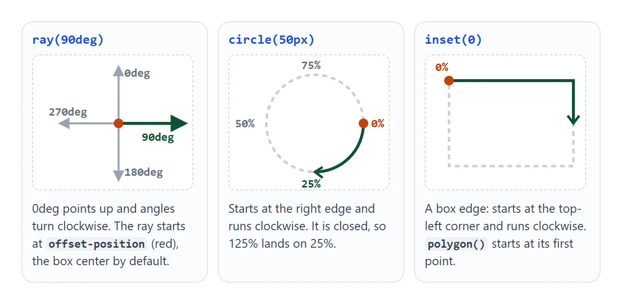
circle(60px at 50% 50%)starts at its rightmost point and runs clockwise.ellipse(40% 38% at 50% 50%)does the same, stretched to the box.inset(0)traces the box edge from the top-left corner, clockwise.polygon()starts at its first point and follows the points in order.
A finished example: orbits, sparks and a comet
This scene uses all three kinds of route. Two planets orbit on circle() and ellipse(), eight sparks fly out on ray(), and a comet crosses on a path() with offset-anchor: right center so its bright head leads.
<!doctype html>
<html lang="en">
<head>
<meta charset="utf-8">
<meta name="viewport" content="width=device-width, initial-scale=1">
<title>Orbits, sparks and a comet</title>
<style>
  body { margin: 0; padding: 12px; font-family: system-ui, sans-serif; background: #0b1020; color: #e5e7eb; }
  .sky {
    position: relative; height: 260px; max-width: 560px; margin: 0 auto; overflow: hidden; border-radius: 14px;
    background: radial-gradient(circle at 50% 50%, #1e2a4a, #0b1020 70%);
  }
  .sun, .planet, .spark, .comet { position: absolute; left: 0; top: 0; }
  .sun {
    left: 50%; top: 50%; width: 44px; height: 44px; margin: -22px 0 0 -22px; border-radius: 50%;
    background: radial-gradient(circle, #fde68a, #f59e0b); box-shadow: 0 0 30px #f59e0b;
  }

  /* basic shapes: percentages follow the size of the sky */
  .planet { border-radius: 50%; offset-rotate: 0deg; animation: go linear infinite; }
  .p1 { width: 14px; height: 14px; background: #60a5fa; offset-path: circle(60px at 50% 50%); animation-duration: 5s; }
  .p2 { width: 20px; height: 20px; background: #34d399; offset-path: ellipse(40% 38% at 50% 50%); animation-duration: 11s; }

  /* ray(): straight out from offset-position (the center, by default) */
  .spark { width: 6px; height: 6px; border-radius: 50%; background: #fde68a; animation: burst 2.4s ease-out infinite; }

  /* path(): fixed pixel route; the head of the comet sits on it */
  .comet {
    width: 70px; height: 8px; border-radius: 4px;
    background: linear-gradient(90deg, transparent, #bae6fd 70%, #fff);
    offset-path: path('M -80 40 Q 200 -10 640 110');
    offset-anchor: right center;   /* the bright end is the point on the path */
    animation: go 4s ease-in 1s infinite;
  }
  @keyframes go { from { offset-distance: 0%; } to { offset-distance: 100%; } }
  @keyframes burst {
    from { offset-distance: 0%; opacity: 1; }
    to   { offset-distance: 45%; opacity: 0; }
  }
  .paused * { animation-play-state: paused; }
  button {
    display: block; margin: 10px auto 0; padding: 6px 18px; border-radius: 99px;
    border: 1px solid #334155; background: #111827; color: #e5e7eb; font: inherit; cursor: pointer;
  }
</style>
</head>
<body>
<div class="sky" id="sky">
  <div class="sun"></div>
  <div class="planet p1"></div>
  <div class="planet p2"></div>
  <div class="comet"></div>
</div>
<button type="button" id="toggle">Pause</button>

<script>
  const sky = document.getElementById('sky'), toggle = document.getElementById('toggle');

  // eight sparks, one ray each, 45 degrees apart
  for (let i = 0; i < 8; i++) {
    const s = document.createElement('div');
    s.className = 'spark';
    s.style.offsetPath = 'ray(' + i * 45 + 'deg closest-side)';
    sky.appendChild(s);
  }

  function setPaused(p) {
    sky.classList.toggle('paused', p);
    toggle.textContent = p ? 'Play' : 'Pause';
  }
  toggle.addEventListener('click', () => setPaused(!sky.classList.contains('paused')));
  // start paused for people who asked their system for less motion
  setPaused(matchMedia('(prefers-reduced-motion: reduce)').matches);
</script>
</body>
</html>
It starts paused when the visitor's system asks for reduced motion, and the button pauses every animation at once with animation-play-state.
When it does not work
| What you see | Cause | Fix |
|---|---|---|
| The element runs beside the drawn curve, not on it | path() starts at the element's own position |
position: absolute; left: 0; top: 0 in the same box as the SVG |
| Half the element hangs off the box at the start | The anchor is the center | Move the path start inward, or set offset-anchor |
| The element turns sideways or upside down | offset-rotate is auto |
offset-rotate: 0deg |
| A ray starts in the middle of the box | offset-position is normal, the center |
Set offset-position, or add at inside ray() |
| The route is too big on a phone | path() numbers are fixed pixels |
Use a basic shape with percentages |
| The speed changes along the route | The timing function eases | animation-timing-function: linear |
| Values past 100% stop at the end | Open paths clamp the distance | Close the path with Z or use a shape |
Share it as a link
Motion is hard to judge from a screenshot or a description. A still image freezes it, and an .html attachment may open as plain code on a phone.
To show the moving version, paste the page into a NOS document and choose Create share link. HTML to link walks through it.
The page renders as written and its animations and scripts run, so the people you send it to can watch the dot follow the curve and press the buttons themselves. If you change the path later, the same link shows the new version.