A CSS scroll timeline replaces the clock of an animation with a scroll position. You write normal @keyframes, then set animation-timeline: scroll().
At the top of the scroll range the animation sits at 0%, at the bottom it sits at 100%, and scrolling back up plays it in reverse.
Scroll inside the example. The green bar is the whole technique: one keyframes rule and two animation properties.
<!doctype html>
<html lang="en">
<head>
<meta charset="utf-8">
<meta name="viewport" content="width=device-width, initial-scale=1">
<title>Reading progress bar</title>
<style>
  body {
    margin: 0; font-family: system-ui, sans-serif;
    line-height: 1.6; color: #1d2330; background: #fff;
  }
  .progress {
    position: fixed; top: 0; left: 0; right: 0; height: 6px;
    background: #16a34a;
    transform-origin: left;
    animation: grow linear both;     /* linear: bar length = scroll position */
    animation-timeline: scroll(root); /* after the shorthand, never before */
  }
  @keyframes grow {
    from { transform: scaleX(0); }
    to   { transform: scaleX(1); }
  }
  main { max-width: 560px; margin: 0 auto; padding: 24px 18px 40px; }
  h1 { font-size: 22px; margin: 8px 0 12px; }
  p { margin: 0 0 14px; }
</style>
</head>
<body>
<div class="progress"></div>
<main>
  <h1>Scroll this page</h1>
  <p>The green bar at the top is a normal CSS animation. The only change is its timeline: instead of seconds, it runs on the scroll position of the page.</p>
  <p>At the top of the page the animation is at 0%, so the bar has no width. At the bottom it is at 100%, so the bar spans the page.</p>
  <p>Scroll back up and the bar shrinks again. The animation follows the scroll position in both directions, because it has no clock of its own.</p>
  <p>No JavaScript runs here. There is no scroll listener and no requestAnimationFrame loop, only a keyframes rule and two animation properties.</p>
  <p>The keyframes animate transform: scaleX() rather than width, which keeps the work away from layout.</p>
  <p>The timing function is linear. With the default ease, the bar would run ahead of the scroll position in the middle of the page.</p>
  <p>You have reached the end. The bar should now be full.</p>
</main>
</body>
</html>
The core of it:
.progress {
  transform-origin: left;
  animation: grow linear both;
  animation-timeline: scroll(root);
}
@keyframes grow {
  from { transform: scaleX(0); }
  to   { transform: scaleX(1); }
}
If @keyframes, fill modes and the shorthand are new to you, CSS animation keyframes covers them one property at a time. This guide only changes where the progress comes from.
Three rules that trip people up
Getting any one of these wrong makes the bar look broken.
- Write
animation-timelineafter theanimationshorthand. The shorthand resetsanimation-timelinetoauto, the normal time-based timeline. Written before it, your timeline is thrown away and the animation finishes instantly. - Use
lineartiming. The default isease. On a scroll timeline, easing bends the mapping between scroll and progress. A quarter of the way down, aneasebar is already well past a quarter. - Leave out the duration. The scroll distance sets the pace. Add
bothas the fill mode so the start and end states hold outside the active range.
scroll() and view(): two kinds of progress
There are two anonymous timelines, written as functions right inside animation-timeline.
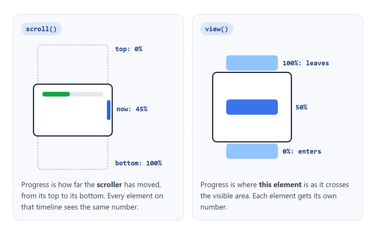
scroll(<scroller> <axis>)tracks a scroll container. The scroller isnearest(the default, the closest scrolling ancestor),root(the page) orself. The axis isblock(the default),inline,xory.view(<axis> <inset>)tracks the animated element itself. Progress is 0% when it starts to enter the scroll container's visible area and 100% when it has fully left.
scroll() |
view() |
|
|---|---|---|
| Progress comes from | The scroll container's position | This element's position in the visible area |
| Same value for every element? | Yes | No, each element has its own |
| Typical use | Progress bars, header that shrinks | Reveal on scroll, parallax per card |
| Default range | Whole scroll range | From entering to fully gone |
Choosing a range with animation-range
A view() timeline covers the whole trip through the visible area. For a fade-in that is usually too long: the card only reaches full opacity when it is about to leave at the top. animation-range picks the part of the timeline the animation runs in.
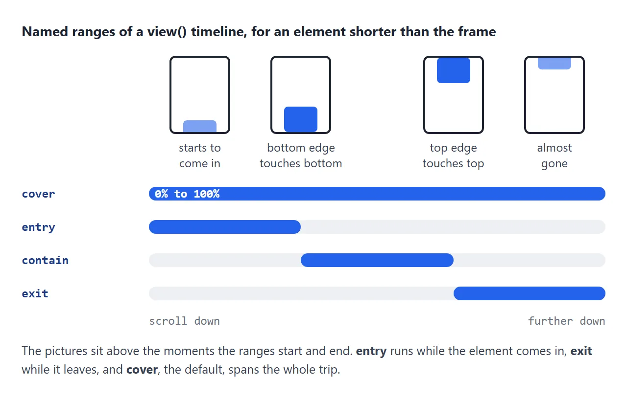
coveris the full trip and the default.entryruns while the element comes in, until it is fully inside.containruns while it is fully inside.exitruns while it leaves.
You can also give a start and an end with offsets, such as animation-range: entry 0% entry 80% or entry 20% cover 50%.
The longhands are animation-range-start and animation-range-end. On a scroll() timeline, use plain percentages, such as 0% 50% for the first half of the page.
Compare the two columns below. Card 2 sits in the middle of the frame in both. On the left it is still half faded; on the right it finished when it was fully in view.
<!doctype html>
<html lang="en">
<head>
<meta charset="utf-8">
<meta name="viewport" content="width=device-width, initial-scale=1">
<title>Reveal on scroll: two ranges</title>
<style>
  body { margin: 0; font-family: system-ui, sans-serif; background: #f4f5f7; color: #1d2330; }
  .hint { text-align: center; padding: 24px 16px 150px; font-size: 15px; }
  .cols { display: grid; grid-template-columns: 1fr 1fr; gap: 12px; padding: 0 12px 200px; }
  .cols h2 { font: 700 13px ui-monospace, Consolas, monospace; margin: 0 0 4px; }
  .card {
    height: 110px; margin-bottom: 18px; border-radius: 12px;
    background: #fff; box-shadow: 0 4px 14px rgba(0, 0, 0, .1);
    display: grid; place-items: center; font-weight: 600;
    animation: reveal linear both;
    animation-timeline: view();          /* progress = this card crossing the frame */
  }
  .entry .card { animation-range: entry; } /* finish once the card is fully in view */

  @keyframes reveal {
    from { opacity: 0; transform: translateY(40px) scale(.9); }
    to   { opacity: 1; transform: none; }
  }
</style>
</head>
<body>
<p class="hint">Scroll down and compare the two columns.</p>
<div class="cols">
  <section class="cover">
    <h2>default range (cover)</h2>
    <div class="card">1</div><div class="card">2</div><div class="card">3</div>
    <div class="card">4</div><div class="card">5</div>
  </section>
  <section class="entry">
    <h2>animation-range: entry</h2>
    <div class="card">1</div><div class="card">2</div><div class="card">3</div>
    <div class="card">4</div><div class="card">5</div>
  </section>
</div>
</body>
</html>
The reveal needs one more piece: fill mode both. Outside its range, an animation without a fill does not apply, so the card shows its normal style.
With a range such as entry 50% entry 100%, the card would appear at full opacity, then snap to transparent when the range starts and fade in again. both holds the from state until then.
Named timelines and timeline-scope
Anonymous timelines only reach the element's own scrolling ancestor. When the animated element is somewhere else, name the timeline on the scroller and refer to the name:
.gallery { overflow-x: auto; scroll-timeline: --gallery x; }
.marker  { animation: slide linear both; animation-timeline: --gallery; }
scroll-timeline is shorthand for scroll-timeline-name and scroll-timeline-axis. The same pair exists for view timelines: view-timeline-name and view-timeline-axis, set on the element being watched. Names start with two dashes.
A name is visible only inside the element that declares it. A sibling such as a position marker next to the gallery cannot see it.
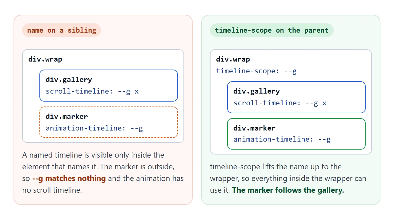
timeline-scope: --gallery on a common ancestor lifts the name up to that ancestor. Anything inside it can then use the timeline.
Feature detection and a fallback
Scroll-driven animations are newer than regular CSS animations, so check before relying on them. Two rules keep a page safe:
- Put every scroll-driven rule inside
@supports (animation-timeline: scroll()). Browsers without the feature skip the block. - Never hide content outside that block. If
opacity: 0lives only in the keyframes, unsupported browsers just show the content.
@supports (animation-timeline: scroll()) {
  .progress { animation: grow linear both; animation-timeline: scroll(root); }
  section   { animation: reveal linear both; animation-timeline: view();
              animation-range: entry 0% entry 80%; }
}
@media (prefers-reduced-motion: reduce) {
  section { animation: none; }
}
For an effect that matters, add a script path. CSS.supports('animation-timeline: scroll()') gives the same answer in JavaScript. The finished example uses it to drive the bar from a scroll listener when the CSS version is missing. For reveals in JavaScript, IntersectionObserver is the usual tool.
A finished page
This page combines all of it: a progress bar on scroll(root), sections that fade in on view() with a custom range, and a gallery marker that uses a named timeline through timeline-scope. The line under the title tells you which path your browser took.
<!doctype html>
<html lang="en">
<head>
<meta charset="utf-8">
<meta name="viewport" content="width=device-width, initial-scale=1">
<title>Scroll-driven page with a fallback</title>
<style>
  body { margin: 0; font-family: system-ui, sans-serif; line-height: 1.6; color: #1d2330; background: #fff; }
  main { max-width: 580px; margin: 0 auto; padding: 22px 16px 60px; }
  h1 { font-size: 22px; margin: 6px 0 10px; }
  h2 { font-size: 17px; margin: 0 0 6px; }
  .note { font-size: 13px; color: #4b5563; }

  /* 1. Reading progress bar */
  .progress {
    position: fixed; top: 0; left: 0; right: 0; height: 6px; z-index: 1;
    background: #16a34a; transform-origin: left;
    transform: scaleX(var(--p, 0));   /* used by the JavaScript fallback */
  }

  /* 2. Sections that fade in */
  section { margin: 26px 0; padding: 16px; border-radius: 12px; background: #f4f5f7; }

  /* 3. Gallery with a position marker outside the scroller */
  .gallery-wrap { timeline-scope: --gallery; } /* lets the marker see the gallery's timeline */
  .gallery {
    display: flex; gap: 10px; overflow-x: auto;
    scroll-timeline: --gallery x;               /* name + axis */
  }
  .slide { flex: 0 0 70%; height: 120px; border-radius: 10px; }
  .track { position: relative; height: 6px; margin-top: 10px; border-radius: 3px; background: #e5e7eb; }
  .marker { position: absolute; left: 0; top: 0; width: 25%; height: 100%; border-radius: 3px; background: #2563eb; }

  @supports (animation-timeline: scroll()) {
    .progress { animation: grow linear both; animation-timeline: scroll(root); }
    section { animation: reveal linear both; animation-timeline: view(); animation-range: entry 0% entry 80%; }
    .marker { animation: slide linear both; animation-timeline: --gallery; }
  }
  @media (prefers-reduced-motion: reduce) {
    section { animation: none; }  /* keep the progress bar, drop the movement */
  }

  @keyframes grow { from { transform: scaleX(0); } to { transform: scaleX(1); } }
  @keyframes reveal { from { opacity: 0; transform: translateY(30px); } to { opacity: 1; transform: none; } }
  @keyframes slide { to { left: 75%; } }
</style>
</head>
<body>
<div class="progress"></div>
<main>
  <h1>A page that reacts to scrolling</h1>
  <p class="note" id="mode"></p>
  <p>Three effects share this page: the bar at the top, the sections below, and the marker under the gallery.</p>
  <section><h2>Progress bar</h2><p>The bar runs on scroll(root), the scroll position of the whole page.</p></section>
  <section><h2>Reveal</h2><p>Each section runs on its own view() timeline and is fully visible by the time 80% of its entry is done.</p></section>
  <section>
    <h2>Gallery</h2>
    <div class="gallery-wrap">
      <div class="gallery">
        <div class="slide" style="background:linear-gradient(135deg,#86efac,#16a34a)"></div>
        <div class="slide" style="background:linear-gradient(135deg,#93c5fd,#2563eb)"></div>
        <div class="slide" style="background:linear-gradient(135deg,#fcd34d,#d97706)"></div>
        <div class="slide" style="background:linear-gradient(135deg,#f9a8d4,#db2777)"></div>
      </div>
      <div class="track"><div class="marker"></div></div>
    </div>
    <p>Swipe the gallery sideways. The marker is a sibling of the gallery, so it can only use the named timeline because the wrapper declares timeline-scope.</p>
  </section>
  <section><h2>Fallback</h2><p>Browsers without scroll-driven animations skip the @supports block. The sections simply show, and a small script keeps the bar working.</p></section>
  <section><h2>The end</h2><p>The bar should be full now.</p></section>
</main>

<script>
  const supported = CSS.supports('animation-timeline: scroll()');
  document.getElementById('mode').textContent = supported
    ? 'This browser runs the CSS version.'
    : 'This browser runs the JavaScript fallback for the bar.';

  if (!supported) {
    const bar = document.querySelector('.progress');
    const update = () => {
      const max = document.documentElement.scrollHeight - innerHeight;
      bar.style.setProperty('--p', max > 0 ? scrollY / max : 0);
    };
    addEventListener('scroll', update, { passive: true });
    addEventListener('resize', update);
    update();
  }
</script>
</body>
</html>
The prefers-reduced-motion query drops the moving reveal and keeps the progress bar, which shows position rather than decoration.
When it does not work
| What you see | Cause | Fix |
|---|---|---|
| The element sits at its end state and never moves | animation shorthand written after animation-timeline |
Put animation-timeline last |
| Same symptom with a named timeline | The name does not reach the element (sibling, cousin) | Add timeline-scope on a shared ancestor |
| Nothing animates, the element shows its normal style | The scroller has nothing to scroll, so its timeline is inactive | Check overflow and that content is taller or wider than the box |
| The bar runs ahead of the scroll in the middle | Default ease timing |
Use linear |
| A reveal only finishes when the card leaves the top | The default range is cover |
animation-range: entry |
| A card shows fully, then snaps transparent partway in | No fill, and the range starts after the card is visible | Add both to the shorthand |
| Horizontal scroller does not drive anything | Timeline axis is block by default |
scroll(nearest x) or scroll-timeline: --name x |
| Nothing happens in one browser | No support for scroll-driven animations | @supports block plus a script fallback |
For time-based animations that refuse to start, see CSS animation not working.
Share it as a link
Scroll effects are hard to show in a screenshot: the whole point is what happens while you scroll. Send the page itself instead.
Paste the page into a NOS document and choose Create share link. HTML to link walks through it.
The page renders as written and its scripts run, so the people you send it to can scroll it and watch the bar fill. If you change the code later, the same link shows the new version.