A view transition animates a change to the page. You put the change inside document.startViewTransition(). The browser takes a picture of the page before, runs your change, then animates from the old picture to the new layout.
CSS controls which elements move and how. Where a CSS transition animates one property, a view transition animates the whole before and after.
Try it. Open the card and close it again.
<!doctype html>
<html lang="en">
<head>
<meta charset="utf-8">
<meta name="viewport" content="width=device-width, initial-scale=1">
<title>View transition: open a card</title>
<style>
  body { margin: 0; padding: 16px; font-family: system-ui, sans-serif; background: #f4f5f7; }
  button { font: inherit; padding: 8px 14px; border: 0; border-radius: 8px; background: #1d4ed8; color: #fff; cursor: pointer; }
  .stage { position: relative; height: 240px; margin-top: 14px; }
  .card {
    view-transition-name: card;          /* this box moves and resizes on its own */
    position: absolute; left: 0; top: 0; width: 140px; height: 96px;
    border-radius: 12px; overflow: hidden; background: #fff;
    box-shadow: 0 6px 18px rgba(0, 0, 0, .12);
  }
  .card .pic { height: 56px; background: linear-gradient(135deg, #f59e0b, #db2777); }
  .card h3 { view-transition-name: card-title; margin: 8px 12px; font-size: 15px; width: max-content; }
  .card p { display: none; margin: 0 12px; font-size: 14px; line-height: 1.45; color: #4b5563; }
  /* the open state: a different size and place */
  .card.open { width: 100%; height: 240px; }
  .card.open .pic { height: 120px; }
  .card.open p { display: block; }
</style>
</head>
<body>
<button id="toggle">Open the card</button>
<div class="stage">
  <div class="card" id="card">
    <div class="pic"></div>
    <h3>Sunset trip</h3>
    <p>The browser took a picture of the small card, applied the change, then animated from the old picture to the new layout.</p>
  </div>
</div>

<script>
  const card = document.getElementById('card');
  const btn = document.getElementById('toggle');

  function update() {
    const open = card.classList.toggle('open');
    btn.textContent = open ? 'Close the card' : 'Open the card';
  }

  btn.addEventListener('click', () => {
    // Fallback: browsers without the API just change instantly
    if (!document.startViewTransition) { update(); return; }
    document.startViewTransition(update);
  });
</script>
</body>
</html>
There are no keyframes in that example and no measuring of positions. The card has view-transition-name: card, so the browser moves and resizes it from its old box to its new one. The code that makes it happen is short:
btn.addEventListener('click', () => {
  if (!document.startViewTransition) { update(); return; } // no support: change instantly
  document.startViewTransition(update);
});
How startViewTransition works
startViewTransition takes one function, the update. That function changes the DOM however you like: toggle a class, reorder a list, swap text. The browser wraps it in four steps.
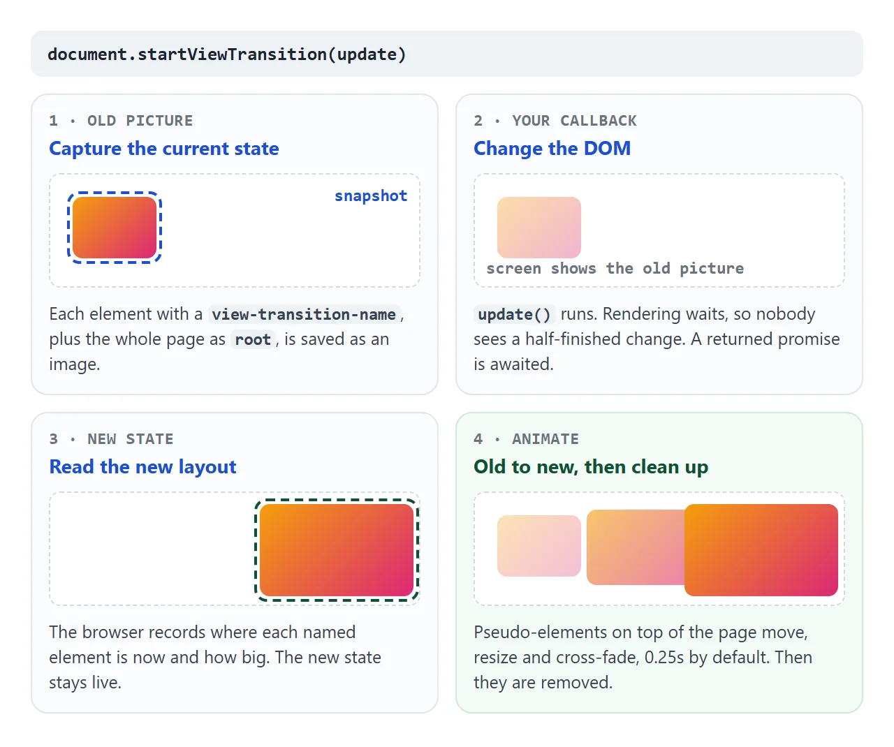
- Capture the old state. Every element with a
view-transition-nameis saved as a picture. The whole page is captured too, under the nameroot. - Run your update. Rendering waits while it runs, so nobody sees a half-finished change. If the function returns a promise, the browser waits for it.
- Read the new state. The browser notes where each named element is now and how big it is.
- Animate. Pseudo-elements laid over the page move, resize and cross-fade from old to new. The default takes 0.25 seconds. Then they are removed and the real page shows again.
The call returns a ViewTransition object with three promises: updateCallbackDone, ready (the animation is about to start) and finished. Its skipTransition() method jumps straight to the end.
view-transition-name decides what moves
Without names, only root is captured. The old page and the new page cross-fade in place, and nothing travels across the screen. Try the three modes below with Shuffle.
<!doctype html>
<html lang="en">
<head>
<meta charset="utf-8">
<meta name="viewport" content="width=device-width, initial-scale=1">
<title>View transition: with and without names</title>
<style>
  body { margin: 0; padding: 14px 16px; font-family: system-ui, sans-serif; background: #f4f5f7; color: #1d2330; }
  fieldset { border: 0; padding: 0; margin: 0 0 10px; display: flex; flex-wrap: wrap; gap: 6px 14px; font-size: 14px; }
  button { font: inherit; padding: 8px 14px; border: 0; border-radius: 8px; background: #1d4ed8; color: #fff; cursor: pointer; }
  ul { list-style: none; padding: 0; margin: 12px 0 0; display: grid; gap: 6px; }
  li { padding: 9px 12px; border-radius: 8px; color: #fff; font-weight: 600; }
  /* slow every group down a little so the difference is easy to see */
  ::view-transition-group(*) { animation-duration: .6s; }
</style>
</head>
<body>
<fieldset>
  <label><input type="radio" name="mode" value="none"> No transition</label>
  <label><input type="radio" name="mode" value="page"> startViewTransition only</label>
  <label><input type="radio" name="mode" value="named" checked> + view-transition-name</label>
</fieldset>
<button id="shuffle">Shuffle</button>
<ul id="list">
  <li data-id="1" style="background:#2563eb">1 · Blue</li>
  <li data-id="2" style="background:#16a34a">2 · Green</li>
  <li data-id="3" style="background:#d97706">3 · Amber</li>
  <li data-id="4" style="background:#db2777">4 · Pink</li>
  <li data-id="5" style="background:#7c3aed">5 · Violet</li>
</ul>

<script>
  const list = document.getElementById('list');
  const items = [...list.children];

  function shuffle() {
    const order = [...list.children];
    order.push(order.shift());   // move the first item to the end
    order.reverse();             // then flip the order
    list.append(...order);
  }

  document.getElementById('shuffle').addEventListener('click', () => {
    const mode = document.querySelector('input[name=mode]:checked').value;
    // each item needs its own, unique name to move by itself
    items.forEach((li) => {
      li.style.viewTransitionName = mode === 'named' ? 'item-' + li.dataset.id : 'none';
    });
    if (mode === 'none' || !document.startViewTransition) { shuffle(); return; }
    document.startViewTransition(shuffle);
  });
</script>
</body>
</html>
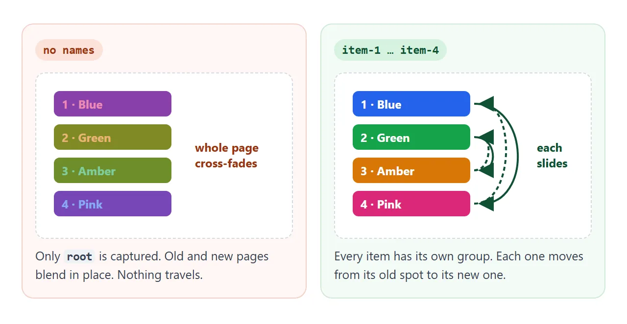
Each name must be unique among the elements on screen. If two visible elements share a name, the browser skips the whole transition with an InvalidStateError.
Your update still runs, so the page ends up correct, just without animation. In a list, build the name from an id:
li.style.viewTransitionName = 'item-' + li.dataset.id;
| Value | What it does |
|---|---|
none (default) |
Not captured on its own. It is part of the root picture. |
root |
Given to the <html> element by the browser. The page-wide cross-fade. |
Any other name, such as card |
Captured separately and animated as its own group. Must be unique on screen. |
Style it with ::view-transition-old and ::view-transition-new
During the animation, the browser builds a small tree of pseudo-elements for each name. You can select them in CSS like any other element.
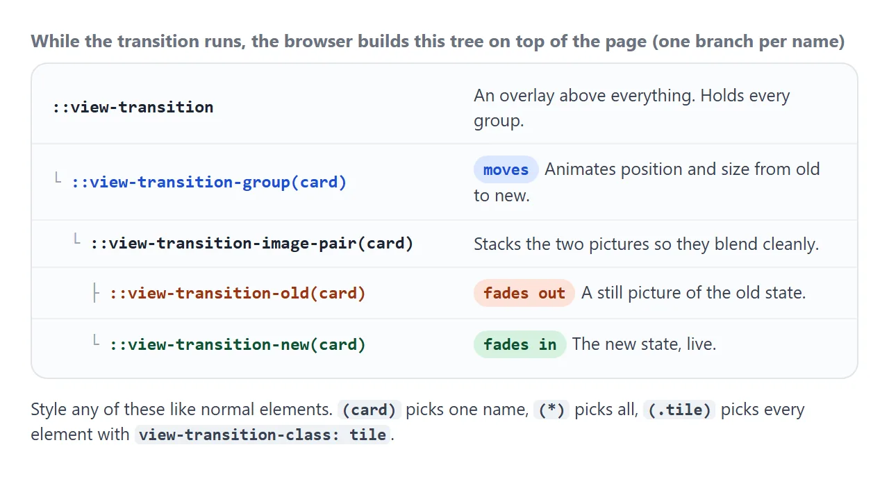
The group carries the move and the resize. Change its timing to slow every move down:
::view-transition-group(*) { animation-duration: .6s; }
The old and new parts carry the fade. Replace their animation to get a different effect, for example a slide:
@keyframes slide-out { to { transform: translateX(-40px); opacity: 0; } }
@keyframes slide-in { from { transform: translateX(40px); opacity: 0; } }

::view-transition-old(root) { animation: slide-out .3s ease-in both; }
::view-transition-new(root) { animation: slide-in .3s ease-out both; }
These are ordinary CSS animations, so the rules from CSS keyframes apply: name, duration, timing function and fill mode.
Style many elements at once with view-transition-class
A gallery might have 50 tiles, each with its own name. Writing 50 selectors is not practical. view-transition-class gives them a shared class for these pseudo-elements only:
.tile { view-transition-class: tile; }
::view-transition-group(.tile) { animation-duration: .4s; }
The names still have to be unique. The class is only for styling. It is newer than the rest of the API. Where it is not supported, a selector such as ::view-transition-group(.tile) is invalid, the rule is dropped and the default animation plays instead.
Elements that appear or disappear
When an element is hidden by the update, it only has an old picture. When it appears, it only has a new one. In both cases that picture is the only child of its image pair, and :only-child can target it:
::view-transition-new(.tile):only-child { animation: pop-in .3s ease-out both; }
::view-transition-old(.tile):only-child { animation: pop-out .2s ease-in both; }
An element with display: none is not captured at all. That is why hiding a tile works, and why a hidden element does not clash with a visible one that uses the same name.
A fallback when the browser does not support it
View transitions are a newer feature, so check current browser support for the browsers your readers use. Where the method is missing, document.startViewTransition is undefined and calling it throws. Test for it and run the update directly:
function withTransition(update) {
  if (!document.startViewTransition) { update(); return; }
  document.startViewTransition(update);
}
The page then changes instantly, which is exactly what it did before you added the animation. CSS rules for the pseudo-elements are simply never used there.
Reduced motion
Some people turn on reduce motion in their system settings because movement on screen makes them feel unwell. Respect it by keeping the change and dropping the movement:
@media (prefers-reduced-motion: reduce) {
  ::view-transition-group(*),
  ::view-transition-old(*),
  ::view-transition-new(*) { animation: none !important; }
}
With these rules there are no animations, and the transition finishes at once. If you prefer to handle it in the script, check matchMedia('(prefers-reduced-motion: reduce)').matches and call the update directly when it is true.
A finished example: a filtered gallery
This gallery puts everything together. Tiles that stay slide to their new spot, tiles that leave shrink away, and tiles that come back pop in. It has the fallback, and with reduced motion on, the grid changes without animation.
<!doctype html>
<html lang="en">
<head>
<meta charset="utf-8">
<meta name="viewport" content="width=device-width, initial-scale=1">
<title>View transition: filtered gallery</title>
<style>
  body { margin: 0; padding: 14px 16px; font-family: system-ui, sans-serif; background: #f4f5f7; color: #1d2330; }
  .filters { display: flex; gap: 6px; flex-wrap: wrap; }
  .filters button { font: inherit; padding: 7px 13px; border: 1px solid #cbd5e1; border-radius: 99px; background: #fff; color: #1d2330; cursor: pointer; }
  .filters button[aria-pressed="true"] { background: #1d2330; border-color: #1d2330; color: #fff; }
  .grid { display: grid; grid-template-columns: repeat(auto-fill, minmax(96px, 1fr)); gap: 8px; margin-top: 12px; }
  .tile { view-transition-class: tile; height: 84px; border-radius: 10px; display: flex; align-items: flex-end;
          padding: 6px 8px; color: #fff; font-size: 13px; font-weight: 600; box-sizing: border-box; }
  .tile[hidden] { display: none; }
  .note { font-size: 13px; color: #4b5563; margin: 10px 0 0; }
  .note .rm { display: none; }

  /* one rule styles every tile, whatever its name */
  ::view-transition-group(.tile) { animation-duration: .4s; }
  /* a tile that only exists after the change: it is appearing */
  ::view-transition-new(.tile):only-child { animation: pop-in .3s ease-out both; }
  /* a tile that only existed before the change: it is leaving */
  ::view-transition-old(.tile):only-child { animation: pop-out .2s ease-in both; }
  @keyframes pop-in  { from { opacity: 0; transform: scale(.6); } }
  @keyframes pop-out { to   { opacity: 0; transform: scale(.6); } }

  /* reduced motion: keep the change, drop the movement */
  @media (prefers-reduced-motion: reduce) {
    ::view-transition-group(*), ::view-transition-old(*), ::view-transition-new(*) { animation: none !important; }
    .note .rm { display: inline; }
  }
</style>
</head>
<body>
<div class="filters">
  <button data-f="all" aria-pressed="true">All</button>
  <button data-f="warm" aria-pressed="false">Warm</button>
  <button data-f="cool" aria-pressed="false">Cool</button>
</div>
<div class="grid" id="grid">
  <div class="tile" data-t="warm" style="background:linear-gradient(135deg,#f59e0b,#dc2626)">Ember</div>
  <div class="tile" data-t="cool" style="background:linear-gradient(135deg,#06b6d4,#2563eb)">Lagoon</div>
  <div class="tile" data-t="warm" style="background:linear-gradient(135deg,#fb7185,#e11d48)">Coral</div>
  <div class="tile" data-t="cool" style="background:linear-gradient(135deg,#34d399,#0d9488)">Mint</div>
  <div class="tile" data-t="warm" style="background:linear-gradient(135deg,#fbbf24,#ea580c)">Amber</div>
  <div class="tile" data-t="cool" style="background:linear-gradient(135deg,#a78bfa,#4f46e5)">Iris</div>
  <div class="tile" data-t="warm" style="background:linear-gradient(135deg,#f472b6,#be185d)">Rose</div>
  <div class="tile" data-t="cool" style="background:linear-gradient(135deg,#7dd3fc,#0369a1)">Glacier</div>
</div>
<p class="note">Pick a filter. Tiles that stay slide into place, the others shrink away or pop in.<span class="rm"> Reduce motion is on, so the grid changes without animation.</span></p>

<script>
  const tiles = [...document.querySelectorAll('.tile')];
  const buttons = [...document.querySelectorAll('.filters button')];

  // a unique name per tile; the shared class is set in the CSS
  tiles.forEach((t, i) => { t.style.viewTransitionName = 'tile-' + i; });

  function applyFilter(f) {
    tiles.forEach((t) => { t.hidden = f !== 'all' && t.dataset.t !== f; });
    buttons.forEach((b) => b.setAttribute('aria-pressed', b.dataset.f === f));
  }

  buttons.forEach((b) => b.addEventListener('click', () => {
    if (!document.startViewTransition) { applyFilter(b.dataset.f); return; }
    document.startViewTransition(() => applyFilter(b.dataset.f));
  }));
</script>
</body>
</html>
- Names: the script gives each tile
tile-0,tile-1and so on, once, at the start. - Class:
view-transition-class: tilein the CSS lets three rules style every tile. - Fast clicks: starting a new transition skips the one in progress. The page always ends on the last filter chosen.
The layout itself is a normal CSS grid, as in the HTML image gallery guide. The transition only animates between its states.
When it does not work
| What you see | Cause | Fix |
|---|---|---|
| The whole page fades, nothing moves | The element has no view-transition-name |
Give it a unique name |
| The change happens with no animation at all | Two visible elements share a name, so the transition was skipped | Make every name unique, such as item- plus an id |
startViewTransition is not a function |
The browser does not support the API | Check for the method and call the update directly |
::view-transition-group(.tile) has no effect |
view-transition-class is not set or not supported |
Set it on the elements, or style each name |
| Clicks during the animation do nothing | The pseudo-element overlay sits on top of the page until it ends | Keep durations short |
| An animation jumps to its end | A new transition started before it finished | Expected. The newest change wins |
Share it as a link
A view transition is hard to show in a screenshot, because it only exists while it moves. A screen recording loses the part where the other person clicks.
To send the working version, paste the page into a NOS document and choose Create share link. HTML to link walks through it.
The page renders as written and its scripts run, so the people you send it to can click the filters and watch the tiles move themselves.
If you change the code later, the same link shows the new version.