The HTML <hr> tag marks a thematic break: the place where a text moves to a new topic or scene. Browsers draw it as a thin grey line.
That line is a border on an empty box, so to style it you remove the border with border: 0 and draw your own.
Try it. The top line is the browser default. The sliders style the second one and print the CSS.
<!doctype html>
<html lang="en">
<head>
<meta charset="utf-8">
<meta name="viewport" content="width=device-width, initial-scale=1">
<title>hr styler</title>
<style>
body { margin: 0; padding: 16px; font-family: system-ui, sans-serif; background: #f4f5f7; color: #1d2330; }
.wrap { max-width: 640px; margin: 0 auto; }
.page { background: #fff; border-radius: 12px; padding: 14px 18px; box-shadow: 0 2px 10px rgba(0, 0, 0, .06); }
.page p { margin: 0; font-size: 14px; line-height: 1.5; }
.label { font-size: 12px; color: #6b7280; margin: 0 0 2px; }
/* the hr you are styling: the sliders write its inline style */
#line { border: 0; }
.controls { display: grid; grid-template-columns: repeat(auto-fit, minmax(170px, 1fr)); gap: 10px 16px; margin: 14px 0; }
.controls label { font-size: 13px; display: grid; gap: 4px; }
.controls input[type=range], .controls select { width: 100%; }
pre { margin: 0; padding: 12px 14px; border-radius: 10px; background: #111827; color: #e5e7eb; font: 13px/1.5 ui-monospace, Consolas, monospace; white-space: pre-wrap; }
</style>
</head>
<body>
<div class="wrap">
<div class="page">
<p class="label">Browser default <hr></p>
<hr>
<p class="label" style="margin-top: 14px;">Your <hr></p>
<p>First section ends here.</p>
<hr id="line">
<p>A new topic starts here.</p>
</div>
<div class="controls">
<label><span>Thickness: <b id="tOut"></b>px</span> <input id="t" type="range" min="1" max="12" value="2"></label>
<label><span>Colour</span> <input id="c" type="color" value="#4f46e5"></label>
<label><span>Style</span>
<select id="s"><option>solid</option><option>dashed</option><option>dotted</option><option>double</option></select>
</label>
<label><span>Width: <b id="wOut"></b>%</span> <input id="w" type="range" min="10" max="100" value="100"></label>
<label><span>Margin above and below: <b id="mOut"></b>px</span> <input id="m" type="range" min="0" max="48" value="20"></label>
</div>
<pre id="css"></pre>
</div>
<script>
const line = document.getElementById('line');
const $ = (id) => document.getElementById(id);
function update() {
const t = $('t').value, c = $('c').value, s = $('s').value, w = $('w').value, m = $('m').value;
$('tOut').textContent = t; $('wOut').textContent = w; $('mOut').textContent = m;
// start from zero, then draw one top border
line.style.border = '0';
line.style.borderTop = `${t}px ${s} ${c}`;
line.style.width = w + '%';
line.style.margin = `${m}px auto`; // auto keeps a narrow line centred
$('css').textContent =
`hr {
border: 0; /* remove the default inset border */
border-top: ${t}px ${s} ${c};
width: ${w}%;
margin: ${m}px auto;
}`;
}
document.querySelectorAll('.controls input, .controls select')
.forEach((el) => el.addEventListener('input', update));
update();
</script>
</body>
</html>
What hr means (not just a line)
The HTML standard calls <hr> a paragraph-level thematic break. Typical places are a change of scene in a story, a new topic in a long answer, or the end of one part of a receipt.
It is a void element, written as <hr> with no closing tag. Because it carries meaning, screen readers can announce it as a separator.
A line that is only decoration is better drawn with CSS, such as a border on a heading. Semantic HTML covers the same idea for other elements.
| Situation | Use |
|---|---|
| The text changes topic within a section | <hr> |
| Space between two blocks | margin or gap |
| A line under a heading, for looks | border-bottom on the heading |
| A line between items in a row | border-left on the items |
| A new section with its own heading | <section> with a heading |
How browsers draw the default line
The rendering section of the HTML standard gives hr a small set of styles.
The box has no height. It has a 1px inset border on all four sides, the text colour is grey, and the margin is 0.5em above and below with auto on the sides.
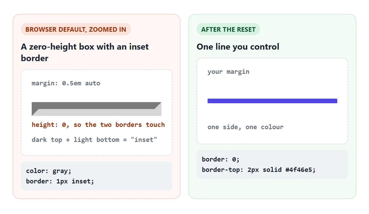
The two borders touching make the 2px line you see. Because the style is inset, the browser shades the top and bottom edges in different tones. That is why a plain <hr> looks slightly engraved.
Colour and thickness
Start every custom rule with border: 0. Then draw one side:
hr {
  border: 0;
  border-top: 2px solid #4f46e5;
}
The border width is the thickness, and the colour sits in the same line. dashed, dotted and double work here too; double needs 3px or more to show two lines. The CSS border guide covers the three parts of the shorthand.
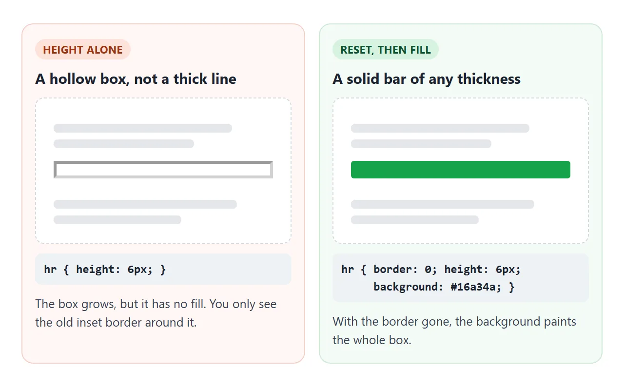
For a thick bar, paint the box instead:
hr {
  border: 0;
  height: 6px;
  background: #4f46e5;
  border-radius: 3px;
}
Gradient lines and centred dots
Once the border is gone, hr is an empty block you can paint. A 1px height with a linear-gradient fades the line out at both ends. More gradient patterns are in the CSS gradient background guide.
hr is not a replaced element, so ::after can put text inside it. Three centred bullets are a classic scene break in fiction.
<!doctype html>
<html lang="en">
<head>
<meta charset="utf-8">
<meta name="viewport" content="width=device-width, initial-scale=1">
<title>Divider gallery</title>
<style>
  body { margin: 0; padding: 16px; font-family: system-ui, sans-serif; background: #f4f5f7; color: #1d2330; }
  .grid { display: grid; grid-template-columns: repeat(auto-fit, minmax(260px, 1fr)); gap: 12px; max-width: 680px; margin: 0 auto; }
  .card { background: #fff; border-radius: 12px; padding: 12px 16px 14px; box-shadow: 0 2px 10px rgba(0, 0, 0, .06); }
  .card h3 { margin: 0 0 4px; font-size: 14px; }
  .card code { font: 12px ui-monospace, Consolas, monospace; color: #6b7280; }

  /* every hr below starts from the same reset */
  hr { border: 0; margin: 18px 0 10px; }

  .thin     { border-top: 1px solid #d1d5db; }
  .thick    { height: 6px; background: #4f46e5; border-radius: 3px; }
  .dashed   { border-top: 2px dashed #9ca3af; }
  .fade     { height: 1px; background: linear-gradient(to right, transparent, #4f46e5, transparent); }
  .dots     { text-align: center; }
  .dots::after { content: "\2022  \2022  \2022"; color: #9ca3af; letter-spacing: 6px; }

  /* not an hr: a flex row with a line on each side of the word */
  .or { display: flex; align-items: center; gap: 10px; margin: 18px 0 10px; color: #6b7280; font-size: 13px; }
  .or::before, .or::after { content: ""; flex: 1; height: 1px; background: #d1d5db; }
</style>
</head>
<body>
<div class="grid">
  <div class="card"><h3>Thin</h3><code>border-top: 1px solid</code><hr class="thin"></div>
  <div class="card"><h3>Thick bar</h3><code>height + background</code><hr class="thick"></div>
  <div class="card"><h3>Dashed</h3><code>border-top: 2px dashed</code><hr class="dashed"></div>
  <div class="card"><h3>Gradient fade</h3><code>background: linear-gradient()</code><hr class="fade"></div>
  <div class="card"><h3>Centred dots</h3><code>hr::after { content }</code><hr class="dots"></div>
  <div class="card"><h3>"OR" divider</h3><code>flex + ::before / ::after</code><div class="or">OR</div></div>
</div>
</body>
</html>
The "OR" divider is not an hr
A line on each side of a word, as between two sign-in buttons, is a label with decoration. Build it on a div with flexbox:
.or { display: flex; align-items: center; gap: 10px; }
.or::before, .or::after {
  content: "";
  flex: 1;
  height: 1px;
  background: #d1d5db;
}
flex: 1 lets each pseudo-element take half of the space left beside the word. Screen readers read only the word. The flexbox guide explains flex: 1 and gap.
Width, alignment and margins
A percentage width works, and the default auto side margins centre the line. To align a short line to the left, set margin-left: 0.
Watch the shorthand: margin: 2rem 0 sets the sides to 0, so a narrower line moves to the left. Write margin: 2rem auto to keep it centred.
The vertical margins of hr collapse with the margins of the paragraphs around it. The gap you see is the larger margin, not the sum. If the space looks unchanged after you edit hr, check the paragraph margins.
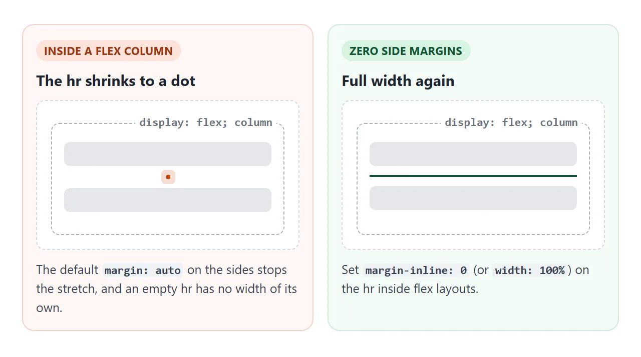
The auto side margins also cause a surprise in flex layouts. In a flex column, auto margins win over stretching, and an empty hr has no width of its own, so it shrinks to a dot.
A finished example: a receipt page
This order summary uses <hr> between its parts, a dashed hr before the total, and vertical lines in the stats row. The button switches one CSS variable that every hr margin reads.
<!doctype html>
<html lang="en">
<head>
<meta charset="utf-8">
<meta name="viewport" content="width=device-width, initial-scale=1">
<title>Order summary</title>
<style>
  body { margin: 0; padding: 16px; font-family: system-ui, sans-serif; background: #eceef1; color: #1d2330; }
  .doc { --gap: 22px; max-width: 520px; margin: 0 auto; background: #fff; border-radius: 14px; padding: 20px 22px; box-shadow: 0 4px 18px rgba(0, 0, 0, .08); }
  .doc.compact { --gap: 10px; }
  h1 { margin: 0 0 4px; font-size: 20px; }
  h2 { margin: 0 0 8px; font-size: 14px; text-transform: uppercase; letter-spacing: .06em; color: #6b7280; }
  p { margin: 0; font-size: 14px; line-height: 1.5; }
  .muted { color: #6b7280; font-size: 13px; }

  /* one rule for every section break */
  hr { border: 0; border-top: 1px solid #e5e7eb; margin: var(--gap) 0; }
  hr.strong { border-top: 2px dashed #9ca3af; }

  /* stats row: the vertical lines are borders on the items, not hr */
  .stats { display: flex; }
  .stats > div { flex: 1; text-align: center; padding: 2px 6px; }
  .stats > div + div { border-left: 1px solid #e5e7eb; }
  .stats b { display: block; font-size: 20px; }
  .stats span { font-size: 12px; color: #6b7280; }

  .row { display: flex; justify-content: space-between; font-size: 14px; padding: 3px 0; }
  .total { font-weight: 700; font-size: 16px; }
  button { font: inherit; font-size: 13px; padding: 6px 12px; border-radius: 8px; border: 1px solid #d1d5db; background: #fff; cursor: pointer; }
  .bar { display: flex; justify-content: flex-end; max-width: 520px; margin: 0 auto 10px; }
</style>
</head>
<body>
<div class="bar"><button id="toggle" type="button">Compact spacing</button></div>

<article class="doc" id="doc">
  <h1>Order #4821</h1>
  <p class="muted">Placed 26 September · Paid by card</p>

  <hr>

  <div class="stats">
    <div><b>3</b><span>items</span></div>
    <div><b>2</b><span>parcels</span></div>
    <div><b>Fri</b><span>delivery</span></div>
  </div>

  <hr>

  <section>
    <h2>Items</h2>
    <div class="row"><span>Linen notebook ×2</span><span>$24.00</span></div>
    <div class="row"><span>Brass pen</span><span>$18.50</span></div>
    <div class="row"><span>Shipping</span><span>$4.00</span></div>
  </section>

  <hr class="strong">

  <div class="row total"><span>Total</span><span>$46.50</span></div>

  <hr>

  <section>
    <h2>Returns</h2>
    <p>Unused items can be returned within 30 days. Keep this page as your receipt.</p>
  </section>
</article>

<script>
  const doc = document.getElementById('doc');
  const btn = document.getElementById('toggle');
  // one class changes --gap, and every hr margin follows
  btn.addEventListener('click', () => {
    const on = doc.classList.toggle('compact');
    btn.textContent = on ? 'Roomy spacing' : 'Compact spacing';
  });
</script>
</body>
</html>
The vertical lines come from one rule, .stats > div + div { border-left: 1px solid #e5e7eb; }. It puts a line before every item except the first, and the lines grow with the row.
When it does not work
| What you see | Cause | Fix |
|---|---|---|
color: red gives a dull two-tone line, or no change |
The line is an inset border; any border colour you set wins |
border: 0; border-top: 1px solid red; |
height: 6px gives a hollow box |
The default border is still there and the box has no background | border: 0 plus a background |
After border: 0, background shows nothing |
height is still 0 |
Add a height |
width: 50% line sits in the middle |
The default side margins are auto |
margin-left: 0 for a left-aligned line |
margin: 20px 0 moves a short line left |
The shorthand replaced the auto side margins |
margin: 20px auto |
| The hr is a tiny dot inside a flex container | Auto side margins stop the stretch, and an empty hr has no width | margin-inline: 0 or width: 100% |
| Several hr elements stacked to make space | hr is being used as a spacer | Use margin or gap and remove the extra hr |
Share it as a link
Dividers are small, and the difference between a 1px grey line and a fading gradient is hard to judge from a description. A shared page shows the real thing, sliders included.
To send the working version, paste the page into a NOS document and choose Create share link. HTML to link walks through it.
The page renders as written and its scripts run, so people can move the sliders themselves. If you change the code later, the same link shows the new version.