To build an HTML sticky table header, put position: sticky and top: 0 on the <th> cells.
thead th {
  position: sticky;
  top: 0;
  z-index: 2;
  background: #16181d;
}
Not on <thead>, and not on the <tr>. Table section and row elements do not take positioning in most engines, so the rule is accepted, ignored, and reports nothing.
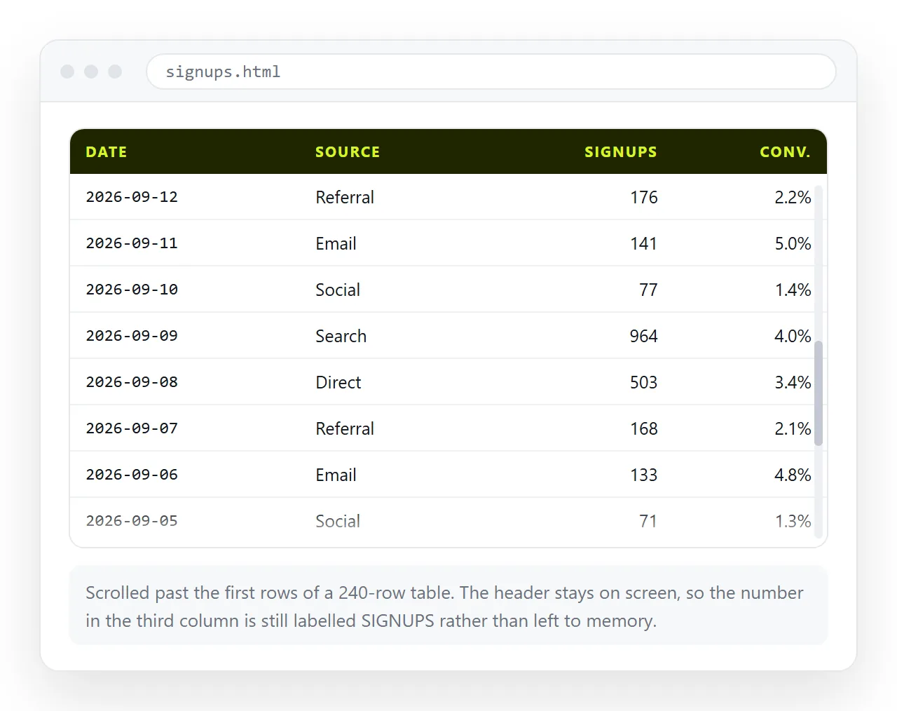
Why an HTML sticky table header on thead does nothing
display: table-header-group and display: table-row are not positioned boxes. The specification allows positioning on table cells, and that is the level browsers implement consistently.
The practical rule: sticky lives on th and td, never on the elements that contain them.
If your header spans two rows, put the rule on every th in both, and give the second row a top equal to the first row's height.
thead tr:first-child th { top: 0; }
thead tr:nth-child(2) th { top: 2.25rem; }
The disappearing borders
This is the second surprise. With border-collapse: collapse, borders belong to the table, not to the cells, so the header's bottom border stays behind while the cell travels.
Two fixes, and the second is usually cleaner.
table { border-collapse: separate; border-spacing: 0; }
thead th { border-bottom: 1px solid #2c2f36; }
table { border-collapse: collapse; }
thead th { box-shadow: inset 0 -1px 0 #2c2f36; }
The shadow version keeps collapsed borders everywhere else in the table, which matters if the body cells already have a grid of lines you do not want to redraw.
The background is not optional either. A transparent header lets the data rows scroll visibly through the column names.
Page scroll or container scroll
| Page scrolls | Wrapper div scrolls | |
|---|---|---|
| Sticks to | Top of the window | Top of the wrapper |
| Needs a height | No | Yes, max-height |
| Works with a page header | Needs top offset |
Yes, independently |
| Horizontal scrolling for wide tables | Whole page moves | Only the table moves |
| Better on a phone | No | Yes |
The wrapper version:
.table-wrap { max-height: 70vh; overflow: auto; }
It is the better default for a report page. The surrounding text stays where the reader left it, and a wide table scrolls sideways on its own instead of dragging the whole layout.
Give the wrapper a tabindex of zero so the scroll region can be reached and moved with the keyboard. A scrolling box that only responds to a mouse wheel hides rows from anyone not using one.
<div class="table-wrap" tabindex="0" role="region" aria-label="Regional revenue">
The role and label together mean a screen reader announces what the scrollable area contains before the reader enters it.
Watch the interaction with a page level sticky header. If the page has one and the table scrolls with the page, the table header needs top set to the page header height, not zero.
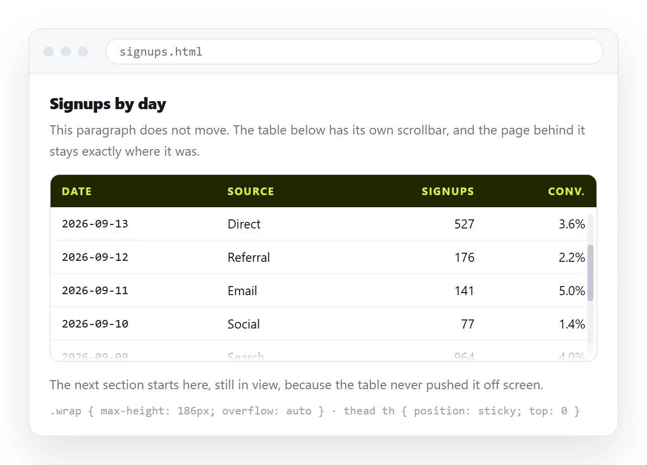
Sticking the first column as well
tbody th, tbody td:first-child {
  position: sticky;
  left: 0;
  z-index: 1;
  background: #16181d;
}
thead th:first-child {
  z-index: 3;
}
The z-index ladder is what makes this work. The corner cell belongs to both the sticky row and the sticky column, so it needs the highest value or it is painted over as the table scrolls diagonally.
Use <th scope="row"> for the first column rather than <td>. It sticks the same way and it makes each row announce its own label, which is the whole point of a frozen first column.
Column widths that stop moving
A sticky header makes an old table problem visible. With table-layout: auto the browser sizes columns from the content, so a long value in row 400 widens a column and the header no longer lines up with it.
table { table-layout: fixed; width: 100%; }
th:nth-child(1) { width: 12rem; }
th:nth-child(2) { width: 6rem; }
With fixed layout the widths come from the first row only, which is the header, so the header is by definition in charge.
The cost is that long values no longer expand their column. Decide what happens to them:
td { overflow: hidden; text-overflow: ellipsis; white-space: nowrap; }
Truncating is right for identifiers and paths. It is wrong for anything the reader has to read, so wrap those instead and let the row get taller.
Right align numeric columns and use tabular figures, so digits line up down the column:
td.num { text-align: right; font-variant-numeric: tabular-nums; }
Row headers and scope
While you are here, two attributes make a large table usable with a screen reader.
<th scope="col">Region</th>
<th scope="row">North</th>
scope tells assistive technology which cells a header governs, so a value read out in the middle of the table is announced with its column and row names. A sticky header solves this visually for sighted readers; scope solves it for everyone else.
Add a <caption> as the first child of the table. It is the table's accessible name and it prints.
Printing a long table
Sticky does nothing in print. Use the table specific rules instead:
@media print {
  thead { display: table-header-group; }
  tr { break-inside: avoid; }
  .table-wrap { max-height: none; overflow: visible; }
}
display: table-header-group repeats the header on every printed page, which is the print equivalent of sticking it. Resetting the wrapper is what stops only the visible rows printing. More in print stylesheets.
Checking it
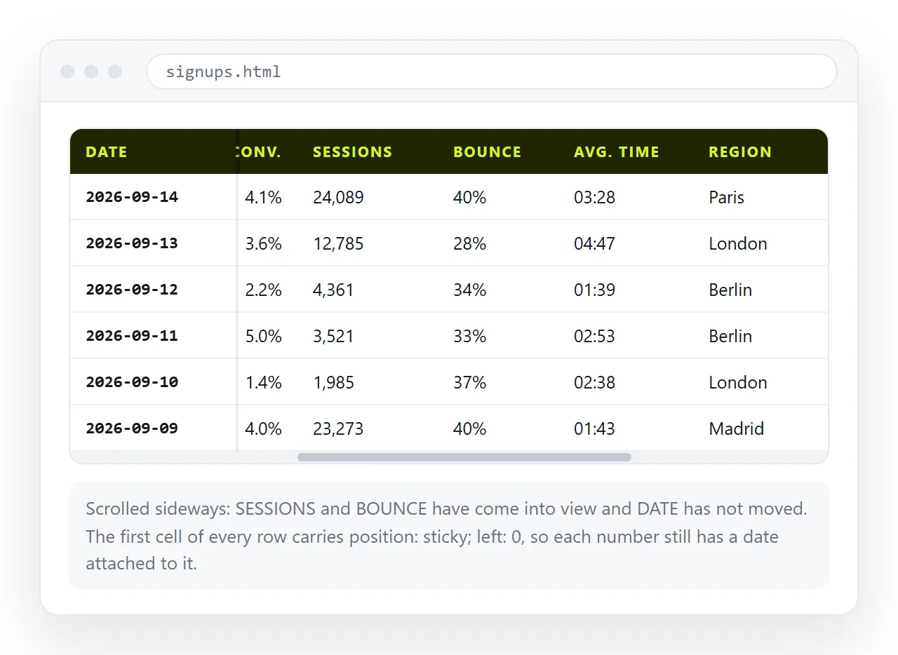
Open the file in the HTML file opener and scroll to the last row. The header should still be there with its border intact.
Then narrow the window until the table is wider than the screen and scroll sideways. Then open the print preview and confirm the header repeats.
When it holds up, paste the HTML into a NOS document. The table renders with the sticky rules intact at the document's own address, so the reader clicks a link and gets the working table rather than a spreadsheet export.
If the reader should be changing the numbers rather than only reading them, editable tables covers that, and turning a table into a link covers getting it out of a spreadsheet in the first place.