In CSS, bottom sets how far an element's bottom edge sits from the bottom edge of its containing block. It only works on a positioned element.
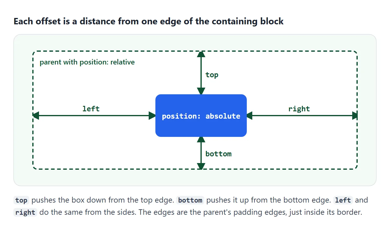
On an absolute element, the containing block is the nearest ancestor with a position other than static. top, left and right do the same from the other three edges.
Try the four offsets together. Pick values in the menus and watch the box move inside the dashed parent.
<!doctype html>
<html lang="en">
<head>
<meta charset="utf-8">
<meta name="viewport" content="width=device-width, initial-scale=1">
<title>top, right, bottom, left</title>
<style>
  body { margin: 0; padding: 14px; font-family: system-ui, sans-serif; background: #f4f5f7; color: #1d2330; }
  .controls { display: grid; grid-template-columns: repeat(4, 1fr); gap: 8px; margin-bottom: 10px; }
  label { font-size: 13px; font-weight: 600; }
  select { display: block; width: 100%; margin-top: 3px; padding: 4px; font-size: 14px; }
  .parent {
    position: relative;  /* the box the offsets are measured from */
    height: 220px; background: #fff; border: 2px dashed #9aa3b2; border-radius: 10px;
  }
  .parent > p { margin: 10px; font-size: 13px; color: #6b7280; }
  .box {
    position: absolute;
    min-width: 60px; min-height: 36px; padding: 6px 10px; box-sizing: border-box;
    background: #2563eb; color: #fff; border-radius: 8px; font-weight: 700;
  }
  pre { margin: 10px 0 0; padding: 8px 10px; background: #1d2330; color: #e5e7eb; border-radius: 8px; font-size: 13px; white-space: pre-wrap; }
</style>
</head>
<body>
<div class="controls">
  <label>top <select data-side="top"></select></label>
  <label>right <select data-side="right"></select></label>
  <label>bottom <select data-side="bottom"></select></label>
  <label>left <select data-side="left"></select></label>
</div>
<div class="parent">
  <p>position: relative parent</p>
  <div class="box" id="box">box</div>
</div>
<pre id="code"></pre>

<script>
  const box = document.getElementById('box');
  const code = document.getElementById('code');
  const values = ['auto', '0', '20px', '10%', '50%'];
  const start = { top: 'auto', right: '0', bottom: '0', left: 'auto' };  // pinned bottom-right

  document.querySelectorAll('select').forEach((sel) => {
    values.forEach((v) => sel.add(new Option(v, v)));
    sel.value = start[sel.dataset.side];
    sel.addEventListener('change', show);
  });

  function show() {
    const lines = ['.box {', '  position: absolute;'];
    document.querySelectorAll('select').forEach((sel) => {
      box.style[sel.dataset.side] = sel.value;  // set the offset on the box
      lines.push('  ' + sel.dataset.side + ': ' + sel.value + ';');
    });
    code.textContent = lines.join('\n') + '\n}';
  }
  show();
</script>
</body>
</html>
Setting top and bottom both, or left and right both, makes the box stretch. Setting 50% on one side moves the box's edge, not its middle, to the halfway line.
This page is about the offset properties themselves. For the five position values and how to choose between them, see CSS position.
What bottom, top, left and right measure
Each offset is a distance between one edge of the element and the same edge of its containing block. The distance goes inward: bottom: 20px lifts the box 20px off the bottom edge.
- Give the parent
position: relative. It now becomes the containing block. - Give the child
position: absolute. - Set
bottom: 0to pin it to the bottom,right: 0for the right side. - Set two opposite offsets to stretch it, or
inset: 0for all four.
The edges are the parent's padding edges, just inside its border. A parent with padding: 20px does not push an absolute child in. bottom: 0 still reaches past the padding to the border.
Negative values push the element outward. top: -8px with right: -8px hangs a badge over the corner of a card.
The inset shorthand
inset sets all four offsets in one line. It takes one to four values, in the same order as margin and padding: top, right, bottom, left.
| You write | top | right | bottom | left |
|---|---|---|---|---|
inset: 0 |
0 | 0 | 0 | 0 |
inset: 10px 20px |
10px | 20px | 10px | 20px |
inset: 10px 20px 30px |
10px | 20px | 30px | 20px |
inset: auto 0 0 |
auto | 0 | 0 | 0 |
With three values, the missing left copies right. Click through the common patterns here:
<!doctype html>
<html lang="en">
<head>
<meta charset="utf-8">
<meta name="viewport" content="width=device-width, initial-scale=1">
<title>The inset shorthand</title>
<style>
  body { margin: 0; padding: 14px; font-family: system-ui, sans-serif; background: #f4f5f7; color: #1d2330; }
  .buttons { display: flex; flex-wrap: wrap; gap: 6px; margin-bottom: 10px; }
  button { font: 600 13px ui-monospace, Consolas, monospace; padding: 6px 9px; border: 1px solid #c9ced8; border-radius: 7px; background: #fff; color: #1d2330; cursor: pointer; }
  button.on { background: #1d2330; color: #fff; border-color: #1d2330; }
  .photo {
    position: relative; height: 220px; border-radius: 10px; overflow: hidden;
    background: linear-gradient(135deg, #7dd3fc, #a78bfa 60%, #f472b6);
  }
  .layer {
    position: absolute; inset: 0;
    box-sizing: border-box; padding: 4px; background: rgba(17, 24, 39, .6); color: #fff; border-radius: 6px;
    display: grid; place-items: center; font: 600 13px ui-monospace, Consolas, monospace; text-align: center;
  }
  p.note { margin: 10px 0 0; font-size: 14px; line-height: 1.45; }
</style>
</head>
<body>
<div class="buttons" id="buttons"></div>
<div class="photo"><div class="layer" id="layer"></div></div>
<p class="note" id="note"></p>

<script>
  const layer = document.getElementById('layer');
  const note = document.getElementById('note');
  // label, styles to set on the layer, explanation
  const examples = [
    ['inset: 0', { inset: '0' }, 'All four sides at 0: the layer covers the whole photo.'],
    ['inset: 20px', { inset: '20px' }, 'One value sets all four sides.'],
    ['inset: 20px 60px', { inset: '20px 60px' }, 'Two values: top and bottom first, then right and left.'],
    ['inset: auto 0 0', { inset: 'auto 0 0', height: '44px' }, 'Top auto, bottom and sides 0, fixed height: a caption strip on the bottom edge.'],
    ['+ width, height', { inset: '0', width: '60%', height: '50%' }, 'inset: 0 plus a size: the box keeps its size, and top and left win.'],
    ['+ margin: auto', { inset: '0', width: '60%', height: '50%', margin: 'auto' }, 'Add margin: auto and the sized box is centered.'],
  ];

  examples.forEach(([label, styles, text], i) => {
    const b = document.createElement('button');
    b.textContent = label;
    b.addEventListener('click', () => {
      layer.removeAttribute('style');     // start again from the stylesheet
      Object.assign(layer.style, styles);
      layer.textContent = Object.entries(styles).map(([k, v]) => k + ': ' + v).join('; ');
      note.textContent = text;
      document.querySelectorAll('button').forEach((x) => x.classList.toggle('on', x === b));
    });
    document.getElementById('buttons').append(b);
    if (i === 0) b.click();
  });
</script>
</body>
</html>
inset: 0 covers the parent completely, which is what an overlay, a clickable card link or a loading screen needs. For offsets that follow writing direction, CSS logical properties has inset-block and inset-inline.
Stretching: two offsets and no size
When both top and bottom are set on an absolute element and height is auto, the browser works out the height from the gap between them. The same goes for left, right and width.
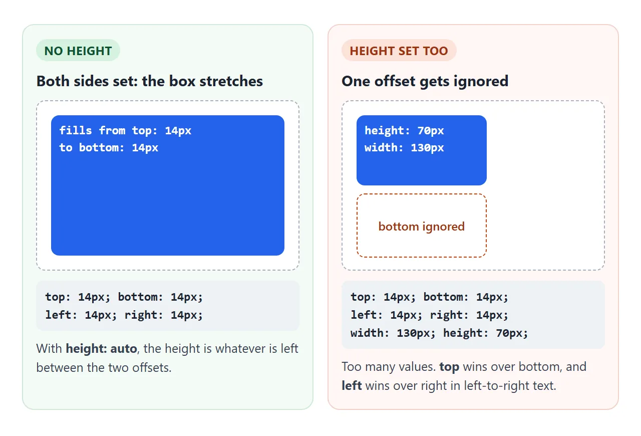
If you also set a height, the three values cannot all be true. The browser then ignores bottom. For width, it ignores right in left-to-right text and left in right-to-left text.
Adding margin: auto changes that outcome. The leftover space goes to the margins instead, and a sized box sits in the middle:
.center {
  position: absolute;
  inset: 0;
  margin: auto;
  width: 200px;
  height: 120px;
}
Center a div compares this with flexbox and grid centering.
Percentages and auto
A percentage offset is a share of the containing block, not of the element. top and bottom use the parent's height. left and right use its width.
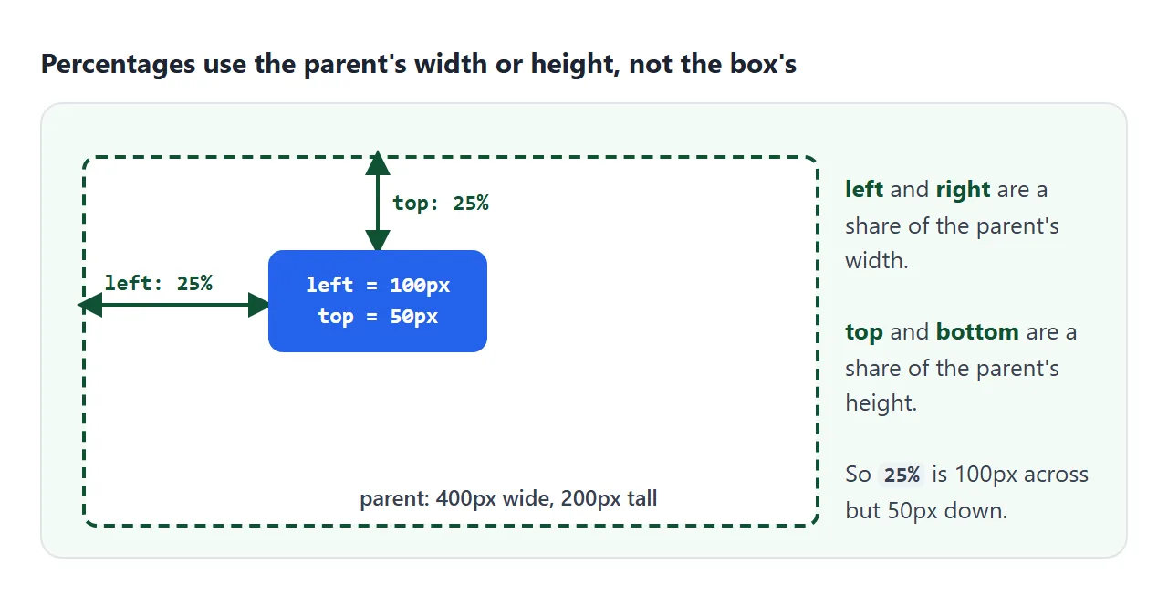
That is why top: 50% puts the element's top edge on the midline and the element hangs below it. To center it on the line, pull it back by half its own size, since a translate percentage uses the element's own size:
.mid { position: absolute; top: 50%; transform: translateY(-50%); }
auto is the starting value of every offset. When all four are auto, an absolute element stays near where it would have been in the normal flow. It just no longer takes up space. That spot is called its static position.
bottom on relative, fixed and sticky elements
The offsets mean something slightly different for each position value.
| position | What bottom: 20px does |
|---|---|
static |
Nothing |
relative |
Moves the element up 20px from its normal spot; the gap it left stays |
absolute |
Puts its bottom edge 20px above the bottom of the positioned ancestor |
fixed |
Puts it 20px above the bottom of the viewport, and it stays there on scroll |
sticky |
Keeps it at least 20px above the bottom of the scroll area while its parent is in view |
On a relative element, top wins if you set both top and bottom. A page footer that sits at the bottom of the window when content is short is a layout job, covered in CSS sticky footer.
A finished example: footers pinned to the bottom of cards
Cards in a row often have different amounts of text, yet the buttons should line up. Grid stretches each card to the tallest one. An absolute footer with bottom then follows each card's bottom edge.
<!doctype html>
<html lang="en">
<head>
<meta charset="utf-8">
<meta name="viewport" content="width=device-width, initial-scale=1">
<title>Cards with a footer pinned to the bottom</title>
<style>
  body { margin: 0; padding: 14px; font-family: system-ui, sans-serif; background: #f4f5f7; color: #1d2330; }
  .grid { display: grid; grid-template-columns: repeat(auto-fit, minmax(170px, 1fr)); gap: 12px; }
  .card {
    position: relative;          /* offsets inside the card are measured from here */
    padding: 16px 16px 64px;     /* room at the bottom so text never runs under the footer */
    background: #fff; border-radius: 12px; box-shadow: 0 4px 14px rgba(0, 0, 0, .08);
  }
  .card h3 { margin: 0 0 6px; font-size: 16px; }
  .card p { margin: 0; font-size: 14px; line-height: 1.45; color: #4b5563; }
  .badge {
    position: absolute; top: 10px; right: 10px;   /* corner badge */
    padding: 2px 8px; border-radius: 99px; background: #dcfce7; color: #166534; font-size: 12px; font-weight: 700;
  }
  .footer {
    position: absolute; left: 16px; right: 16px; bottom: 14px;  /* left + right = full width */
    display: flex; justify-content: space-between; align-items: center;
  }
  .time { font-weight: 800; }
  .footer button { padding: 7px 12px; border: 0; border-radius: 8px; background: #2563eb; color: #fff; font-weight: 600; cursor: pointer; }
  .more { margin-top: 12px; padding: 7px 12px; border-radius: 8px; border: 1px solid #c9ced8; background: #fff; color: #1d2330; cursor: pointer; }
</style>
</head>
<body>
<div class="grid">
  <div class="card"><span class="badge">New</span><h3>Pancakes</h3><p>Flour, milk, eggs.</p>
    <div class="footer"><span class="time">15 min</span><button>Open</button></div></div>
  <div class="card"><h3>Tomato soup</h3><p id="long">Roast the tomatoes first for a deeper taste.</p>
    <div class="footer"><span class="time">40 min</span><button>Open</button></div></div>
  <div class="card"><h3>Lemon cake</h3><p>A loaf cake with a sharp lemon glaze on top.</p>
    <div class="footer"><span class="time">70 min</span><button>Open</button></div></div>
</div>
<button class="more" id="more">Add text to the soup card</button>

<script>
  // grid rows stretch every card to the tallest one, and each footer follows its card's bottom edge
  document.getElementById('more').addEventListener('click', () => {
    document.getElementById('long').textContent += ' More text, and the footers still line up.';
  });
</script>
</body>
</html>
.card   { position: relative; padding-bottom: 64px; }
.footer { position: absolute; left: 16px; right: 16px; bottom: 14px; }
- Room for the footer: an absolute footer takes no space. The card's
padding-bottomkeeps the text out from under it. - Full width:
leftandrighttogether stretch the footer, and flexbox inside it spreads the time and the button. - Corner badge: the "New" label uses
topandrightin the same card.
If the footer height changes with its content, a flex column on the card with margin-top: auto on the footer avoids the fixed padding. HTML card layout builds that version.
When it does not work
| What you see | Cause | Fix |
|---|---|---|
bottom does nothing |
The element is position: static |
Set absolute, relative, fixed or sticky |
bottom: 0 lands at the bottom of the first screen and scrolls away |
No positioned ancestor | Give the parent position: relative |
bottom: 0 pins to the wrong box |
A different ancestor is positioned | Move position: relative to the box you mean |
top and bottom set, but it does not stretch |
A height is also set |
Remove the height, or use margin: auto to center it |
| The footer covers the last line of text | Absolute elements take no space | Add padding-bottom to the parent |
top: 50% puts it too low |
The top edge goes to the midline | Add transform: translateY(-50%) |
inset seems to do nothing |
The element is position: static |
Add a position value |
Share it as a link
Offsets are easier to feel than to read. A screenshot shows one set of values, but the person you send it to cannot change a menu or add text to a card.
To send the live version, paste the page into a NOS document and choose Create share link. HTML to link walks through it.
The page renders as written and its scripts run, so people can try the offsets themselves. If you change the code later, the same link shows the new version.