To change the colour of the text cursor, set caret-color on the field. That is the blinking line in an input, textarea or contenteditable element that shows where typed text will appear.
input, textarea, [contenteditable] { caret-color: #e11d48; }
Try it. Click into a field, then pick a colour below it.
<!doctype html>
<html lang="en">
<head>
<meta charset="utf-8">
<meta name="viewport" content="width=device-width, initial-scale=1">
<title>caret-color</title>
<style>
  body { margin: 0; padding: 18px; font-family: system-ui, sans-serif; background: #f4f5f7; color: #1d2330; }
  .fields {
    caret-color: #e11d48;  /* inherited: every field inside gets this caret */
    display: grid; gap: 10px; max-width: 460px;
  }
  input, textarea, .editable {
    font: 16px/1.4 system-ui, sans-serif; padding: 9px 11px;
    border: 1px solid #cfd4dc; border-radius: 8px; background: #fff; color: #1d2330;
  }
  textarea { height: 52px; resize: none; }
  .editable { min-height: 22px; }
  .swatches { display: flex; flex-wrap: wrap; gap: 8px; margin: 14px 0 8px; }
  .swatches button {
    width: 34px; height: 34px; border-radius: 50%; border: 3px solid #fff;
    box-shadow: 0 0 0 1px #cfd4dc; cursor: pointer;
  }
  .swatches button[aria-pressed="true"] { box-shadow: 0 0 0 2px #1d2330; }
  code { font: 14px ui-monospace, Consolas, monospace; background: #e8ebf0; padding: 2px 6px; border-radius: 4px; }
</style>
</head>
<body>
<div class="fields" id="fields">
  <input type="text" value="Click here and type" aria-label="Text input">
  <textarea aria-label="Textarea">A textarea gets the same caret.</textarea>
  <div class="editable" contenteditable="true">So does a contenteditable div.</div>
</div>

<div class="swatches" id="swatches">
  <button style="background:#e11d48" data-c="#e11d48" aria-label="Red" aria-pressed="true"></button>
  <button style="background:#2563eb" data-c="#2563eb" aria-label="Blue" aria-pressed="false"></button>
  <button style="background:#16a34a" data-c="#16a34a" aria-label="Green" aria-pressed="false"></button>
  <button style="background:#f59e0b" data-c="#f59e0b" aria-label="Amber" aria-pressed="false"></button>
</div>
<code id="out">caret-color: #e11d48;</code>

<script>
  const fields = document.getElementById('fields');
  const out = document.getElementById('out');
  let last = fields.querySelector('input');

  // remember which field had the caret, so a swatch click can put it back
  fields.addEventListener('focusin', (e) => { last = e.target; });

  document.getElementById('swatches').addEventListener('click', (e) => {
    const btn = e.target.closest('button');
    if (!btn) return;
    fields.style.caretColor = btn.dataset.c;  // one rule on the wrapper
    out.textContent = 'caret-color: ' + btn.dataset.c + ';';
    document.querySelectorAll('#swatches button').forEach((b) => b.setAttribute('aria-pressed', b === btn));
    last.focus();
  });
</script>
</body>
</html>
The demo sets caret-color once, on the <div> around the fields. The property is inherited, so all three fields pick it up without their own rule.
What caret-color changes, and what it does not
"Cursor" means two different things on a page, and CSS has a separate property for each. The text caret is where typing goes. The mouse pointer is the arrow that follows your hand.
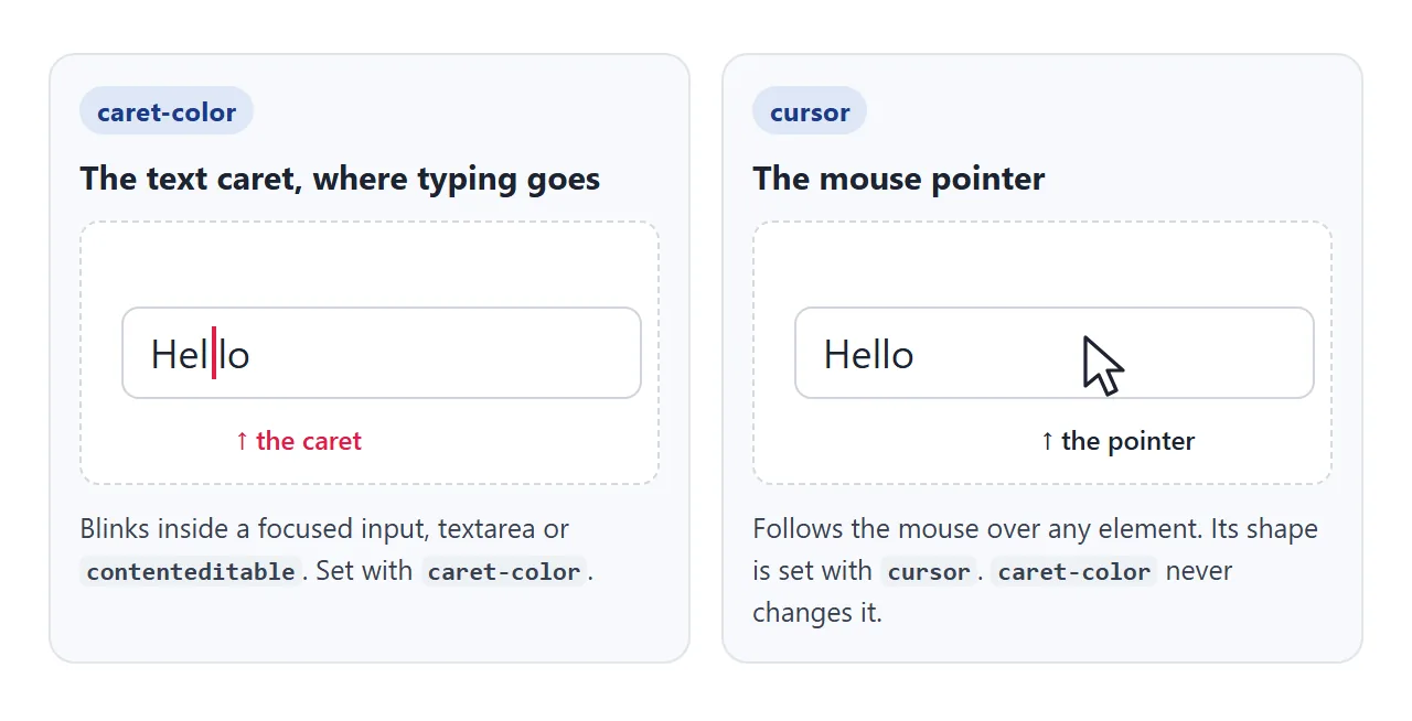
| Property | What it styles |
|---|---|
caret-color |
The blinking text caret in editable fields |
cursor |
The mouse pointer's shape, such as a hand or a text I-beam |
color |
The text itself, and the caret while caret-color is auto |
::selection |
The highlight behind selected text |
If you came here to change the arrow, CSS cursor covers pointer shapes. caret-color never touches it.
Values: auto, a colour, or transparent
caret-color takes auto or any CSS colour.
autois the default. The browser picks the colour, and it usually matches the text colour.- A colour such as
#2563eb,rgb(),hsl()or a variable likevar(--brand). transparenthides the caret. The field still gets focus and typing, which is the start of a custom caret.
Hiding the caret without drawing a replacement makes a field hard to use. People lose track of where their next letter will land, especially after moving with the arrow keys.
caret-shape: bar, block and underscore
caret-shape is a newer property from CSS Basic User Interface Level 4. It changes the form of the caret, not its colour.
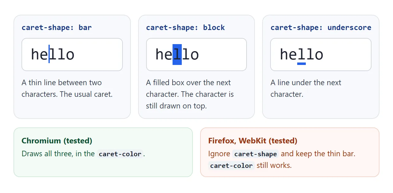
Click into each field below and move the caret with the arrow keys. The note underneath says whether your browser supports the property.
<!doctype html>
<html lang="en">
<head>
<meta charset="utf-8">
<meta name="viewport" content="width=device-width, initial-scale=1">
<title>caret-shape</title>
<style>
  body { margin: 0; padding: 16px; font-family: system-ui, sans-serif; background: #f4f5f7; color: #1d2330; }
  .grid { display: grid; grid-template-columns: repeat(auto-fit, minmax(150px, 1fr)); gap: 10px; }
  label { display: grid; gap: 5px; font: 600 13px ui-monospace, Consolas, monospace; }
  input {
    font: 20px ui-monospace, Consolas, monospace; padding: 8px 10px; min-width: 0;
    border: 1px solid #cfd4dc; border-radius: 8px; background: #fff; color: #1d2330;
    caret-color: #2563eb;
  }
  .auto  { caret-shape: auto; }
  .bar   { caret-shape: bar; }
  .block { caret-shape: block; }
  .under { caret-shape: underscore; }
  #note { margin-top: 14px; padding: 10px 12px; border-radius: 8px; font-size: 14px; line-height: 1.45; }
  #note.yes { background: #e3f5e9; color: #0f5132; }
  #note.no  { background: #fdeee8; color: #9a3412; }
</style>
</head>
<body>
<div class="grid">
  <label>caret-shape: auto<input class="auto" value="hello" aria-label="auto"></label>
  <label>caret-shape: bar<input class="bar" value="hello" aria-label="bar"></label>
  <label>caret-shape: block<input class="block" value="hello" aria-label="block"></label>
  <label>caret-shape: underscore<input class="under" value="hello" aria-label="underscore"></label>
</div>
<p id="note"></p>

<script>
  // feature check: an unsupported property is simply ignored, so the page still works
  const ok = CSS.supports('caret-shape', 'block');
  const note = document.getElementById('note');
  note.className = ok ? 'yes' : 'no';
  note.textContent = ok
    ? 'This browser supports caret-shape. Click into each field and move with the arrow keys.'
    : 'This browser ignores caret-shape, so all four fields show its normal thin caret. The blue caret-color still applies.';
</script>
</body>
</html>
| Value | What you see |
|---|---|
auto |
The browser decides. In our Chromium test it looked the same as bar |
bar |
A thin vertical line between two characters |
block |
A filled box over the next character, with the character drawn on top |
underscore |
A short line under the next character |
At the end of the text there is no next character, so block and underscore sit on the empty space after the last letter.
caret-shape support and a safe fallback
We checked CSS.supports('caret-shape', 'block') in the browser engines we had installed. Chromium returned true and drew all three shapes. Firefox and WebKit returned false and kept their thin bar.
An unknown property is simply skipped, so nothing breaks. Write caret-color first, then caret-shape. Browsers without shape support still show the thin caret in your colour.
.code-field {
  caret-color: #2563eb;      /* works in all three engines we tested */
  caret-shape: block;        /* skipped where unsupported */
}
@supports (caret-shape: block) {
  .code-field { /* extra styling only for the block caret */ }
}
The spec also defines a caret shorthand. None of the three engines we tested accepted it, so use the two longhand properties.
A custom terminal-style caret
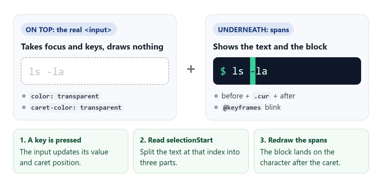
For a block caret in every browser, draw it yourself. The real input stays in charge of focus, typing and selection. It is simply made invisible, and a few spans underneath show the text and the block.
<!doctype html>
<html lang="en">
<head>
<meta charset="utf-8">
<meta name="viewport" content="width=device-width, initial-scale=1">
<title>Terminal-style caret</title>
<style>
body { margin: 0; padding: 12px; background: #e9ecf1; font-family: system-ui, sans-serif; }
.term {
height: 290px; box-sizing: border-box; padding: 12px 14px; border-radius: 10px;
background: #0f172a; color: #d1fae5; overflow-y: auto; cursor: text;
font: 15px/1.5 ui-monospace, Consolas, monospace;
}
#log div { white-space: pre-wrap; word-break: break-all; }
#log .muted { color: #7dd3a8; }
.line { display: flex; gap: 1ch; }
.prompt { color: #34d399; }
.view { position: relative; flex: 1; white-space: pre; }
/* the real input sits on top: it gets focus, typing and selection, but draws nothing */
#cmd {
position: absolute; inset: 0; width: 100%; margin: 0; padding: 0; border: 0; outline: 0;
font: inherit; background: transparent; color: transparent;
caret-color: transparent; /* hide the browser's caret */
}
#cmd::selection { background: rgba(52, 211, 153, .35); }
/* the drawn caret: a block over the next character */
.cur { background: #34d399; color: #0f172a; animation: blink 1s steps(1) infinite; }
.term:not(:focus-within) .cur { background: none; color: inherit; outline: 1px solid #34d399; animation: none; }
.typing .cur { animation: none; } /* stay solid while keys are pressed */
@keyframes blink { 50% { background: transparent; color: inherit; } }
@media (prefers-reduced-motion: reduce) { .cur { animation: none; } }
</style>
</head>
<body>
<div class="term" id="term">
<div id="log"><div class="muted">Click here, type help and press Enter.</div></div>
<div class="line">
<span class="prompt">$</span>
<!-- no spaces inside .view: it uses white-space: pre -->
<span class="view"><span id="before"></span><span class="cur" id="cur"> </span><span id="after"></span><input id="cmd" maxlength="30" autocomplete="off" autocapitalize="off" spellcheck="false" aria-label="Command"></span>
</div>
</div>
<script>
const term = document.getElementById('term');
const cmd = document.getElementById('cmd');
const log = document.getElementById('log');
const before = document.getElementById('before');
const cur = document.getElementById('cur');
const after = document.getElementById('after');
let idle;
// split the text at the caret position and draw the block over the next character
function draw() {
const v = cmd.value;
const i = cmd.selectionStart;
before.textContent = v.slice(0, i);
cur.textContent = v[i] || '\u00a0'; // at the end, the block sits on an empty cell
after.textContent = v.slice(i + 1);
}
// a solid caret while typing, blinking again after a pause
function typing() {
term.classList.add('typing');
clearTimeout(idle);
idle = setTimeout(() => term.classList.remove('typing'), 500);
}
function print(text, cls) {
const d = document.createElement('div');
d.textContent = text;
if (cls) d.className = cls;
log.append(d);
}
function run(line) {
print('$ ' + line);
const [name, ...rest] = line.trim().split(/\s+/);
if (!name) return;
if (name === 'help') print('help, echo <text>, date, clear', 'muted');
else if (name === 'echo') print(rest.join(' '));
else if (name === 'date') print(new Date().toString());
else if (name === 'clear') log.textContent = '';
else print('command not found: ' + name, 'muted');
}
cmd.addEventListener('input', () => { draw(); typing(); });
cmd.addEventListener('keydown', (e) => {
if (e.key === 'Enter') {
run(cmd.value);
cmd.value = '';
draw();
term.scrollTop = term.scrollHeight;
}
typing();
requestAnimationFrame(draw); // arrow keys move the caret after keydown
});
cmd.addEventListener('select', draw);
cmd.addEventListener('pointerup', () => requestAnimationFrame(draw));
term.addEventListener('click', () => cmd.focus());
</script>
</body>
</html>
- Hide the real caret and text. The input gets
color: transparentandcaret-color: transparent, and sits on top of the spans. - Read the caret position. After each key,
selectionStartis the index where the caret sits. - Split the text into three spans. Before the caret, the one character after it, and the rest. The middle span gets the block background.
- Blink with
@keyframes. Pause the animation while keys are pressed, and stop it underprefers-reduced-motion.
function draw() {
  const v = cmd.value, i = cmd.selectionStart;
  before.textContent = v.slice(0, i);
  cur.textContent = v[i] || '\u00a0';  // an empty cell at the end
  after.textContent = v.slice(i + 1);
}
The drawn text only lines up with the input if both use the same font, size and padding. Use font: inherit on the input and a monospace font, so every character has the same width. For the blink itself, CSS keyframes explains steps().
Because the real input is still there, screen readers, the on-screen keyboard on phones, copy and paste all keep working.
caret-color next to accent-color
accent-color recolours checkboxes, radio buttons, range sliders and progress bars. It does not reach text fields. caret-color covers those. CSS accent-color goes through the controls it reaches.
Both properties are inherited, so one brand variable on :root can feed them together:
:root {
  --brand: #e11d48;
  accent-color: var(--brand);   /* checkboxes, radios, sliders */
  caret-color: var(--brand);    /* text caret in every field */
}
Changing --brand then updates every control and every caret at once. CSS variables covers the var() part. On a dark theme, check that the caret still stands out against the field background.
When it does not work
| What you see | Cause | Fix |
|---|---|---|
| The caret keeps its old colour | The rule is on an element that does not contain the field, or a field rule overrides it | Put caret-color on the field or on a wrapper around it |
| The mouse arrow did not change | That is the cursor property |
Use cursor for the pointer |
| No caret appears on a div | The div is not editable | Add contenteditable, or use an input |
| The caret is invisible | Its colour matches the background, or it is transparent |
Pick a colour with contrast |
caret-shape: block shows a thin bar |
The browser does not support caret-shape |
Keep the bar as the fallback, or draw a custom caret |
| The custom block drifts away from the text | Input and spans use different fonts or padding | Same font through font: inherit, monospace, no padding |
| The custom block blinks while typing | The animation never pauses | Add a class on keydown that sets animation: none |
Share it as a link
A caret is hard to show in a screenshot: it blinks, and it only appears once someone clicks into a field. The people you want feedback from need to type into it themselves.
Paste the page into a NOS document and choose Create share link. HTML to link walks through it.
The page renders as written and its scripts run, so the terminal answers commands for whoever opens the link. If you change the colour or the shape later, the same link shows the new version.