An HTML timeline template should be a vertical list, because that is how a timeline is read on a phone even though it is almost always drawn horizontally.
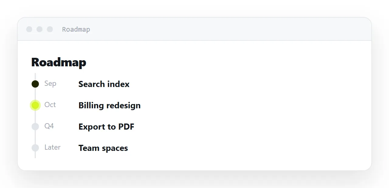
A roadmap is the document most likely to be out of date, since dates move and the file does not.
This guide covers the vertical list that needs no library, how to show where you are now, how to keep implied dates from becoming promises, and the four steps to put the timeline at one address.
A roadmap is the document most likely to be out of date, because dates move and the file does not. It is also the one most often drawn in a way that cannot be read on a phone.
The HTML timeline template: vertical, not horizontal
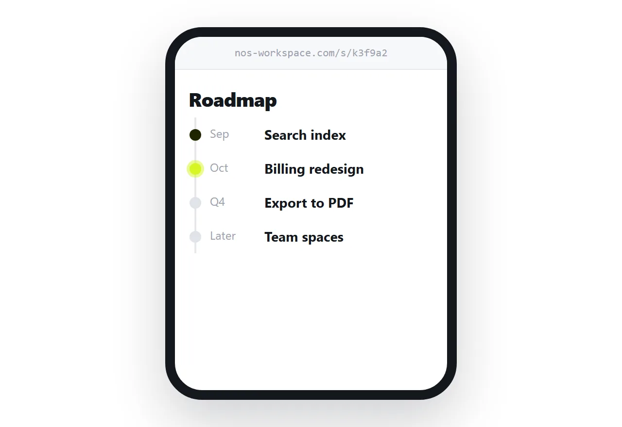
The instinct is a horizontal track with milestones along it. On a laptop that looks good. On a phone it becomes a sideways-scrolling strip where everything past the second item is invisible, and most readers never discover there was a third.
A vertical list solves it and is less code:
<style>
  .tl { list-style: none; margin: 0; padding: 0 0 0 26px; border-left: 2px solid #e7e7ea; }
  .tl li { position: relative; padding: 0 0 22px 6px; }
  .tl li::before {
    content: ""; position: absolute; left: -33px; top: 6px;
    width: 12px; height: 12px; border-radius: 50%;
    background: #fff; border: 2px solid #d0d0d4;
  }
  .tl li.done::before { background: #3f8f4f; border-color: #3f8f4f; }
  .tl li.now::before  { background: #d5f525; border-color: #a8c914; box-shadow: 0 0 0 4px #f2ffc2; }
  .tl .when { font-size: 12.5px; color: #71717a; }
  .tl .what { font-weight: 700; }
</style>

<ol class="tl">
  <li class="done"><span class="when">June</span><div class="what">Editor rewrite</div></li>
  <li class="done"><span class="when">August</span><div class="what">Billing</div></li>
  <li class="now"><span class="when">September</span><div class="what">Shared pages</div></li>
  <li><span class="when">Q4</span><div class="what">Team permissions</div></li>
</ol>
The border on the list is the line; a pseudo-element per item is the dot. It reflows on any width because it is a list, and it needs no library.
The ring on the current item is worth the extra line. "Where are we now" is the first question every reader has, and answering it visually saves them reading the whole thing.
Be specific about what is not a commitment
The most damaging thing a shared roadmap does is imply dates that were never promised. Two habits fix it:
Coarsen the future. Named months for what is done and in progress, quarters for what is next, "later" for anything beyond that. Precision that decays is worse than vagueness that holds.
Say so in writing. One line at the top: "dates past the current quarter are intent, not commitment". It costs nothing and prevents a conversation you do not want to have.
If you want a horizontal view as well
Use a grid on wide screens and let it fall back to the list:
@media (min-width: 860px) {
  .tl {
    display: grid;
    grid-auto-flow: column;
    grid-auto-columns: 1fr;
    border-left: 0;
    border-top: 2px solid #e7e7ea;
    padding: 26px 0 0;
  }
  .tl li { padding: 6px 12px 0 0; }
  .tl li::before { left: 0; top: -33px; }
}
Same markup, two layouts. See media queries and CSS grid for the parts. Note the direction of the fallback: the vertical version is the default and the horizontal one is the enhancement, so the phone case is the one that cannot break.
Why this has to be a link
A roadmap is defined by changing. Every mechanism that freezes it works against it:
| Sent as | What happens in three weeks |
|---|---|
| Slides in a file | Still showing the dates from three weeks ago |
| A screenshot in a channel | Same, and it looks current |
| A PDF | Same, and it looks official |
| A link | Shows this week's dates |
The failure is not that the old version exists. It is that nothing about it says it is old, so people plan around it.
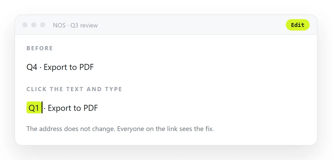
Publishing the page gives you one address to keep correct. In NOS the timeline HTML renders exactly as written and the dates in it are clickable text — so moving a milestone is typing over it, and everyone holding the link sees the move without being told.
Where to put the link
A roadmap is looked at repeatedly, so put the address where people already look rather than sending it once: a pinned message in the team channel, a Website tab in Teams, a bookmark in the wiki. Then the question "where is the roadmap" has one answer, and that answer is always current.
Keeping the history
When a date moves, it is worth being able to answer "when did that change". A document that keeps its own revisions answers it without anybody maintaining a folder of dated copies — and the link everybody uses still shows the current plan.
What each milestone should carry
Three things and no more: when, what, and one line of detail for the current item. A roadmap that explains every item is a document, and readers stop before the item that concerns them.
Put the detail behind each milestone in its own page and link the title, so the roadmap stays a list and the reader who wants the plan for "team permissions" clicks through to it.
Showing what changed
When a date moves, say so on the page for a while: "moved from Q3 to Q4 on 12 Sep" in small type under the item. It answers the question before it is asked and it is more honest than a silent edit.
Remove the note when the item ships. The document's own history keeps the full record for anyone who wants it.
Sharing the timeline as a link: 4 steps
- Build it as a vertical list. The bordered list above, a dot per item, a ring on the current one. No library, reflows on any width.
- Coarsen the dates as they get further out. Months for what is done and in progress, quarters for what is next, "later" beyond that, and one line at the top saying which dates are commitments.
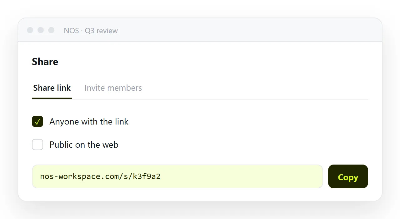
- Paste the timeline into a NOS document and copy the share link. Share, then Share link, then Create link. Pin the address where the team looks. Turning HTML into a link is this step.
- Move a date by editing the page. Click it, type. The link everyone holds shows the new date, and the document's history answers "when did that change".