An HTML presentation has real advantages over a deck file: it is one small file, its text is text rather than an image of text, and the styling is yours rather than a template's.
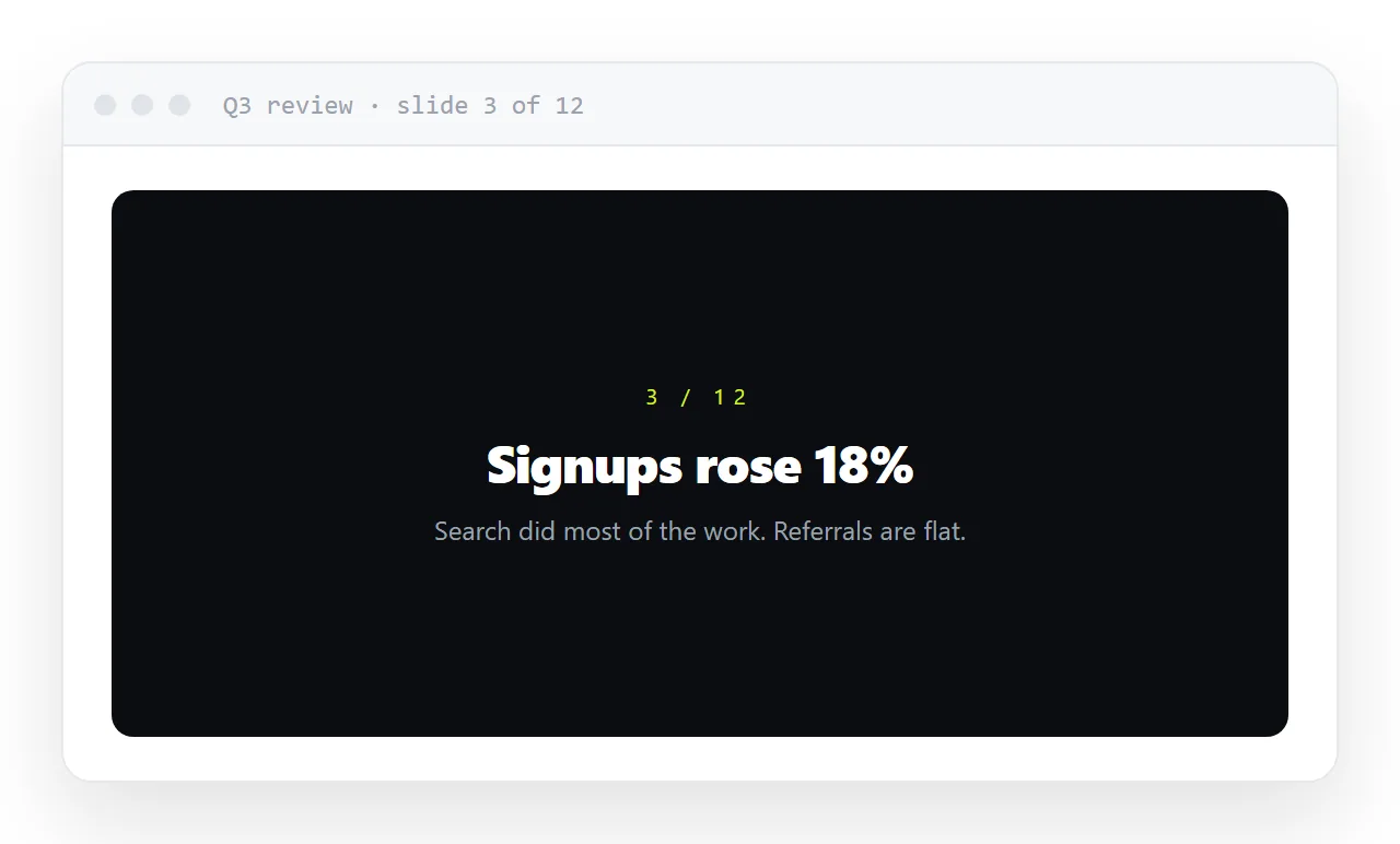
The disadvantage is entirely in distribution, because a deck saved as a file is as unopenable as any other HTML attachment.
This guide covers what to change so the deck reads on a phone as well as a projector, presenting straight from an address, sharing it afterwards, and what to do when somebody insists on a file.
An HTML deck has real advantages: it is one small file, text is text rather than an image of text, and the styling is yours rather than a template's. The disadvantage is entirely in distribution — a deck file is as unopenable as any other HTML attachment.
The HTML presentation: give it an address
Publish the page and send the link. The deck opens in a browser tab on any device, goes full screen with one key, and can be read on a phone on the way to the meeting. No app, no download, no attachment filter.
What to change once it is a link
A deck that only ever appeared on your own screen makes assumptions that break the moment other people open it.
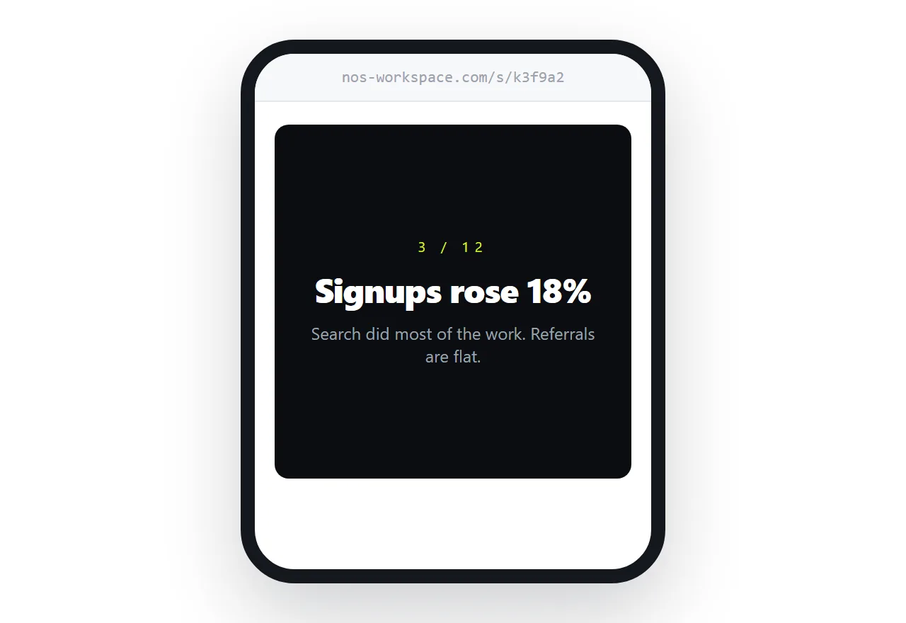
Do not fix the slide size
The instinct is to size slides to a projector. Resist it — a slide fixed at 1920 by 1080 is a postage stamp on a phone, and someone will read it on a phone.
.slide {
  min-height: 100svh;
  display: grid;
  place-items: center;
  padding: 6vh 5vw;
}
.slide > * { max-width: 760px; }
svh is the small viewport height unit — it accounts for phone browser toolbars, so a slide does not end up slightly taller than the visible area and leave a sliver of the next one showing. A maximum width on the content keeps lines readable on a wide screen without fixing the slide itself.
Snap between slides
.deck { scroll-snap-type: y mandatory; overflow-y: scroll; height: 100svh; }
.slide { scroll-snap-align: start; }
Four lines, and scrolling lands cleanly on each slide instead of stopping halfway between two. Works with a trackpad, a scroll wheel, arrow keys and a thumb.
Use fewer, larger words
A deck read on a phone rewards the same discipline as a deck read from the back of a room: one idea per slide, a headline that says it, and figures large enough to read without effort. If a slide needs a paragraph, it is a document, not a slide.
Give figures their own slide
<section class="slide">
  <p class="kicker">Q3</p>
  <h1>63% of the time went to <em>sending it</em>.</h1>
  <p>Not to writing the report. To formatting, re-sending, and answering which version this was.</p>
</section>
One number, one sentence of context. That is the whole slide.
Presenting from a link
Open the link, press the full-screen key, and step through. There is no presenter mode unless you build one, and for most internal decks nobody misses it.
If you need speaker notes, put them in a second page and open it on your own screen — which is easier with links than with a single deck file, because you can have two addresses open without any coordination.
Sharing after the meeting
This is where the link earns its keep. The deck you presented is the deck they read afterwards, at the same address, with your corrections in it. There is no "attached is the final version" email, and no set of four decks with different dates in the filename.
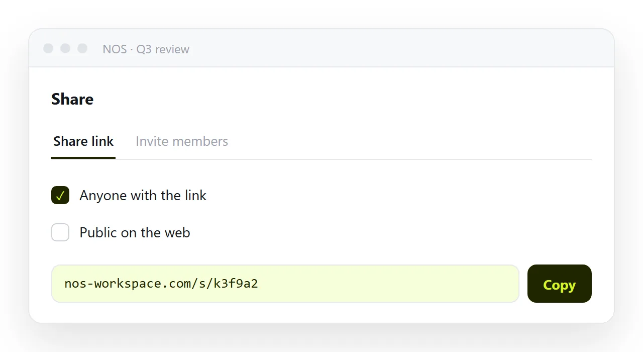
In NOS the pasted deck HTML renders exactly as written at a fixed address, and the text on each slide is clickable text. So fixing a figure the morning after the meeting is typing over it — the link you already sent shows the corrected slide, and nobody has to be told to discard the old one.
If somebody insists on a file
Export a PDF from the browser's print dialog — see HTML to image or PDF for the print rules that stop slides being sliced across sheets. Send it as the archive copy, and keep the link as the thing people actually read.
Reading the deck without presenting it
Most people who open a deck link are not in the room. They are reading it afterwards, on a phone, or before the meeting to decide whether to attend. That reader wants to scroll, not to step.
Scroll snapping gives them both: a swipe moves one slide, and a long scroll moves through the deck. Put the conclusion on the second slide, not the last, for the reader who gives it thirty seconds.
Speaker notes and the second screen
A deck at an address makes the two-screen problem easier than a deck file does.
Put the notes on a second page, or under each slide behind a <details> element that stays closed for the audience, and open that address on your own laptop while the projector shows the deck.
Two browser tabs, no presenter mode to configure, and the notes never appear on the big screen by accident.
Fonts, images and the projector
Two things go wrong at the front of the room. A font loaded from a folder next to the file falls back to a default on the venue machine, so embed it or use a system font.
And an image referenced by folder path is an empty box on any machine but yours, so put images at full addresses or embed them.
Both are the same rule: a slide deck that has to open on someone else's computer has to be self-contained.
Sharing the deck as a link: 4 steps
- Size each slide to the screen, not to a projector.
min-height: 100svh, content centred, amax-widthon the text. One idea per slide, large type. - Add scroll snapping. The four lines above, so a trackpad, a scroll wheel, the arrow keys and a thumb all land cleanly on each slide.
- Paste the deck into a NOS document and copy the share link. It renders exactly as written, transitions and all. Share, then Share link, then Create link. Turning HTML into a link is this step.
- Present from the link, then leave it as the copy people read. Open it, press the full-screen key, step through. The morning after, fix the figure on slide four by clicking it; the link you sent already shows the corrected slide.