shape-margin adds an even gap between a shape and the text that wraps around it. Put it on a float that already has shape-outside, and every line is pushed the same distance away from the curve.
Give the float a margin at least as large, or the gap is cut off at the float's edge.
.pic {
  float: left;
  width: 120px;
  height: 120px;
  shape-outside: circle(50%) border-box;
  shape-margin: 20px;
  margin-right: 20px; /* room for the gap */
}
Drag the slider to change the gap. Then untick the box to see what happens without the matching margin.
<!doctype html>
<html lang="en">
<head>
<meta charset="utf-8">
<meta name="viewport" content="width=device-width, initial-scale=1">
<title>shape-margin basics</title>
<style>
  body { margin: 0; padding: 14px 16px 16px 40px; font: 15px/1.55 system-ui, sans-serif; color: #1d2330; background: #fff; }
  .controls { display: flex; flex-wrap: wrap; gap: 8px 18px; align-items: center; margin: 0 0 10px -24px; font-size: 14px; }
  .controls input[type=range] { width: 150px; }
  pre { margin: 0 0 14px -24px; padding: 8px 10px; background: #f1f4f8; border-radius: 8px; font: 13px/1.45 ui-monospace, Consolas, monospace; white-space: pre-wrap; }

  .pic {
    --m: 20px;       /* shape-margin */
    --mr: 20px;      /* margin-right */
    float: left;
    width: 120px; height: 120px;
    border-radius: 50%;
    background: radial-gradient(circle at 35% 35%, #fdba74, #ea580c);
    shape-outside: circle(50%) border-box; /* the circle on the picture itself */
    shape-margin: var(--m);                /* the even gap around it */
    margin-right: var(--mr);               /* room for that gap */
    box-shadow: 0 0 0 var(--m) rgba(234, 88, 12, .16); /* paints the shape-margin band */
    position: relative;
  }
  /* dashed line = the float's margin box, where the shape is cut off */
  .pic::after {
    content: ""; position: absolute; top: 0; bottom: 0; left: 0;
    right: calc(-1 * var(--mr));
    border: 1.5px dashed #64748b;
  }
  p { margin: 0; }
</style>
</head>
<body>
<div class="controls">
  <label>shape-margin <input id="gap" type="range" min="0" max="32" value="20"></label>
  <label><input id="room" type="checkbox" checked> margin-right the same size</label>
</div>
<pre id="code"></pre>

<div class="pic" id="pic"></div>
<p id="text">The orange disc is a float with shape-outside set to a circle. The pale ring around it is the shape-margin: the lines of text stop at its outer edge, so the gap between the words and the curve stays the same all the way round. Untick the box and look at the widest point of the circle. The ring is still painted, but the text ignores the part that sticks out past the dashed line, because a shape can never reach outside the float's margin box. Drag the slider to 0 and the lines close in until they touch the disc, since shape-margin starts at 0.</p>

<script>
  const gap = document.getElementById('gap');
  const room = document.getElementById('room');
  const pic = document.getElementById('pic');
  const code = document.getElementById('code');

  function update() {
    const m = gap.value + 'px';
    const mr = room.checked ? m : '0px';
    pic.style.setProperty('--m', m);
    pic.style.setProperty('--mr', mr);
    code.textContent = 'shape-margin: ' + m + ';\nmargin-right: ' + mr + ';';
  }
  gap.addEventListener('input', update);
  room.addEventListener('change', update);
  update();
</script>
</body>
</html>
If you are new to shapes, CSS shape-outside covers the shape functions and image shapes. This page is about the gap around them.
What shape-margin does to the shape
shape-margin does not move the float or change its size. It builds a new, larger shape from the one shape-outside gave, and the text wraps around that larger shape instead.
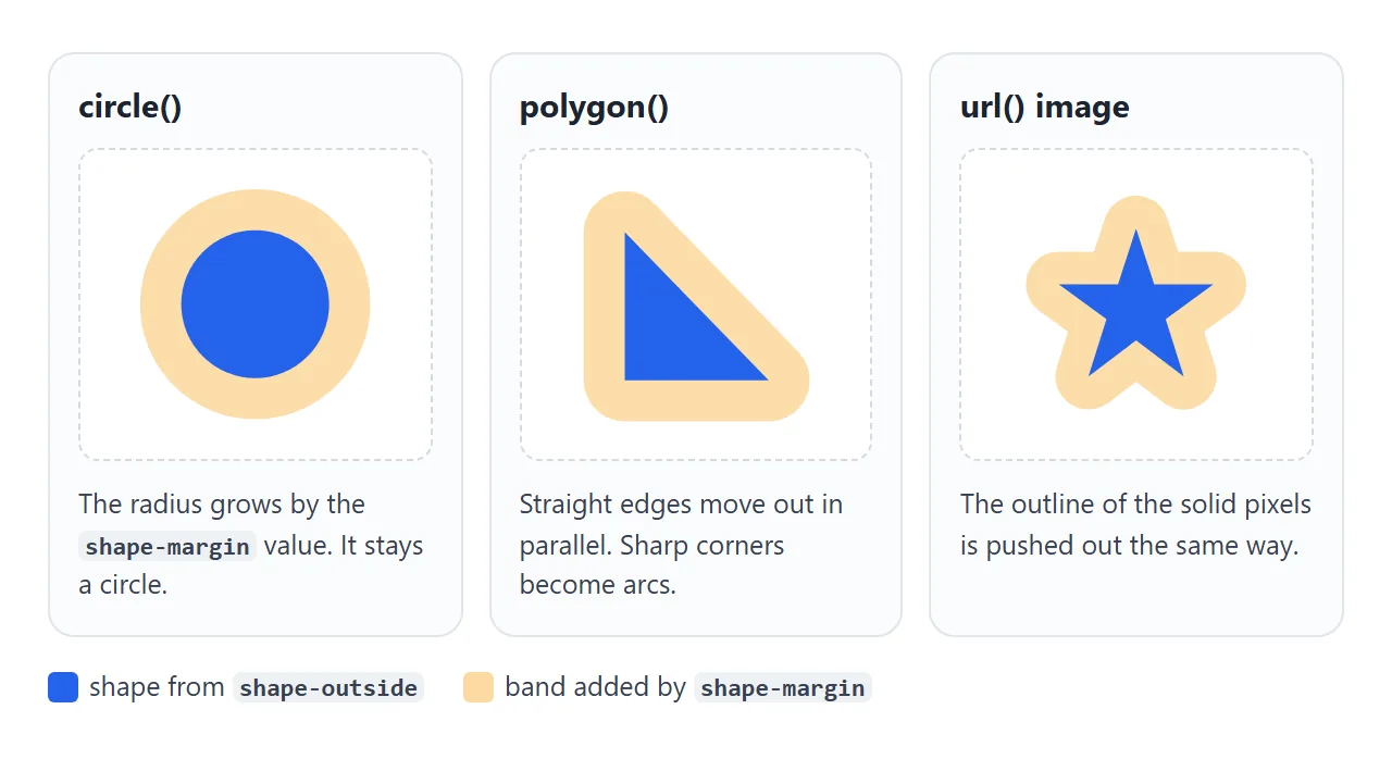
The CSS Shapes spec defines the new shape as every point that lies the shape-margin distance outward from the original edge. In practice:
- A circle stays a circle. Its radius grows by the
shape-marginvalue. - A polygon keeps its straight edges, each moved out in parallel. Sharp corners and points become arcs of that radius.
- An image shape from
url()gets the same treatment around the outline of its solid pixels.
The float itself is painted as before. shape-margin only changes where the lines of text start or stop, so the band is invisible unless you draw it, as the first example does with a spread box-shadow.
Give the gap room: the margin box limit
A shape can only ever make the area around a float smaller, never larger. The spec clips every shape to the float's margin box, and shape-margin is no exception.
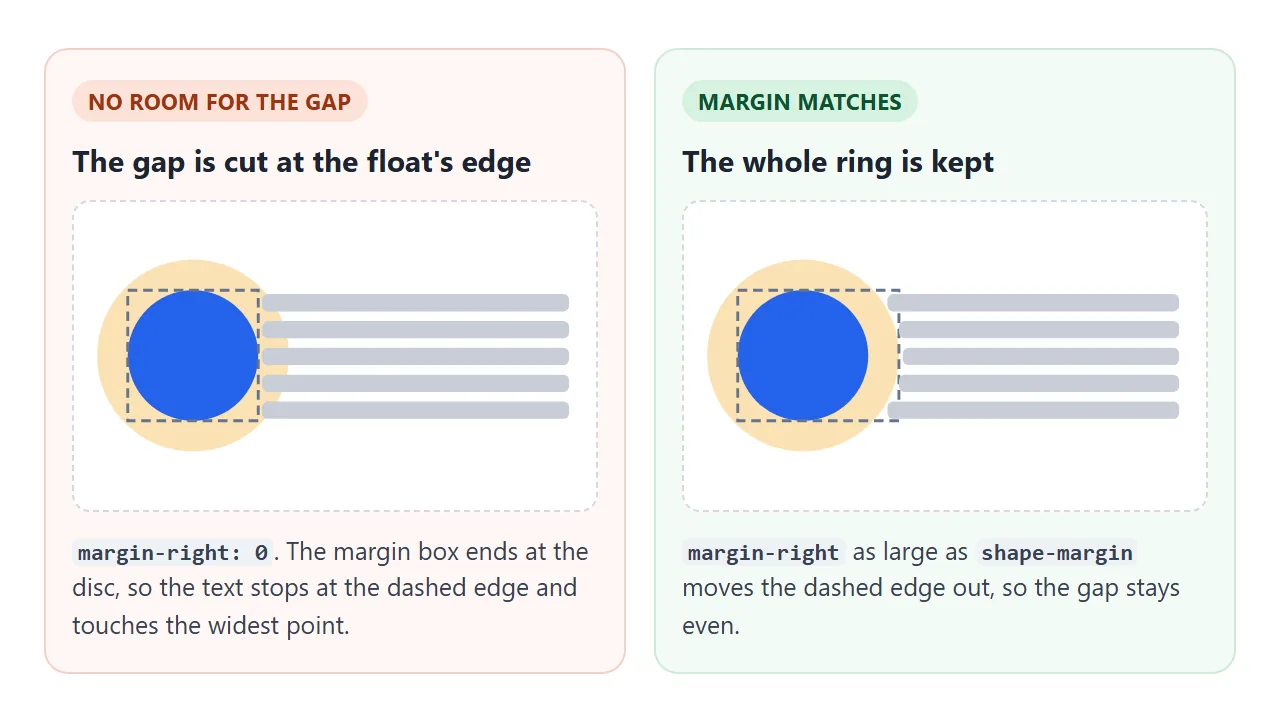
With circle(50%) border-box on a square float, the circle touches the box on all four sides. Any shape-margin beyond that is outside the margin box, so at the widest point the text still touches the circle.
The spec itself says extra margin may be needed to avoid this.
The fix is a margin on the side the text is on:
.pic {
  float: left;
  shape-outside: circle(50%) border-box;
  shape-margin: 16px;
  margin-right: 16px;   /* at least the shape-margin */
  margin-bottom: 16px;  /* so the line below the float gets the gap too */
}
For float: right, the text is on the left, so use margin-left.
shape-margin vs margin
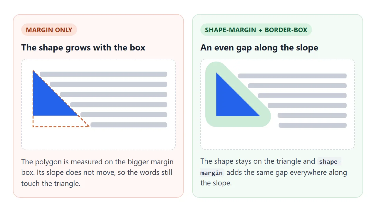
It is tempting to skip shape-margin and just add margin. That fails because of the reference box. A shape without a box keyword is measured on the margin box, so a bigger margin makes the whole shape bigger rather than adding a gap around it.
<!doctype html>
<html lang="en">
<head>
<meta charset="utf-8">
<meta name="viewport" content="width=device-width, initial-scale=1">
<title>margin vs shape-margin</title>
<style>
  body { margin: 0; padding: 14px 16px; font: 14px/1.5 system-ui, sans-serif; color: #1d2330; background: #fff; }
  label { font-size: 14px; }
  .row { display: grid; grid-template-columns: 1fr 1fr; gap: 14px; margin-top: 10px; }
  @media (max-width: 560px) { .row { grid-template-columns: 1fr; } }
  .pn { border: 1px solid #e1e4ea; border-radius: 10px; padding: 10px 12px; }
  h2 { margin: 0 0 4px; font-size: 15px; }
  code { font: 12.5px ui-monospace, Consolas, monospace; background: #f1f4f8; border-radius: 4px; padding: 0 3px; }
  .note { margin: 0 0 8px; font-size: 13px; color: #4b5563; }
  p.txt { margin: 0; }

  .tri {
    --gap: 20px;
    float: left;
    width: 100px; height: 100px;
    background: #2563eb;
    clip-path: polygon(0 0, 100% 100%, 0 100%); /* what you see */
  }
  /* Left: margin only. The shape is measured on the bigger margin box. */
  .by-margin .tri {
    margin: 0 var(--gap) var(--gap) 0;
    shape-outside: polygon(0 0, 100% 100%, 0 100%);
  }
  /* Right: shape-margin. The shape stays on the triangle, the gap is even. */
  .by-shape-margin .tri {
    margin: 0 var(--gap) var(--gap) 0;
    shape-outside: polygon(0 0, 100% 100%, 0 100%) border-box;
    shape-margin: var(--gap);
  }
</style>
</head>
<body>
<label>Gap <input id="gap" type="range" min="0" max="36" value="20"> <b id="val">20px</b></label>

<div class="row">
  <div class="pn by-margin">
    <h2>margin only</h2>
    <p class="note"><code>margin</code> + shape on the margin box</p>
    <div class="tri"></div>
    <p class="txt">Here the gap comes from margin alone. The shape is measured on the margin box, which grew by the same amount in both directions, so the slope lands exactly where it was. The words still touch the triangle. Only the flat bottom gets a gap.</p>
  </div>
  <div class="pn by-shape-margin">
    <h2>shape-margin</h2>
    <p class="note"><code>shape-margin</code> + <code>border-box</code></p>
    <div class="tri"></div>
    <p class="txt">Here the shape is measured on the border box, so it matches the blue triangle, and shape-margin pushes every line the same distance from the slope. The margin only makes room so the gap is not cut off.</p>
  </div>
</div>

<script>
  const gap = document.getElementById('gap');
  const val = document.getElementById('val');
  gap.addEventListener('input', () => {
    // one value drives margin and shape-margin in both panels
    document.querySelectorAll('.tri').forEach(t => t.style.setProperty('--gap', gap.value + 'px'));
    val.textContent = gap.value + 'px';
  });
</script>
</body>
</html>
In the left panel, the triangle's polygon is stretched to fill the larger margin box. Its slope runs from corner to corner of that box, which is the same line as before, so the words still touch the triangle.
Only the flat bottom gets a gap, because the box grew downward too.
margin only |
shape-margin + border-box |
|
|---|---|---|
| What grows | The box the shape is measured on | The shape itself |
| Gap along the triangle's slope | None | Even |
| Circle with margin on one side | Centre moves | Centre stays put |
| Still needed | – | A margin as large as the gap |
The two work as a pair. border-box keeps the shape on the visible element, shape-margin sets the gap, and margin makes room for it.
Values, requirements and browser support
Values
shape-margin takes one length or percentage.
| Value | Gap |
|---|---|
0 |
None. This is the initial value |
20px |
20 pixels all round |
1em |
One font size, so it grows with the text |
5% |
5% of the containing block's width |
-10px |
Invalid, the declaration is ignored |
Percentages are the one surprise. They are not measured on the float or on the shape.
MDN and the spec both measure them against the containing block, which for a float is most often the nearest block-level ancestor. In a 400px wide article, 10% is a 40px gap.
The property is not inherited, so setting it on a parent does nothing for the floats inside. It can be animated: a transition between two values moves the text smoothly.
What it needs
shape-margin has two requirements, both inherited from shape-outside:
- A float. The element needs
float: leftorfloat: right. The spec lists floats and initial letter boxes as the only elements the property applies to. - A shape. With
shape-outside: none, the text wraps around the plain margin box andshape-marginchanges nothing.
Browser support
MDN lists shape-margin as Baseline Widely available, and says it has worked across browsers since January 2020. MDN's compatibility data lists support in Chrome, Edge, Firefox and Safari, with Safari also accepting a -webkit- prefixed name.
We ran every example on this page in the Chromium, Firefox and WebKit builds that ship with Playwright. The gap measured the same in all three.
A finished example: one variable for every gap
A real layout often has more than one shaped float. Keep the gap in one custom property and feed it to both shape-margin and the margin that makes room for it. Then the two can never drift apart.
<!doctype html>
<html lang="en">
<head>
<meta charset="utf-8">
<meta name="viewport" content="width=device-width, initial-scale=1">
<title>Article layout with shape-margin</title>
<style>
  :root {
    --gap: 14px; /* one value for every shape-margin and the margin that makes room for it */
    --star: polygon(50% 4%, 61% 38%, 97% 38%, 68% 59%, 79% 94%, 50% 72%, 21% 94%, 32% 59%, 3% 38%, 39% 38%);
  }
  body { margin: 0; padding: 16px 18px; font-family: Georgia, serif; background: #faf7f2; color: #2b2622; }
  .bar { font: 14px system-ui, sans-serif; margin: 0 0 12px; }
  h1 { margin: 0 0 12px; font-size: 24px; }
  p { margin: 0 0 12px; font-size: 15px; line-height: 1.6; }

  /* round picture: clip-path cuts it, shape-outside + shape-margin wrap it */
  .portrait {
    float: left;
    width: 130px; height: 130px;
    margin: 0 var(--gap) var(--gap) 0;
    background: linear-gradient(#0e7490 55%, #164e63 55%), #0e7490;
    clip-path: circle(50%);
    shape-outside: circle(50%) border-box;
    shape-margin: var(--gap);
  }

  /* star: one polygon cuts the picture and shapes the wrap */
  .star {
    float: right;
    width: 110px; height: 110px;
    margin: 0 0 var(--gap) var(--gap);
    background: #f59e0b;
    clip-path: var(--star);
    shape-outside: var(--star) border-box;
    shape-margin: var(--gap);
  }

  @media (max-width: 480px) {
    .portrait { width: 96px; height: 96px; }
    .star { width: 84px; height: 84px; }
  }
</style>
</head>
<body>
<label class="bar">Gap <input id="gap" type="range" min="0" max="30" value="14"> <b id="val">14px</b></label>
<h1>Notes from the night sky</h1>

<div class="portrait" role="img" aria-label="A lake at night"></div>
<p>We rowed out past the reeds once the wind dropped, and the lake went so still that the sky seemed to continue below the boat. The first stars came through in the east while the west was still pale. Nobody wanted to be the first to speak.</p>

<div class="star" role="img" aria-label="A star"></div>
<p>The brightest point over the far shore was not a star at all but a planet, steady where the others flickered. We tried to name the rest from memory and got most of them wrong. It did not matter much. The point was to sit there long enough for the eye to adjust, until the faint ones filled in the gaps between the bright ones.</p>

<p>By midnight the dew had soaked everything we had not put away, and the oars were cold enough to sting. We rowed back slowly, following the light we had left on the porch.</p>

<script>
  const gap = document.getElementById('gap');
  const val = document.getElementById('val');
  gap.addEventListener('input', () => {
    // changing one custom property updates both floats
    document.documentElement.style.setProperty('--gap', gap.value + 'px');
    val.textContent = gap.value + 'px';
  });
</script>
</body>
</html>
:root { --gap: 14px; }

.portrait {
  float: left;
  margin: 0 var(--gap) var(--gap) 0;
  clip-path: circle(50%);
  shape-outside: circle(50%) border-box;
  shape-margin: var(--gap);
}
clip-path cuts the picture to the same circle, so the text follows what people see. It measures from the border box by default, which is one more reason to write border-box after the shape. CSS clip-path and CSS variables cover both tools in more depth.
When it does not work
| What you see | Cause | Fix |
|---|---|---|
| No change at all | The element is not floated | Add float: left or right |
| No change, and the text wraps a rectangle | shape-outside is missing or none |
Give the float a shape |
| The gap vanishes at the widest point | The shape is clipped to the margin box | Add a margin on the text side, at least as large |
| The gap is fine beside the float, missing below it | No bottom margin | Add margin-bottom of the same size |
| A percentage gap is far too big | It is measured on the parent's width | Use px or em |
| A negative value is ignored | Only 0 or more is allowed | Shrink the shape instead |
| The gap is uneven along a slope | Margin used instead of shape-margin |
Use shape-margin with border-box |
Share it as a link
Text wrapping changes with the width of the screen, so a screenshot only shows one case. A live page lets people drag the window, or open it on a phone, and watch the gap hold.
Paste the page into a NOS document and choose Create share link. HTML to link walks through it.
The page renders as written and its scripts run, so the sliders in these examples work for whoever opens the link. If you change the code later, the same link shows the new version.